
How does SUSI AI web bot plugin work
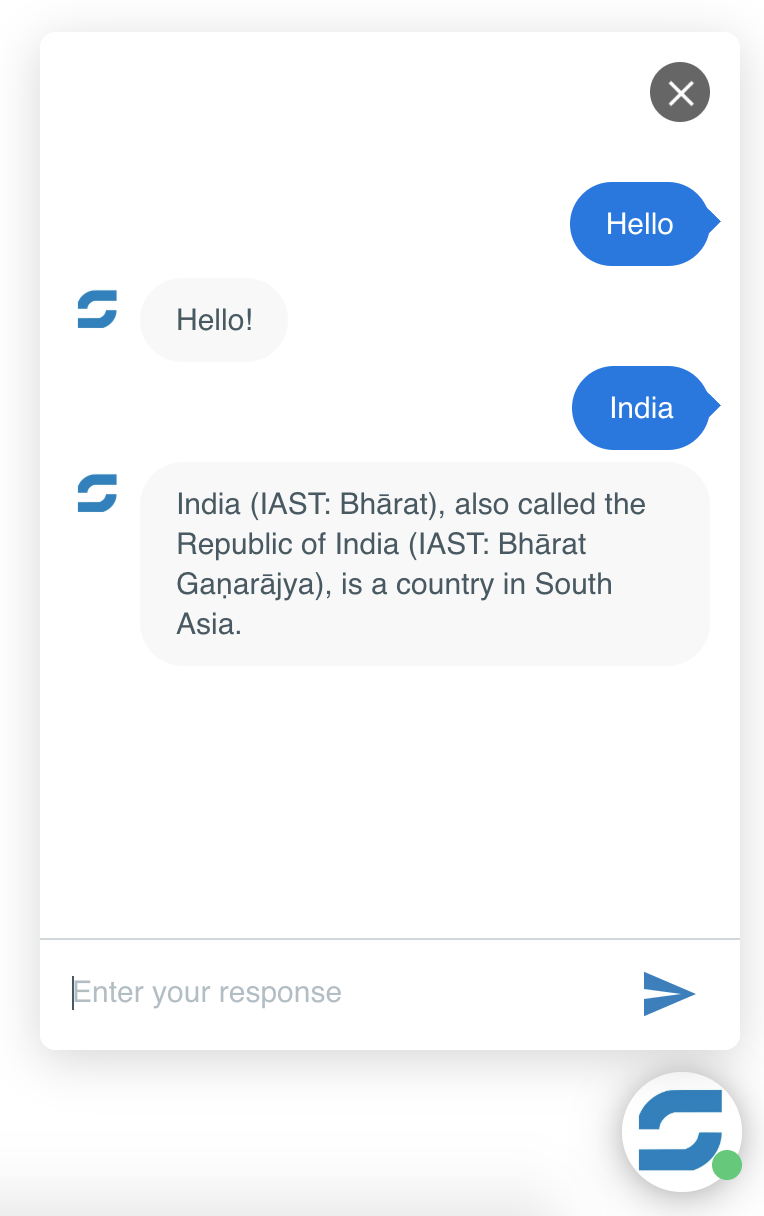
In this blog, we’ll learn how SUSI AI web plugin works. Normally, for any bot like Kik bot, we don’t have to worry about the chat boxes or the way chatbot is rendered on screen because all of that is handled by the service on which we are building our bot. So, for these bots, we simply take the text input from user, send a GET request to SUSI server, receive the response and display it.

This is not the case with SUSI AI Web Bot plugin. In this case, there is not Bot platform.
Hence, there are a lot of other things that we need to take care of here. Let’s explore the main ones among them.
Adding bot to website:
The final product that we’re going to provide to the client is going to be just a JavaScript code. Hence the HTML code of bot widget needs to be added to the <body> of the website. This is done usingappend() method of jQuery. The html() method sets or returns the content (innerHTML) of selected elements.
Syntax:
$(selector).append(content)
So we store the HTML code of bot widget in a variable and then returns the content of that variable to the body tag using:
$("body").append(mybot);
Here “mybot” is the variable containing HTML code of bot widget.
The text boxes of user texts and bot texts are added to a HTML element in the same way.
Event handling:
JavaScript’s interaction with HTML is handled through events that occur when the user or the browser manipulates a page. Loading of the page, clicking, pressing a key, closing a window, resizing the window etc are all examples of events.
In the SUSI AI web bot, there are two major events.
-
Clicking a button
This is required for allowing clicks on send button. Clicking of a button can be done in many ways. There are two major ways that are used in SUSI AI web bot.
Some elements already exist on the webpage. For example – the HTML code of web bot. It is added to the body tag as soon as webpage loads. For these elements we use click(). The click() binding is called “direct” binding which can be attached to the elements that already exists.
Syntax:
$(selector).click(function);
Selector – Class, ID or name of HTML element.
Function – Specifies the function to run when click event occurs.
Some elements are dynamically generated. This means that they are added at a later point of time. For example – the text messages are added when user types in. This happens after loading of page. For this, we have to create “delegated” binding by using on() method.
Syntax:
$(selector).on(event,childSelector,data,function);
Selector – Class, ID or name of HTML element
Event – (Required) Specifies one or more event(s) or namespaces to attach to the selected elements.
childSelector – (Optional) Specifies that the event handler should only be attached to the specified child elements
Data – (Optional) Specifies additional data to pass along to the function
Function – Specifies the function to run when click event occurs.
-
Pressing the enter key
For identifying which key is pressed, we use key codes. The code for enter key is 13.
The on() method is used for handling this event. It’ll be clear from the following code snippet:
Keyup – Keyboard key is released
Keypress – Keyboard key is pressed
$('#txMessage').on('keyup keypress', function(e) {
        var keyCode = e.keyCode || e.which;
        var text = $("#txMessage").val();
        if (keyCode === 13) {
                if(text == "" ||  $.trim(text) == '') {
                        e.preventDefault();
                        return false;
                } else {
                        $("#chat-input").blur();
                        setUserResponse(text);
                        send(text);
                        e.preventDefault();
                        return false;
                }
        }
});
This is the code used to handle “enter” key event in SUSI AI web bot. Here “txMessage” is the id of text box where user entered text.
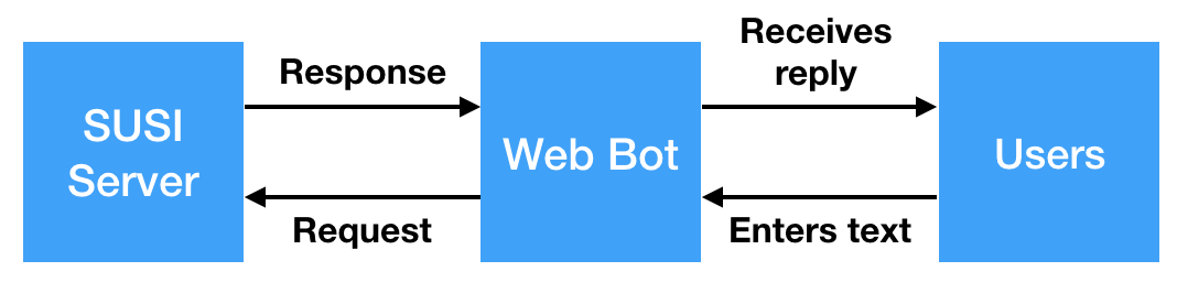
Making GET HTTP request to SUSI Server
We use ajax() method of jQuery to perform an asynchronous HTTP request to SUSI Server. Looking at the code will make things more clear:
$.ajax({
        type: "GET",
        url: baseUrl+text,
        contentType: "application/json",
        dataType: "json",
        success: function(data) {
                main(data);
        },
        error: function(e) {
                console.log(e);
        }
});
This is a GET type Ajax request. The endpoint of SUSI API is in url . We can see from dataType that the response received will be a JSON file. If the file is successfully received then main function is called else the error is logged into console.
References :
- Click() event – https://www.w3schools.com/jquery/event_click.asp
- On() event – https://www.w3schools.com/jquery/event_on.asp
- Key codes – https://www.cambiaresearch.com/articles/15/javascript-char-codes-key-codes
- ajax() method – http://api.jquery.com/jquery.ajax/


You must be logged in to post a comment.