Updating of Linux Standard Base (lsb) and Shorten of log of Meilix Build

Updating the Linux Standard Base of the Meilix

Originally Meilix uses the Ubuntu mirror to fetch the Kernel source for the building of the Operating System. Therefore whenever a user type lsb_release -a for fetching the required information, they get the Ubuntu build info. The task is to change the config file to update the Linux Base Information from Ubuntu to Meilix.

lsb_release -a
No LSB modules are available.
Distributor ID: Ubuntu
Description: Ubuntu 17.04
Release: 17.04
Codename: zesty

We need to patch a file in the location meilix-default-settings/etc/lsb-release which contains the information of the lsb release and this will overwrite the original configuration of Meilix.
This is how the lsb-release file looks like now:

DISTRIB_ID=Meilix
DISTRIB_RELEASE=17.04
DISTRIB_CODENAME=meilix
DISTRIB_DESCRIPTION="Meilix 17.04"

We made the required changes in the file as shown above and the output is as follows:

Shorten the log length of Meilix in Travis

We are facing issues while deployment of Meilix ISO in Travis and the error follows is ReadTimeout Error. Example log of one of fail build is:

This error gets solved automatically and the the ISO gets deployment after 1 or 2 restart of the build. But this time the error doesn’t get solved and after several attempts of restart of build, the ISO doesn’t get deployed.

Reason behind the error:

Travis is taking a lot of time to build the ISO. Travis logs are exceeding the time limit.

Proposed solution:

Reduce the time of build or shift to a new CI.
Reduce the log of the build so as to get the log within 9999 lines.

Solution Implemented

The best solution is to reduce the number of lines used in the log and this will also reduce the time of the build.
I tried concealing some command outputs by appending >/dev/null 2>&1 to some of the commands that has long outputs and adding -y to the commands like:

apt-get -qq -y --purge install file-roller unrar

References

Wiki of Linux Standard Base
Linux Foundation lsb
Ubuntu answer to reduce log

Continue ReadingUpdating of Linux Standard Base (lsb) and Shorten of log of Meilix Build

Turning off Power Management and Blanking of Screen in Meilix

Meililx has the LXQt desktop environment which already have the lxqt-powermanagement package. We don’t need to configure the power management during an event. Every time when an ISO is booted a pop-up arrives which asks to configure power. On the one hand, the pop-ups are a disturbing element during a presentation, slide-show, etc. On the other hand, while a presentation is going on and the presenter is explaining a slide for a longer duration then there is a possibility of the screen to turn blank or screen saver to get started due to inactivity. In this post we will discuss to resolve the above two issues.

Disabling Power Management
The issue has been filed #133 to solve. We can follow two approaches to shutdown the power daemon which is responsible for starting the power-management everytime during startup.

In the beginning the issue looks as:

One is to copy the script to /etc/X11/xorg.conf.d/10-monitor.conf by editing the meilix-default-settings metapackage. 

1. [panel1]
2. alignment=-1
3. animation-duration=0
4. background-color=@Variant(\0\0\0\x43\0\xff\xff\0\0\0\0\0\0\0\0)
5. background-image=
6. desktop=0
7. font-color=@Variant(\0\0\0\x43\0\xff\xff\0\0\0\0\0\0\0\0)
8. hidable=true
9. iconSize=22
10. lineCount=1
11. lockPanel=false
12. opacity=100
13.panelSize=32
14. plugins=mainmenu, desktopswitch, quicklaunch, taskbar, tray, statusnotifier, mount, volume, clock, showdesktop
15. position=Bottom
16. show-delay=0
17. width=100
18. width-percent=true

Explanation of code:

In the Monitor section, DPMS (Desktop Power Management System) is turned off by setting the value to false
In the ServerLayout section, Blanktime, Offtime, SuspendTime, StandbyTime are set to “0”, so that they will be disabled.
Through this way we are suspending the power-management to use it feature by making changes in the script. This approach will make sure that this feature can’t be changed through the GUI, too.

And the other approach is the basic one but it’s also fulfilling the similar need. Adding a line to chroot.sh

apt-get purge lxqt-powermanagement

Both will solve the issue and the pop will not arrive at the startup of the OS.
Now LXQt desktop starts as:

Disabling Blanking of Screen in Meilix
A presenter never wants to turn his monitor blank or screensaver while presenting his presentation. Here we will edit the .profile file in the home folder to fulfill our requirement.
For get the same file in the ISO, we need to patch the file meilix-default-settings/etc/skel/.profile.
Skel folder has the property to transfer the tree inside the folder to the home folder of the new user created. For example here, the new user created will have .profile folder inside its home directory and it will apply the requested changes.

Important code which is responsible for turning the blanking of screen off:

xset s off && xset -dpms


Link to important pages:
Disabling Power Management – Arch Wiki
Code for turning Power Management (PR) – @meets2tarun (author)
Code for turning off blanking of screen (PR) – @meets2tarun (author)

Continue ReadingTurning off Power Management and Blanking of Screen in Meilix

Configuration for Auto-hiding Panel in Meilix with LXQt desktop

In the new LXQt desktop, we can intelligently hide the panel. For that purpose, we’ll just need to patch a new file in a location under the meilix-default-settings metapackage.
Originally the file lies in the lxqt folder of the .config of the OS with the name panel.conf like .config/lxqt/panel.conf but since we have to make changes in the metapackage, we need to patch it here meilix-default-settings/etc/skel/.config/lxqt/panel.conf. Files in etc/skel/ will be put in each users’ new home folder, a folder which does not exist yet when we build the ISO.

panel.conf

1. [panel1]
2. alignment=-1
3. animation-duration=0
4. background-color=@Variant(\0\0\0\x43\0\xff\xff\0\0\0\0\0\0\0\0)
5. background-image=
6. desktop=0
7. font-color=@Variant(\0\0\0\x43\0\xff\xff\0\0\0\0\0\0\0\0)
8. hidable=true
9. iconSize=22
10. lineCount=1
11. lockPanel=false
12. opacity=100
13.panelSize=32
14. plugins=mainmenu, desktopswitch, quicklaunch, taskbar, tray, statusnotifier, mount, volume, clock, showdesktop
15. position=Bottom
16. show-delay=0
17. width=100
18. width-percent=true

In the line number 8 , hidable=true is doing all the jobs. It is the only line which hides the panel by default.

How we find this approach?
Originally LXQt panel is not hidden, they are shown by default. I first try to locate panel.conf file which will carry out the configuration for the panel. I try to find the code responsible for hiding the panel, but I can’t find that. Then I copied the panel.conf in a file and then by GUI I hide the panel and reopen the config file. Then I compare the changes between this file and the old config.panel file in which I found that the new file has a new line hidable=true. We introduced the changes in this PR.

How this approach actually work?
We are using meilix-default-settings metapackage to make the things work. We made an .config file which contains the configuration file. And the .config file is present under skel folder which gets copied under the home folder of the user. Thus ultimately we get a configuration file which will overwrite the original one to get the desired changes.

Other Uses of panel.conf
The file panel.conf could be used to customize all related settings to the LXQT panel, like its alignment, volume bar, quick launch, show desktop, etc.

References:
LXQt panel hiding
Customize LXQt desktop

Continue ReadingConfiguration for Auto-hiding Panel in Meilix with LXQt desktop

Debuilding the meilix-default-settings Metapackage

In the Meilix code repository you find a metapackage named meilix-default-settings which contains custom settings in directories as debian, etc, and user. In these directories one can make changes to make them be included in the build ISO. As Meilix runs on Debian we package our custom user settings in a Debian package to be installed along all the other software packages. The process and utility to make a Debian package is called debuild.

Directories in the meilix-default-settings:

What is debuilding?

It’s Debian slang for “making a deb package” and that stirred quite some confusion in our communications. Debuild is actually a rebuilding of the metapackage. But as to rebuild the Debian package you usually type debuild -uc -us therefore I stick to the language

Suppose someone has edited a configuration file in the metapackage according to its desires to achieve a specific result in the ISO it won’t get in unless he rebuilds the metapackage.He has not only to edit the metapackage but also to rebuild it to get the desired output in the ISO. To make the process automated, we have made a tiny script which will debuild the metapackages during each and every build, we only need to modify the metapackage.

Actually the first meilix-default-settings folder is the only metapackage and inside of it is the sub-metapackage which is responsible to get the changes applied in the ISO. To see a change in the ISO, we only need to edit the meilix-default-settings usr or etc folder in the first layer. Then, we need to debuild the metapackages.

Code-Base:

This file is present here

1. #!/bin/bash
2. rm meilix-default-settings_*                                    
3. cd meilix-default-settings                                      
4. debuild -uc -us

Let’s go through the whole code base line by line:
Line 2 deletes the previous meilix-default-settings binary packages.
Line 3 in this we changed our directory to the metapackage folder that is of our concern.
Line 4 is the most important line, it builds the whole metapackage and brings back all the binary packages and metapackages after making the desired changes.

Follow the example below to know that actually how it works:

This pull request is responsible to turn off system sounds by default in the generated ISO. Pull Requests files in which I only edited the this file and rest of the files get changes in the process of debuilding the metapackage (ignore .travis.yml file).

References:
Required files under debian directory
Debian directory guideline

Continue ReadingDebuilding the meilix-default-settings Metapackage

Hiding the Scrollbar in HTML in the loklak Media Wall

Loklak media wall needs to provide an appealing view to the user. The issue of visibility of scrollbars appeared on the browsers which uses webkit as a browser engine, for example, Google chrome and some others. This issue caused problems like shifting of elements when scrollbars are visible, bad UI. The task was to hide the scrollbars completely from the application while still making overflow of web page resources available by scrolling.

In this blog, I explain how to hide scrollbars from a webpage and still making scrolling available for the user.

Procedure


  • Removing scrollbars from the body division: By default, the <body> tag has the style property overflow:auto which makes overflow available automatically if web page resources exceed the current page dimensions. Therefore, to hide scrollbar from the body, we need to hide the overflow using overflow:hidden.

body {
overflow: hidden;
}


  • Creating a child wrapper division for the body: Since body now doesn’t provide scrolling available for the web page, we need to create a wrapper division for the web page for which scrolling would be available, however, scrollbars would not be visible. The idea behind this step is that wrapper division would now act as a wrapper for the web page and if there is some overflow of web page resources, scrolling can be performed from the child division (for which scrollbar can be hidden) instead of parent division.


The wrapper division needs to be a block which should occupy total web page available and CSS property overflow should be set to auto.

div.wrapper {
display: block;
width: 100%;
height: 100%;
overflow: auto;
}


  • Hiding scrollbars from the wrapper division: The browsers which uses webkit as the browser engines provides scrollbar to every DOM element as webkit-scrollbar which can be customized according to our need. We can now turn scrollbar background to transparent or either set width to 0. Now, since problem of shifting of DOM elements exists, we can need to set width to 0.

.wrapper::-webkitscrollbar {
width: 0px;
}


  • Blocking Scroll Blocks: For Angular Material Dialog box, same problem exists since Scroll blocks sets the CSS property of HTML to scroll. This causes the whole  html element to have a scroll. For the same, we can set overflow to hidden by using \deep\ tag to change CSS property deeply of different component of Angular project.

/deep/ html.cdkglobalscrollblock {
overflow: hidden;
}

References

Continue ReadingHiding the Scrollbar in HTML in the loklak Media Wall

Implementing Predefined Color Themes in loklak Media Wall

Loklak media wall provides predefined color theme buttons which can be used to directly switch to day or night mode. It is important that the colors of the components are updated instantly with a click of a button. To implement pre-defined color options, we should, first, choose a set of color combinations which should be updated on the concerned divisions of the templates. These set of colors should be stored as an object (same interface) and the current state should be updated with this object when another theme is requested.

In this blog, I will explain how to implement predefined theme options and how to add a new theme in media wall.

Working

Media Wall can provide plenty of themes to help the user to choose a theme of their choice. Loklak media wall currently provides two themes, i.e.,  dark and light themes to provide a contrasting variety of themes at first. Ngrx structure makes it easy to add a predefined themes to the media wall. Let’s see how to add a theme to media wall and see it in action.

Adding ngrx structure

The first task is to create actions which will be dispatched from the Angular components to update the media wall. Depending on the action dispatched, state properties will change and when passed to the template, will update the media wall with the requested theme. There is no need of payload since the color options for all the themes are stored already as a reducer variable which will be updated directly to the media wall state.

export class WallLightThemeChangeAction implements Action {
type = ActionTypes.WALL_LIGHT_THEME_CHANGE;constructor(public payload: ) { }
}export class WallDarkThemeChangeAction implements Action {
type = ActionTypes.WALL_DARK_THEME_CHANGE;constructor(public payload: ) { }
}

Next, we have to update reducer functions for the corresponding actions so that the state properties change according to the actions and wall is updated. For color options, we have an interface defined for color options. For a particular type of theme, we have to adjust interface and just have to update state with the personalised theme state. As the default theme is set to light theme, we have to update state to the initial state when user requests for  light theme

case mediaWallCustomAction.ActionTypes.WALL_DARK_THEME_CHANGE: {
state = {
wallHeader: {
backgroundColor: ‘#243447’,
fontColor: ‘#FFFFFF’
},
wallBackground: {
backgroundColor: ‘#2C4158’
},
wallCard: {
fontColor: ‘#FFFFFF’,
backgroundColor: ‘#1B2836’,
accentColor: ‘#1c94e0’
}
}
return state;
}case mediaWallCustomAction.ActionTypes.WALL_LIGHT_THEME_CHANGE: {
state = initialState;return state;
}

Component and Template

Component

Now, we need to define an array of the string value of colors corresponding to a particular theme. These corresponding theme colors will be displayed in a form of color picker to the user through looping in the template. Whenever user requests for a particular theme, at first, the variable currentTheme is updated with the theme color. Next, the action is dispatched according to the selected theme from the method installTheme().

export class MediaWallMenuComponent implements OnInit, OnDestroy {
.
.
public currentTheme: string;
public themes = [ ‘#FFFFFF’, ‘#333’ ];public installTheme() {
if (this.currentTheme === this.themes[0]) {
this.store.dispatch( new mediaWallCustomAction.WallLightThemeChangeAction());
this.store.dispatch(new mediaWallDirectUrlAction.WallGenerateDirectUrlAction());
}
else if (this.currentTheme === this.themes[1]) {
this.store.dispatch( new mediaWallCustomAction.WallDarkThemeChangeAction());
this.store.dispatch(new mediaWallDirectUrlAction.WallGenerateDirectUrlAction());
}
}
.
.
}

Template

Now, we have to provide a menu for color themes in media wall template to make it easier for user to select the theme. Any interaction with the menu buttons will update the current chosen color and calls a method installTheme() and the corresponding action is dispatched and theme will be updated. Also, the check should show the updated theme for the media wall. For this, a check icon is put up based on condition *ngIf=”currentTheme === theme”.

<mdmenu class=“docs-theme-picker-menu” overlapTrigger=“false” #themeMenu=“mdMenu” yposition=“above”>
<mdgridlist cols=“2”>
<mdgridtile *ngFor=“let theme of themes”>
<div mdmenuitem (click)=“currentTheme = theme; installTheme();”>
<div class=“docs-theme-picker-swatch”>
<mdicon class=“docs-theme-chosen-icon” *ngIf=“currentTheme === theme”>check_circle</md-icon>
<div class=”docs-theme-picker-primary” [style.background]=”theme”></div>
</div>
</div>
</md-grid-tile>
</mdgridlist>
</mdmenu>

Now, The swatch menu looks like this and user can select any predefined theme from the menu and now, the wall is updated with the selected color option.

Reference

Continue ReadingImplementing Predefined Color Themes in loklak Media Wall

Controlling Motors using PSLab Device

PSLab device is capable of building up a complete science lab almost anywhere. While the privilege is mostly taken by high school students and teachers to perform scientific experiments, electronic hobbyists can greatly be influenced from the device. One of the usages is to test and debug sensors and other electronic components before actually using them in their projects. In this blog it will be explained how hobbyist motors are made functional with the use of the PSLab device.

There are four types of motors generally used by hobbyists in their DIY(Do-It-Yourself) projects. They are;

  • DC Gear Motor
  • DC Brushless Motor
  • Servo Motor
  • Stepper Motor

DC motors do not require much of a control as their internal structure is simply a magnet and a shaft which was made rotatable around the magnetic field. The following image from slideshare illustrates the cross section of a motor. These motors require high currents and PSLab device as it is powered from a USB port from a PC or a mobile phone, cannot provide such high current. Hence these type of motors are not recommended to use with the device as there is a very high probability it might burn something.

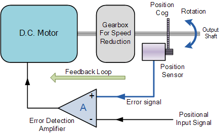
In the current context, we are concerned about stepper motors and servo motors. They cannot be powered up using direct currents to them. Inside these motors, the structure is different and they require a set of controlled signals to function. The following diagram from electronics-tutorials illustrates the feedback loop inside a servo motor. A servo motor is functional using a PWM wave. Depending on the duty cycle, the rotational angle will be determined. PSLab device is capable of generating four different square waves at any duty cycle varying from 0% to 100%. This gives us freedom to acquire any angle we desire from a servo motor. The experiment “Servo Motors” implement the following method where it accepts four angles.

public void servo4(double angle1, double angle2, double angle3, double angle4)

The experiment supports control of four different servo motors at independant angles. Most of the servos available in the market support only 180 degree rotation where some servos can rotate indefinitely. In such a case, the servo will rotate one cycle and reach its initial position.

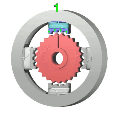
The last type of motor is stepper motor. As the name says it, this motor can produce steps. Inside of the motor, there are four coils and and five wires coming out of the motor body connecting these coils. The illustration from Wikipedia shows how four steps are acquired by powering up the respective coil in order. This powering up process needs to be controlled and hard to do manually. Using PSLab device experiment “Stepper Motor”, a user can acquire any number of steps just by entering the step value in the text box. The implementation consists of a set of method calls;

scienceLab.stepForward(steps, 100);

scienceLab.stepBackward(steps, 100);

A delay of 100 milliseconds is provided so that there is enough time to produce a step. Otherwise the shaft will not experience enough resultant force to move and will remain in the same position.

These two experiments are possible with PSLab because the amount of current drawn is quite small which can be delivered through a general USB port. It is worth mentioning that as industry grade servo and stepper motors may draw high current as they were built to interact with heavy loads, they are not suitable for this type of experiments.

Resources:

Continue ReadingControlling Motors using PSLab Device

Using Protractor for UI Tests in Angular JS for Loklak Apps Site

Loklak apps site’s home page and app details page have sections where data is dynamically loaded from external javascript and json files. Data is fetched from json files using angular js, processed and then rendered to the corresponding views by controllers. Any erroneous modification to the controller functions might cause discrepancies in the frontend. Since Loklak apps is a frontend project, any bug in the home page or details page will lead to poor UI/UX. How do we deal with this? One way is to write unit tests for the various controller functions and check their behaviours. Now how do we test the behaviours of the site. Most of the controller functions render something on the view. One thing we can do is simulate the various browser actions and test site against known, accepted behaviours with Protractor.

What is Protractor

Protractor is end to end test framework for Angular and AngularJS apps. It runs tests against our app running in browser as if a real user is interacting with our browser. It uses browser specific drivers to interact with our web application as any user would.

Using Protractor to write tests for Loklak apps site

First we need to install Protractor and its dependencies. Let us begin by creating an empty json file in the project directory using the following command.

echo {} > package.json

Next we will have to install Protractor.

The above command installs protractor and webdriver-manager. After this we need to get the necessary binaries to set up our selenium server. This can be done using the following.

./node_modules/protractor/bin/webdriver-manager update
./node_modules/protractor/bin/webdriver-manager start

Let us tidy up things a bit. We will include these commands in package.json file under scripts section so that we can shorten our commands.

Given below is the current state of package.json

{
    "scripts": {
        "start": "./node_modules/http-server/bin/http-server",
        "update-driver": "./node_modules/protractor/bin/webdriver-manager update",
        "start-driver": "./node_modules/protractor/bin/webdriver-manager start",
        "test": "./node_modules/protractor/bin/protractor conf.js"
    },
    "dependencies": {
        "http-server": "^0.10.0",
        "protractor": "^5.1.2"
    }
}

The package.json file currently holds our dependencies and scripts. It contains command for starting development server, updating webdriver and starting webdriver (mentioned just before this) and command to run test.

Next we need to include a configuration file for protractor. The configuration file should contain the test framework to be used, the address at which selenium is running and path to specs file.

// conf.js
exports.config = {
    framework: "jasmine",
    seleniumAddress: "http://localhost:4444/wd/hub",
    specs: ["tests/home-spec.js"]
};

We have set the framework as jasmine and selenium address as http://localhost:4444/wd/hub. Next we need to define our actual file. But before writing tests we need to find out what are the things that we need to test. We will mostly be testing dynamic content loaded by Javascript files. Let us define a spec. A spec is a collection of tests. We will start by testing the category name. Initially when the page loads it should be equal to All apps. Next we test the top right hand side menu which is loaded by javascript using topmenu.json file.

it("should have a category name", function() {
    expect(element(by.id("categoryName")).getText()).toEqual("All apps");
  });

  it("should have top menu", function() {
    let list = element.all(by.css(".topmenu li a"));
    expect(list.count()).toBe(5);
  });

As mentioned earlier, we are using jasmine framework for writing our specs. In the above code snippet ‘it’ describes a particular test. It takes a test description and a callback function thereby providing a very efficient way to document our tests white write the test code itself. In the first test we use expect function to check whether the category name is equal to All apps or not. Here we select the div containing the category name by its id.

Next we write a test for top menu. There should be five menu options in total for the top menu. We select all the list items that are supposed to contain the top menu items and check whether the number of such items are five or not using expect function. As it can be seen from the snippet, the process of selecting a node is almost similar to that of Jquery library.

Next we test the left hand side category list. This list is loaded by AngularJS controller from apps,json file. We should make sure the list is loaded properly and all the options are present.

it("should have a category list", function() {
    let categoryIds = ["All", "Scraper", "Search", "Visualizer", "LoklakLibraries", "InternetOfThings", "Misc"];
    let categoryNames = ["All", "Scraper", "Search", "Visualizer", "Loklak Libraries", "Internet Of Things", "Misc"];

    expect(element(by.css("#catTitle")).getText()).toBe("Categories");

    let categoryList = element.all(by.css(".category-main"));
    expect(categoryList.count()).toBe(7);

    categoryIds.forEach(function(id, index) {
      element(by.css("#" + id)).isPresent().then(function(present) {
        expect(present).toBe(true);
      });

      element(by.css("#" + id)).getText().then(function(text) {
        expect(text).toBe(categoryNames[index]);
      });
    });
  });

At first we maintain two lists of category id and category names. We begin by confirming that Category title is equal to Categories. Next we get the list of categories and iterate over them, For each category we check whether the corresponding id is present in the DOM or not. After confirming this, we match the names of the categories with the expected names. Elements.all function allows us to get a list of selected nodes.

Finally we check the click functionality of the left side menu. Expected behaviour is, on clicking a menu item, the category name should get replaced with the selected category name. For this we need to simulate the click event. Protractor allows us to do it very easily using click function.

it("category list should respond to click", function() {
    let categoryIds = ["All", "Scraper", "Search", "Visualizer", "LoklakLibraries", "InternetOfThings", "Misc"];
    let categoryNames = ["All apps", "Scraper", "Search", "Visualizer", "Loklak Libraries", "Internet Of Things", "Misc"];

    categoryIds.forEach(function(id, index) {
      element(by.id(categoryIds[index])).click().then(function() {
        browser.getCurrentUrl().then(function(url) {
          expect(url).toBe("http://127.0.0.1:8080/#/" + categoryIds[index]);
        });
        element(by.id("categoryName")).getText().then(function(text) {
          expect(text).toBe(categoryNames[index]);
        });
      });
    });
  });


Once again we maintain two lists, category id and category names. We obtain the present list of categories and iterate over them. For each category link we simulate a click event. For each click event we check two values. We check the new browser URL which should now contain the category id. Next we check the value of category name. It should be equal to the category selected.
FInally after all the tests are over we get the final report on our terminal.
In order to run the tests, use the following command.

npm test

This will start executing the tests.

Important resources

Continue ReadingUsing Protractor for UI Tests in Angular JS for Loklak Apps Site

Creating GUI for configuring SUSI Linux Settings

SUSI Linux app provides access to SUSI on Linux distributions on desktop as well as hardware devices like Raspberry Pi. The settings for SUSI Linux are controlled with the use of a config.json file. You may edit the file manually, but to provide safe configurations, we have a config generator script. You may run the script to configure settings like TTS Engine, STT Engine, authentication, choice about the hotword engine etc. Generally, it is easier to configure application settings through a GUI. Thus, we added a GUI for it using PyGTK and Glade.

Glade is a GUI designer for GNOME based Linux systems. I wrote a blog about how to create user interfaces in Glade and access it from Python code in SUSI Linux. Now, for creating UI for Configuration screen, we need to choose an ideal layout. Glade provides various choices like BoxLayout, GridLayout, FlowBox, ListBox , Notebook etc. Since, we need to display only basic settings options, we select the BoxLayout for this purpose.

BoxLayout as the name suggests, forms a box like arrangement for widgets. You can arrange the widgets in either Landscape or Horizontal Layout. We select Application Window as a top-level container and add a BoxLayout container in it. Now, in each box of the BoxLayout, we need to add the widgets like ComboBox and Switch for user’s choice and a Label. This can be done by using a horizontal BoxLayout with corresponding widgets. After arranging the UI in above described manner, we have a GUI like below.

If you see the current window in the preview now, you will find that the ComboBox do not have any items. We need to define items in the ComboBox using a GTKListStore. You may refer to this video tutorial to see how this can be done.

Now, when we see the preview, our GUI is fully functional. We have options for Speech Recognition Service, Text to Speech Service in ComboBox. Other simple settings are available as switches.

Now, we need to add functionality to our UI. We want our code to be modular and structured, therefore, we declare a ConfigurationWindow class. Though the ideal way to handle such cases is inheriting from the Gtk.Window class, but reading the documentation of PyGTK+ 3, I could not find a way to do this for windows created through Glade. Thus, we will use composition for storing the window object. We add window and other widgets present in the UI as properties of ConfigurationWindow class like this.

class ConfigurationWindow:
   def __init__(self) -> None:
       super().__init__()
       builder = Gtk.Builder()
       builder.add_from_file(os.path.join("glade_files/configure.glade"))

       self.window = builder.get_object("configuration_window")
       self.stt_combobox = builder.get_object("stt_combobox")
       self.tts_combobox = builder.get_object("tts_combobox")
       self.auth_switch = builder.get_object("auth_switch")
       self.snowboy_switch = builder.get_object("snowboy_switch")
       self.wake_button_switch = builder.get_object("wake_button_switch")

Now, we need to connect the Signals from our configuration window to the Handler. We declare the Handler as a nested class in the ConfigurationWindow class because its scope of usage is inside the ConfigurationWindow object. Then you may connect signals to an object of the Handler class.

builder.connect_signals(ConfigurationWindow.Handler(self))

Since we may need to modify the state of the widgets, we hold a reference of the parent ConfigurationWindow object in the Handler and pass the self as a parameter to the Handler. You may read more about using the handlers in my previous blog.

In the Handler, we connect to the config.json file and change the parameters of the the file based on the user inputs on the GUI. We handle it for the Text to Speech selection comboBox in the following manner. We also declare two addition Dialogs for handling the input of credentials by the users for the Watson and Bing services.

def on_stt_combobox_changed(self, combo: Gtk.ComboBox):
   selection = combo.get_active()

   if selection == 0:
       config['default_stt'] = 'google'

   elif selection == 1:
       credential_dialog = WatsonCredentialsDialog(self.config_window.window)
       response = credential_dialog.run()

       if response == Gtk.ResponseType.OK:
           username = credential_dialog.username_field.get_text()
           password = credential_dialog.password_field.get_text()
           config['default_stt'] = 'watson'
           config['watson_stt_config']['username'] = username
           config['watson_stt_config']['password'] = password
       else:
           self.config_window.init_stt_combobox()

       credential_dialog.destroy()

   elif selection == 2:
       credential_dialog = BingCredentialDialog(self.config_window.window)
       response = credential_dialog.run()

       if response == Gtk.ResponseType.OK:
           api_key = credential_dialog.api_key_field.get_text()
           config['default_stt'] = 'bing'
           config['bing_speech_api_key']['username'] = api_key
       else:
           self.config_window.init_stt_combobox()

       credential_dialog.destroy()

Now, we declare two more methods to show and exit the Window.

def show_window(self):
   self.window.show_all()
   Gtk.main()

def exit_window(self):
   self.window.destroy()
   Gtk.main_quit()

Now, we may use the ConfigurationWindow class object anywhere from our code. This modularized approach is better when you need to manage multiple windows as you can just declare the Window of a particular type and show it whenever need in your code.

Resources

  • Glade usage Youtube tutorial: https://www.youtube.com/watch?v=vOGK3TveDDk
  • Creating GUI using PyGTK for SUSI Linux: https://blog.fossasia.org/making-gui-for-susi-linux-with-pygtk/
  • PyGObject Documentation: http://pygobject.readthedocs.io/en/latest/getting_started.html
Continue ReadingCreating GUI for configuring SUSI Linux Settings

Keeping Order of tickets in Event Wizard in Sync with API on Open Event Frontend

This blog article will illustrate how the various tickets are stored and displayed in order the event organiser decides  on  Open Event Frontend and also, how they are kept in sync with the backend.

First we will take a look at how the user is able to control the order of the tickets using the ticket widget.

{{#each tickets as |ticket index|}}
  {{widgets/forms/ticket-input ticket=ticket
  timezone=data.event.timezone
  canMoveUp=(not-eq index 0)
  canMoveDown=(not-eq ticket.position (dec
  data.event.tickets.length))
  moveTicketUp=(action 'moveTicket' ticket 'up')
  moveTicketDown=(action 'moveTicket' ticket 'down')
  removeTicket=(confirm 'Are you sure you  wish to delete this 
  ticket ?' (action 'removeTicket' ticket))}}
{{/each}}

The canMoveUp and canMoveDown are dynamic properties and are dependent upon the current positions of the tickets in the tickets array.  These properties define whether the up or down arraow or both should be visible alongside the ticket to trigger the moveTicket action.

There is an attribute called position in the ticket model which is responsible for storing the position of the ticket on the backend. Hence it is necessary that the list of the ticket available should always be ordered by position. However, it should be kept in mind, that even if the position attribute of the tickers is changed, it will not actually change the indices of the ticket records in the array fetched from the API. And since we want the ticker order in sync with the backend, i.e. user shouldn’t have to refresh to see the changes in ticket order, we are going to return the tickets via a computed function which sorts them in the required order.

tickets: computed('data.event.tickets.@each.isDeleted', 'data.event.tickets.@each.position', function() {
   return this.get('data.event.tickets').sortBy('position').filterBy('isDeleted', false);
 })

The sortBy method ensures that the tickets are always ordered and this computed property thus watches the position of each of the tickets to look out for any changes. Now we can finally define the moveTicket action to enable modification of position for tickets.

moveTicket(ticket, direction) {
     const index = ticket.get('position');
     const otherTicket = this.get('data.event.tickets').find(otherTicket => otherTicket.get('position') === (direction === 'up' ? (index - 1) : (index + 1)));
     otherTicket.set('position', index);
     ticket.set('position', direction === 'up' ? (index - 1) : (index + 1));
   }

The moveTicket action takes two arguments, ticket and direction. It temporarily stores the position of the current ticket and the position of the ticket which needs to be swapped with the current ticket.Based on the direction the positions are swapped. Since the position of each of the tickets is being watched by the tickets computed array, the change in order becomes apparent immediately.

Now when the User will trigger the save request, the positions of each of the tickets will be updated via a PATCH or POST (if the ticket is new) request.

Also, the positions of all the tickets maybe affected while adding a new ticket or deleting an existing one. In case of a new ticket, the position of the new ticket should be initialised while creating it and it should be below all the other tickets.

addTicket(type, position) {
     const salesStartDateTime = moment();
     const salesEndDateTime = this.get('data.event.startsAt');
     this.get('data.event.tickets').pushObject(this.store.createRecord('ticket', {
       type,
       position,
       salesStartsAt : salesStartDateTime,
       salesEndsAt   : salesEndDateTime
     }));
   }

Deleting a ticket requires updating positions of all the tickets below the deleted ticket. All of the positions need to be shifted one place up.

removeTicket(deleteTicket) {
     const index = deleteTicket.get('position');
     this.get('data.event.tickets').forEach(ticket => {
       if (ticket.get('position') > index) {
         ticket.set('position', ticket.get('position') - 1);
       }
     });
     deleteTicket.deleteRecord();
   }

The tickets whose position is to be updated are filtered by comparison of their position from the position of the deleted ticket.

Resources

Continue ReadingKeeping Order of tickets in Event Wizard in Sync with API on Open Event Frontend