Several modules of Open Event Frontend involve the use of custom forms, which currently are not truly custom in the sense that they are really restricted, and rigid. Only text fields are available, along with hardcoded dropdowns. Further, the user is only able to select from among the hardcoded fields and toggle them on/off for his/her event.
Any component which extends the form mixin can make specify the validations required using the getValidationRules hook.
Current custom forms are really restricted, and rigid. Only text fields are available, along with hardcoded dropdowns. Further, the user is only able to select from among the hardcoded fields and toggle them on/off for his/her event.
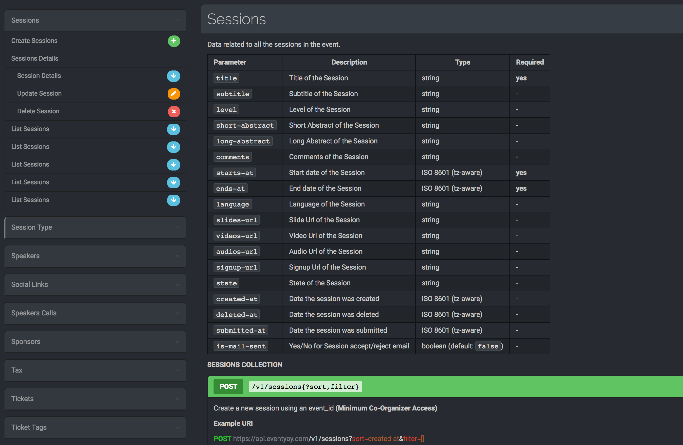
We already have the framework to associate simple custom fields with individual events or orders, and an API to create them. The custom forms schema needs to be now expanded to allow more complex fields. Taking Google forms and our use case as an inspiration, the user should be able to create the following fields:
Simple text *
Paragraph *
Radio Buttons (single choice)
Checkboxes
Dropdown
File upload *
Time
Date
Date & Time
* Already implemented
The schema needs expansion to accommodate options for fields like dropdowns, checkboxes and radio buttons. Also, to store custom labels to the fields, which the user assigns. Currently, they are hardcoded by comparing the name of the field with if-else.
Thus we propose the following schema related changes to accomodate the complex custom forms.
Add a separate model called customFormOptions to store various options of radio buttons, checkboxes, and dropdowns.
They will have the following fields:
Column
Description
ID
default unique ID
value
value of the custom form field options like ‘XS, XL’
custom_form_id
foreign key – the id of the custom form field this option belongs to
CustomForm model will have a hasMany relationship with customFormOptions.
For text fields, and other fields which don’t require options within them can have the relationship as null.
The changes to customForm Model itself:
Column
Description
description
An optional simple string column to store the custom messages/info the user may give to the custom form field like T-shirt Size Chart link etc.
isComplex
Boolean field to indicate if a particular field is complex
The changes to event, speaker, session Models:
Column
Description
customFormValues
A JSON type column which stores all the complex custom form values(currently all the fields offered are hardcoded in the schema)
This expansion of schemas will allow the clients to create new, custom fields as per the requirement of the system. Future work may involve creating an API for validations of these fields.
Several modules of Open Event Frontend involve start and end date-times. While for simple type fields like text, dropdowns or radio buttons, default semantic UI validations are available, which are used inside the app via the form mixin.
Any component which extends the form mixin can make specify the validations required using the getValidationRules hook.
For instance, this set of rules will enforce validations on the field called ticket_price which will prohibit it from being left empty, or something other than a real number.
getValidationRules(){
ticketPrice:{
identifier :'ticket_price',
rules :[{
type :'empty',prompt:this.l10n.t('Please give your ticket a price')},{
type :'number',prompt:this.l10n.t('Please give a proper price for you ticket')},{
type :'decimal[0..]',prompt:this.l10n.t('Ticket price should be greater than 0')}]},}
The validations provided by semantic UI only extend to single fields, and are independent of each other. However, in our use case we have four fields:
Start date
Start time
End date
End time
The general requirement is that the DateTime object formed by joining the start date and the start time should be before the DateTime object obtained by joining the end date and time. Also, these four distributed fields exist only on the frontend, on the server they are actually just two fields startsAt and endsAt each carrying UTC time values of DateTime objects. To split them into date and time a new computed function is created which is invoked in the model definitions of various resources. Consider the two following complex fields defined in the model according to the schema on the server.
These values can then be used inside individual fields. To enhance the user experience jquery Calendar module is used to allow the user to enter the date and time values using a calendar and time picker as shown below.
The computedDateTimeSplit helper, takes in the property whose part it is splitting, along with the specification of the part it will split. It also takes an optional endProperty argument, which is passed if it is being called for a start property. This function returns a pair of getters and setters,the get function returns the part of datetime object requested like, date or time where as the setter sets these values each time this function is called.
With this complex set up it is not possible to use semantic UI validations, hence we extend the default semantic UI validations, by introducing custom rules for the form.
A rule called checkDates is introduced inside the getValidationRules hook.
This hook manually compares the end and start datetime objects, and if they are in violation, it returns false, which triggers a semantic UI styled validation.
To enforce the validation, the start and end datetime fields are embedded with
startDate:{
identifier :'start_date',
rules :[{
type :'empty',prompt:this.l10n.t('Please tell us when your event starts')},{
type :'checkDates',prompt:this.l10n.t('Start date & time should be after End date and time ')}]},
endDate:{
identifier :'end_date',
rules :[{
type :'empty',prompt:this.l10n.t('Please tell us when your event ends')},{
type :'checkDates',prompt:this.l10n.t('Start date & time should be after End date and time')}]},
startTime:{
identifier :'start_time',
depends :'start_date',
rules :[{
type :'empty',prompt:this.l10n.t('Please give a start time')},{
type :'checkDates',prompt:'.'}]},
endTime:{
identifier :'end_time',
rules :[{
type :'empty',prompt:this.l10n.t('Please give an end time')},{
type :'checkDates',prompt:'.'}]
However one big problem with this approach is the clearing of validation messages, when one field is in violation, technically all four are in violation as you can either adjust the start time or end time to make the datetimes valid. However, semantic UI validations which operate upon the blur listening property operate with respect to a single field at a time, and any changes to a particular field does not retrigger validations on others. So, for instance an end date was added which was occurring on the same date as a start date, and times are the same too, the form will throw validation on all four fields. However, if we just change the time of one of the dates, the dates will be valid again, but the validation error dialogs of only that field will disappear which was actually modified. This default behavior of semantic UI problematic for us.
onChange(){this.onValid(()=>{});}
Thus an onChange action is attached with the focus-out event of the date and time inputs
This action triggers the validations on the entire form, which will clear at any redundant validation error prompts still remaining in the form. As a future improvement, instead of onChange triggering validations on the entire form, only the datetimes can be revalidated, though this will require extension of the form mixin to support more flexible methods to validate forms using latest semantic UI APIs.
This blog article will continue the discussions about setting up ember tables on open event frontend. The implementation and design of the search module of the ember tables will be discussed.
Leveraging the refreshModel property of the queryParams, we can bind the value of a potential search query of a user to a queryParam. As the user types the query, the queryParam will change, which in turn will refresh the model, and send a new request to the server, giving the impression of a basic search.
An icon input field with a search icon is placed on the top right corner of the table wrapped in its own separate component, search-box. The component is rendered within the default table component, which acts as a base for all other tables in the app.
Here, searchQuery is binded to the param search defined in the controller mixin for ember tables.
Now in order to generate the query string which will result in a search involves complex array filter manipulations, hence the logic was abstracted into the route mixin to avoid it’s repetition across various routes.
Flast-rest-json api’s filters follow the following format for a basic like styled sql filter:
GET /events?filter=[{"name":"event","op":"ilike","val": searchQuery }] HTTP/1.1
Accept: application/vnd.api+json
There are several other query combinations available for comparison, dates and other data-types or for relationships themselves. They needed to be appended to the filter portion of a query and then removed.
When the search param is null, the query string has the following form:
let queryString ={
include :'tickets,user',filter: filterOptions,'page[size]': params.per_page ||10,'page[number]': params.page ||1};
filterOptions are other filters already present, for instance for listing orders on the basis of a dynamic status parameter, filterOptions can be defined as follows.
filterOptions =[{
name :'status',
op :'eq',
val : params.orders_status
}];
Since filterOptions are an array, new filters are either added or appended to the array.
applySearchFilters(options, params, searchField){
searchField = kebabCase(searchField);if(params.search){
options.pushObject({
name : searchField,
op :'ilike',
val :`%${params.search}%`});}else{
options.removeObject({
name : searchField,
op :'ilike',
val :`%${params.search}%`});}return options;}
Thus a method called applySearchFilters is defined in the ember-table-router mixin.
It takes three arguments:
options
params
searchField
Options is the filter array, discussed above, params contains the value of the current search param, and the searchField is the target of the search which is defined in the route’s model hook itself. The open-event-api server, expects the name of fields in kebab case, where as the front-end uses camelCase, hence the searchField is explicitly converted into a kebab-case string before manipulating the filter array. If params are present, it appends the filter object to the queryString, else this function will remove the very filter it added to the query string.
Finally in the route’s model hook itself, queryString is passed to this function, and the filters get applied to it.
Semantic UI has a dedicated class for search input fields, which has been used in the template. As a future goal, a slight delay can be introduced in the update cycle of the search queryParam, currently a network request is sent on each keystroke of the user’s input which can be taxing for the server. Introducing a slight delay or alternatively cancelling a request no longer needed will improve latency and response time of the API server, until elastic search is introduced.
This blog article will continue the discussions about setting up ember tables on open event frontend. The implementation and design of the pagination module of the ember tables will be discussed.
Open event server uses JSON:API spec. Whenever the server returns a query, the JSON contains a meta field, that field contains the total number of records on the API server, which satisfy the query. This number, of course is different from the actual number of records returned which depend on the page size, and page number. But this serves as a good starting point for implementing the pagination module. For the open event server, the property inside the meta tag which contains the total count is called count. Using this property we define a computed property called totalContentLength.
import Component from '@ember/component';import{ computed, action, get } from '@ember/object';exportdefaultclassextends Component {
metaItemsCountProperty ='count';
@computed('metaData')
get totalContentLength(){return get(this.metaData,this.metaItemsCountProperty);}}
Ember has great support for queryParams, and if in their declaration inside the route, the property refreshModel is set to true, then the model refreshes and reloads the data whenever the query params update. Thus, the current page and page size are maintained in the form of query params.
For computing the total number of pages (pageCount), that the content will be split in, we have all three required variables, totalContentLength (computed above), currentPage and pageSize (both available as queryParams).
Once we have pagesCount, it is easy to decide if moving forward or backwards is possible and can themselves be stored as computed properties. Similarly, in order to move forwards or backwards by a page, or to last or first pages, the queryParam for currentPage can be altered.
import Component from '@ember/component';import{ computed, action, get } from '@ember/object';exportdefaultclassextends Component {
metaItemsCountProperty ='count';
@computed('metaData')
get totalContentLength(){return get(this.metaData,this.metaItemsCountProperty);}
@computed('currentPage','pageSize','totalContentLength')
get pageCount(){let totalPages =1;if(parseInt(this.pageSize)!==0&&this.pageSize <this.totalContentLength){
totalPages =parseInt(this.totalContentLength /this.pageSize);if(this.totalContentLength %this.pageSize){
totalPages +=1;}}return totalPages;}
@computed('currentPage')
get moveToPreviousPageDisabled(){returnthis.currentPage <=1;}
@computed('currentPage','pageCount')
get moveToNextPageDisabled(){returnthis.currentPage >=this.pageCount;}
@action
moveToNextPage(){if(!this.moveToNextPageDisabled){this.incrementProperty('currentPage');}}
@action
moveToPreviousPage(){if(!this.moveToPreviousPageDisabled){this.decrementProperty('currentPage');}}
@action
moveToLastPage(){if(!this.moveToNextPageDisabled){this.set('currentPage',this.pageCount);}}
@action
moveToFirstPage(){if(!this.moveToPreviousPageDisabled){this.set('currentPage',1);}}}
We also need to display, what is the current range of entries being shown. For eg, Showing 20-30 of 100 entries. This can again be computed by using current page, page size and total number of entries.
Using all of these computed properties, we can render the template for a pagination menu, which the user can use in order to navigate through the data.
<div class="ui small pagination menu"><a role="button"class="item {{if moveToPreviousPageDisabled 'disabled'}}"{{action 'moveToFirstPage'}}><i class="angle double left icon"></i></a><a role="button"class="item {{if moveToPreviousPageDisabled 'disabled'}}"{{action 'moveToPreviousPage'}}><i class="angle left icon"></i></a><a role="button"class="item {{if moveToNextPageDisabled 'disabled'}}"{{action 'moveToNextPage'}}><i class="angle right icon"></i></a><a role="button"class="item {{if moveToNextPageDisabled 'disabled'}}"{{action 'moveToLastPage'}}><i class="angle double right icon"></i></a></div><div class="ui right floated less padding basic segment">{{t 'Showing'}}{{currentRange}}{{t 'of'}}{{totalContentLength}}{{t 'entries'}}</div>
Semantic UI has a dedicated class for pagination menu, which has been used in this template. The buttons are disabled as per the computed properties to enhance the user experience.
This blog article will illustrate how ember tables were set up, reopened as a component, for customization and how the pagination module was implemented.
Ember source 3.11 which Open event frontend uses is not compatible with the last release of ember tables, hence the master branch of ember tables which does support the latest ember source was chosen. To install a dependency from a Github repository link instead of a yarn package, we can use
yarn add addepar/ember-table#0aa5637
Ember tables offer no inbuilt theme, and use the default HTML styles. They do have support for styling, but only via CSS selectors in CSS files. In our use case, we needed the styling to be those of semantic UI tables. However, for that the classes had to be added inside the table element, and ember tables by default, don’t allow addition of classes, as the table was under other layers. Even if the classNames property of component had been specified, it would just append the specified class names to the wrapper of the table element, not the actual table itself. Ember’s reopen feature was used to solve this problem. The reopen method allows ‘reopening’ of the component in the sense that it’s existing properties can be overwritten, or new properties can be added.
It is a convention to store the reopened component files in a folder separate from external folder.
The definition of the table was inside a component.js file inside the source of ember tables. Hence a new file located at app/extensions/ember-table/component.js was created.
Then the component.js was reopened to change the source of the template file which is used for ember tables.
import component from 'ember-table/components/ember-table/component';import layout from './template';
component.reopen({
layout
});
This reopening modifies the ember table component, such that it now searches for the layout file in the new directory at ember-table/components/ember-table/layout.hbs
It is the exact same file which was present in the source of ember tables, with the only modification being the addition of class ui unstackable table to the table element. This class makes the table support semantic UI styling.
Ember tables follow a structure similar to ember model tables, wherein the columns are defined inside the controller of the route which will render the table. However, it is not possible to pass the actions defined in the controller to the final cell components for columns without passing them throughout until the very last layer. I.e. actions of controller are not passed to the custom cell components, automatically. Specifying them explicitly results in loss of generalisation, and a significant portion of code will be repeated. Also, sometimes, we might need to pass more than one valuePaths if we don’t need to pass the entire entity, if a column cell needs only some of the properties. Custom options were a requirement as well. Hence, to generalise these properties, the expanded form of ember table from ember table docs was slightly modified to :
{{#ember-table as |t|}}{{#t.head sortFunction=null columns=columns enableReorder=true as |h|}}{{#h.row as |r|}}{{#r.cell as |column|}}{{#if column.headerComponent}}{{#component
column.headerComponent
}}{{column.name}}{{/component}} {{else}} {{column.name}} {{/if}}{{/r.cell}} {{/h.row}}{{/t.head}} {{#t.body rows=rows as |b|}} {{#b.row as |r|}} {{#r.cell as |cell column row|}} {{#if column.cellComponent}} {{#component column.cellComponent record=(get row column.valuePath) extraRecords=(get-properties row column.extraValuePaths) props=(hash options=column.options actions=column.actions) }} {{cell}} {{/component}}{{else}}{{cell}}{{/if}} {{/r.cell}}{{/b.row}} {{/t.body}}{{/ember-table}}
Two additions were made in terms of properties passed to a cell in the table.
A props object, which is a hash of the options and actions properties which will be defined inside the columns definition as column properties.
Also the extraValuePaths are passed as extraRecords using getProperties helper.
The getProperties helper takes in an object and a list of properties, it then returns those properties of an object, as hash.
An important thing to note is that even though the actions defined in the controller can be passed in the actions property, they still require a correct context of this. That is achieved using binding the current context of this to them before passing.
The example above shows how the correct context of this is binded with actions.
The next blog will cover more details about the implementation ember tables, and focus on various utilities present inside tables like pagination, searching and sorting.
This blog will showcase how test email module was developed for open event. This required implementing a new API endpoint on the Open event server, and it’s subsequent integration on the front-end. The test email functionality essentially tests if a given mail configuration is successfully able to deliver mail. The user gets an option to enter any email, and then trigger a test mail to that address. The tester may manually verify then if an email has been received.
In app/api/helpers/system_mails.py a field for the test email is added.
TEST_MAIL:{'recipient':'User','subject': u'Test Mail Subject','message':(
u"This is a <strong> Test </strong> E-mail.")}
And in the helper file at app/api/helpers/mail.py, a function for sending a test mail is added.
Since this is a trivial route, with no data exchange, we will implement this as a miscellaneous route under the settings API. Also, it is important that the route is restricted for use only by an admin.
Decorators are used to ensure that.
@admin_misc_routes.route('/test-mail', methods=['POST'])@is_admin
def test_email_setup():
recipient = request.json.get('recipient')ifnot recipient:return UnprocessableEntityError({'source':'recipient'},'Required parameter recipient not found').respond()
send_test_email(recipient)return make_response(jsonify(message='Test mail sent, please verify delivery'),200)
The endpoint only accepts POST requests, whose body should contain a field called recipient which contains the email address to which the test mail should be sent.
With the API endpoint for test emails ready, a small form needs to be added on the front-end in the admin area.
A new form for this field was added within the form of general system settings.
Additionally, email validations are added to the field which accepts the email input. This module after it’s implementation is able to handle both cases, if the mail endpoint returns an error status code, this means mail send function on the server is broken, or the configuration is misconfigured in an unexpected manner. If it returns a successful status, and yet mail has not been received on the desired email address, this might point to a deeper problem regarding, the sending mail getting blacklisted or otherwise.
This blog article will illustrate how, after significant refactors, eventyay.com was switched from open-event-legacy to the new version of open-event which has a decoupled open-event-API-server and frontend. We will discuss this switch from two aspects – the database migration and the DevOps logistic, as we moved from google cloud to a more economically feasible platform – hetzner cloud.
Downloading a copy of the legacy database from Kubernetes pod on the google cloud platform
The first step, was to obtain a copy of the database being used in production. The database was stored inside a pod named Postgres of the Kubernetes cluster.
These commands initialized and authenticated the gcloud sdk with the project eventyay.
Next, to gain bash access to the postgres pod, exec of kubectl CLI was used.
kubectl exec -it postgres — /bin/bash
The database in both the new and legacy versions was postgresSql. Using the pg_dump functionality, a database can be dumped into a transferable file
kubectl exec-it postgres --/bin/bash
However this file still resides on the kubernetes pod’s local storage itself. The cp utility of kubectl CLI comes in handy to copy that file from pod to local storage.
This command transfers the file to local storage. Now we have a database we can begin to refactor, for this we first need to import it into the postgres instance on the local machine, to take a peek inside the schema.
These commands dump the data inside the legacy database into the newly created database inside the Postgres instance. The schema and architecture of the new version of server is different from the legacy database, hence DB has to go through migrations.
The last migration file shared by legacy and the next gen of server is corresponding to the migration ddaa6df27340.
However, it is important to note that the migrations branched from here onwards. Hence to downgrade the databse to the last legacy migration, we need to use the migrations folder of the legacy version of eventyay and not the original migrations directory
Assuming that the migrations from the legacy server stiored in a folder called migrations-legacy
mv migrations migrations-new
mv migrations-legacy migrations
Change the config in the local .env inside open-event-server to switch to this newly created database.
9d21de792967
Ticket holder thing
python manage.py db downgrade ddaa6df27340
Then we upgrade to the latest instance of the db
Switch back the directories
(venv) Abhinavs-MacBook-Pro:open-event-server abhinav$ mv migrations migrations-legacy
(venv) Abhinavs-MacBook-Pro:open-event-server abhinav$ mv migrations-new migrations
Then we upgrade the database
Python manage.py db upgrade
These commands migrate the database in principal, and we have a basic system with core functionality using legacy data but the database is not at all ready to be used in production yet. It is rife with bugs. The migrations file don’t cover each change, and some are outright breaking. Some have problems like comma separated values being converted into their own schemas without any migration written for them. These issues were tackled separately.
Most significant of these was the scripts written to convert legacy comma separated data format of custom forms into a separate schema.
Forms =[exported custom forms table of legacy]
n=2567for(let i in forms){//console.log(i);
a = JSON.parse(forms[i].speaker_form);
c = forms[i].event_id;for(key in a){//console.log(key);
mkey = key.toLowerCase().replace(/_([a-z])/,function(m){return m.toUpperCase();}).replace(/_/,'');if(key=='name'|| key=='email'|| key =='title'|| key=='track'){
console.log("insert into custom_forms values("+n+","+c+", '"+ mkey +"', 'speaker', true,"+(a[key].include==1?true:false)+","+(a[key].require==1?true:false)+","+"'text');");}else{
console.log("insert into custom_forms values("+n+","+c+", '"+ mkey +"', 'speaker', false,"+(a[key].include==1?true:false)+","+(a[key].require==1?true:false)+","+"'text');");}
n++;}}
Similar script had to be written for sessions
n=11987for(let i in forms){//console.log(i);
a = JSON.parse(forms[i].session_form);
c = forms[i].event_id;for(key in a){//console.log(key);
mkey = key.toLowerCase().replace(/_([a-z])/,function(m){return m.toUpperCase();}).replace(/_/,'');if(key =='title'|| key=='track'){
console.log("insert into custom_forms values("+n+","+c+", '"+ mkey +"', 'session', true,"+(a[key].include==1?true:false)+","+(a[key].require==1?true:false)+","+"'text');");}else{
console.log("insert into custom_forms values("+n+","+c+", '"+ mkey +"', 'session', false,"+(a[key].include==1?true:false)+","+(a[key].require==1?true:false)+","+"'text');");}
n++;}}
These scripts returned the sql queries required to insert these custom forms to corresponding tables. After some more miscellaneous fixes like this one, the migrations was fully complete and ready for production.
This blog article will illustrate how the various error or status codes are handled in Open Event Frontend, and how the appropriate response is generated corresponding to those error codes. Open Event Frontend, relies on Open Event Server for all server operations. Open Event Server exposes a well documented JSON:API Spec Compliant REST API. The clients using the api primarily interact with it using GET, POST , PATCH and DELETE requests. And thus for each request the API returns corresponding data as response along with it’s status code.
For instance whenever the app opens, for the landing page, all the events are fetched by making a GET request to the end point v1/events. If the request is successful and events data is returned, the status code is 200 which stands for OK in the http standard set by IANA.
Fig 1: Screenshot of google chrome developer consoles’ networking tab while making a request.
Since Open Event server is compliant with JSON:API Spec, to quote it’s official documentation, “Error objects MUST be returned as an array keyed by errors in the top level of a JSON API document.” Thus whenever there is an error, or the request is unsuccessful due to a variety of reasons, the server has a predefined format to convey the information to the front end.
The process is illustrated by the reset password form on open event frontend. When a user forgets his password, he/she has the option to reset it, using his email address. Thus the form just takes in the email address of the user and makes a POST request to the reset-password API endpoint of the server.
Once the request is made there are 3 possibilities (check references for error code significance): The request is successful and a status code of 200 is returned.
The email address user entered doesn’t exists and no record is found in the database. 422 status code should be returned.
The server is down, or the request is invalid (something unexpected has occurred). In all such scenarios error code 404 should be returned.
this.get('loader').post('auth/reset-password',payload).then(()=>{this.set('successMessage',this.l10n.t('Please go to the link sent to your emailtoresetyourpassword'));}).catch(reason=>{if(reason&&reason.hasOwnProperty('errors')&&reason.errors[0].status===422){this.set('errorMessage',this.l10n.t('No account is registered with thisemailaddress.'));}else{this.set('errorMessage',this.l10n.t('An unexpected error occurred.'));}}).finally(()=>{this.set('isLoading',false);});
Figure 2 : The reset password UI
Thus as mentioned in the JSON:API docs, the errors property is expected to contain the status code and error message(optional) , which ember handles via the the catch block. The catch block is executed whenever the response from the request is not successful. The contents of the response are present in the reason property. If the status of the error is 422, the corresponding message is stored inside the errorMessage property of the component which is further used to display the alert by rendering an error block on the forgot password form.
In case there is no error, the errorMessage is undefined, and the error block is not rendered at all. In case of any other unexpected error, the standard text is displayed by initialising the errorMessage property to it.
Resources
JSON:API Spec – Official Documentation of JSON:API spec Error handling
This blog article will illustrate how, with the help of SQLAlchemy, a last modified at column, with complete functionality can be added to the Open Event Server database. To illustrate the process, the blog article will discuss adding the column to the sessions api. Since last modified at is a time field, and will need to be updated each time user successfully updates the session, the logic to implement will be a slightly more complex than a mere addition of a column to the table.
The first obvious step will comprise of adding the column to the database table. To achieve the same, the column will have to be added to the model for the sessions table, as well as the schema.
In app/api/schema/sessions.py:
...classSessionSchema(Schema):""" Api schema for Session Model """...last_modified_at=fields.DateTime(dump_only=True)...
And in app/models/sessions.py:
importpytz...classSession(db.Model):"""Session model class"""__tablename__='sessions'__versioned__={'exclude':[]}...last_modified_at=db.Column(db.DateTime(timezone=True),default=datetime.datetime.utcnow)definit(self,...,last_modified_at=None))#inside init method...self.last_modified_at=datetime.datetime.now(pytz.utc)...
NOTE: The users for the open event organiser server will be operating in multiple time zones and hence it is important for all the times to be in sync, hence the open event database maintains all the time in UTC timezone (python’s pytz module takes care of converting user’s local time into UTC time while storing, thus unifying the timezones.) From this, it directly follows that the time needs to be timezone aware hence timezone=true is passed, while defining the column.
Next, while initialising an object of this class, the last modified time is the time of creation, and hence
datetime.now(pytz.utc) is set as the initial value which basically stores the current time in UTC timezone format.
Finally, the logic for updating the last modified at column every time any other value changes for a session record needs to be implemented. SQLAlchemy provides an inbuilt support for detecting update and insert events which have been used to achieve the goal. To quote the official SQLAlchemy Docs, “SQLAlchemy includes an event API which publishes a wide variety of hooks into the internals of both SQLAlchemy Core and ORM.”
The listens_for() decorator is used to register the event according to the arguments passed to it. In our case, it will register any event on the Session API (sessions table), whenever it updates.
The corresponding function defined below the decorator, receive_after_update(mapper, connection, target) is then called, and session model (table) is the the registered target with the event. It sets the value of the last_modified_at to the current time in the UTC timezone as expected.
Lastly, since the changes have been made to the database schema, the migration file needs to be generated, and the database will be upgraded to alter the structure.
The sequence of steps to be followed on the CLI will be
This blog article will illustrate how the various validations come together in Open Event Frontend, in a standard format, strongly reducing the code redundancy in declaring validations. Open Event Frontend, offers high flexibility in terms of validation options, and all are stored in a convenient object notation format as follows:
getValidationRules(){return{inline:true,delay:false,on:'blur',fields:{identification:{identifier:'email',rules:[{type:'empty',prompt:this.l10n.t('Please enter your email ID')},{type:'email',prompt:this.l10n.t('Please enter a valid email ID')}]},password:{identifier:'password',rules:[{type:'empty',prompt:this.l10n.t('Please enter your password')}]}}};}
Thus the validations of a form are stored as objects, where the identifier attribute determines which field to apply the validation conditions to. The rules array contains all the rules to be applied to the determined object. Within rules, the type represents the kind of validation, whereas the prompt attribute determines what message shall be displayed in case there is a violation of the validation rule.
NOTE: In case an identifier is not specified, then the name of the rule object is itself considered as the identifier.
These validations are in turn implemented by the FormMixin. The various relevant sections of the mixin will be discussed in detail. Please check references for complete source code of the mixin.
getForm(){returnthis.get(‘$form’);}
The getForm function returns the calling component’s entire form object on which the validations are to be applied.
The onValid function serves as the boundary level function, and is used to specify what should happen when the validation is successful. It expects a function object as i’s argument. It makes use of the getForm() function to retrieve the form and using semantic UI, determines if all the validations have been successful. In case they have, it calls the callback method passed down to it as the argument.
Next transitioning into the actual implementation, certain behavioral traits of the validations are controlled by the two global variables autoScrollToErrors and autoScrollSpeed. The former is a boolean, which is set to true if the application is designed in such a way that once the user presses the submit button and a validation fails, the browser scrolls to the first field whose validation failed with a speed specified by the latter.
Next, comes the heart of the mixin. Since it needs to be continuously determined if a field’s validation has failed, the entire logic of checking is placed inside a debounce call which is supported by ember to continuously execute a function with a gap of a certain specified time (400 ms in this case). Since the validity can be checked only after all the fields have rendered, the debounce call is placed inside a didRender call. The didRender call ensures that any logic inside it is executed only after all the elements of the relevant component have been rendered and are a part of the DOM.
didRender(){...debounce(this,()=>{constdefaultFormRules={onFailure:formErrors=>{if(this.autoScrollToErrors){// Scroll to the first error messageif(formErrors.length>0){$('html,body').animate({scrollTop:this.$(`div:contains('${formErrors[0]}')`).offset().top},this.autoScrollSpeed);}}}};},400);...}
onFailure is an ES6 syntax function, which takes all the form errors as its arguments. And in case the autoScrollToErrors global variable is set to true, it checks if there are any errors or the length of the formErrors array is more than 0. In case there are errors, it makes a call to animate callback, and scrolls to the very first field which has an error with the speed defined by the previously discussed global autoScrollSpeed . The fact that the very first field is selected for scrolling off to, is ensured by the index 0 specified (formErrors[0]). Thus role of the mixin is to continuously check for any validations and in case there are, scroll to them.


You must be logged in to post a comment.