
This blog article will continue the discussions about setting up ember tables on open event frontend. The implementation and design of the pagination module of the ember tables will be discussed.
Open event server uses JSON:API spec. Whenever the server returns a query, the JSON contains a meta field, that field contains the total number of records on the API server, which satisfy the query. This number, of course is different from the actual number of records returned which depend on the page size, and page number. But this serves as a good starting point for implementing the pagination module. For the open event server, the property inside the meta tag which contains the total count is called count. Using this property we define a computed property called totalContentLength.
import Component from '@ember/component';
import { computed, action, get } from '@ember/object';

export default class extends Component {

  metaItemsCountProperty = 'count';

 @computed('metaData')
  get totalContentLength() {
    return get(this.metaData, this.metaItemsCountProperty);
  }
}
Ember has great support for queryParams, and if in their declaration inside the route, the property refreshModel is set to true, then the model refreshes and reloads the data whenever the query params update. Thus, the current page and page size are maintained in the form of query params.
For computing the total number of pages (pageCount), that the content will be split in, we have all three required variables, totalContentLength (computed above), currentPage and pageSize (both available as queryParams).
Once we have pagesCount, it is easy to decide if moving forward or backwards is possible and can themselves be stored as computed properties. Similarly, in order to move forwards or backwards by a page, or to last or first pages, the queryParam for currentPage can be altered.
import Component from '@ember/component';
import { computed, action, get } from '@ember/object';

export default class extends Component {

  metaItemsCountProperty = 'count';

 @computed('metaData')
  get totalContentLength() {
    return get(this.metaData, this.metaItemsCountProperty);
  }

@computed('currentPage', 'pageSize', 'totalContentLength')
  get pageCount() {
    let totalPages = 1;
    if (parseInt(this.pageSize) !== 0 && this.pageSize < this.totalContentLength) {
      totalPages = parseInt(this.totalContentLength / this.pageSize);
      if (this.totalContentLength % this.pageSize) {
        totalPages += 1;
      }
    }
    return totalPages;
  }
 @computed('currentPage')
  get moveToPreviousPageDisabled() {
    return this.currentPage <= 1;

  }
  @computed('currentPage', 'pageCount')
  get moveToNextPageDisabled() {
    return this.currentPage >= this.pageCount;
  }

  @action
  moveToNextPage() {
    if (!this.moveToNextPageDisabled) {
      this.incrementProperty('currentPage');
    }
  }

  @action
  moveToPreviousPage() {
    if (!this.moveToPreviousPageDisabled) {
      this.decrementProperty('currentPage');
    }
  }

 @action
  moveToLastPage() {
    if (!this.moveToNextPageDisabled) {
      this.set('currentPage', this.pageCount);
    }
  }

  @action
  moveToFirstPage() {
    if (!this.moveToPreviousPageDisabled) {
      this.set('currentPage', 1);
    }
  }
}
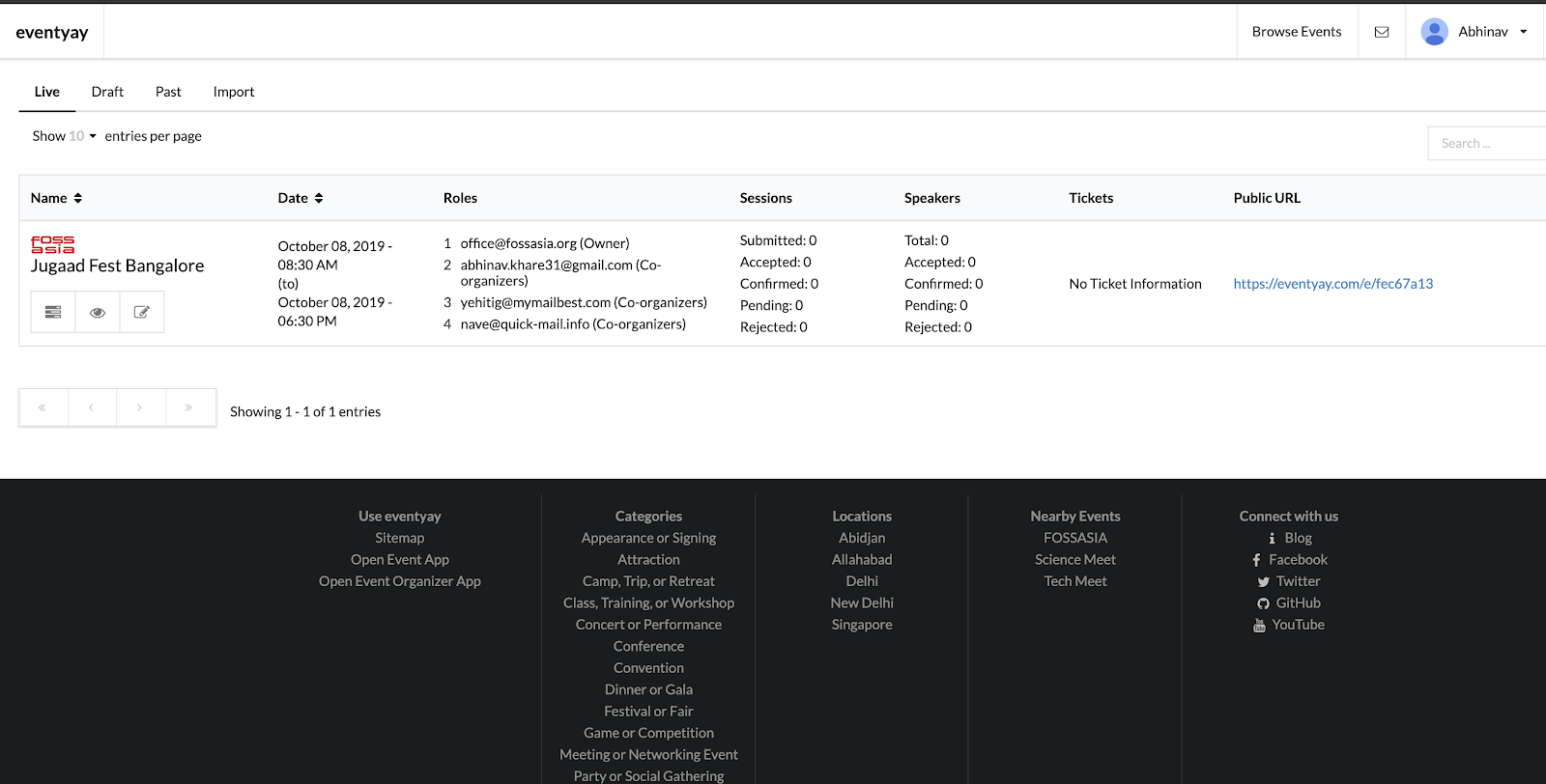
We also need to display, what is the current range of entries being shown. For eg, Showing 20-30 of 100 entries. This can again be computed by using current page, page size and total number of entries.
Using all of these computed properties, we can render the template for a pagination menu, which the user can use in order to navigate through the data.
<div class="ui small pagination menu">
  <a role="button" class="item {{if moveToPreviousPageDisabled 'disabled'}}" {{action 'moveToFirstPage'}}>
    <i class="angle double left icon"></i>
  </a>
  <a role="button" class="item {{if moveToPreviousPageDisabled 'disabled'}}" {{action 'moveToPreviousPage'}}>
    <i class="angle left icon"></i>
  </a>
  <a role="button" class="item {{if moveToNextPageDisabled 'disabled'}}" {{action 'moveToNextPage'}}>
    <i class="angle right icon"></i>
  </a>
  <a role="button" class="item {{if moveToNextPageDisabled 'disabled'}}" {{action 'moveToLastPage'}}>
    <i class="angle double right icon"></i>
  </a>
</div>
<div class="ui right floated less padding basic segment">
  {{t 'Showing'}} {{currentRange}} {{t 'of'}}  {{totalContentLength}} {{t 'entries'}}
</div>
Semantic UI has a dedicated class for pagination menu, which has been used in this template. The buttons are disabled as per the computed properties to enhance the user experience.