Automatic Signing and Publishing of Android Apps from Travis

As I discussed about preparing the apps in Play Store for automatic deployment and Google App Signing in previous blogs, in this blog, I’ll talk about how to use Travis Ci to automatically sign and publish the apps using fastlane, as well as how to upload sensitive information like signing keys and publishing JSON to the Open Source repository. This method will be used to publish the following Android Apps:

Current Project Structure

The example project I have used to set up the process has the following structure:

It’s a normal Android Project with some .travis.yml and some additional bash scripts in scripts folder. The update-apk.sh file is standard app build and repo push file found in FOSSASIA projects. The process used to develop it is documented in previous blogs. First, we’ll see how to upload our keys to the repo after encrypting them.

Encrypting keys using Travis

Travis provides a very nice documentation on encrypting files containing sensitive information, but a crucial information is buried below the page. As you’d normally want to upload two things to the repo – the app signing key, and API JSON file for release manager API of Google Play for Fastlane, you can’t do it separately by using standard file encryption command for travis as it will override the previous encrypted file’s secret. In order to do so, you need to create a tarball of all the files that need to be encrypted and encrypt that tar instead. Along with this, before you need to use the file, you’ll have to decrypt in in the travis build and also uncompress it for use.

So, first install Travis CLI tool and login using travis login (You should have right access to the repo and Travis CI in order to encrypt the files for it)

Then add the signing key and fastlane json in the scripts folder. Let’s assume the names of the files are key.jks and fastlane.json

Then, go to scripts folder and run this command to create a tar of these files:

tar cvf secrets.tar fastlane.json key.jks


secrets.tar will be created in the folder. Now, run this command to encrypt the file

travis encrypt-file secrets.tar


A new file secrets.tar.enc will be created in the folder. Now delete the original files and secrets tar so they do not get added to the repo by mistake. The output log will show the the command for decryption of the file to be added to the .travis.yml file.

Decrypting keys using Travis

But if we add it there, the keys will be decrypted for each commit on each branch. We want it to happen only for master branch as we only require publishing from that branch. So, we’ll create a bash script prep-key.sh for the task with following content

#!/bin/sh
set -e

export DEPLOY_BRANCH=${DEPLOY_BRANCH:-master}

if [ "$TRAVIS_PULL_REQUEST" != "false" -o "$TRAVIS_REPO_SLUG" != "iamareebjamal/android-test-fastlane" -o "$TRAVIS_BRANCH" != "$DEPLOY_BRANCH" ]; then
    echo "We decrypt key only for pushes to the master branch and not PRs. So, skip."
    exit 0
fi

openssl aes-256-cbc -K $encrypted_4dd7_key -iv $encrypted_4dd7_iv -in ./scripts/secrets.tar.enc -out ./scripts/secrets.tar -d
tar xvf ./scripts/secrets.tar -C scripts/


Of course, you’ll have to change the commands and arguments according to your need and repo. Specially, the decryption command keys ID

The script checks if the repo and branch are correct, and the commit is not of a PR, then decrypts the file and extracts them in appropriate directory

Before signing the app, you’ll need to store the keystore password, alias and key password in Travis Environment Variables. Once you have done that, you can proceed to signing the app. I’ll assume the variable names to be $STORE_PASS, $ALIAS and $KEY_PASS respectively

Signing App

Now, come to the part in upload-apk.sh script where you have the unsigned release app built. Let’s assume its name is app-release-unsigned.apk.Then run this command to sign it

cp app-release-unsigned.apk app-release-unaligned.apk
jarsigner -verbose -tsa http://timestamp.comodoca.com/rfc3161 -sigalg SHA1withRSA -digestalg SHA1 -keystore ../scripts/key.jks -storepass $STORE_PASS -keypass $KEY_PASS app-release-unaligned.apk $ALIAS


Then run this command to zipalign the app

${ANDROID_HOME}/build-tools/25.0.2/zipalign -v -p 4 app-release-unaligned.apk app-release.apk


Remember that the build tools version should be the same as the one specified in .travis.yml

This will create an apk named app-release.apk

Publishing App

This is the easiest step. First install fastlane using this command

gem install fastlane


Then run this command to publish the app to alpha channel on Play Store

fastlane supply --apk app-release.apk --track alpha --json_key ../scripts/fastlane.json --package_name com.iamareebjamal.fastlane


You can always configure the arguments according to your need. Also notice that you have to provide the package name for Fastlane to know which app to update. This can also be stored as an environment variable.

This is all for this blog, you can read more about travis CLI, fastlane features and signing process in these links below:

Continue ReadingAutomatic Signing and Publishing of Android Apps from Travis

Auto Updating SUSI Android APK and App Preview on appetize.io

This blog will cover the way in which the SUSI Android APK is build automatically after each commit and pushed to “apk” branch in the github repo. Other thing which will be covered is that how the app preview on appetize.io can be updated after each commit. This is basically for the testers who wish to test the SUSI Android App. There are four ways to test the SUSI Android App. One is to simply download the alpha version of the app from the Google PlayStore. Here is the link to the app. Join the alpha testing and report bugs on the github issue tracker of the repo. Other way is to build the app from Android Studio but you may need to set the complete project. If you are looking to contribute in the project, this is the advised way to test the app. The other two ways are explained below.

Auto Building of APK and pushing to “apk” branch

We have written a script which does following steps whenever a PR is merged:

  1. Checks if the commit is of a PR or a commit to repo
  2. If not of PR, configures a user whose github account will be used to push the APKs.
  3. Clones the repo, generates the debug and release APK.
  4. Deletes everything in the apk branch.
  5. Commits and Pushes new changes to apk branch.

This script is written for people or testers who do not have android studio installed in their computer and want to test the app. So, they can directly download the apk from the apk branch and install it in their phone. The APK is always updated after each commit. So, whenever a tester downloads the APK from apk branch, he will always get the latest app.

if [[ $CIRCLE_BRANCH != pull* ]]
then
    git config --global user.name "USERNAME"
    git config --global user.email "EMAIL"

    git clone --quiet --branch=apk https://USERNAME:$GITHUB_API_KEY@github.com/fossasia/susi_android apk > /dev/null
    ls
    cp -r ${HOME}/${CIRCLE_PROJECT_REPONAME}/app/build/outputs/apk/app-debug.apk apk/susi-debug.apk
    cp -r ${HOME}/${CIRCLE_PROJECT_REPONAME}/app/build/outputs/apk/app-release-unsigned.apk apk/susi-release.apk
    cd apk

    git checkout --orphan workaround
    git add -A

    git commit -am "[Circle CI] Update Susi Apk"

    git branch -D apk
    git branch -m apk

    git push origin apk --force --quiet > /dev/null
fi

Auto Updating of App Preview on appetize.io

The APKs generated in the above step can now be used to set up the preview of the app on the appetize.io. Appetize.io is an online simulator to run mobile apps ( IOS and Android). Appetize.io provides a nice virtual mobile frame to run native apps with various options like screen size, mobile, OS version, etc. Appetize.io provides some API to update/publish the app. In SUSI, we once uploaded the app on appetize.io and now we are using the API provided by them to update the APK everytime a commit is pushed in the repository.

API information (Derived from official docs of appetize.io):

You may upload a new version of an existing app, or update app settings.

Send an HTTP POST request to

https://APITOKEN@api.appetize.io/v1/apps/PUBLICKEY

Replace APITOKEN with your API token and PUBLICKEY with the public key of the app you’re updating. Your API token must be permissioned to the same account as was used to upload the app. The POST body must be a JSON object. To delete a previously set field, use a value of null.

Optional Fields

  1. url: (string) a publicly accessible link to your .zip, .tar.gz, or .apk file, used to upload a new version of your app.
  2. note: (string) a note for your own purposes, will appear on your management dashboard.

For the url parameter, we have used https://github.com/fossasia/susi_android/raw/apk/susi-debug.apk and note can be anything. We have used Update SUSI Preview.

curl https://$APPETIZE_API_TOKEN@api.appetize.io/v1/apps/mbpprq4xj92c119j7nxdhttjm0 -H 'Content-Type: application/json' -d '{"url":"https://github.com/fossasia/susi_android/raw/apk/susi-debug.apk", "note": "Update SUSI Preview"}'

Summary

This blog covered about how to implement an automatic structure to generate APKs for testing and using that APK to build a preview on websites like appetize.io and then using the APIs provided by them to update the APK after each PR merge in the repo. Check out the resources below to learn more about the topic. So, if you are thinking of contributing to SUSI Android App, this may help you a little in testing the app. But if not, then you can also use the similar technique for your android app as well and ease the life of testers.

Resources

  1. Docs of appetize.io to learn more about the API https://appetize.io/docs
  2. Tutorial on using curl to make API requests https://curl.haxx.se/docs/httpscripting.html
  3. Tutorial on writing basic shell scripts https://ryanstutorials.net/bash-scripting-tutorial/
Continue ReadingAuto Updating SUSI Android APK and App Preview on appetize.io

Setting Loklak Server with SSL

Loklak Server is based on embedded Jetty Server which can work both with or without SSL encryption. Lately, there was need to setup Loklak Server with SSL. Though the need was satisfied by CloudFlare. Alternatively, there are 2 ways to set up Loklak Server with SSL. They are:-

1) Default Jetty Implementation

There is pre-existing implementation of Jetty libraries. The http mode can be set in configuration file. There are 4 modes on which Loklak Server can work: http mode, https mode, only https mode and redirect to https mode. Loklak Server listens to port 9000 when in http mode and to port 9443 when in https mode.

There is also a need of SSL certificate which is to be added in configuration file.

2) Getting SSL certificate with Kube-Lego on Kubernetes Deployment

I got to know about Kube-Lego by @niranjan94. It is implemented in Open-Event-Orga-Server. The approach is to use:

a) Nginx as ingress controller

For setting up Nginx ingress controller, a yml file is needed which downloads and configures the server.

The configurations for data requests and response are:

proxy-connect-timeout: "15"
 proxy-read-timeout: "600"
 proxy-send-imeout: "600"
 hsts-include-subdomains: "false"
 body-size: "64m"
 server-name-hash-bucket-size: "256"
 server-tokens: "false"

Nginx is configured to work on both http and https ports in service.yml

ports:
- port: 80
  name: http
- port: 443
  name: https


b) Kube-Lego for fetching SSL certificates from Let’s Encrypt

Kube-Lego was set up with default values in yml. It uses the host-name, email address and secretname of the deployment to validate url and fetch SSL certificate from Let’s Encrypt.

c) Setup configurations related to TLS and no-TLS connection

These configuration files mentions the path and service ports for Nginx Server through which requests are forwarded to backend Loklak Server. Here for no-TLS and TLS requests, the requests are directly forwarded to localhost at port 80 of Loklak Server container.

rules:
- host: staging.loklak.org
  http:
  paths:
  - path: /
    backend:
    serviceName: server
    servicePort: 80

For TLS requests, the secret name is also mentioned. Kube-Lego fetches host-name and secret-name from here for the certificate

tls:
- hosts:
- staging.loklak.org
  secretName: loklak-api-tls

d) Loklak Server, ElasticSearch and Mosquitto at backend

These containers work at backend. ElasticSearch and Mosquitto are only accessible to Loklak Server. Loklak Server can be accessed through Nginx server. Loklak Server is configured to work at http mode and is exposed at port 80.

ports:
- port: 80
  protocol: TCP
  targetPort: 80

To deploy the Loklak Server, all these are deployed in separate pods and they interact through service ports. To deploy, we use deploy script:

# For elasticsearch, accessible only to api-server
kubectl create -R -f ${path-to-config-file}/elasticsearch/

# For mqtt, accessible only to api-server
kubectl create -R -f ${path-to-config-file}/mosquitto/

# Start KubeLego deployment for TLS certificates
kubectl create -R -f ${path-to-config-file}/lego/
kubectl create -R -f ${path-to-config-file}/nginx/

# Create web namespace, this acts as bridge to Loklak Server
kubectl create -R -f ${path-to-config-file}/web/

# Create API server deployment and expose the services
kubectl create -R -f ${path-to-config-file}/api-server/

# Get the IP address of the deployment to be used
kubectl get services --namespace=nginx-ingress

References

Continue ReadingSetting Loklak Server with SSL

Showing location response in SUSI.AI bots

SUSI.AI has a capability to tell the basic information about a location, it is asked for. Along with the basic information about that place, it shows a map (i.e. open street map) pointing to that location. The task at hand is to inculcate this “location” feature to the SUSI.AI messenger bots. The SUSI Tweetbot and SUSI Fbbot are used as examples in this blog.

Let’s first check on what response do we get, when a person asks a query like “where is london” to the SUSI API. Along with the basic information about that location, the result as shown below has the type of reply (i.e. map), latitude, longitude and a link to the open street map.

"actions": [
      {
        "type": "answer",
        "language": "en",
        "expression": "Ludhiana is a city and a municipal corporation in Ludhiana district in the Indian state of Punjab, and is the largest city north of Delhi."
      },
      {
        "type": "anchor",
        "link": "https://www.openstreetmap.org/#map=13/30.912040570244187/75.85379021980509",
        "text": "Here is a map",
        "language": "en"
      },
      {
        "type": "map",
        "latitude": "30.912040570244187",
        "longitude": "75.85379021980509",
        "zoom": "13",
        "language": "en"
      }
    ]

The response for a location type query has these 3 main parts:

  1. Clickable static map image.
  2. A basic information of the place asked about.
  3. The link i.e. when the static map image is clicked it should redirect to the corresponding map location.

Let’s try to make up with the 1st part of the response i.e. Static map image.

The map quest API is used to result in a static map image of the location. We need an API key to access the map quest API, which can be requested from their developer site.

Along with that we need the latitude and longitude of the location at hand.

The SUSI API’s response helps us to get the latitude value:

// if body represents the response object 
var lat = body.answers[0].actions[2].latitude;

And the longitude value:

var lon = body.answers[0].actions[2].longitude;

Using the three values that are API key, latitude and longitude, the static image is rendered by this link:

var static_image_url = "https://open.mapquestapi.com/staticmap/v4/getmap?key=API_KEY&size=600,400&zoom=13&center="+lat+","+lon;

The second part is, basic information about the place asked, can be fetched from:

// if body is the JSON response object from SUSI API
var mapMessage = body.answers[0].actions[0].expression;

The link to the map location can be easily fetched from the SUSI API’s response:

var link = body.answers[0].actions[1].link;

As all the three parts are ready, let’s look on how to render them on the SUSI.AI bot’s screen.

Facebook:

Sending a generic template message object:

message = {
        "type":"template",
        "payload":{
                    "template_type":"generic",
                    "elements":[{
                        "title": mapMessage,
                       "image_url": static_image_url,
                       "Item_url": link
                    }]
        }
};

sendTextMessage(sender, message, 1);

Twitter:

The Twitter API does not need a static image of the map to be rendered. It does that work for us. We just need to send an event to the Twitter API with the message data object constituting of the map message, the latitude and longitude values:

"message_data": {
            "text": mapMessage,
            "attachment": {
                "type": "location",
                "location": {
                    "type": "shared_coordinate",
                    "shared_coordinate": {
                        "coordinates": {
                            "type": "Point",
                            "coordinates": [lon, lat]
                        }
                    }
                }
            }
}

Resources:

  1. Speed up customer service with quick replies and welcome messages by Ian Cairns from Twitter blog.
  2. Drive discovery of bots and other customer experiences in direct messages by By Travis Lull from Twitter blog.
  3. By Seth Rosenberg from Facebook developers blogLink Ads to Messenger, Enhanced Mobile Websites, Payments and More.
Continue ReadingShowing location response in SUSI.AI bots

Adding Tweet Streaming Feature in World Mood Tracker loklak App

The World Mood Tracker was added to loklak apps with the feature to display aggregated data from the emotion classifier of loklak server. The next step in the app was adding the feature to display the stream of Tweets from a country as they are discovered by loklak. With the addition of stream servlet in loklak, it was possible to utilise it in this app.

In this blog post, I will be discussing the steps taken while adding to introduce this feature in World Mood Tracker app.

Props for WorldMap component

The WorldMap component holds the view for the map displayed in the app. This is where API calls to classifier endpoint are made and results are displayed on the map. In order to display tweets on clicking a country, we need to define react props so that methods from higher level components can be called.

In order to enable props, we need to change the constructor for the component –

export default class WorldMap extends React.Component {
    constructor(props) {
        super(props);
        ...
    }
    ...
}

[SOURCE]

We can now pass the method from parent component to enable streaming and other components can close the stream by using props in them –

export default class WorldMoodTracker extends React.Component {
    ...
    showStream(countryName, countryCode) {
        /* Do something to enable streaming component */
        ...
    }
 
    render() {
        return (
             ...
                <WorldMap showStream={this.showStream}/>
             ...
        )
    }
}

[SOURCE]

Defining Actions on Clicking Country Map

As mentioned in an earlier blog post, World Mood Tracker uses Datamaps to visualize data on a map. In order to trigger a piece of code on clicking a country, we can use the “done” method of the Datamaps instance. This is where we use the props passed earlier –

done: function(datamap) {
    datamap.svg.selectAll('.datamaps-subunit').on('click', function (geography) {
        props.showStream(geography.properties.name, reverseCountryCode(geography.id));
    })
}

[SOURCE]

The name and ID for the country will be used to display name and make API call to stream endpoint respectively.

The StreamOverlay Component

The StreamOverlay components hold all the utilities to display the stream of Tweets from loklak. This component is used from its parent components whose state holds info about displaying this component –

export default class WorldMoodTracker extends React.Component {
    ...
    getStreamOverlay() {
        if (this.state.enabled) {
            return (<StreamOverlay
                show={true} channel={this.state.channel}
                country={this.state.country} onClose={this.onOverlayClose}/>);
        }
    }

    render() {
        return (
            ...
                {this.getStreamOverlay()}
            ...
        )
    }
}

[SOURCE]

The corresponding props passed are used to render the component and connect to the stream from loklak server.

Creating Overlay Modal

On clicking the map, an overlay is shown. To display this overlay, react-overlays is used. The Modal component offered by the packages provides a very simple interface to define the design and interface of the component, including style, onclose hook, etc.

import {Modal} from 'react-overlays';

<Modal aria-labelledby='modal-label'
    style={modalStyle}
    backdropStyle={backdropStyle}
    show={true}
    onHide={this.close}>
    <div style={dialogStyle()}>
        ...
    </div>
</Modal>

[SOURCE]

It must be noted that modalStyle and backdropStyle are React style objects.

Dialog Style

The dialog style is defined to provide some space at the top, clicking where, the overlay is closed. To do this, vertical height units are used –

const dialogStyle = function () {
    return {
        position: 'absolute',
        width: '100%',
        top: '5vh',
        height: '95vh',
        padding: 20
        ...
    };
};

[SOURCE]

Connecting to loklak Tweet Stream

loklak sends Server Sent Events to clients connected to it. To utilise this stream, we can use the natively supported EventSource object. Event stream is started with the render method of the StreamOverlay component –

render () {
    this.startEventSource(this.props.channel);
    ...
}

[SOURCE]

This channel is used to connect to twitter/country/<country-ID> channel on the stream and then this can be passed to EventStream constructor. On receiving a message, a list of Tweets is appended and later rendered in the view –

startEventSource(country) {
    let channel = 'twitter%2Fcountry%2F' + country;
    if (this.eventSource) {
        return;
    }
    this.eventSource = new EventSource(host + '/api/stream.json?channel=' + channel);
    this.eventSource.onmessage = (event) => {
        let json = JSON.parse(event.data);
        this.state.tweets.push(json);
        if (this.state.tweets.length > 250) {
            this.state.tweets.shift();
        }
        this.setState(this.state);
    };
}

[SOURCE]

The size of the list is restricted to 250 here, so when a newer Tweet comes in, the oldest one is chopped off. And thanks to fast DOM actions in React, the rendering doesn’t take much time.

Rendering Tweets

The Tweets are displayed as simple cards on which user can click to open it on Twitter in a new tab. It contains basic information about the Tweet – screen name and Tweet text. Images are not rendered as it would make no sense to load them when Tweets are coming at a high rate.

function getTweetHtml(json) {
    return (
        <div style={{padding: '5px', borderRadius: '3px', border: '1px solid black', margin: '10px'}}>
            <a href={json.link} target="_blank">
            <div style={{marginBottom: '5px'}}>
                <b>@{json['screen_name']}</b>
            </div>
            <div style={{overflowX: 'hidden'}}>{json['text']}</div>
            </a>
        </div>
    )
}

[SOURCE]

They are rendered using a simple map in the render method of StreamOverlay component –

<div className={styles.container} style={{'height': '100%', 'overflowY': 'auto',
    'overflowX': 'hidden', maxWidth: '100%'}}>
    {this.state.tweets.reverse().map(getTweetHtml)}
</div>

[SOURCE]

Closing Overlay

With the previous setup in place, we can now see Tweets from the loklak backend as they arrive. But the problem is that we will still be connected to the stream when we click-close the modal. Also, we would need to close the overlay from the parent component in order to stop rendering it.

We can use the onclose method for the Modal here –

close() {
    if (this.eventSource) {
        this.eventSource.close();
        this.eventSource = null;
    }
    this.props.onClose();
}

[SOURCE]

Here, props.onClose() disables rendering of StreamOverlay in the parent component.

Conclusion

In this blog post, I explained how the flow of props are used in the World Mood Tracker app to turn on and off the streaming in the overlay defined using react-overlays. This feature shows a basic setup for using the newly introduced stream API in loklak.

The motivation of such application was taken from emojitracker by mroth as mentioned in fossasia/labs.fossasia.org#136. The changes were proposed in fossasia/apps.loklak.org#315 by @singhpratyush (me).

The app can be accessed live at https://singhpratyush.github.io/world-mood-tracker/index.html.

Resources

Continue ReadingAdding Tweet Streaming Feature in World Mood Tracker loklak App

Loklak Timeline Using Sphinx Extension In Yaydoc

In Yaydoc, I decided to add option, to show show the twitter timeline which showthe latest twitter feed. But I wanted to implement it using loklak instead of twitter embedded plugin. I started to search for an embedded plugin that exists for loklak. There is no such plugin, hence I built my own plugin. You can see the source code here.

Now that I have the plugin, the next phase is to add the plugin to the documentation. Adding the plugin by appending the plugin code to HTML is not viable. Therefore I decided to make Directive for Sphinx which adds a timeline based on the query parameter which user provides.

In order to make a Directive, I had to make a Sphinx extension which creates a timeline Directive. The Directive has to look like this

.. timeline :: fossasia

from docutils import nodes

from docutils.parsers import rst

class timeline(nodes.General, nodes.Element):
  pass

def visit(self, node):
  tag=u'''

”’

.format(node.display_name)
  self.body.append(tag)
  self.visit_admonition(node)

def depart(self, node):
  self.depart_admonition(node)

class TimelineDirective(rst.Directive):
  name = 'timeline'
  node_class = timeline
  has_content = True
  required_argument = 1
  optional_argument = 0
  final_argument_whitespace = False
  option_spec = {}

 def run(self):
    node = self.node_class()
    node.display_name = self.content[0]
    return [node]

def setup(app):            app.add_javascript("https://cdn.rawgit.com/fossasia/loklak-timeline-plugin/master/plugi
 n.js")
  app.add_node(timeline, html=(visit, depart))
  app.add_directive('timeline', TimelineDirective)

We have to create an empty class for Nodes that inherits`Node.General` and `Node.Elements`. This class is used for storing the value which will be passed by the directive.

I wrote a `Visit` function which executes when sphinx visits the `timeline` directive. `Visit` function basically appends the necessary html code needed to render the twitter timeline. Then I created TimelineDirective class which inherits rst.Directive. In that class, I defined a run method which read the argument from the directive and passed it to the node. Finally I defined a setup method which adds the loklak-timeline-plugin js to the render html node, and directive to the sphinx. Setup function has to be defined, in order to detect module as an extension by the sphinx.

Resources:

Continue ReadingLoklak Timeline Using Sphinx Extension In Yaydoc

Implementing Predefined Color Themes in loklak Media Wall

Loklak media wall provides predefined color theme buttons which can be used to directly switch to day or night mode. It is important that the colors of the components are updated instantly with a click of a button. To implement pre-defined color options, we should, first, choose a set of color combinations which should be updated on the concerned divisions of the templates. These set of colors should be stored as an object (same interface) and the current state should be updated with this object when another theme is requested.

In this blog, I will explain how to implement predefined theme options and how to add a new theme in media wall.

Working

Media Wall can provide plenty of themes to help the user to choose a theme of their choice. Loklak media wall currently provides two themes, i.e.,  dark and light themes to provide a contrasting variety of themes at first. Ngrx structure makes it easy to add a predefined themes to the media wall. Let’s see how to add a theme to media wall and see it in action.

Adding ngrx structure

The first task is to create actions which will be dispatched from the Angular components to update the media wall. Depending on the action dispatched, state properties will change and when passed to the template, will update the media wall with the requested theme. There is no need of payload since the color options for all the themes are stored already as a reducer variable which will be updated directly to the media wall state.

export class WallLightThemeChangeAction implements Action {
type = ActionTypes.WALL_LIGHT_THEME_CHANGE;constructor(public payload: ) { }
}export class WallDarkThemeChangeAction implements Action {
type = ActionTypes.WALL_DARK_THEME_CHANGE;constructor(public payload: ) { }
}

Next, we have to update reducer functions for the corresponding actions so that the state properties change according to the actions and wall is updated. For color options, we have an interface defined for color options. For a particular type of theme, we have to adjust interface and just have to update state with the personalised theme state. As the default theme is set to light theme, we have to update state to the initial state when user requests for  light theme

case mediaWallCustomAction.ActionTypes.WALL_DARK_THEME_CHANGE: {
state = {
wallHeader: {
backgroundColor: ‘#243447’,
fontColor: ‘#FFFFFF’
},
wallBackground: {
backgroundColor: ‘#2C4158’
},
wallCard: {
fontColor: ‘#FFFFFF’,
backgroundColor: ‘#1B2836’,
accentColor: ‘#1c94e0’
}
}
return state;
}case mediaWallCustomAction.ActionTypes.WALL_LIGHT_THEME_CHANGE: {
state = initialState;return state;
}

Component and Template

Component

Now, we need to define an array of the string value of colors corresponding to a particular theme. These corresponding theme colors will be displayed in a form of color picker to the user through looping in the template. Whenever user requests for a particular theme, at first, the variable currentTheme is updated with the theme color. Next, the action is dispatched according to the selected theme from the method installTheme().

export class MediaWallMenuComponent implements OnInit, OnDestroy {
.
.
public currentTheme: string;
public themes = [ ‘#FFFFFF’, ‘#333’ ];public installTheme() {
if (this.currentTheme === this.themes[0]) {
this.store.dispatch( new mediaWallCustomAction.WallLightThemeChangeAction());
this.store.dispatch(new mediaWallDirectUrlAction.WallGenerateDirectUrlAction());
}
else if (this.currentTheme === this.themes[1]) {
this.store.dispatch( new mediaWallCustomAction.WallDarkThemeChangeAction());
this.store.dispatch(new mediaWallDirectUrlAction.WallGenerateDirectUrlAction());
}
}
.
.
}

Template

Now, we have to provide a menu for color themes in media wall template to make it easier for user to select the theme. Any interaction with the menu buttons will update the current chosen color and calls a method installTheme() and the corresponding action is dispatched and theme will be updated. Also, the check should show the updated theme for the media wall. For this, a check icon is put up based on condition *ngIf=”currentTheme === theme”.

<mdmenu class=“docs-theme-picker-menu” overlapTrigger=“false” #themeMenu=“mdMenu” yposition=“above”>
<mdgridlist cols=“2”>
<mdgridtile *ngFor=“let theme of themes”>
<div mdmenuitem (click)=“currentTheme = theme; installTheme();”>
<div class=“docs-theme-picker-swatch”>
<mdicon class=“docs-theme-chosen-icon” *ngIf=“currentTheme === theme”>check_circle</md-icon>
<div class=”docs-theme-picker-primary” [style.background]=”theme”></div>
</div>
</div>
</md-grid-tile>
</mdgridlist>
</mdmenu>

Now, The swatch menu looks like this and user can select any predefined theme from the menu and now, the wall is updated with the selected color option.

Reference

Continue ReadingImplementing Predefined Color Themes in loklak Media Wall

Adding Zooming Functionality For Gallery Images

Phimpme is an Android app which contains the camera, editing, sharing on different platforms and displaying local images. To display local images with swipe feature we also allow the user to zoom images with pinch and double tap action on an image. So in this post, I will be explaining how I added zooming functionality for images in phimpme.

To zoom an image we are using Photoview that is similar to an imageview means it support all option that imageview supports.

Step 1

The first step is to add the following dependency in your Gradle.build file of your project.

dependencies {
   compile 'com.github.chrisbanes:PhotoView:latest.release.here'
}

Step 2

Now replace your imageview with PhotoView and it can be done by following way.

<com.github.chrisbanes.photoview.PhotoView
   android:id="@+id/photo_view"
   android:layout_width="match_parent"
   android:layout_height="match_parent"/>

Now we can use this photoview as imageview and it will enable zoom functionality easily.

Step 3

Now next step is to load image in PhotoView. As phimpme allow to display local images of a device so we are using glide library to load image in PhotoView. We are using URI to load image in Glide.

PhotoView imageView = new PhotoView(ActivitySwitchHelper.context);


Glide.with(getContext())
       .load(media.get(position).getUri())
       .diskCacheStrategy(DiskCacheStrategy.SOURCE)
       .thumbnail(0.5f)
       .into(imageView);

Now your image view which is actually a PhotoView is ready to provide zoom functionality by double tap on and image and by pan-zoom.

PhotoView in Phimpme Android

Resources

Continue ReadingAdding Zooming Functionality For Gallery Images

Controlling Motors using PSLab Device

PSLab device is capable of building up a complete science lab almost anywhere. While the privilege is mostly taken by high school students and teachers to perform scientific experiments, electronic hobbyists can greatly be influenced from the device. One of the usages is to test and debug sensors and other electronic components before actually using them in their projects. In this blog it will be explained how hobbyist motors are made functional with the use of the PSLab device.

There are four types of motors generally used by hobbyists in their DIY(Do-It-Yourself) projects. They are;

  • DC Gear Motor
  • DC Brushless Motor
  • Servo Motor
  • Stepper Motor

DC motors do not require much of a control as their internal structure is simply a magnet and a shaft which was made rotatable around the magnetic field. The following image from slideshare illustrates the cross section of a motor. These motors require high currents and PSLab device as it is powered from a USB port from a PC or a mobile phone, cannot provide such high current. Hence these type of motors are not recommended to use with the device as there is a very high probability it might burn something.

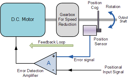
In the current context, we are concerned about stepper motors and servo motors. They cannot be powered up using direct currents to them. Inside these motors, the structure is different and they require a set of controlled signals to function. The following diagram from electronics-tutorials illustrates the feedback loop inside a servo motor. A servo motor is functional using a PWM wave. Depending on the duty cycle, the rotational angle will be determined. PSLab device is capable of generating four different square waves at any duty cycle varying from 0% to 100%. This gives us freedom to acquire any angle we desire from a servo motor. The experiment “Servo Motors” implement the following method where it accepts four angles.

public void servo4(double angle1, double angle2, double angle3, double angle4)

The experiment supports control of four different servo motors at independant angles. Most of the servos available in the market support only 180 degree rotation where some servos can rotate indefinitely. In such a case, the servo will rotate one cycle and reach its initial position.

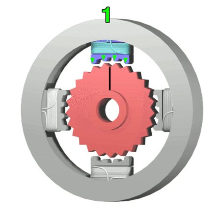
The last type of motor is stepper motor. As the name says it, this motor can produce steps. Inside of the motor, there are four coils and and five wires coming out of the motor body connecting these coils. The illustration from Wikipedia shows how four steps are acquired by powering up the respective coil in order. This powering up process needs to be controlled and hard to do manually. Using PSLab device experiment “Stepper Motor”, a user can acquire any number of steps just by entering the step value in the text box. The implementation consists of a set of method calls;

scienceLab.stepForward(steps, 100);

scienceLab.stepBackward(steps, 100);

A delay of 100 milliseconds is provided so that there is enough time to produce a step. Otherwise the shaft will not experience enough resultant force to move and will remain in the same position.

These two experiments are possible with PSLab because the amount of current drawn is quite small which can be delivered through a general USB port. It is worth mentioning that as industry grade servo and stepper motors may draw high current as they were built to interact with heavy loads, they are not suitable for this type of experiments.

Resources:

Continue ReadingControlling Motors using PSLab Device