
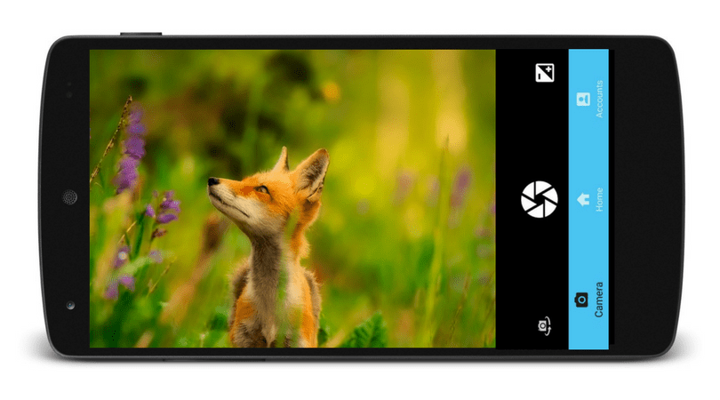
Zooming Feature in the Phimpme Android’s Camera
The Phimpme Android application comes with a complete package of camera, Edit images, sharing and gallery functionalities. It has a well featured and fully functional camera with all the capabilities that a user expects from a camera application. One such feature in the Phimpme Android application is the zooming functionality. It provides the user the option to zoom in using the pinch gesture of the fingers or the user can select the settings to zoom in from the volume buttons. In this tutorial, I will be explaining how I achieved the zooming functionality in the Phimpme Android app.
Step 1
The first thing we need to do is to check whether the device will support the zoom in functionality or not to avoid random crashes while runtime of the application and while performing the zoom action in case the camera of the device doesn’t support this feature. This can be done by the following lines of code:
Camera.Parameters params = mCamera.getParameters();
Boolean supports = params.isZoomSupported();
Step 2
Now after getting the camera parameters and checking whether the camera supports the zoom in functionality, we need to add the touch listener to the surface view of the camera so that we can get the touch locations and the finger spacing of the user to get the pinch to zoom in functionality. This can be done using the following line of code.
surfaceView.setOnTouchListener(this);
Whenever the user touches the screen this touch listener gives a callback to the overridden onTouchEvent method and passes the MotionEvent to the function. The motion event object in Android handles the movement reports. Now in the onTouchEvent method, we calculate the finger spacing between the two fingers and calculate the approximate amount by which the user wants to zoom in. The finger spacing can be calculated using the following lines of code.
float x = event.getX(0) - event.getX(1);
   float y = event.getY(0) - event.getY(1);
   return FloatMath.sqrt(x * x + y * y);
After getting the finger spacing we need to cancel the auto focus of the camera before performing the zoom action so that the application does not crash. This can be achieved by a single line of code below.
mCamera.cancelAutoFocus();
Step 3
The final step is to set the zoom level in the camera application by calculating the zoom level by using the finger spacing. For this, first we need to get the max zoom level supported by the device so that we do not apply the zoom level that is not supported by the device. The calculation of max zoom level and setting of the desired zoom level by the user can be performed by using the following lines of code.
int maxZoom = params.getMaxZoom();
   int zoom = params.getZoom();
   float newDist = getFingerSpacing(event);
   if (newDist > mDist) {
       //zoom in
       if (zoom < maxZoom)
           zoom++;
   } else if (newDist < mDist) {
       //zoom out
       if (zoom > 0)
           zoom--;
   }
   mDist = newDist;
   params.setZoom(zoom);
This is how we have achieved the functionality of zooming in and clicking pictures in the Phimpme Android application. To get the full source code and to know how to use the volume control buttons to zoom in/out, please refer to the Phimpme Android repository.
Resources
- GitHub – Open camera source code : https://github.com/almalence/OpenCamera
- Android developer’s guide – MotionEvents in Android : https://developer.android.com/reference/android/view/MotionEvent.html
- StackOverflow – Pinch to zoom functionality : https://stackoverflow.com/questions/8120753/android-camera-preview-zoom-using-double-finger-touch
- GitHub – Phimpme Android repository : https://github.com/fossasia/phimpme-android


 Fig. 1: The user interface of the copyright details
 Fig. 1: Login form before applying validation rules
 Fig. 2: Login form after applying validation rules
You must be logged in to post a comment.