Designing PayTM Checkout Components

This summer, Open Event project has 3 different payment gateways integrated in its system enabling the user base a wider base of options to buy their tickets and pay the organizers and hence making the platform more user friendly. In the initial period Omise gateway was implemented and properly documented in the first phase while Alipay was subsequently implemented in the middle of the coding period. In the late phase, the focus has been shifted to Indian payment gateways and PayTM came out as prime choice considering it’s popularity and ease of integration with the existing technology stack.

This requires two different modals to be added to frontend project to felicitate the open-event-server hits being made on PayTM’s API services.

The first modal’s skeleton design is to check paytm wallets as the payment option and acquire the mobile number to be used.

// app/templates/components/modals/paytm-payment-options.hbs

<
div class="header">
{{t 'Amount to be paid:'}} {{currency-symbol currency}} {{amount}}
</
div>

<
div class="content">
<
div class="muted small text">
  {{t 'Select an option to pay'}}
</
div>
<
form class="ui form" autocomplete="off" {{action 'openOTPController' on='submit' preventDefault=true}}>
  <
div class="field">
    {{ui-radio name='payment_mode' value='paytm' onChange=(action (mut isWalletSelected))}}
    {{t 'Paytm Wallet'}}<
img src="/images/payment-logos/paytm.png" alt="paytm">
  </
div>
  {{#
if isWalletSelected}}
    <
div class="field">
      <
div class="label">
        {{t 'Please enter your Paytm registered Mobile Number to continue'}}
      </
div>
      {{input type='number' id='mobile_number' value=mobileNumber required=true}}
    </
div>
  {{/
if}}
</
form>
</
div>

<
div class="actions">
<
button type="button" class="ui black button" {{action 'close'}}>
  {{t 'Cancel'}}
</
button>
<
button {{action openOTPController}} class="ui green button" disabled={{not isWalletSelected}}>
  {{t 'Proceed'}}
</
button>
</
div>

This simple modal design implementation resulted in the skeleton design of the first modal which can be seen as following:

OTP sending modal

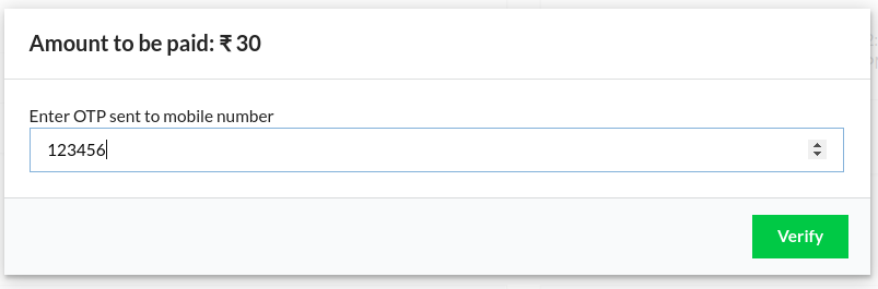
The second modal required a simple API hit integration which will be validating the acquired OTP. This was designed rather simply with the following snippet:

// app/templates/components/modals/paytm-otp.hbs
<
div class="header">
{{t 'Amount to be paid:'}} {{currency-symbol currency}} {{amount}}
</
div>

<
div class="content">
{{t 'Enter OTP sent to mobile number'}}
<
form class="ui form" autocomplete="off">
  <
div class="field">
    {{input type='number' id='otp' value=otp required=true}}
  </
div>
</
form>
</
div>
<
div class="actions">
<
button type="button" class="ui black button" {{action 'close'}}>
  {{t 'Cancel'}}
</
button>
<
button class="ui green button">
  {{t 'Verify'}}
</
button>
</
div>
OTP confirmation modal

These modals were controlled by adding corresponding pop-up logic in the pending.js controller focusing on the clicks on Proceed and verify buttons respectively.

// app/controllers/orders/pending.js
  openPaytmModal() {
    // Model controller for PaytmModal
    this.setProperties({
      'isPaytmModalOpen': true
    });
  },

  openOTPController() {
    // Modal controller for OTP step
    this.setProperties({
      'isPaytmModalOpen' : false,
      'isOTPModalOpen'   : true
    });
  }

This concludes the design walk through of custom PayTM checkout modals. These will be integrated with the APIs to complete the backend workflow and hence adding PayTM as another payment option!

Resources

Related Work and Code Repository

Continue ReadingDesigning PayTM Checkout Components

Create custom theme for SUSI chatbot web plugin

SUSI web plugin bot provides the features of SUSI as a chat window which users can plugin to their websites. They just need to copy the generated javascript code into their website and the SUSI bot plugin will be enabled. The user can customize the theme of the chatbot. This blog explains how the feature of applying custom theme is implemented.

Accepting user’s input

The react component of our concern is BotBuilderPages/Design.js. We use material-ui-color-picker component to accept user’s choice of color.

<ColorPicker
  className='color-picker'
  style={{display:'inline-block',float:'left'}}
  name='color'
  defaultValue={ this.state[component.component] }
  onChange={(color)=>
   this.handleChangeColor(component.component,color) }
/>


Similarly, there is a text field which accepts the url of an image. The values are stored in the component’s state variables.

Storing settings in server

The design settings are stored in the text format:

This forms part of the skill’s text file. When the user clicks on “save and deploy” button, the complete skill gets send to the server through the following API:

let settings = {
      async: true,
      crossDomain: true,
      url:
        urls.API_URL +
        '/cms/' +
        (this.state.updateSkillNow ? 'modifySkill.json' : 'createSkill.json'),
      method: 'POST',
      processData: false,
      contentType: false,
      mimeType: 'multipart/form-data',
      data: form,
    };

    $.ajax(settings)
      .done(function(response) {
        // successfully saved in server
      });


In the server, the skill is saved in susi_private_skill_data directory. Also, the design and configuration settings are stored in chatbot.json file.

Applying the settings to the bot

Now, in the susi-chatbot.js file, the custom theme settings are applied to the bot. The function getTheme() fetches the theme settings from the server via an ajax request. Then the function applyTheme() is executed which applies the theme to the chatbot.

$(".susi-sheet-content-container").css("background-color",botbuilderBackgroundBody);
if(botbuilderBodyBackgroundImg){
$(".susi-sheet-content-container").css("background-image","url("+botbuilderBodyBackgroundImg+")");
}


Similarly, other theme variables are applied as well. Thus we have customised the theme of the SUSI chatbot plugin.

Result:

Resources


Continue ReadingCreate custom theme for SUSI chatbot web plugin

Creating Onboarding Screens for SUSI iOS

Onboarding screens are designed to introduce users to how the application works and what main functions it has, to help them understand how to use it. It can also be helpful for developers who intend to extend the current project.

When you enter in the SUSI iOS app for the first time, you see the onboarding screen displaying information about SUSI iOS features. SUSI iOS is using Material design so the UI of Onboarding screens are following the Material design.

There are four onboarding screens:

  1. Login (Showing the login features of SUSI iOS) – Login to the app using SUSI.AI account or else signup to create a new account or just skip login.
  2. Chat Interface (Showing the chat screen of SUSI iOS) – Interact with SUSI.AI asking queries. Use microphone button for voice interaction.
  3. SUSI Skill (Showing SUSI Skills features) – Browse and try your favorite SUSI.AI Skill.
  4. Chat Settings (SUSI iOS Chat Settings) – Personalize your chat settings for the better experience.

Onboarding Screens User Interface


There are three important components of every onboarding screen:

  1. Title – Title of the screen (Login, Chat Interface etc).
  2. Image – Showing the visual presentation of SUSI iOS features.
  3. Description – Small descriptions of features.

Onboarding screen user control:

  • Pagination – Give the ability to the user to go next and previous onboarding screen.
  • Swiping – Left and Right swipe are implemented to enable the user to go to next and previous onboarding screen.
  • Skip Button – Enable users to skip the onboarding instructions and go directly to the login screen.

Implementation of Onboarding Screens:

  • Initializing PaperOnboarding:
override func viewDidLoad() {
super.viewDidLoad()

UIApplication.shared.statusBarStyle = .lightContent
view.accessibilityIdentifier = "onboardingView"

setupPaperOnboardingView()
skipButton.isHidden = false
bottomLoginSkipButton.isHidden = true
view.bringSubview(toFront: skipButton)
view.bringSubview(toFront: bottomLoginSkipButton)
}

private func setupPaperOnboardingView() {
let onboarding = PaperOnboarding()
onboarding.delegate = self
onboarding.dataSource = self
onboarding.translatesAutoresizingMaskIntoConstraints = false
view.addSubview(onboarding)

// Add constraints
for attribute: NSLayoutAttribute in [.left, .right, .top, .bottom] {
let constraint = NSLayoutConstraint(item: onboarding,
attribute: attribute,
relatedBy: .equal,
toItem: view,
attribute: attribute,
multiplier: 1,
constant: 0)
view.addConstraint(constraint)
}
}


  • Adding content using dataSource methods:

    let items = [
    OnboardingItemInfo(informationImage: Asset.login.image,
    title: ControllerConstants.Onboarding.login,
    description: ControllerConstants.Onboarding.loginDescription,
    pageIcon: Asset.pageIcon.image,
    color: UIColor.skillOnboardingColor(),
    titleColor: UIColor.white, descriptionColor: UIColor.white, titleFont: titleFont, descriptionFont: descriptionFont),OnboardingItemInfo(informationImage: Asset.chat.image,
    title: ControllerConstants.Onboarding.chatInterface,
    description: ControllerConstants.Onboarding.chatInterfaceDescription,
    pageIcon: Asset.pageIcon.image,
    color: UIColor.chatOnboardingColor(),
    titleColor: UIColor.white, descriptionColor: UIColor.white, titleFont: titleFont, descriptionFont: descriptionFont),OnboardingItemInfo(informationImage: Asset.skill.image,
    title: ControllerConstants.Onboarding.skillListing,
    description: ControllerConstants.Onboarding.skillListingDescription,
    pageIcon: Asset.pageIcon.image,
    color: UIColor.loginOnboardingColor(),
    titleColor: UIColor.white, descriptionColor: UIColor.white, titleFont: titleFont, descriptionFont: descriptionFont),OnboardingItemInfo(informationImage: Asset.skillSettings.image,
    title: ControllerConstants.Onboarding.chatSettings,
    description: ControllerConstants.Onboarding.chatSettingsDescription,
    pageIcon: Asset.pageIcon.image,
    color: UIColor.iOSBlue(),
    titleColor: UIColor.white, descriptionColor: UIColor.white, titleFont: titleFont, descriptionFont: descriptionFont)]
    extension OnboardingViewController: PaperOnboardingDelegate, PaperOnboardingDataSource {
    func onboardingItemsCount() -> Int {
    return items.count
    }
    
    func onboardingItem(at index: Int) -> OnboardingItemInfo {
    return items[index]
    }
    }


  • Hiding/Showing Skip Buttons:
    func onboardingWillTransitonToIndex(_ index: Int) {
    skipButton.isHidden = index == 3 ? true : false
    bottomLoginSkipButton.isHidden = index == 3 ? false : true
    }
    

Resources:

Continue ReadingCreating Onboarding Screens for SUSI iOS

Using CSS Grid in Loklak Search

CSS Grid is the latest web standard for the layouts in the web applications. This is the web standard which allows the HTML page to be viewed as 2-dimensional for laying out the elements in the page. It is thus used in parts of loklak search for layout. In this blog post, I will discuss the basic naming convention for CSS grid and its usage in Loklak Search for layout structuring and responsiveness.

CSS Grid Basics

There are some basic terminologies regarding grid few major ones are the following

Grid Container

The grid container is the container which is the wrapper of all the grid items. It is declared by display: grid, this makes all the direct children of that element to become grid items.

Grid Tracks

We define rows and columns of the grid as the lines, the area between any two lines is called a grid track. Tracks can be defined using any length unit. Grid also introduces an additional length unit to help us create flexible grid tracks. The new fr unit represents a fraction of the available space in the grid container.

Grid Cells

The area between any two horizontal and vertical lines is called a grid cell.

Grid Area

The area formed by the combination of two or more cells is called a grid area.

Using CSS grid in Loklak Search

The CSS grid is used in loklak search uses CSS grid in the feeds page to align elements in a responsive way on mobile and desktop. Earlier there was the issue that on small displays the info box of the results appeared after the feed results, and we needed to make sure that it appears on top on smaller displays. This is the outline of the structure of the feed page.

<div class=”feed-wrapper”>
<div class=”feed-results”>
<!-- Feed Results -->
</div>

<div class=”feed-info-box”>
<!-- Feed Info Box -->
</div>
</div>

Now we use the CSS grid to position the items according to the display width. First we declare the “feed-wrapper” as display:grid to make it a Grid Container, and we associate the rows and columns accordingly.

.feed-wrapper {
   display: grid;
   grid-template-columns: 150px 632px 455px 1fr;
   grid-template-rows: auto;
}

This defines the grid to be consisting of 4 columns of width 150px, 632px,  455px and one remaining unit i.e. 1fr. The rows are set to be auto.

Now we define the grid areas i.e. the names of the areas using the grid-area:<area> css property. This gives names to the elements in the CSS grid.

.feed-results {
   grid-area: feed-results;
}

.feed-info-box {
   grid-area: feed-info-box;
}

The last thing which remains now is to specify the position of these grid elements in the grid cells according to the display width, we use simple media queries along with simple grid area positioning property, i.e. grid-template-areas.

.feed-wrapper {
   /* Other Properties */
   @media(min-width: 1200px) {
      grid-template-areas: ". feed-results feed-info-box .";
   }

   @media(max-width: 1199px) {
      grid-template-columns: 1fr;
      grid-template-areas:
         "feed-info-box"
         "feed-results";
   }
}

This positions both the boxes according to the display width, in one column for large displays, and info box on top of results on mobile displays.

This is how it looks on the large desktop displays


This is how it looks on small mobile displays

Links and References


Continue ReadingUsing CSS Grid in Loklak Search

Shifting from Java to Kotlin in SUSI Android

SUSI Android (https://github.com/fossasia/susi_android) is written in Java. After the announcement of Google to officially support Kotlin as a first class language for Android development we decided to shift to Kotlin as it is more robust and code friendly than Java.

Advantages of Kotlin over Java

  1. Kotlin is a null safe language. It changes all the instances used in the code to non nullable type thus it ensures that the developer don’t get any nullPointerException.
  2. Kotlin provides the way to declare Extensive function similar to that of C#. We can use this function in the same way as we use the member functions of our class.
  3. Kotlin also provides support for Lambda function and other high order functions.

For more details refer to this link.

After seeing the above points it is now clear that Kotlin is much more effective than Java and there is harm in switching the code from Java to Kotlin. Lets now see the implementation in Susi Android.

Implementation in Susi Android

In the Susi Android App we are implementing the MVP design with Kotlin. We are converting the code by one activity each time from java to Kotlin. The advantage here with Kotlin is that it is totally compatible with java at any time. Thus allowing the developer to change the code bit by bit instead of all at once.Let’s now look at SignUp Activity implementation in Susi Android.

The SignUpView interface contains all the function related to the view.

interface ISignUpView {


  fun alertSuccess()

  fun alertFailure()

  fun alertError(message: String)

  fun setErrorEmail()

  fun setErrorPass()

  fun setErrorConpass(msg: String)

  fun setErrorUrl()

  fun enableSignUp(bool: Boolean)

  fun clearField()

  fun showProgress()

  fun hideProgress()

  fun passwordInvalid()

  fun emptyEmailError()

  fun emptyPasswordError()

  fun emptyConPassError()


}

The SignUpActivity implements the view interface in the following way. The view is responsible for all the interaction of user with the UI elements of the app. It does not contain any business logic related to the app.

class SignUpActivity : AppCompatActivity(), ISignUpView {


  var signUpPresenter: ISignUpPresenter? = null

  var progressDialog: ProgressDialog? = null


  override fun onCreate(savedInstanceState: Bundle?) {

      super.onCreate(savedInstanceState)

      setContentView(R.layout.activity_sign_up)

      addListeners()

      setupPasswordWatcher()


      progressDialog = ProgressDialog(this@SignUpActivity)

      progressDialog?.setCancelable(false)

      progressDialog?.setMessage(this.getString(R.string.signing_up))


      signUpPresenter = SignUpPresenter()

      signUpPresenter?.onAttach(this)

  }


  fun addListeners() {

      showURL()

      hideURL()

      signUp()

  }


  override fun onOptionsItemSelected(item: MenuItem): Boolean {

      if (item.itemId == android.R.id.home) {

          finish()

          return true

      }

      return super.onOptionsItemSelected(item)

  }

Now we will see the implementation of models in Susi Android in Kotlin and compare it with Java.

Lets First see the implementation in Java

public class WebSearchModel extends RealmObject {

  private String url;

  private String headline;

  private String body;

  private String imageURL;


  public WebSearchModel() {

  }


  public WebSearchModel(String url, String headline, String body, String imageUrl) {

      this.url = url;

      this.headline = headline;

      this.body = body;

      this.imageURL = imageUrl;

  }


  public void setUrl(String url) {

      this.url = url;

  }


  public void setHeadline(String headline) {

      this.headline = headline;

  }


  public void setBody(String body) {

      this.body = body;

  }


  public void setImageURL(String imageURL) {

      this.imageURL = imageURL;

  }


  public String getUrl() {

      return url;

  }


  public String getHeadline() {

      return headline;

  }


  public String getBody() {

      return body;

  }


  public String getImageURL() {

      return imageURL;

  }

}
open class WebSearchModel : RealmObject {


  var url: String? = null


  var headline: String? = null


  var body: String? = null


  var imageURL: String? = null


  constructor() {}


  constructor(url: String, headline: String, body: String, imageUrl: String) {

      this.url = url

      this.headline = headline

      this.body = body

      this.imageURL = imageUrl

  }

}

You can yourself see the difference and how easily with the help of Kotlin we can reduce the code drastically.

For diving more into the code, we can refer to the GitHub repo of Susi Android (https://github.com/fossasia/susi_android).

Resources

Continue ReadingShifting from Java to Kotlin in SUSI Android

Using Day Night Theme in SUSI Android

SUSI is an artificial intelligence for interactive chat bots. It provides response to the user in most intuitive way. Therefore we thought why not implement the option to give theme preference to the user to make it more interactive. It will also help in increasing the user’s interest towards the application.

We tried out different themes and then finally decided to settle for the newly announced Day Night Theme for the SUSI Android App (https://github.com/fossasia/susi_android). This theme is provided by AppCompat 23.2.0 . With the help of this theme we can switch between Theme.AppCompat.Light (light) and Theme.AppCompat (dark) based on the user preference and time of day. For default the theme is set to the light theme and it can be easily changed from the settings. Thus it allows the user to change the theme according to his or her mood which looks very intuitive.

How to use this theme?

To use the Day Night theme is quite simple. We just need to extend our default theme to that of Theme.AppCompat.DayNight. The declaration is done as shown below in the screenshot.

<style name="MyTheme" parent="Theme.AppCompat.DayNight">

  <!-- Blah blah -->

</style>

Now to enable different features of the theme in our application we need to call AppCompatDelegate.setDefaultNightMode(). It takes one of the following values as the parameter.

  • MODE_NIGHT_NO. This is for the day (light) theme.
  • MODE_NIGHT_YES.This is for the night (dark) theme.
  • MODE_NIGHT_AUTO. It automatically changes between the above two themes based on the time of day.
  • MODE_NIGHT_FOLLOW_SYSTEM (default). This theme is dependent on the system settings of the user mobile phone.

We can set one of these parameters at the time of calling the function to fix the theme of the application in the following way.

static {

AppCompatDelegate.setDefaultNightMode(

          AppCompatDelegate.MODE_NIGHT_...);

}

The theme inside an activity is set at the time time of calling onCreate() method. Therefore we cannot change the theme from any other place inside our activity apart from onCreate(). If we want to set it inside our activity but outside the onCreate() method then we have to call the recreate() function to recreate the whole activity which will implement the selected theme.Let us look at the example.

public class MyActivity extends AppCompatActivity {

 public void onCreate(Bundle savedInstanceState) {

      super.onCreate(savedInstanceState);

      if (savedInstanceState == null) {

          // Set the local night mode to some value

          getDelegate().setLocalNightMode(

                  AppCompatDelegate.MODE_NIGHT_...);

          // Now recreate for it to take effect

          recreate();

      }

  }

}

To take care of the text colors in our app we can set textColor attribute as

?android:attr/textColorPrimary

Now let us look at the implementation in Susi Android

In Susi Android we are providing user the option to select either the dark or the light theme in the settings.

 
The code for the implementation is as below

@Override

protected void onCreate(Bundle savedInstanceState) {

  super.onCreate(savedInstanceState);


  prefs = getSharedPreferences(Constant.THEME, MODE_PRIVATE);

  if(prefs.getString(Constant.THEME,"Dark").equals("Dark")) {

      AppCompatDelegate.setDefaultNightMode(AppCompatDelegate.MODE_NIGHT_YES);

  }

  else {

      AppCompatDelegate.setDefaultNightMode(AppCompatDelegate.MODE_NIGHT_NO);

  }


  setContentView(R.layout.activity_main);

}

The result output for the light theme is

To learn more about themes in Android you can refer to this link.

Resources

Continue ReadingUsing Day Night Theme in SUSI Android

Using TabLayouts in your Android app

So while making a sessions schedule for the open event app, I wanted to separate the sessions on the basis of the days they are scheduled for to improve the visual clarity. So to do this I had various approaches like add a filter to separate by date or add checkboxes to show only checked dates but I though they’d look ugly. Instead the best option was to add tabs in a fragment with a viewpager to scroll within them : It looks appealing, has simple and clean UI, easier to implement with the new design library. So, naturally I opted for using the Tablayout from the design Library.

Earlier, when the Support design library was not introduce, it was really a tedious job to add it to our app since we had to extend Listeners to check for tab changes and we had to manually open fragments when a tab was selected or unselected or even when it was reselected. Essentially this meant a lot of errors and memory leaks. In the design library we essentially need to add tablayout and a viewpager to our layout like this :

<android.support.design.widget.AppBarLayout xmlns:android="http://schemas.android.com/apk/res/android"
    xmlns:app="http://schemas.android.com/apk/res-auto"
    android:layout_width="match_parent"
    android:layout_height="match_parent">

    <android.support.design.widget.TabLayout
        android:id="@+id/tabLayout"
        android:layout_width="match_parent"
        android:layout_height="wrap_content"
        app:tabGravity="fill"
        app:tabMode="fixed"
        app:theme="@style/ThemeOverlay.AppCompat.Dark.ActionBar" />

    <android.support.v4.view.ViewPager
        android:id="@+id/viewpager"
        android:layout_width="match_parent"
        android:layout_height="wrap_content"
        android:background="@android:color/white" />

</android.support.design.widget.AppBarLayout>

Next in our activity/ fragment, we can just inflate this view and create an adapter for the viewpager extending a FragmentPagerAdapter:

public class OurAdapter extends FragmentPagerAdapter {
    private final List<Fragment> mFragmentList = new ArrayList<>();
    private final List<String> mFragmentTitleList = new ArrayList<>();

    public ScheduleViewPagerAdapter(FragmentManager manager) {
        super(manager);
    }

    @Override
    public Fragment getItem(int position) {
        return mFragmentList.get(position);
    }

    @Override
    public int getCount() {
        return mFragmentList.size();
    }

    public void addFragment(Fragment fragment, String title, int day) {

        mFragmentList.add(fragment);
        mFragmentTitleList.add(title);
    }

    @Override
    public CharSequence getPageTitle(int position) {
        return mFragmentTitleList.get(position);
    }
}

Now I had to make dynamic number of tabs, since I wanted the app to customisable on the number of days listed in the json downloaded from the server. So, I made some changes in the traditional code. This is what we do in our activity/fragment’s onCreate/OnCreatView :

viewPager = (ViewPager) view.findViewById(R.id.viewpager);

for (int i = 0; i < daysofEvent; i++) {
    adapter.addFragment(new DayScheduleFragment(),title, dayNo);
}

viewPager.setAdapter(adapter);
scheduleTabLayout = (TabLayout) view.findViewById(R.id.tabLayout);
scheduleTabLayout.setupWithViewPager(viewPager);

This is it. Now we have a basic working tablayout in a viewpager. This also has the capability to change according to the number of days specified in the json we have written.

Earlier without the design library, we would have to even add switch cases in the FragmentPagerAdapter like this :

public class OurAdapter extends FragmentPagerAdapter {
 
 public TabsPagerAdapter(FragmentManager fm) {
    super(fm);
 }
 
 @Override
 public Fragment getItem(int index) {
 
 switch (index) {
 case 0:
    return new FirstFragment();
 case 1:
    return new SecondFragment();
 case 2:
    return new ThirdFragment();
 }
 
 return null;
 }

Then we would have to override methods to listen to activities in tabs :

@Override
public void onTabReselected(Tab tab, FragmentTransaction ft) {
}

@Override
public void onTabSelected(Tab tab, FragmentTransaction ft) {
// on tab selected
// show respected fragment view
   viewPager.setCurrentItem(tab.getPosition());
}

@Override
public void onTabUnselected(Tab tab, FragmentTransaction ft) {
}

And more code to listen for swiping within tabs in a viewpager:

/**
* on swiping the viewpager make respective tab selected
**/
viewPager.setOnPageChangeListener(new ViewPager.OnPageChangeListener() {

@Override
public void onPageSelected(int position) {

// on changing the page
// make respected tab selected
actionBar.setSelectedNavigationItem(position);
}

@Override
public void onPageScrolled(int arg0, float arg1, int arg2) {
}

@Override
public void onPageScrollStateChanged(int arg0) {
}
});

You see how easy this got with the inclusion of TabLayout.

Now for the final product I made after inflating the fragments and adding recyclerviews for the schedule, I got this :

Swipable tabs

I urge you to try swipable tabs in your app as well. Adios till next time.

Continue ReadingUsing TabLayouts in your Android app

New Color Schemes in Engelsystem

Engelsystem is a well-built MVC application. It seems to have everything an event manager could want. During the Week 2 of my Summer of Code, I worked on creating new color schemes/themes for the system. Engelsystem initially had 4 color schemes:

  1. Engelsystem cccamp15
    01

  2. Engelsystem 32C3

    02

  3. Engelsystem Dark

    03

  4. Engelsystem Light

    04

Color wields enormous sway over our attitudes and emotions. When our eyes take in a color, they communicate with a region of the brain known as the hypothalamus, which in turn sends a cascade of signals to the pituitary gland, on to the endocrine system, and then to the thyroid glands. The thyroid glands signal the release of hormones, which cause fluctuation in mood, emotion, and resulting behavior.

Research from QuickSprout indicates that 90% of all product assessments have to do with color. “Color,” writes Neil Patel, is “85% of the reason you purchased a specific product.” It’s a no-brainer fact of any website that color affects conversions. Big time.

So, the bottom line is: use the right colors, and you win.

Color schemes lets the user to set the system looks (i.e how the system will appear) which the user likes. During the week 2 of my Summer of Code, I worked on implementing 2 new color schemes for the system:

  1. Engelsystem color scheme-1

    05

  2. Engelsystem color scheme-2

    06

In the later weeks, other developers and I would be working on creating more themes and enhancing them. Anyone who would like to work in the project are welcome. Developers can feel free to take up any issues they would like to work on just like any other open source projects.

Development: https://github.com/fossasia/engelsystem                                           Issues/Bugs:https://github.com/fossasia/engelsystem/issues

Continue ReadingNew Color Schemes in Engelsystem