Temporally accurate data acquisition via digital communication pathways in PSLab

This blog post deals with the importance of using a real-time processor for acquiring time dependent data sets. The PSLab already features an oscilloscope, an instrument capable of high speed voltage measurements with accurate timestamps, and it can be used for monitoring various physical parameters such as acceleration and angular velocity as long as there exists a device that can generate a voltage output corresponding to the parameter being measured.  Such devices are called sensors, and a whole variety of these are available commercially.

However, not all sensors provide an analog output that can be input to a regular oscilloscope. Many of the modern sensors use digitally encoded data which has the advantage of data integrity being preserved over long transmission pathways. A commonly used pathway is the I2C data bus, and this blog post will elaborate the challenges faced during continuous data acquisition from a PC, and will explore how a workaround can be managed by moving the complete digital acquisition process to the PSLab hardware in order create a digital equivalent of the analog oscilloscope.

Precise timestamps are essential for extracting waveform parameters such as frequency and phase shifts, which can then be used for calculating physics constants such as the value of acceleration due to gravity, precession, and other resonant phenomena. As mentioned before, oscilloscopes are capable of reliably measuring such data as long as the input signal is an analog voltage, and if a digital signal needs to be recorded, a separate implementation similar to the oscilloscope must be designed for digital communication pathways.

A question for the reader :

Consider a voltmeter capable of making measurements at a maximum rate of one per microsecond.

We would like to set it up to take a thousand readings (n=1000) with a fixed time delay(e.g. 2uS) between each successive sample in order to make it digitize an unknown input waveform. In other words, make ourselves a crude oscilloscope.

Which equipment would you choose to connect this voltmeter to in order to acquire a dataset?

  1. A 3GHz i3 processor powering your favourite operating system, and executing a simple C program that takes n readings in a for loop with a delay_us(2) function call placed inside the loop.
  2. A 10MHz microcontroller , also running a minimal C program that acquires readings in fixed intervals.

To the uninitiated, faster is better, ergo, the GHz range processor trumps the measly microcontroller.

But, we’ve missed a crucial detail here. A regular desktop operating system multitasks between several hundred tasks at a time. Therefore, your little C program might be paused midway in order to respond to a mouse click, or a window resize on any odd chores that the cpu scheduler might feel is more important. The time after which it returns to your program and resumes acquisition is unpredictable, and is most likely of the order of a few milliseconds.

The microcontroller on the other hand, is doing one thing, and one thing only. A delay_us(2) means a 2uS delay with an error margin corresponding to the accuracy of the reference clock used. Simple crystal oscillators usually offer accuracies as good as 30ppm/C, and very low jitter.

Armed with this DIY oscilloscope, we can now proceed to digitize a KHz range since wave or a sound signal from a microphone with good temporal accuracy.

Sample results from the PSLab’s analog oscilloscope

sine wave shown on the oscilloscope
PSLab Oscilloscope showing a 1KHz sinusoidal wave plotted with Matplotlib

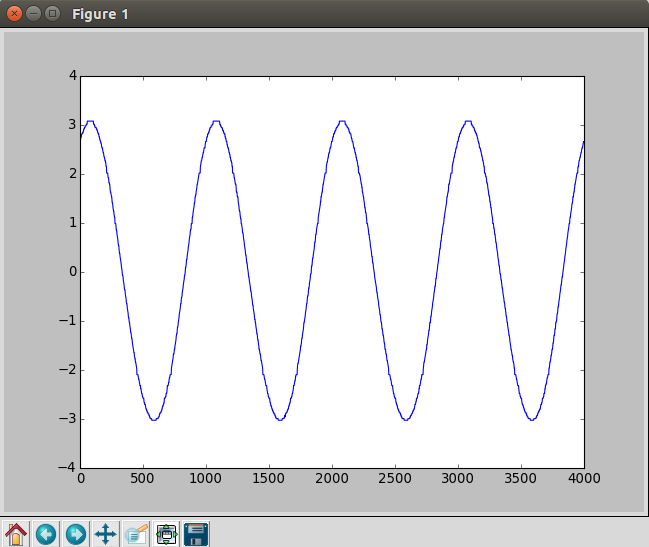
If the same were taken via a script that shares CPU time with other processes, the waveform would compress at random intervals due to CPU time unavailability. Starting a new CPU intensive process usually has the effect of the entire waveform appearing compressed because actual time intervals between each sample are greater than the expected time intervals


Implementing the oscilloscope for data buses such as I2C

With regards to the PSLab which already has a reasonably accurate oscilloscope built-in, what happens if one wants to acquire time critical information from sensors connected to the data bus , and not the analog inputs ?

In order acquire such data , the PSLab firmware houses the read routine from I2C in an interrupt function that is invoked at precise intervals by a preconfigured timer’s timeout event. Each sample is stored to an array via a self incrementing pointer.

The I2C address to be accessed, and the bytes to be written before one can start reading data are all pre-configured before the acquisition process starts.

This process then runs at top priority until a preset number of samples have been acquired.Once the host software knows that acquisition should have completed, it fetches the data buffer containing the acquired information.

An example of data being read from a 6-Degree of freedom inertial measurement unit mounted on the pivot of an oscillating physical pendulum.

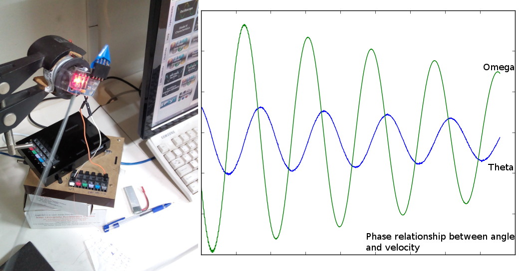
The plots that overlap accurately with a simulated damped sinusoidal waveform are not possible in the absence of a real-time acquisition system

A 6-DOF sensor connected to the pivot of a physical pendulum.

The sensor in question is the MPU6050 from invensense, used primarily in drones, and other self-stabilising robots.

Its default I2C address is 0x68 ( 104 ) , and 14 registers starting from 0x3B contain data for acceleration along orthogonal axes, temperature, and angular velocity along orthogonal axes. Each of these values is an integer, and is therefore represented by two successive registers. E.g. , 0x3B and 0x3C together make up a 16-bit value for acceleration along the X-axis.
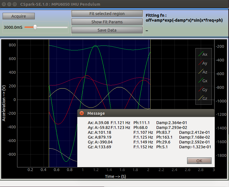
 

The Final App


Raw Data from a 6-Degree of freedom Inertial Measurement Unit
A least square fit is applied to all 6 datasets (3-axis acceleration, 3-axis angular velocity) from the MPU6050. Extracted parameters show amplitude, frequency, phase and damping coefficient.


Continue ReadingTemporally accurate data acquisition via digital communication pathways in PSLab

Creating functional components in Ember JS in Open Event Front-end

In the Open Event Front-end using Ember JS we are creating a functional ticket ordering component which lets users select the amount of tickets and update the total & subtotal price accordingly. How are we doing it?

Creating a component

Components in ember are modular widgets which are used to define a single HTML element, as an independent element. Components can be reused without any dependencies across the project. This provides us a modular architecture to define a component once and reuse it across the project.

For creating a new component use:

ember g component ticket-component

In ember all components must have at least one hyphen in their name. This is an Ember convention, but it is an important one as it ensures there are no naming collisions with future HTML elements. After execution of the above command three new files are generated in the project under:

  • app/components: Contains the logic of the component.
  • app/templates: Contains the view of the component.
  • tests/integration/components: Contains all tests related to component.

Passing an array of ticket detail to template

We can pass data from APIs to the templates using ember-data, but for simplicity we are passing an array of dummy data to get it working. To pass the array to the template we need to add the following JSON to the application controller under controllers/application.js in the application.

tickets:[
  {
    description: 'Discounted ticket for all community members',
    date: 'Mon, May 22',
    price: 40.50,
    name: 'Community Ticket',
    type: 'paid',
    id: 1,
    quantity: 10,
    orderQuantity: 0,
    min: 0,
    max: 5
  }
]

For passing the data to the component template we need to pass the above object to the template using the following syntax in the application.hbs route.

{{public/ticket-component tickets=tickets}}

Rendering ticket details

We iterate over the tickets array passed by application.hbs using each handlebars helper, and we are also using semantic ui dropdown.

For computing subtotals we are using a ember-math-helpers which can be installed using

ember install ember-math-helpers

The semantic ui dropdown is used for selecting the number of orders. This allows us to bind a hidden field for storing the selected value from the dropdown.

{{#ui-dropdown class='compact selection' forceSelection=false}}
 {{input type='hidden' id=(concat ticket.id '_quantity') value=ticket.orderQuantity}}
{{/ui-dropdown}}

For downloading semantic-ui to the project we use:

ember install semantic-ui-ember

Computing subtotal using ember-math-helpers using the mult function which multiplies the price of tickets and the number of order selected from the dropdown.

<td id='{{ticket.id}}_subtotal' class="ui right aligned">
  $ {{number-format (mult ticket.orderQuantity ticket.price)}}
</td>

Computing total price of ordered tickets

To compute total price we are using computed properties which lets us observe properties in the component and compute other properties which are dependent on it. We add a computed property for the orderQuantity property associated with each of the tickets and update the total accordingly.

total: computed('tickets.@each.orderQuantity', function() {
  let sum = 0.0;
  this.get('tickets').forEach(ticket => {
    sum += (ticket.price * ticket.orderQuantity);
  });
  return sum;
})

This ensures an update of the total if any changes are made to the orderQuantity property of any ticket.


Continue ReadingCreating functional components in Ember JS in Open Event Front-end

Creating a Custom Theme Template in sphinx for the yaydoc automatic documentation generator

Sphinx is one of the most famous documentation generator out there and we can also customize sphinx to match the needs of the yaydoc automatic documentation generator we are building at FOSSASIA. Sphinx comes with lots of themes and you can also create your own theme. This blog will guide you on how to set your own custom theme and how to make use of sphnix-quickstart tool that allows you to create a boilerplate in a few seconds.

In yaydoc, we have a feature of generating documentation from markdown. So what you have to do is to modify conf.py to generate documentation from markdown. Therefore, I modified the bash script to add the necessary parser to conf.py but my co-contributor came with a better idea of solving the problem by creating a template file and specifying the path of template files to the sphinx-quickstart using the ‘t’ flag.

Below are the steps on how you can create your own sphinx template.

The command for initializing the basic template is as follows:

pip install sphinx
sphinx-quickstart

After completing the above step, it’ll ask you a series of questions. Your basic template will be created but you can customize the generated files by providing your own custom templates and ask sphinx to generate a boilerplate from our customized template. Sphinx uses jinja for templating. To know more about jinja check this link. Let’s start creating our own customized template. Basic files needed to create a new sphinx template are as follows:

  • Makefile.new_t
  • Makefile_t
  • conf.py_t
  • make.bat.new_t
  • make.bat_t
  • master_doc.rst_t

conf.py_t contains all the configuration for documentation generation. Let’s say if you have to generate documentation from markdown file you will have to add recommonmark parser. Instead of adding the parser after boiler plate generation you can simply add it in the template beforehand.

from recommonmark.parser import CommonMarkParser

With the help of jinja templating we can create boiler plate according to our business logic . For example, if you want to hard code copyright you can do it simply by changing the conf.py_t

copyright = u'{{ copyright_str }}'

master_doc.rst_t will be having the default index page generated by sphinx . You can edit that also according to your need. Remaining files are basic makefile for sphinx, no need of altering them. You can see the example snippets in yaydoc repository. After you are done with your templating, you can generate boilerplate using -t flag by specifying the folder.

sphnix-quickstart -t <template folder path>
Continue ReadingCreating a Custom Theme Template in sphinx for the yaydoc automatic documentation generator

Recyclerview in Open Event Android: A great upgradation to ListView

Recently, I was fixing a trivial bug in the Open Event Android app, an interesting thing caught my attention. Most of the lists in the app where actually not implemented using the traditional ListView, but instead used something called RecyclerView. The beautiful transitions that make this app the beauty it is, is due to the amazing and easy to code Recycler Views used in it.

A screen shot showcasing the simplicity of the FOSSASIA Open event android app.


List View is one among the various views that Android provides. In a nutshell, it is literally a group of generic views in Android. Why then use an entire new and more complex view, if all that it offers is a number of views displayed together? Well, it certainly has certain add-ons to the most generic set of views like Image and TextViews in Android.

I encourage you to think about what different could the ListView be as compared to multiple declarations of TextView. The thing with multiple declarations of a Text or Image View is that they aren’t “scrollable”, that is, if you want numerous Views in a single activity, without List View, you will have to fit them on one screen, else make another activity. So, if you want a scrollable view with same basic view items, List View is the way to go about it in Android.

The next question that may arise is:

How does a Listview work?

Google defines Adapters as “a bridge between an AdapterView and the underlying data for that view”. List Views use Adapters that retrieve data from Arrays, Lists and other data structures and queries, plugs them into our List View and thus, creates a beautiful looking List in no time. In Spite of all this, List View certainly lags in various fields that deal with performance, memory and compactness issues. As a great improvement Recycler View was introduced.

Using Recyclerview you are not restricted to vertical scrollable views. It has the ability to provide horizontal, vertical, grid and staggered layouts among others, with the help of different layout managers:-

recyclerView.setLayoutManager(new StaggeredGridLayoutManager(2,StaggeredGridLayoutManager.VERTICAL));
recyclerView.setLayoutManager(new LinearLayoutManager(RecyclerView_Activity.this,LinearLayoutManager.HORIZONTAL, false));

RecyclerView.ItemDecoration class allows us to add special drawings to our view. Thus, we can add dividers, borders and much more using this class.

public class DividerItemDecoration extends RecyclerView.ItemDecoration {
 
     private Drawable mDivider;
 
     public DividerItemDecoration(Drawable divider) {
         mDivider = divider;
     }

Adding animation used to be a devil of a task in Listview days, however with the release of Recyclerview, it has become a lot more easy. RecyclerView.ItemAnimator class helps in animating items while the adapters are being changed.

Next, we have something related to the performance:-

In a List View, you might have come across the term, ‘Viewholder’, but if you haven’t, that’s okay too. However, in Recyclerview, using View Holders have been made mandatory and for a good reason. The class goes by the name RecyclerView.ViewHolder.

What exactly are View Holders?
The clean dividers and minimal design in the Recyclerview makes up for a subtle UI.

In a broader sense, it is used to provide information about the identity of an itemView and it’s position within a Recyclerview. Without View Holders we have an overhead of calling the function findViewById() for every item in our Recyclerview! This upgradation from the typical findViewById() to View Holders awards us with better and more smooth scrolling through the list.

How does Recyclerview work?

List View is an ancestor to Recyclerview. Recyclerview has everything that List View offers to us (except for a few things like setchoicemode(), which I might take up in my upcoming blog posts), and much more.

A great achievement that Android achieved through Recyclerview has been it’s ability to “recycle” views on the way. In laymen terms, if you scroll through a Recyclerview, the views that go away from the screen during scrolling are the same views that come into the screen. The only difference is that the data in the views leaving the screen is changed to the data of the views entering your screen and so they are presented as new views. In this way, a Recyclerview helps saving memory for sure as compared to List Views.

There are still a lot of other things to learn about Recycler and List Views and you find more resources here.


Continue ReadingRecyclerview in Open Event Android: A great upgradation to ListView

Build a simple Angular 4 message publisher

Introduction

The differences between Angular 1, Angular 2 and Angular 4

AngularJS/Angular 1 is a very popular framework which is based on MVC model, and it was released in October, 2010.
Angular 2, also called Angular, is based on component and is completely different from Angular 1 , which was released in September 2016.
Angular 4 is simply an update of Angular 2, which is released in March, 2017.

Note that Angular 3 was skipped due to the version number conflicts.

Installation

Prerequisites

1. Install TypeScript:

npm install -g typescript

2. Install code editor: vscode, sublime, intellij.

3. Use Google chrome and development tool to debug.

Install Angular CLI by command line

Angular CLI is a very useful tool which contains a brunch of commands to work with Angular 4. In order to install Angular CLI, the version of Node should be higher or equal to 6.9.0, and NPM need to higher or equal to 3.

npm install -g @angular/cli

Create a new Project

ng new loklak-message-publisher
cd loklak-message-publisher
ng serve

The command will launch web browser automatically in localhost:4200 to run the application. It will detect any change in files. Of course you can change the default port to others.
The basic project structure is like this:

package.json: standard node configuration file, which including the name, version and dependency of the configuration.

tsconfig.json: configuration file for TypeScript compiler.

typings.json: another configuration file for typescript, mainly used for type checking.

app folder contains the main ts file, boot.ts and app.component.ts.


Next we will show how to build a simple message publisher. The final application looks like this, we can post new tweets in the timeline, and remove any tweet by clicking ‘x’ button:

  • The first step in to create new elements in app.component.html file.

The HTML file look quite simple, we save the file and switch to browser, the application is like this:

A very simple interface! In next step we need to add some style for the elements. Edit the app.component.css file:

.block {
   width: 800px;
   border: 1px solid #E8F5FD;
   border-bottom: 0px;
   text-align: center;
   margin: 0 auto;
   padding: 50px;
   font-family: monospace;
   background-color: #F5F8FA;
   border-radius: 5px;
}

h1 {
   text-align: center;
   color: #0084B4;
   margin-top: 0px;
}

.post {
   width: 600px;
   height: 180px;
   text-align: center;
   margin: 0 auto;
   background-color: #E8F5FD;
   border-radius: 5px;
}

.addstory {
   width: 80%;
   height: 100px;
   font-size: 15px;
   margin-top: 20px;
   resize: none;
   -webkit-border-radius: 5px;
   -moz-border-radius: 5px;
   border-radius: 5px;
   border-color: #fff;
   outline: none;
}

.post button {
   height: 30px;
   width: 75px;
   margin-top: 5px;
   position: relative;
   left: 200px;
   background-color: #008CBA;
   border: none;
   color: white;
   display: inline-block;
   border-radius: 6px;
   outline: none;
}

.post button:active {
   border: 0.2em solid #fff;
   opacity: 0.6;
}

.stream-container {
   width: 600px;
   border-bottom: 1px solid #E8F5FD;
   background-color: white;
   padding: 10px 0px;
   margin: 0 auto;
   border-radius: 5px;
}

.tweet {
   border: 1px solid;
   border-color: #E8F5FD;
   border-radius: 3px;
}

p {
   text-align: left;
   text-indent: 25px;
   display: inline-block;
   width: 500px;
}

span {
   display: inline-block;
   width: 30px;
   height: 30px;
   font-size: 30px;
   cursor: pointer;
   -webkit-text-fill-color: #0084B4;
}

The app is almost finished, so excited! Now we want to add some default tweets that will be shown up in our application.
Let’s open the app.component.ts file, add an array in class AppComponent.

Then in the app.component.html file, we add ngFor to instantiates a tweets in the page.

After we finished this step, all the tweets are displayed in our application. Now we have to implement ‘tweet’ button and delete button. We define addTweet and removeTweet functions in app.component.ts file.

For the addTweet function, we need to modify html to define the behavior of textarea and tweet button:

For removeTweet function, we add id for each tweet we posted, and combine delete span with removeTweet function, which pass the id of tweet.

Conclusion

There are two things about Angular 4 we can learn from this tutorial:

  1. How to bind functions or variables to DOM elements, e.g. click function, ngModel.
  2. How to use the directives such as *ngFor to instantiate template.
Continue ReadingBuild a simple Angular 4 message publisher

Implementing Google Maps in Open Event ember Front-end

In the deployment of the Open Event Front-end on eventyay.com we want to show an event’s location on a map using Google Maps. Since Eventyay.com requires Google map to be used at several web pages, we can use Google map as an ember component for reusability.

How did we do it? The following walks you through the entire process.

The first step is to: Install g-map addon-

  • ember g-map, which is an addon, is available on ember add-on library which can be found at emberobserver.com. So first import that library using ember cli command
ember install ember-g-map
  • This command adds an ember-g-map module in our node_modules and also updated package.json file of our app now our ember-g-map modules contains the following directories. The following three are required to be highlighted that serves our purpose-
  • Addon/ – this directory contains all the implementation logic which acts as a prototype for the g-map component
  • App/- this directory basically exports a copy of g-map from our Addon/ directory to the web page where it is required. The export includes the logic implement inside the Addon/ directory which can later be imported by the parent app for use.Package.json – this file holds various metadata relevant to the ember-g-map

Generate Component-

  • The next step is to generate a component event-map (we can name our component anything we want but be sure to add a hyphen between the name). The component can be generated with the help of the following command of ember cli-
ember g component public/event-map

This will add three files in our app –

event-map.js located at app/component/public/event-map.js

event-map.hbs located at app/template/component/public/event-map.hbs

event-map-test.js located at tests/integration/component/public/event-map-test.js

Define Component-

Now let us use these files to add a google map component in our app-

  • First of all, we have to tell index.hbs about our new component that we are going to add. So we add our component {{public/event-map}} in our index.hbs file which is located at app/templates/public/index.hbs And we fetch latitude, longitude and location name from model and store in the event object and pass it to our component so that this information is available in the component.
<div class="location">
<h1 id="getting-here">{{t 'Getting Here'}}</h1>
 {{public/event-map event=model.event}}
</div>
  • The event-map.js file will be used to add ui grid class to assign a class to the div of the component. This will alleviate the redundancy regarding the creation of an extra div to enclose the component and then giving it the ui grid class.
import Ember from 'ember';
 
const { Component } = Ember;
 
export default Component.extend({
 classNames: ['ui', 'stackable', 'grid']
});
  • In our event-map.hbs we have with us the latitude, longitude, and locationName available and we are good to use our g-map addon. So in our event-map.hbs we can directly add g-map and g-map-marker but make sure that we pass lat and lang attributes to it. We can use custom options like backgroundColor, draggable etc. but here we have used street view and gestureHandling. gestureHandling is set as “cooperative” so that for smaller screen device,  zooming is possible only with two fingers so that scrolling would become easy.
<div class="eight wide column event-map">
 {{#g-map lat=event.latitude lng=event.longitude 
 zoom=12 gestureHandling='cooperative' 
 streetView='StreetViewPanorama' as |context|}}
 {{g-map-marker context lat=event.latitude lng=event.longitude}}
 {{/g-map}}
</div>
<div class="eight wide column address">
 <h1>{{t 'Address'}}</h1>
 <p>{{event.locationName}}</p>
</div>
  • Next we have to decide the size of aur google map canvas on which our map is to be displayed. We define the size of our canvas in the public-event.scss file which is located under styles/pages/public-event-scss.
.event-map > .g-map {
 height: 100%;
 width: 100%;
}
 
.event-map > .g-map > .g-map-canvas {
 height: 300px;
}
  • Lastly, we have to modify our event-map-test.js file. Here we perform integration test for our component. We create a dummy object with latitude, longitude, and locationName in it and pass it to our component and then check if it renders correctly or not.
import { test } from 'ember-qunit';

import moduleForComponent from 'open-event-frontend/tests/helpers/component-helper';

import hbs from 'htmlbars-inline-precompile';

moduleForComponent('public/event-map', 'Integration | Component | public/event map');

let event = Object.create({ latitude: 37.7833, longitude: -122.4167, locationName: 'Sample event location address' });

test('it renders', function(assert) {

  this.set('event', event);

  this.render(hbs `{{public/event-map event=event}}`);

  assert.equal(this.$('.address p').text(), 'Sample event location address');

});

Now use ember s command in our ember cli and visit localhost:4200

Then open a event at the end we see our Google map integrated.

Use ember test –server command to check if all our tests (integration, acceptance, etc.) are passed.


Find out more at – ember-g-map

Continue ReadingImplementing Google Maps in Open Event ember Front-end

Quick-filter for filtering of events

With a myriad of events present, it might get difficult for users to search for a specific event. So, giving the user a tool to search according to whatever clue they have to search for an event makes it easier for them. Search tool based on location, date (or day) or event’s name or rather a combination of any of these will answer most of the problems to this issue.

To create such a tool we implement a quick-filter component.

An Ember Component is a view that is completely isolated. Properties accessed in its templates got to the view object and actions are targeted at the view object. There is no access to the surrounding context or outer controller, all contextual information must be passed in.

Now, let’s create a component ‘quick-filter’

This command will create 3 files

  1. Quick-filter.js

A JS file is used mainly to run client side JavaScript code on a webpage. The quick-filter component encapsulates certain snippets of Handlebar templates that can be reused in our code. If we need to customize the behaviour of our component we define a subclass of Ember.Component in the app/components

import Ember from ’ember’;
const { Component } = Ember;
export default Component.extend({
tagName   : ‘footer’
classNames: [‘ui’, ‘action’, ‘input’, ‘fluid’]
});


  1. Quick-filter-test.js

This is where we check whether our component is compatible with other components of the system or not. Here, for now, we are just making sure if our component renders or not, by checking the presence of ‘All Dates’.

import { test } from ’ember-qunit’;
import moduleForComponent from ‘open-event-frontend/tests/helpers/component-helper’;
import hbs from ‘htmlbars-inline-precompile’;

moduleForComponent(‘quick-filter’, ‘Integration | Component | quick-filter’);

test(‘it renders’, function(assert) {
this.render(hbs`{{quick-filter}}`);
assert.ok(this.$().html().trim().includes(‘Search’));
});


  1. Quick-filter.hbs

Here we design our component. We have used semantic UI elements for designing. Specifically speaking we have used

  • ui-action-input
  • ui-dropdown
  • ui-blue-button-large

Here we have used semantics fluid class to make the component take width of its container.

{{input type=‘text’ placeholder=(t ‘Search for events’)}}
{{#unless device.isMobile }}
 {{input type=‘text’ placeholder=(t ‘Location’)}}
 {{#ui-dropdown class=‘search selection’ selected=filterDate forceSelection=false}}
   {{input type=‘hidden’ id=‘filter_date’ value=filterDate}}
   <i class=“dropdown icon”></i>
   <div class=“default text”>{{t ‘All Dates’}}</div>
   <div class=”menu”>
     <div class=”item” data-value=”all-dates”>{{t ‘All Dates’}}</div>
     <div class=“item” data-value=“today”>{{t ‘Today’}}</div>
     <div class=“item” data-value=“tomorrow”>{{t ‘Tomorrow’}}</div>
     <div class=”item” data-value=”this-week”>{{t ‘This Week’}}</div>
     <div class=“item” data-value=“this-weekend”>{{t ‘This Weekend’}}</div>
     <div class=“item” data-value=“next-week”>{{t ‘Next Week’}}</div>
     <div class=”item” data-value=”this-month”>{{t ‘This Month’}}</div>
   </div>
 {{/ui-dropdown}}
{{/unless}}
<button class=“ui blue button large” type=“button”>{{t ‘Search’}}</button>

Now, our component is ready, and the only part remaining is to place it in our application. We place it in app/templates/index.hbs

<div class=“ui container”>
 {{quick-filter}}
 <h2>{{t ‘Upcoming Events’}}</h2>
 <div class=”ui stackable three column grid”>
   {{#each model as |event|}}
     {{event-card event=event shareEvent=(action ‘shareEvent’)}}
   {{/each}}
 </div>

Now our filter component is up and running.

Continue ReadingQuick-filter for filtering of events
Read more about the article Set spacing in RecyclerView items by custom Item Decorator in Phimpme Android App
Spacing in RecyclerView GridLayoutManager

Set spacing in RecyclerView items by custom Item Decorator in Phimpme Android App

We have decided to shift our images Gallery code from GridView to using Grid Layout manager in RecyclerView in Phimpme Android application. RecyclerView has many advantages as compare to Grid/ List view.

  • Advantages of using layout manager either List, Grid or Staggered.
  • We can use many built in animations.
  • Item decorator for customizing the item.
  • Recycle items using the View Holder pattern

Recycler View documentation

Adding recyclerview in xml

<android.support.v7.widget.RecyclerView

    android:layout_width="match_parent"

    android:layout_height="match_parent"

    android:id="@+id/rv"

    />

Setting layout manager

mLayoutManager = new GridLayoutManager(this, 3);

recyclerView.setLayoutManager(mLayoutManager);

In phimpme we have an item as an ImageView, to show into the grid. Setup the Grid using layout manager as above.

Gallery of images is set but there is no spacing in between grid items. Padding will not help in this case.

Found a way to set offset by creating a Custom item decoration class. Add a constructor with parameter as a dimension resource.


public class ItemOffsetDecoration extends RecyclerView.ItemDecoration {

   private int mItemOffset;

   public ItemOffsetDecoration(int itemOffset) {

       mItemOffset = itemOffset;

   }


   public ItemOffsetDecoration(@NonNull Context context, @DimenRes int itemOffsetId) {

       this(context.getResources().getDimensionPixelSize(itemOffsetId));

   }

   @Override

   public void getItemOffsets(Rect outRect, View view, RecyclerView parent,

           RecyclerView.State state) {

       super.getItemOffsets(outRect, view, parent, state);

       outRect.set(mItemOffset, mItemOffset, mItemOffset, mItemOffset);

   }

}

Author: gist.github.com/yqritc/ccca77dc42f2364777e1

Usage:

ItemOffsetDecoration itemDecoration = new ItemOffsetDecoration(context, R.dimen.item_offset);

mRecyclerView.addItemDecoration(itemDecoration)

Pass the item_offset value in the function. Go through the material design guidelines for a clear understanding of dimensions in item offset.

Continue ReadingSet spacing in RecyclerView items by custom Item Decorator in Phimpme Android App

Arch Linux for Travis CI

Travis CI does not provide Arch Linux as a testing environment but if you need to test some script or some app specifically on Arch Linux, you would have to do that manually for every change made into code and that would waste time. I had a similar problem when I was trying to test the Event Linux build scripts based on Arch Linux which required the Arch Linux environment to be able to run build scripts which take around 25 to 30 minutes to be tested for every change

How to use Arch travis script for Travis CI?

To solve the problem we need to use Arch as chroot in Travis CI. To do so we are going to use this script (link) which will deploy Arch Linux chroot on travis for us to start testing
For using it we need to configure the travis.yml like this :-

sudo: required
arch:
 repos:
  - archlinuxfr=http://repo.archlinux.fr/$arch
 packages:
  # pacman packages
  - yaourt
  - archiso
 script:

  - ./build-repo
  - sudo ./build.sh -v

script:
 - "travis_wait 30 sleep 1800 &"
 - curl -s https://raw.githubusercontent.com/fossasia/arch-travis/master/arch-travis.sh | bash

arch.packages defines a list of packages (from official repository or AUR) to be installed before running the build.
For eg:

packages:
  # pacman packages
  - python
  - perl
  # aur packages
  - go-git
  # packages from custom repo
  - yaourt

Here in arch.repos we define custom repository required for the package which is required during testing.

For eg. in above code repo : http://repo.archlinux.fr/$arch is used to install yaourt we could have used AUR too but that will increase our build testing time as the AUR will first download the pkgbuild and then build the package which can result in increase of time

arch.script defines a list of scripts to run as part of the build. Like in above example we have used ./build-repo and sudo ./build -v

Anything defined in the arch.script list will run from the base of the repository as a normal user called travis CI . sudo is available as well as any packages installed in the setup. The path of the build dir (or repository base), is stored in the TRAVIS_BUILD_DIR environment variable inside the chroot.

At the end of example we have used
script:
Which defines the scripts to be run by travis, this is where arch-travis was initialized and then we pipe it

Usage of travis-wait function

script:

- travis_wait 30 sleep 1800 &
 - curl -s https://raw.githubusercontent.com/fossasia/arch-travis/master/arch-travis.sh | bash

We cannot use travis wait function inside the chroot neither we can export it so we apply the travis wait function at the point where we have initialised the Arch-travis

Example usage for pkgbuild scripts

sudo: required # this to get sudo permissions

arch: # anything to be tested under Arch is defined below this
 script: 
  - makepkg app.pkgbuild # this will test the pkgbuild script

script: #for setting up arch chroot using the arch travis script
 - curl -s https://raw.githubusercontent.com/fossasia/arch-travis/master/arch-travis.sh | bash

Limitations

  • Increases build time by about 1-3 min.
  • Does not work on travis container-based infrastructure because sudo is required.
  • Limited configuration.
  • Does not include base group packages.
Continue ReadingArch Linux for Travis CI

Hotword Detection in Susi Android

Hotword detection is one of the coolest features in Android. Voice control has emerged as a popular method for interacting with smartphones and wearable devices. It allows the user to interact with the app without even touching the device in a much intuitive way. At the same time it’s difficult to implement them in the Android app and requires use of large number of resources. Let us dive deeper into this topic.

So, Firstly What is a Hotword?

Hotword is generally a phrase or a word that can be used to initiate a particular task in the app. The user needs to speak the phrase or the hotword which on detection makes a callback that can be used to carry out a particular task in the app.

Examples of hotword include “Ok Google” which is used to initiate Google assistant in the Android mobile phones.

Why is it difficult to implement hotword detection?

To enable hotword detection is a cumbersome task. There are different problems associated with it including:-

  1. Change in the accent of the speaker.
  2. Continuous task of recognizing the voice and then matching it with the hotword.
  3. The features needs to be run as a service in android which causes the drain of battery.
  4. Also it is a memory intensive task at the same time.

Let’s us look at the present techniques available for the hotword detection.

  1. The Android provides a class called as AlwaysOnHotwordDetector. This class can be used to detect the keywords inside the activity of an Android app. For more details you can visit this link.

The implementation goes like this

/**

* @param text The keyphrase text to get the detector for.

* @param locale The java locale for the detector.

* @param callback A non-null Callback for receiving the recognition events.

* @param voiceInteractionService The current voice interaction service.

* @param modelManagementService A service that allows management of sound models.

*

* @hide

*/


public AlwaysOnHotwordDetector(String text, Locale locale, Callback callback, KeyphraseEnrollmentInfo keyphraseEnrollmentInfo, IVoiceInteractionService voiceInteractionService, IVoiceInteractionManagerService modelManagementService) {

  mText = text;

  mLocale = locale;

  mKeyphraseEnrollmentInfo = keyphraseEnrollmentInfo;

  mKeyphraseMetadata = mKeyphraseEnrollmentInfo.getKeyphraseMetadata(text, locale);

  mExternalCallback = callback;

  mHandler = new MyHandler();

  mInternalCallback = new SoundTriggerListener(mHandler);

  mVoiceInteractionService = voiceInteractionService;

  mModelManagementService = modelManagementService;

  new RefreshAvailabiltyTask().execute();


}

2.  We can also detect hotword using Pocketsphinx library in Android. The library acts as a service in the Android app. It is quite efficient when it comes to battery consumption. The implementation goes like this:-    

recognizer = defaultSetup()
   .setAcousticModel(new File(assetsDir, "en-us-ptm"))
   .setDictionary(new File(assetsDir, 
"cmudict-en-us.dict"))
   .getRecognizer();
recognizer.addListener(this);


// Create keyword-activation search.
recognizer.addKeyphraseSearch(KWS_SEARCH, KEYPHRASE);

// Create grammar-based searches.
File menuGrammar = new File(assetsDir, "menu.gram");
recognizer.addGrammarSearch(MENU_SEARCH, menuGrammar);

// Next search for digits
File digitsGrammar = new File(assetsDir, "digits.gram");
recognizer.addGrammarSearch(DIGITS_SEARCH, digitsGrammar);

// Create language model search.
File languageModel = new File(assetsDir, "weather.dmp");
recognizer.addNgramSearch(FORECAST_SEARCH, languageModel);


recognizer.startListening(searchName);

Now Lets us look at how we are implementing it in Susi Android:

In Susi Android, we have used CMU’s Pocketsphinx library for the hotword detection. We are using “Hi Susi” as the hotword for the detection.

private SpeechRecognizer recognizer;

/* Keyword we are looking for to activate menu */

private static final String KEYPHRASE = "hi susi";

/* Named searches allow to quickly reconfigure the decoder */

private static final String KWS_SEARCH = "hi susi";


The function setupRecognizer is used to initialize the Recognizer and detect the keyphrase


private void setupRecognizer(File assetsDir) throws IOException {

// The recognizer can be configured to perform multiple searches

// of different kind and switch between them

recognizer = SpeechRecognizerSetup.defaultSetup()

.setAcousticModel(new File(assetsDir, "en-us-ptm"))

.setDictionary(new File(assetsDir, "cmudict-en-us.dict"))

.setRawLogDir(assetsDir)

.getRecognizer();

recognizer.addListener(this);

recognizer.addKeyphraseSearch(KWS_SEARCH, KEYPHRASE);

There is still some need of improvement towards this approach in Susi app as the success rate of detection of keyword is not very high. We can overcome this by training the model or having a set of strings similar to that of “Hi Susi” such as “Hii Susi” or “Hi Sushi”. This will increase the rate of detection.  

Continue ReadingHotword Detection in Susi Android