Extending Markdown Support in Yaydoc

Yaydoc, our automatic documentation generator, builds static websites from a set of markup documents in markdown or reStructuredText format. Yaydoc uses the sphinx documentation generator internally hence reStructuredText support comes out of the box with it. To support markdown we use multiple techniques depending on the context. Most of the markdown support is provided by recommonmark, a docutils bridge for sphinx which basically converts markdown documents into proper docutil’s abstract syntax tree which is then converted to HTML by sphinx. While It works pretty well for most of the use cases, It does fall short in some instances. They are discussed in the following paragraphs.

The first problem was inclusion of other markdown files in the starting page. This was due to the fact that markdown does not supports any include mechanism. And if we used the reStructuredText include directive, the included text was parsed as reStructuredText. This problem was solved earlier using pandoc – an excellent tool to convert between various markup formats. What we did was that we created another directive mdinclude which converts the markdown to reStructuredText before inclusion. Although this was solved a while ago, The reason I’m discussing this here is that this was the inspiration behind the solution to our recent problem.

The problem we encountered was that recommonmark follows the Commonmark spec which is an ongoing effort towards standardization of markdown which has been somewhat lacking till now. The process is currently going on so the recommonmark library doesn’t yet support the concept of extensions to support various features of different markdown flavours not in the core commonmark spec. We could have settled for only supporting the markdown features in the core spec but tables not being present in the core spec was problematic. We had to support tables as it is widely used in most of the docs present in github repositories as GFM(Github Flavoured Markdown) renders ascii tables nicely.

The solution was to use a combination of recommonmark and pandoc. recommonmark provides a eval_rst code block which can be used to embed non-section reStructuredText within markdown. I created a new MarkdownParser class which inherited the CommonMarkParser class from recommonmark. Within it, using regular expressions, I convert any text within `<!– markdown+ –>` and `<!– endmarkdown+ –>`  into reStructuredText and enclose it within eval_rst code block. The result was that tables when enclosed within those trigger html comments would be converted to reST tables and then enclosed within eval_rst block which resulted in recommonmark renderering them properly. Below is a snippet which shows how this was implemented.

import re
from recommonmark.parser import CommonMarkParser
from md2rst import md2rst


MARKDOWN_PLUS_REGEX = re.compile('<!--\s+markdown\+\s+-->(.*?)<!--\s+endmarkdown\+\s+-->', re.DOTALL)
EVAL_RST_TEMPLATE = "```eval_rst\n{content}\n```"


def preprocess_markdown(inputstring):
    def callback(match_object):
        text = match_object.group(1)
        return EVAL_RST_TEMPLATE.format(content=md2rst(text))

    return re.sub(MARKDOWN_PLUS_REGEX, callback, inputstring)


class MarkdownParser(CommonMarkParser):
    def parse(self, inputstring, document):
        content = preprocess_markdown(inputstring)
        CommonMarkParser.parse(self, content, document)

Resources

Continue ReadingExtending Markdown Support in Yaydoc

Working of Meilix Build Script

Meilix build script is divided into several parts the initial part consist of getting the build environment ready for build which includes installation of packages to build the ISO.

Iike debootstrap genisoimage p7zip-full squashfs-tools ubuntu-dev-tools.

The we have a debuild script which is ran by the build script in initially to rebuild the metapackages so that if any change is created it can be included in the build.

To make the change in metapackage like meilix-default-settings.deb we include the changes in the meilix-default-settings/ to test the meta package locally we can use the following script to build it for testing.

#!/bin/bash
rm meilix-default-settings_*                                    #removes the older meilix-default-settings packages
cd meilix-default-settings                                      #cd into the metapackage directory
debuild -uc -us                                                 #debuild the meilix-default-settings metapackage


After creation of packages we prepare chroot with the help of debbootstrap using ubuntu mirror for application installation after that we copy the files we created using debuild script and the files we require in the chroot.
We have a different file for working in the chroot which executes once the chroot is ready.

Now we copy the kernel from chroot to the build server /image for creation of live cd

sudo cp chroot/boot/vmlinuz-**-generic image/casper/vmlinuz sudo cp chroot/boot/initrd.img-**-generic image/casper/initrd.lz

Next step is to extract initrd for updating the uuid information for the above changes.

7z e image/casper/initrd.lz && \
  mkdir initrd_FILES/ && \
  mv initrd initrd_FILES/ && \
  cd initrd_FILES/ && \
  cpio -id < initrd && \
  cd .. && \
  cp initrd_FILES/conf/uuid.conf image/.disk/casper-uuid-generic && \

Now we pack the ISO using mkisofs but the problem here is we don’t have a boot.cat file and without that we will have errors in packing the ISO so to handle that we first create a temporary ISO to be able to extract boot.cat from it.

IMAGE_NAME=${IMAGE_NAME:-"Meilix ${release} $(date -u +%Y%m%d) - ${arch}"}
ISOFILE=meilix-${release}-$(date -u +%Y%m%d)-${arch}.iso
sudo mkisofs -r -V "$IMAGE_NAME" -cache-inodes -J -l \
  -b isolinux/isolinux.bin -c isolinux/boot.cat \
  -no-emul-boot -boot-load-size 4 -boot-info-table \
  --publisher "Meilix Packaging Team" \
  --volset "Ubuntu Linux http://www.ubuntu.com" \
  -p "${DEBFULLNAME:-$USER} <${DEBEMAIL:-on host $(hostname --fqdn)}>" \
  -A "$IMAGE_NAME" \
  -m filesystem.squashfs \
  -o ../$ISOFILE.tmp .

After getting a updated boot.cat file by mounting the temporary ISO and extracting boot.cat from it, we repeat the similar steps to create the ISO.

Chroot Script

Inside the chroot script we are going to install all the packages we require in the ISO and the metapackages we created for ISO. we can also add the custom changes we require like turning off screen dimming or setting plymouth after installing the package.

echo -ne "\033[9;0]" >> /etc/issue
setterm -blank 0 >> /etc/issue

At the end of chroot script we do the cleanup.

perl -i -nle 'print unless /^Package: language-(pack|support)/ .. /^$/;' /var/lib/apt/extended_states 
apt-get -qq clean
 rm -rf /tmp/* #rm /etc/resolv.conf 
rm meilix-default-settings_1.0_all.deb 
rm meilix-metapackage_1.0-1_all.deb 
rm systemlock_0.1-1_all.deb plymouth-meilix-logo_1.0-1_all.deb plymouth-meilix-text_1.0-1_all.deb skype-ubuntu_4.1.0.20-1_i386.deb rm meilix-imclient_*_all.deb
rm /sbin/initctl dpkg-divert --rename --remove /sbin/initctl

Resources

Continue ReadingWorking of Meilix Build Script

Updating the UI of the generator form in Open Event Webapp

  • Add a pop-up menu bar similar to the one shown in Google/Susper6be8d972-72bc-4e12-b27a-219e46608cfc.png
  • Add a version deployment link at the bottom of the page like the one shown in staging.loklak.org.

29072668-b1db-4ef5-8865-c71ef2438433.png


  • Implementing the top-bar and the pop-up menu bar

The first task was to introduce a top-bar and a pop-up menu bar in Generator. The top-bar would contain the text Open Event Webapp Generator and an icon button on the right side of it which would show a pop-up menu. The pop-up menu would contain a number of icons which would link to different pages like FOSSASIA blogs and it’s official website, different projects like loklak, SUSI and Eventyay and also to the Webapp Project Readme and issues page.

Creating a top navbar is easy but the pop-up menu is a comparatively tougher. The first step was to gather the gather the small images of the different services. Since this feature had already been implemented in Susper project, we just copied all the icon images from there and copy it into a folder named icons in the open event webapp. Then we create a custom menu div which would hold all the different icons and present it an aesthetic manner. Write the HTML code for the menu and then CSS to decorate and position it! Also, we have to create a click event handler on the pop-up menu button for toggling the menu on and off.

Here is an excerpt of the code. The whole file can be seen here

<div class="custom-navbar">
 <a href='.' class="custom-navtitle">
   <strong>Open Event Webapp Generator</strong> <!-- Navbar Title -->
 </a>
 <div class="custom-menubutton">
   <i class="glyphicon glyphicon-th"></i> <!-- Pop-up Menu button -->
 </div>
 <div class="custom-menu"> <!-- Custom pop-up menu containing different links -->
   <div class="custom-menu-item">
     <a class="custom-icon" href="http://github.com/fossasia/open-event-webapp" target="_blank"><img src="./icons/code.png">
       <p class="custom-title">Code</p></a>
   </div>
   <!-- Code for other links to different projects-->
 </div>
</div>

Here is a screenshot of how the top-bar and the pop-up menu looks!

bb82ba88-4317-46b0-91ec-514499c5cfde.png

  • Adding version deployment info to the bottom

The next task was to add a footer to the page which would contain the version deployment info. The user can click on that link and we can then be taken to the latest version of the code which is currently deployed.

To show the version info, we make use of the Github API. We need to get the hash of the latest commit made on the development branch. We send an API request to the Github requesting for the latest hash and then dynamically add the info and the link received to the footer. The user can then click on that link and will be taken to the latest deployment page of the webapp!

var apiUrl = "https://api.github.com/repos/fossasia/open-event-webapp/git/refs/heads/development";
$.ajax({url: apiUrl, success: function(result){
 var version = result['object']['sha'];
 var versionLink = 'https://github.com/fossasia/open-event-webapp/tree/' + version;
 var deployLink = $('#deploy-link');
 deployLink.attr('href', versionLink);
 deployLink.html(version);
}});

This is how the footer looks after the API Response

44385ad8-e094-490b-8575-a47932aa75c5.png

References:

Continue ReadingUpdating the UI of the generator form in Open Event Webapp

Creating an Infobox for Mobile View Using Angular in Susper

In Susper, the Information and Analytics boxes disappeared for widths smaller than 1100px, since they were too big to fit in the existing page layout.
In Laptop view:

In Mobile view:

Hence we decided to design a new Info-cum-Analytics box for mobile devices, where the Analytics are displayed only if the ‘Show Analytics’ button is clicked and they are hidden on clicking the ‘Hide Analytics’ button.

The following is the html code for the Infobox:

<div class=“combo-box”>
<appinfobox></app-infobox>
<button class=“btn” id=“toggle-button” (click)=“BoxToggle()” type=“button” datatoggle=“collapse” datatarget=“#statbox” ariaexpanded=“false” ariacontrols=“collapseExample”>
{{boxMessage}} Analytics
</button>
<appstatsbox class=“collapse” id=“statbox”></app-statsbox>
</div>

We can make the following observations:

  • The combo box has both the Info and the Stats box, in addition to a button, which toggles the display status of the Analytics box.
  • To display the appropriate message on the button, we have a special function called BoxToggle() which sets the value of boxMessage()
  • The data-toggle attribute of the button has been set to collapse and the data-target is statbox
  • The statsbox has the class collapse, so that it collapses on clicking on the Toggle button.

The typescript code is as follows:

BoxToggle() {
if (this.boxMessage === ‘Show’) {
this.boxMessage = ‘Hide’;
} else {
this.boxMessage = ‘Show’;
}
}

This code thus effectively toggles between the messages Show and Hide, if the button is clicked when the message says Show, it changes to Hide and vice-versa

The CSS code:

@media screen and (min-width:768px) {
div.combo-box {
display: none;
}
}

The css code ensures that this combo-box is displayed only for widths less than 768px (only mobile and tablet screens).

To view the entire code you can check results.component.html and results.component.css in the Susper repository.

References

  1. W3 Schools for Collapsible buttons and their implementation: https://www.w3schools.com/bootstrap/bootstrap_collapse.asp
  2. Official Bootstrap documentation for collapsible buttons: https://v4-alpha.getbootstrap.com/components/collapse/
Continue ReadingCreating an Infobox for Mobile View Using Angular in Susper

Implementing Version Control System for SUSI Skill CMS

SUSI Skill CMS now has a version control system where users can browse through all the previous revisions of a skill and roll back to a selected version. Users can modify existing skills and push the changes. So a skill could have been edited many times by the same or different users and so have many revisions. The version control functionalities help users to :

  • Browse through all the revisions of a selected skill
  • View the content of a selected revision
  • Compare any two selected revisions highlighting the changes
  • Option to edit and rollback to a selected revision.

Let us visit SUSI Skill CMS and try it out.

  1. Select a skill
  2. Click on versions button
  3. A table populated with previous revisions is displayed

  1. Clicking on a single revision opens the content of that version
  2. Selecting 2 versions and clicking on compare selected versions loads the content of the 2 selected revisions and shows the differences between the two.
  3. Clicking on Undo loads the selected revision and the latest version of that skill, highlighting the differences and also an editor loaded with the code of the selected revision to make changes and save to roll back.

How was this implemented?

Firstly, to get the previous revisions of a selected skill, we need the skills meta data including model, group, language and skill name which is used to make an ajax call to the server using the endpoint :

http://api.susi.ai/cms/getSkillHistory.json?model=MODEL&group=GROUP&language=LANGUAGE&skill=SKILL_NAME

We create a new component SkillVersion and pass the skill meta data in the pathname while accessing that component. The path where SkillVersion component is loaded is /:category/:skill/versions/:lang . We parse this data from the path and set our state with skill meta data. In componentDidMount we use this data to make the ajax call to the server to get all previous version data and update our state. A sample response from getSkillHistory endpoint looks like :

{
  "session": {
    "identity": {
      "type": "",
      "name": "",
      "anonymous":
    }
  },
  "commits": [
    {
      "commitRev": "",
      "author_mail": "AUTHOR_MAIL_ID",
      "author": "AUTOR_NAME",
      "commitID": "COMMIT_ID",
      "commit_message": "COMMIT_MESSAGE",
     "commitName": "COMMIT_NAME",
     "commitDate": "COMMIT_DATE"
    },
  ],
  "accepted": TRUE/FALSE
}

We now populate the table with the obtained revision history. We used Material UI Table for tabulating the data. The first 2 columns of the table have radio buttons to select any 2 revisions. The left side radio buttons are for selecting the older versions and the right side radio buttons to select the more recent versions. We keep track of the selected versions through onCheck function of the radio buttons and updating state accordingly.

if(side === 'right'){
  if(!(index >= currLeft)){
    rightChecks.fill(false);
    rightChecks[index] = true;
    currRight = index;
  }
}
else if(side === 'left'){
  if(!(index <= currRight)){
    leftChecks.fill(false);
    leftChecks[index] = true;
    currLeft = index;
  }
}
this.setState({
  currLeftChecked: currLeft,
  currRightChecked: currRight,
  leftChecks: leftChecks,
  rightChecks: rightChecks,
});

Once 2 versions are selected and we click on compare selected versions button, we get the currently selected versions stored from getCheckedCommits function and we are redirected to /:category/:skill/compare/:lang/:oldid/:recentid where we pass the selected 2 revisions commitIDs in the URL.

{(this.state.commitsChecked.length === 2) &&
<Link to={{
  pathname: '/'+this.state.skillMeta.groupValue+
            '/'+this.state.skillMeta.skillName+
            '/compare/'+this.state.skillMeta.languageValue+
            '/'+checkedCommits[0].commitID+
            '/'+checkedCommits[1].commitID,
}}>
  <RaisedButton
    label='Compare Selected Versions'
    backgroundColor='#4285f4'
    labelColor='#fff'
    style={compareBtnStyle}
  />
</Link>
}

SkillHistory Component is now loaded and the 2 selected revisions commitIDs are parsed from the URL pathname. Once we have the commitIDs we make ajax calls to the server to get the code for that particular commit. The skill meta data is also parsed from the URL path which is required to make the server call to getFileAtCommitID.

http://api.susi.ai/cms/getSkillHistory.json?model=MODEL&group=GROUP&language=LANGUAGE&skill=SKILL_NAME&commitID=COMMIT_ID

We make the ajax calls in componentDidMount and update the state with the received data. A sample response from getFileAtCommitID looks like :

{
  "accepted": TRUE/FALSE,
  "file": "CONTENT",
  "session": {
    "identity": {
       "type": "",
       "name": "",
       "anonymous":
    }
  }
}

We populate the code of each revision in an editor. We used react-ace as our editor component where we use the value prop to populate the content and display it in read-only mode.

<AceEditor
  mode='java'
  readOnly={true}
  theme={this.state.editorTheme}
  width='100%'
  fontSize={this.state.fontSizeCode}
  height= '400px'
  value={this.state.commitData[0].code}
  showPrintMargin={false}
  name='skill_code_editor'
  editorProps={{$blockScrolling: true}}
/>

We then show the differences between the 2 selected versions content. To compare and highlight the differences, we used react-diff package which takes in the content of both the commits as inputA and inputB props and we compare character by character using the type chars prop. Here input A is compared with input B. The component compares and returns the highlighted element which we display in a scrollable div preventing overflows.

{/* latest code should be inputB */}
<Diff
  inputA={this.state.commitData[0].code}
  inputB={this.state.commitData[1].code}
  type='chars'
/>

Clicking on Undo then redirects to /:category/:skill/edit/:lang/:latestid/:revertid where latest id is the commitID of the latest revision and revert id is the commitID of the oldest commit ID selected amongst the 2 commits selected initially. This redirects to SkillRollBack component where we again parse the skill meta data and the commit IDs from the URL pathname and call getFileAtCommitID to get the content for the latest and the reverting commit and again populate the content in editor using react-ace and also show the differences using react-diff and finally load the modify skill component where an editor is preloaded with the content of the reverting commit and a similar interface like modify skill is shown where user can edit the content of the reverting commit and push the changes.

let baseUrl = this.getSkillAtCommitIDUrl() ;
let self = this;
var url1 = baseUrl + self.state.latestCommit;
$.ajax({
  url: url1,
  jsonpCallback: 'pc',
  dataType: 'jsonp',
  jsonp: 'callback',
  crossDomain: true,
  success: function (data1) {
    var url2 = baseUrl + self.state.revertingCommit;
    $.ajax({
      url: url2,
      jsonpCallback: 'pd',
      dataType: 'jsonp',
      jsonp: 'callback',
      crossDomain: true,
      success: function (data2) {
        self.updateData([{
        code:data1.file,
        commitID:self.state.latestCommit,
      },{
        code:data2.file,
        commitID:self.state.revertingCommit,
      }])
      }
    });
  }
});

Here, we make nested ajax calls to maintain synchronization and update state after we receive data from both the calls else if we make ajax calls in a loop, then the second ajax call doesn’t wait for the first one to finish and is most likely to fail.

This is how the skill version system was implemented in SUSI Skill CMS. You can find the complete code at SUSI Skill CMS Repository. Feel free to contribute.

Resources:

Continue ReadingImplementing Version Control System for SUSI Skill CMS

Implementing Order Statistics API on Tickets Route in Open Event Frontend

The order statistics API endpoints are used to display the statistics related to tickets, orders, and sales. It contains the details about the total number of orders, the total number of tickets sold and the amount of the sales. It also gives the detailed information about the pending, expired, placed and completed orders, tickets, and sales.

This article will illustrate how the order statistics can be displayed using the Order Statistics API in Open Event Frontend. The primary end point of Open Event API with which we are concerned with for statistics is

GET /v1/events/{event_identifier}/order-statistics

First, we need to create a model for the order statistics, which will have the fields corresponding to the API, so we proceed with the ember CLI command:

ember g model order-statistics-tickets

Next, we need to define the model according to the requirements. The model needs to extend the base model class. The code for the model looks like this:

import attr from 'ember-data/attr';
import ModelBase from 'open-event-frontend/models/base';

export default ModelBase.extend({
  orders  : attr(),
  tickets : attr(),
  sales   : attr()
});

As we need to display the statistics related to orders, tickets, and sales so we have their respective variables inside the model which will fetch and store the details from the API.

Now, after creating a model, we need to make an API call to get the details. This can be done using the following:

return this.modelFor('events.view').query('orderStatistics', {});

Since the tickets route is nested inside the event.view route so, first we are getting the model for event.view route and then we’re querying order statistics from the model.

The complete code can be seen here.

Now, we need to call the model inside the template file to display the details. To fetch the total orders we can write like this

{{model.orders.total}}


In a similar way, the total sales can be displayed like this.

{{model.sales.total}}


And total tickets can be displayed like this

{{model.tickets.total}}


If we want to fetch other details like the pending sales or completed orders then the only thing we need to replace is the total attribute. In place of total, we can add any other attribute depending on the requirement. The complete code of the template can be seen here.

The UI for the order statistics on the tickets route looks like this.

Fig. 1: The user interface for displaying the statistics

The complete source code can be seen here.

Resources:

Continue ReadingImplementing Order Statistics API on Tickets Route in Open Event Frontend

Implementing Pages API in Open Event Frontend

The pages endpoints are used to create static pages which such as about page or any other page that doesn’t need to be updated frequently and only a specific content is to be shown. This article will illustrate how the pages can be added or removed from the /admin/content/pages route using the pages API in Open Event Frontend. The primary end point of Open Event API with which we are concerned with for pages is

GET /v1/pages

First, we need to create a model for the pages, which will have the fields corresponding to the API, so we proceed with the ember CLI command:

ember g model page

Next, we need to define the model according to the requirements. The model needs to extend the base model class. The code for the page model looks like this:

import attr from 'ember-data/attr';
import ModelBase from 'open-event-frontend/models/base';

export default ModelBase.extend({
  name        : attr('string'),
  title       : attr('string'),
  url         : attr('string'),
  description : attr('string'),
  language    : attr('string'),
  index       : attr('number', { defaultValue: 0 }),
  place       : attr('string')
});

As the page will have name, title, url which will tell the URL of the page, the language, the description, index and the place of the page where it has to be which can be either a footer or an event.

The complete code for the model can be seen here.

Now, after creating a model, we need to make an API call to get and post the pages created. This can be done using the following:

return this.get('store').findAll('page');

The above line will check the store and find all the pages which have been cached in and if there is no record found then it will make an API call and cache the records in the store so that when called it can return it immediately.

Since in the case of pages we have multiple options like creating a new page, updating a new page, deleting an existing page etc. For creating and updating the page we have a form which has the fields required by the API to create the page.  The UI of the form looks like this.

Fig. 1: The user interface of the form used to create the page.

Fig. 2: The user interface of the form used to update and delete the already existing page

The code for the above form can be seen here.

Now, if we click the items which are present in the sidebar on the left, it enables us to edit and update the page by displaying the information stored in the form and then the details be later updated on the server by clicking the Update button. If we want to delete the form we can do so using the delete button which first shows a pop up to confirm whether we actually want to delete it or not. The code for displaying the delete confirmation pop up looks like this.

<button class="ui red button" 
{{action (confirm (t 'Are you sure you would like to delete this page?') (action 'deletePage' data))}}>
{{t 'Delete'}}</button>


The code to delete the page looks like this

deletePage(data) {
    if (!this.get('isCreate')) {
      data.destroyRecord();
      this.set('isFormOpen', false);
    }
  }

In the above piece of code, we’re checking whether the form is in create mode or update mode and if it’s in create mode then we can destroy the record and then close the form.

The UI for the pop up looks like this.

Fig.3: The user interface for delete confirmation pop up

The code for the entire process of page creation to deletion can be checked here

To conclude, this is how we efficiently do the process of page creation, updating and deletion using the Open-Event-Orga pages API  ensuring that there is no unnecessary API call to fetch the data and no code duplication.

Resources:
Continue ReadingImplementing Pages API in Open Event Frontend

Making Skill Display Cards Identical in SUSI.AI Skill CMS

SUSI.AI Skill CMS shows all the skills of SUSI.AI. The cards used to display all the skills follow flexbox structure and adjust their height according to content. This lead to cards of different sizes and this needed to be fixed. This needed to fix as the cards looked like this:

The cards display following things:

  • Image related to skill
  • An example query related to skill in double quotes
  • Name of skill
  • Short description of skill

Now to get all these, we make an ajax call to the following endpoint:

http://api.susi.ai/cms/getSkillList.json?model='+ this.state.modelValue + '&group=' + this.state.groupValue + '&language=' + this.state.languageValue

Explanation:

  • this.state.modelValue: This is the model of the skill, stored in state of component
  • this.state.groupValue: This represents the group to which skill belongs to. For example Knowledge, Communication, Music, and Audio, etc.
  • this.state.languageValue: This represents the ISO language code of language in which skill is defined

Now the response is in JSONP format and it looks like:

Now we parse the response to get the information needed and return the following Card(Material UI Component):

<Link key={el}
     to={{
        pathname: '/' + self.state.groupValue + '/' + el + '/' + self.state.languageValue,
            state: {
                        url: url,
                        element: el,
                        name: el,
                        modelValue: self.state.modelValue,
                        groupValue: self.state.groupValue,
                        languageValue: self.state.languageValue,
                       }
           }}>
           <Card style={styles.row} key={el}>
                <div style={styles.right} key={el}>
                       {image ? <div style={styles.imageContainer}>
                        <img alt={skill_name}
                          src={image}
                          style={styles.image} />
                          </div> :
                         <CircleImage name={el} size='48' />}
                             <div style={styles.titleStyle}>{examples}</div>
                             </div>
                             <div style={styles.details}>
                                 <h3 style={styles.name}>{skill_name}</h3>
                                 <p style={styles.description}>{description}</p>
                             </div>
         </Card>
</Link>

Now the information that leads to non-uniformity in these cards is the skill description. Now to solve this we decided to put a certain limit to the description length and if that limit is crossed, then we will show the following dots: “”. The height and width of the cards were fixed according to screen size and we modified the description as follows:

if (skill.descriptions) {
      if (skill.descriptions.length > 120) {
          description = skill.descriptions.substring(0, 119) + '...';
      }
      else {
          description = skill.descriptions;
      }
}

This way no content was being cut and all the skill cards looks identical:

Resources:

Continue ReadingMaking Skill Display Cards Identical in SUSI.AI Skill CMS

Implementing Author’s Skill Page in SUSI.AI CMS

SUSI.AI Skill CMS is improving every day and we keep adding new features to it. Recently a feature was added to display all the skills by an author. This feature only showed the list of skills. The user might want to visit the skill page to see the description so we linked the skills on the list to skill page. The list looked like this:

We need to link skill name and image to respective skill page. Now since this is react based app, we do not have different URL for different skills due to SPA. The description, images and other relevant details of skills were being passed as props. We needed to have routes through which we can directly access the skill. This was done by implementing child routes for Skill CMS. Earlier the description, images, and other relevant data was being passed as props from the BrowseSkill component, but now we need to derive this from the URL:

let baseUrl = 'http://api.susi.ai/cms/getSkillMetadata.json';           
let modelValue = "general";
this.name = this.props.location.pathname.split('/')[2];
this.groupValue = this.props.location.pathname.split('/')[1];
this.languageValue = this.props.location.pathname.split('/')[3];
url = baseUrl + '?model=' + modelValue + '&group=' + this.groupValue +        '&language=' + this.languageValue + '&skill=' + this.name;

We now make an ajax call to this URL for fetching the data:

$.ajax({
               url: url,
               jsonpCallback: 'pc',
               dataType: 'jsonp',
               jsonp: 'callback',
               crossDomain: true,
               success: function (data) {
                   self.updateData(data.skill_metadata)
               }
           });

This updates the skill page with the description, image, author and other relevant details of the skills. Now all left to do is link the skills on the list to their respective links. This is done by following code:

We define skillURL as:

let skillURL = 'http://skills.susi.ai/' + parse[6] + '/' + parse[8].split('.')[0] + '/' + parse[7];

Here parse is an array which contains model, group and ISO language code of the skill. We updated the Image and text component as:

<a
   href={skillURL} >
   <Img
     style={imageStyle}
     src={[
           image1,
           image2
          ]}
     unloader={<CircleImage name={name} size="40"/>}
                          />
</a>
<a
   href={skillURL}
   className="effect-underline" >
    {name}
</a>

Now after proper styling, we had the following looking skill list by author:

Resources

Continue ReadingImplementing Author’s Skill Page in SUSI.AI CMS

Implementing Internationalization with Weblate Integration on SUSI Web Chat

SUSI Web Chat supports different browser languages on the Chat UI. The content used to render the date/time formats and the text is translated to the preferred language based on the language selected in the Language Settings.

To test it out on SUSI Web Chat, 

  1. Head over to http://chat.susi.ai
  2. Go to settings from the right dropdown.
  3. Set your preferred language inside Language Settings.
  4. Save and see the SUSI Chat render in the preferred language.

To achieve Internationalization, a number of important steps are to be followed –

  1. The best approach to follow would be to use po/pot files and get the translated string from the files. The format of the files can be used as follows. This is a JSON Structure for Javascript Projects. (File : de.json)
{
   "About":"About",
   "Chat":"Chat",
   "Skills":"Skills",
   "Settings":"Settings",
   "Login":"Login",
   "Logout":"Logout",
   "Themes": "Themes",
}


2. After creating the valid po/pot files in the right formats, we create a component which shall translate our text in the selected language and will import that particular string from that po file. To make it easier in Javascript we are using the JSON files that we created here.

3. Our Translate.react.js component is a special component which shall return us only a <span> text which shall get the User’s preferred language from the store and import that particular po/pot file and match the key as text which is being passed to it and give us the translated text. The following code snippet explains the above sentences more precisely.

changeLanguage = (text) => {
        this.setState({
            text:text
        })
  }
  // Here 'de' is the JSON file which we imported into this component
  componentDidMount() {
    let defaultPrefLanguage = this.state.defaultPrefLanguage;
    var arrDe = Object.keys(de);
    let text = this.state.text;
    if(defaultPrefLanguage!=='en-US'){
      for (let key=0;key<arrDe.length;key++) {
          if (arrDe[key]===text) {
              this.changeLanguage(de[arrDe[key]]);
          }
        }
    }
  } 
   render() {
        return <span>{this.state.text}</span>
     }

4. The next step is to bind all the text throughout our components into this <Translate text=” ”/> component which shall send us back the translated content. So any string in any component can be replaced with the following.

<Translate text="About" />

Here the text “About” is being sent over to the Translate.react.js component and it is getting us the German translation of the string About from the file de.json.

5. We then render the Translated content in our Chat UI. (File: Translate.react.js)


About Weblate

Weblate is a Web based translation tool with git integration supporting wide range of file formats and making it easy for translators to contribute. The translations should be kept within the same repository as source code and translation process should closely follow development. To know more about Weblate go to this link.

Integrating SUSI Web Chat with Weblate

  1. First, we deploy Weblate on our localhost using the installation guide given in these docs. I used the pip installation guide for Weblate as mentioned in this link. After doing that we copy weblate/settings_example.py to weblate/settings.py. Then we configure settings.py and use the following command to migrate the settings.
./manage.py migrate
  1. Next step is to create an admin using the following command.
./manage.py createadmin
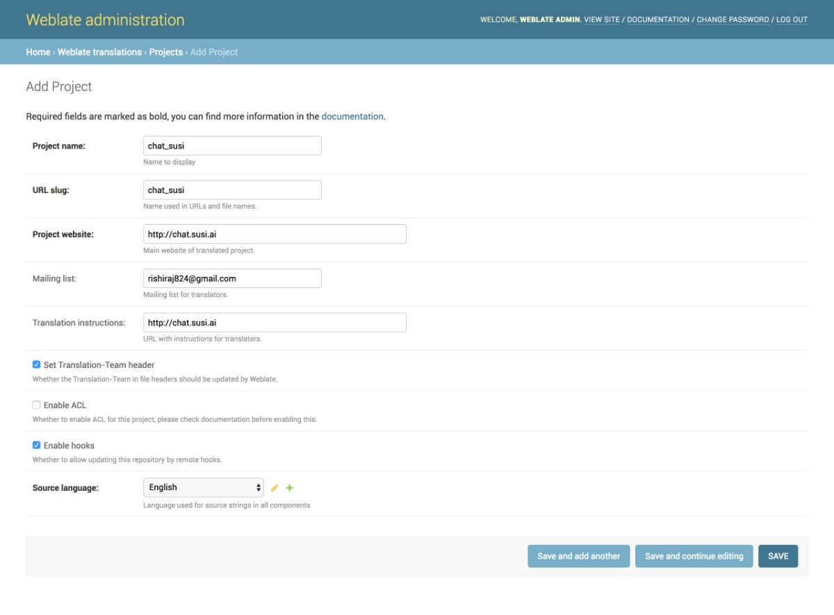
  1. We then add a project from our Admin dashboard by filling details in the following manner as shown in the image
  2. Once the project is added, we add the component to link our Translation files as shown in the image.
  3. Once the files are linked we will see our Overview Project Page and the Information. It can be seen in the image below. The screenshot shows a 100% translation that means all of our strings are translated correctly for German.
  4. To change any translation we make changes and push it to the repository where our SSH key generated from Weblate is added. A full guide to do that is mentioned in this link.
  5. We can push any changes to the repository by making changes in our local. This will generate a commit from the Weblate Admin in our repository as seen in the following screenshot.

Resources

  1. React Internationalization Library  – react-intl
  2. Official Docs about Weblate – Weblate docs.
  3. Format for po/pot files, JSON files etc. – https://docs.weblate.org/en/latest/formats.html#json-and-nested-structure-json-files
  4. Weblate – https://weblate.org
Continue ReadingImplementing Internationalization with Weblate Integration on SUSI Web Chat