Implementing Order Statistics API on Tickets Route in Open Event Frontend

The order statistics API endpoints are used to display the statistics related to tickets, orders, and sales. It contains the details about the total number of orders, the total number of tickets sold and the amount of the sales. It also gives the detailed information about the pending, expired, placed and completed orders, tickets, and sales.

This article will illustrate how the order statistics can be displayed using the Order Statistics API in Open Event Frontend. The primary end point of Open Event API with which we are concerned with for statistics is

GET /v1/events/{event_identifier}/order-statistics

First, we need to create a model for the order statistics, which will have the fields corresponding to the API, so we proceed with the ember CLI command:

ember g model order-statistics-tickets

Next, we need to define the model according to the requirements. The model needs to extend the base model class. The code for the model looks like this:

import attr from 'ember-data/attr';
import ModelBase from 'open-event-frontend/models/base';

export default ModelBase.extend({
  orders  : attr(),
  tickets : attr(),
  sales   : attr()
});

As we need to display the statistics related to orders, tickets, and sales so we have their respective variables inside the model which will fetch and store the details from the API.

Now, after creating a model, we need to make an API call to get the details. This can be done using the following:

return this.modelFor('events.view').query('orderStatistics', {});

Since the tickets route is nested inside the event.view route so, first we are getting the model for event.view route and then we’re querying order statistics from the model.

The complete code can be seen here.

Now, we need to call the model inside the template file to display the details. To fetch the total orders we can write like this

{{model.orders.total}}


In a similar way, the total sales can be displayed like this.

{{model.sales.total}}


And total tickets can be displayed like this

{{model.tickets.total}}


If we want to fetch other details like the pending sales or completed orders then the only thing we need to replace is the total attribute. In place of total, we can add any other attribute depending on the requirement. The complete code of the template can be seen here.

The UI for the order statistics on the tickets route looks like this.

Fig. 1: The user interface for displaying the statistics

The complete source code can be seen here.

Resources:

Continue ReadingImplementing Order Statistics API on Tickets Route in Open Event Frontend

Implementing Pages API in Open Event Frontend

The pages endpoints are used to create static pages which such as about page or any other page that doesn’t need to be updated frequently and only a specific content is to be shown. This article will illustrate how the pages can be added or removed from the /admin/content/pages route using the pages API in Open Event Frontend. The primary end point of Open Event API with which we are concerned with for pages is

GET /v1/pages

First, we need to create a model for the pages, which will have the fields corresponding to the API, so we proceed with the ember CLI command:

ember g model page

Next, we need to define the model according to the requirements. The model needs to extend the base model class. The code for the page model looks like this:

import attr from 'ember-data/attr';
import ModelBase from 'open-event-frontend/models/base';

export default ModelBase.extend({
  name        : attr('string'),
  title       : attr('string'),
  url         : attr('string'),
  description : attr('string'),
  language    : attr('string'),
  index       : attr('number', { defaultValue: 0 }),
  place       : attr('string')
});

As the page will have name, title, url which will tell the URL of the page, the language, the description, index and the place of the page where it has to be which can be either a footer or an event.

The complete code for the model can be seen here.

Now, after creating a model, we need to make an API call to get and post the pages created. This can be done using the following:

return this.get('store').findAll('page');

The above line will check the store and find all the pages which have been cached in and if there is no record found then it will make an API call and cache the records in the store so that when called it can return it immediately.

Since in the case of pages we have multiple options like creating a new page, updating a new page, deleting an existing page etc. For creating and updating the page we have a form which has the fields required by the API to create the page.  The UI of the form looks like this.

Fig. 1: The user interface of the form used to create the page.

Fig. 2: The user interface of the form used to update and delete the already existing page

The code for the above form can be seen here.

Now, if we click the items which are present in the sidebar on the left, it enables us to edit and update the page by displaying the information stored in the form and then the details be later updated on the server by clicking the Update button. If we want to delete the form we can do so using the delete button which first shows a pop up to confirm whether we actually want to delete it or not. The code for displaying the delete confirmation pop up looks like this.

<button class="ui red button" 
{{action (confirm (t 'Are you sure you would like to delete this page?') (action 'deletePage' data))}}>
{{t 'Delete'}}</button>


The code to delete the page looks like this

deletePage(data) {
    if (!this.get('isCreate')) {
      data.destroyRecord();
      this.set('isFormOpen', false);
    }
  }

In the above piece of code, we’re checking whether the form is in create mode or update mode and if it’s in create mode then we can destroy the record and then close the form.

The UI for the pop up looks like this.

Fig.3: The user interface for delete confirmation pop up

The code for the entire process of page creation to deletion can be checked here

To conclude, this is how we efficiently do the process of page creation, updating and deletion using the Open-Event-Orga pages API  ensuring that there is no unnecessary API call to fetch the data and no code duplication.

Resources:

Continue ReadingImplementing Pages API in Open Event Frontend

Making Skill Display Cards Identical in SUSI.AI Skill CMS

SUSI.AI Skill CMS shows all the skills of SUSI.AI. The cards used to display all the skills follow flexbox structure and adjust their height according to content. This lead to cards of different sizes and this needed to be fixed. This needed to fix as the cards looked like this:

The cards display following things:

  • Image related to skill
  • An example query related to skill in double quotes
  • Name of skill
  • Short description of skill

Now to get all these, we make an ajax call to the following endpoint:

http://api.susi.ai/cms/getSkillList.json?model='+ this.state.modelValue + '&group=' + this.state.groupValue + '&language=' + this.state.languageValue

Explanation:

  • this.state.modelValue: This is the model of the skill, stored in state of component
  • this.state.groupValue: This represents the group to which skill belongs to. For example Knowledge, Communication, Music, and Audio, etc.
  • this.state.languageValue: This represents the ISO language code of language in which skill is defined

Now the response is in JSONP format and it looks like:

Now we parse the response to get the information needed and return the following Card(Material UI Component):

<Link key={el}
     to={{
        pathname: '/' + self.state.groupValue + '/' + el + '/' + self.state.languageValue,
            state: {
                        url: url,
                        element: el,
                        name: el,
                        modelValue: self.state.modelValue,
                        groupValue: self.state.groupValue,
                        languageValue: self.state.languageValue,
                       }
           }}>
           <Card style={styles.row} key={el}>
                <div style={styles.right} key={el}>
                       {image ? <div style={styles.imageContainer}>
                        <img alt={skill_name}
                          src={image}
                          style={styles.image} />
                          </div> :
                         <CircleImage name={el} size='48' />}
                             <div style={styles.titleStyle}>{examples}</div>
                             </div>
                             <div style={styles.details}>
                                 <h3 style={styles.name}>{skill_name}</h3>
                                 <p style={styles.description}>{description}</p>
                             </div>
         </Card>
</Link>

Now the information that leads to non-uniformity in these cards is the skill description. Now to solve this we decided to put a certain limit to the description length and if that limit is crossed, then we will show the following dots: “”. The height and width of the cards were fixed according to screen size and we modified the description as follows:

if (skill.descriptions) {
      if (skill.descriptions.length > 120) {
          description = skill.descriptions.substring(0, 119) + '...';
      }
      else {
          description = skill.descriptions;
      }
}

This way no content was being cut and all the skill cards looks identical:

Resources:

Continue ReadingMaking Skill Display Cards Identical in SUSI.AI Skill CMS

Implementing Author’s Skill Page in SUSI.AI CMS

SUSI.AI Skill CMS is improving every day and we keep adding new features to it. Recently a feature was added to display all the skills by an author. This feature only showed the list of skills. The user might want to visit the skill page to see the description so we linked the skills on the list to skill page. The list looked like this:

We need to link skill name and image to respective skill page. Now since this is react based app, we do not have different URL for different skills due to SPA. The description, images and other relevant details of skills were being passed as props. We needed to have routes through which we can directly access the skill. This was done by implementing child routes for Skill CMS. Earlier the description, images, and other relevant data was being passed as props from the BrowseSkill component, but now we need to derive this from the URL:

let baseUrl = 'http://api.susi.ai/cms/getSkillMetadata.json';           
let modelValue = "general";
this.name = this.props.location.pathname.split('/')[2];
this.groupValue = this.props.location.pathname.split('/')[1];
this.languageValue = this.props.location.pathname.split('/')[3];
url = baseUrl + '?model=' + modelValue + '&group=' + this.groupValue +        '&language=' + this.languageValue + '&skill=' + this.name;

We now make an ajax call to this URL for fetching the data:

$.ajax({
               url: url,
               jsonpCallback: 'pc',
               dataType: 'jsonp',
               jsonp: 'callback',
               crossDomain: true,
               success: function (data) {
                   self.updateData(data.skill_metadata)
               }
           });

This updates the skill page with the description, image, author and other relevant details of the skills. Now all left to do is link the skills on the list to their respective links. This is done by following code:

We define skillURL as:

let skillURL = 'http://skills.susi.ai/' + parse[6] + '/' + parse[8].split('.')[0] + '/' + parse[7];

Here parse is an array which contains model, group and ISO language code of the skill. We updated the Image and text component as:

<a
   href={skillURL} >
   <Img
     style={imageStyle}
     src={[
           image1,
           image2
          ]}
     unloader={<CircleImage name={name} size="40"/>}
                          />
</a>
<a
   href={skillURL}
   className="effect-underline" >
    {name}
</a>

Now after proper styling, we had the following looking skill list by author:

Resources

Continue ReadingImplementing Author’s Skill Page in SUSI.AI CMS

Implementing Internationalization with Weblate Integration on SUSI Web Chat

SUSI Web Chat supports different browser languages on the Chat UI. The content used to render the date/time formats and the text is translated to the preferred language based on the language selected in the Language Settings.

To test it out on SUSI Web Chat, 

  1. Head over to http://chat.susi.ai
  2. Go to settings from the right dropdown.
  3. Set your preferred language inside Language Settings.
  4. Save and see the SUSI Chat render in the preferred language.

To achieve Internationalization, a number of important steps are to be followed –

  1. The best approach to follow would be to use po/pot files and get the translated string from the files. The format of the files can be used as follows. This is a JSON Structure for Javascript Projects. (File : de.json)
{
   "About":"About",
   "Chat":"Chat",
   "Skills":"Skills",
   "Settings":"Settings",
   "Login":"Login",
   "Logout":"Logout",
   "Themes": "Themes",
}


2. After creating the valid po/pot files in the right formats, we create a component which shall translate our text in the selected language and will import that particular string from that po file. To make it easier in Javascript we are using the JSON files that we created here.

3. Our Translate.react.js component is a special component which shall return us only a <span> text which shall get the User’s preferred language from the store and import that particular po/pot file and match the key as text which is being passed to it and give us the translated text. The following code snippet explains the above sentences more precisely.

changeLanguage = (text) => {
        this.setState({
            text:text
        })
  }
  // Here 'de' is the JSON file which we imported into this component
  componentDidMount() {
    let defaultPrefLanguage = this.state.defaultPrefLanguage;
    var arrDe = Object.keys(de);
    let text = this.state.text;
    if(defaultPrefLanguage!=='en-US'){
      for (let key=0;key<arrDe.length;key++) {
          if (arrDe[key]===text) {
              this.changeLanguage(de[arrDe[key]]);
          }
        }
    }
  } 
   render() {
        return <span>{this.state.text}</span>
     }

4. The next step is to bind all the text throughout our components into this <Translate text=” ”/> component which shall send us back the translated content. So any string in any component can be replaced with the following.

<Translate text="About" />

Here the text “About” is being sent over to the Translate.react.js component and it is getting us the German translation of the string About from the file de.json.

5. We then render the Translated content in our Chat UI. (File: Translate.react.js)


About Weblate

Weblate is a Web based translation tool with git integration supporting wide range of file formats and making it easy for translators to contribute. The translations should be kept within the same repository as source code and translation process should closely follow development. To know more about Weblate go to this link.

Integrating SUSI Web Chat with Weblate

  1. First, we deploy Weblate on our localhost using the installation guide given in these docs. I used the pip installation guide for Weblate as mentioned in this link. After doing that we copy weblate/settings_example.py to weblate/settings.py. Then we configure settings.py and use the following command to migrate the settings.
./manage.py migrate
  1. Next step is to create an admin using the following command.
./manage.py createadmin
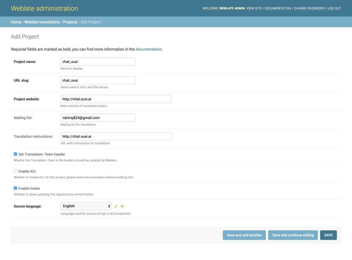
  1. We then add a project from our Admin dashboard by filling details in the following manner as shown in the image
  2. Once the project is added, we add the component to link our Translation files as shown in the image.
  3. Once the files are linked we will see our Overview Project Page and the Information. It can be seen in the image below. The screenshot shows a 100% translation that means all of our strings are translated correctly for German.
  4. To change any translation we make changes and push it to the repository where our SSH key generated from Weblate is added. A full guide to do that is mentioned in this link.
  5. We can push any changes to the repository by making changes in our local. This will generate a commit from the Weblate Admin in our repository as seen in the following screenshot.

Resources

  1. React Internationalization Library  – react-intl
  2. Official Docs about Weblate – Weblate docs.
  3. Format for po/pot files, JSON files etc. – https://docs.weblate.org/en/latest/formats.html#json-and-nested-structure-json-files
  4. Weblate – https://weblate.org
Continue ReadingImplementing Internationalization with Weblate Integration on SUSI Web Chat

Twitter Followers Insight App for loklak Apps Site

Twitter Followers Insight, is an app for checking the followers and following lists of an account and as we click on a name, the chain continues. The app also helps to visualize the data, which is returned from the loklak user information API, where it shows the distribution of followers and following across the world in the form of pie chart.

Related issue: https://github.com/fossasia/apps.loklak.org/pull/291

Developing the App

In the initial stage of the app, the main challenge faced was to implement the clickable feature i.e., make the name of the users in the list which gets displayed should be clickable which navigates to the next list to display as the query changes. Well this was tricky but easy to solve as I had to take the Angular JS with input parameter.

Script for storing and displaying the data:

The script below shows how to details are being fetched from the JSON object which is returned by the loklak Userdata API. The data or details is then being stored into an list/array which is a scope variable. The array is then iterated in a particular fashion how I want to get it displayed.

Storing the data:

for (var i = 0; i < followers.length; i++) {
    user = followers[i].screen_name;
    name = followers[i].name;
    followers_count = followers[i].followers_count;
    pic = followers[i].profile_image_url;
    followers_loc.push(followers[i].location_country);
    followerslist.push([user, pic, name, followers_count]);
}


The below script shows how the array i.e., showed in the above code, being used and iterated over. Here in this script I used a “ng-repeat” angular function where the list/array is iterated till the limit. The script also display in which order the data is getting displayed on the screen. The clickable feature is set in the “ng-click” angular function, where we are calling the Search function with query as the input parameter.

Displaying the data with clickable feature:

<ul class="gallery-container" >
    <li class="gallery-item" style="list-style-type: none;" ng-repeat="value in followersStatus | limitTo: limitFollowers">
        <a href ng-click="Search(value[0])">
            
class="item-image"> src="{{ value[1] }}" style="height: 94px;width: 94px" />
class="item-desc">
class="item-name"> {{ value[2] }}
class="item-handle"> @{{ value[0] }}
class="item-followers"> class="item-label">Followers: class="item-content">{{ value[3] }}
</div> </a> </li> </ul>


Visualizing Followers and Following data using Pie Chart

In this app, the data of user’s followers and following is visualized on the basis of the location they live in. This data is visualized in the form of pie chart using Highcharts.

Script for displaying pie chart:

             $('.pie-chart').highcharts({
                chart: {
                    plotBackgroundColor: null,
                    plotBorderWidth: null,
                    plotShadow: false,
                    type: 'pie'
                },
                title: {
                    text: "Followers"
                },
                tooltip: {
                    pointFormat: '{series.name}: <b>{point.percentage:.1f}%</b>'
                },
                plotOptions: {
                    pie: {
                        allowPointSelect: true,
                        cursor: 'pointer',
                        dataLabels: {
                            enabled: true,
                            format : '',
                            style: {
                                color: (Highcharts.theme && Highcharts.theme.contrastTextColor) || 'black'
                            }
                        }
                    }
                },
                series: [{
                    name: "Followers",
                    colorByPoint: true,
                    data: $scope.locations
                }]
            });


Resources

  • Learn more about AngularJS here.
  • Learn more about Highcharts here.
  • Learn more about Loklak API here.
Continue ReadingTwitter Followers Insight App for loklak Apps Site

Deploy to Azure Button for loklak

In this blog post, am going to tell you about yet a new deployment method for loklak which is easy and quick with just one click. Deploying to Azure Websites from a Git repository just got a little easier with the Deploy to Azure Button. Simply place the button in README.md with a link to the loklak, and users who click on it will be directed to a streamlined deployment process. If we want to do something more advanced and customize this behavior, then add an ARM template called “azuredeploy.json” at the root of the repository which will cause users to be presented with different inputs and configure your services as specified.

I’m going to walk you through a workflow that I used to test them before checking them in to my repo, as well as describe some of the special behaviors that the “Deploy to Azure” site does

Adding a button

To add a deployment button, insert the following markdown to your README.md file:

[![Deploy to Azure](https://azuredeploy.net/deploybutton.svg)](https://deploy.azure.com/?repository=https://github.com/loklak/loklak_server)

How it works

When a user clicks on the button, a “referrer” header is sent to azuredeploy.net which contains the location of the Git repository of loklak_server to deploy from.

An Example Template

This is a blank template which shows, how the azure divides its inputs.

{
  "$schema": "https://schema.management.azure.com/schemas/2015-01-01/deploymentTemplate.json#",
  "contentVersion": "1.0.0.0",
  "parameters": {
  },
  "variables": {
  },
  "resources": [
  ],
  "outputs": {
  }
}

By following the above template, in the case of loklak server, the parameters used are name, image i.e., docker image, port , number of CPUs to be utilized and space i.e., memory required.

In the resources section we use container, the type of the container will be

"type": "Microsoft.ContainerInstance/containerGroups",


And as output, we expect a public IP address to access the azure cloud instance created by us.

Everything under the root “parameters” property will be inputs into our template. Then these parameter values feed into the resources defined later in the template with the “[parameters(‘paramName’)]” syntax.

Try the “Deploy to Azure” Button here:


Resources

Continue ReadingDeploy to Azure Button for loklak

Performing Oscillator Experiments with PSLab

Using PSLab we can read the waveform generated by different Oscillators. First, let’s discuss what’s an Oscillator? An Oscillator is an electronic circuit that converts unidirectional current flow from a DC source into an alternating waveform. Oscillators can produce a sine wave, triangular wave or square wave. Oscillators are used in computers, clocks, watches, radios, and metal detectors. In this post, we are going to discuss 3 different types of Oscillators.

  • Colpitts Oscillator
  • Phase Shift Oscillator
  • Wien Bridge Oscillator

Colpitts Oscillator

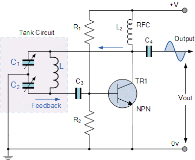
The Colpitts oscillator produces sinusoidal oscillations. The Colpitts oscillator has a tank circuit which consists of two capacitors in series and an inductor connected in parallel to the serial combination. The two capacitors in series produce a 180o phase shift which is inverted by another 180o to produce the required positive feedback. The frequency of the oscillations is determined by the value of the capacitors and inductor in the tank circuit.

Image source

Image source

Phase Shift Oscillator

A phase-shift oscillator produces a sine wave output using regenerative feedback obtained from the combination of resistor and capacitor. This regenerative feedback from the RC network is due to the ability of the capacitor to store an electric charge.

Image source

Wien bridge oscillator

A Wien bridge oscillator generates sine waves. It can generate a large range of frequencies and is based on a bridge circuit. It employs two transistors, each producing a phase shift of 180°, and thus producing a total phase-shift of 360° or 0°. It is simple in design, compact in size, and stable in its frequency output.


Image source

Mapping output waves from the Oscillator Circuits in PSLab Android app

To make PSLab Android app to support experiments related to read the waveforms received from the Oscillator we reused Oscilloscope Activity. In order to analyze the frequencies of the waves captured, we used sine fitting. Sine fitting function simply takes the data points and returns the amplitude, frequency, offset and phase shift of the wave.

The following is a glimpse of output signals from the Oscillators being captured by PSLab Android.

Resources

Read more on Oscillator from the following links

Continue ReadingPerforming Oscillator Experiments with PSLab

Auto Deployment of SUSI Web Chat on gh-pages with Travis-CI

SUSI Web Chat uses Travis CI with a custom build script to deploy itself on gh-pages after every pull request is merged into the project. The build system auto updates the latest changes hosted on chat.susi.ai. In this blog, we will see how to automatically deploy the repository on gh pages.

To proceed with auto deploy on gh-pages branch,

  1. We first need to setup Travis for the project.
  2. Register on https://travis-ci.org/ and turn on the Travis for this repository.

Next, we add .travis.yml in the root directory of the project.

# Set system config
sudo: required
dist: trusty
language: node_js

# Specifying node version
node_js:
  - 6

# Running the test script for the project
script:
  - npm test

# Running the deploy script by specifying the location of the script, here ‘deploy.sh’ 

deploy:
  provider: script
  script: "./deploy.sh"


# We proceed with the cache if there are no changes in the node_modules
cache:
  directories:
    - node_modules

branches:
  only:
    - master

To find the code go to https://github.com/fossasia/chat.susi.ai/blob/master/.travis.yml

The Travis configuration files will ensure that the project is building for every change made, using npm test command, in our case, it will only consider changes made on the master branch.

If one wants to watch other branches one can add the respective branch name in travis configurations. After checking for build passing we need to automatically push the changes made for which we will use a bash script.

#!/bin/bash

SOURCE_BRANCH="master"
TARGET_BRANCH="gh-pages"

# Pull requests and commits to other branches shouldn't try to deploy.
if [ "$TRAVIS_PULL_REQUEST" != "false" -o "$TRAVIS_BRANCH" != "$SOURCE_BRANCH" ]; then
    echo "Skipping deploy; The request or commit is not on master"
    exit 0
fi

# Save some useful information
REPO=`git config remote.origin.url`
SSH_REPO=${REPO/https:\/\/github.com\//git@github.com:}
SHA=`git rev-parse --verify HEAD`

ENCRYPTED_KEY_VAR="encrypted_${ENCRYPTION_LABEL}_key"
ENCRYPTED_IV_VAR="encrypted_${ENCRYPTION_LABEL}_iv"
ENCRYPTED_KEY=${!ENCRYPTED_KEY_VAR}
ENCRYPTED_IV=${!ENCRYPTED_IV_VAR}
openssl aes-256-cbc -K $ENCRYPTED_KEY -iv $ENCRYPTED_IV -in deploy_key.enc -out ../deploy_key -d

chmod 600 ../deploy_key
eval `ssh-agent -s`
ssh-add ../deploy_key

# Cloning the repository to repo/ directory,
# Creating gh-pages branch if it doesn't exists else moving to that branch
git clone $REPO repo
cd repo
git checkout $TARGET_BRANCH || git checkout --orphan $TARGET_BRANCH
cd ..

# Setting up the username and email.
git config user.name "Travis CI"
git config user.email "$COMMIT_AUTHOR_EMAIL"

# Cleaning up the old repo's gh-pages branch except CNAME file and 404.html
find repo/* ! -name "CNAME" ! -name "404.html" -maxdepth 1  -exec rm -rf {} \; 2> /dev/null
cd repo

git add --all
git commit -m "Travis CI Clean Deploy : ${SHA}"

git checkout $SOURCE_BRANCH

# Actual building and setup of current push or PR.
npm install
npm run build
mv build ../build/

git checkout $TARGET_BRANCH
rm -rf node_modules/
mv ../build/* .
cp index.html 404.html

# Staging the new build for commit; and then committing the latest build
git add -A
git commit --amend --no-edit --allow-empty

# Deploying only if the build has changed
if [ -z `git diff --name-only HEAD HEAD~1` ]; then

  echo "No Changes in the Build; exiting"
  exit 0

else
  # There are changes in the Build; push the changes to gh-pages
  echo "There are changes in the Build; pushing the changes to gh-pages"

  # Actual push to gh-pages branch via Travis
  git push --force $SSH_REPO $TARGET_BRANCH
fi

This bash script will enable Travis CI user to push changes to gh pages, for this we need to store the credentials of the repository in encrypted form.

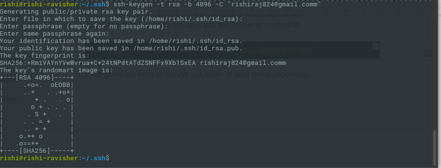
1. To get the public/private rsa keys we use the following command

ssh-keygen -t rsa -b 4096 -C "your_email@example.com"

2.  It will generate keys in .ssh/id_rsa folder in your home repository.

  1. Make sure you do not enter any passphrase while generating credentials otherwise Travis will get stuck at the time of decryption of the keys.
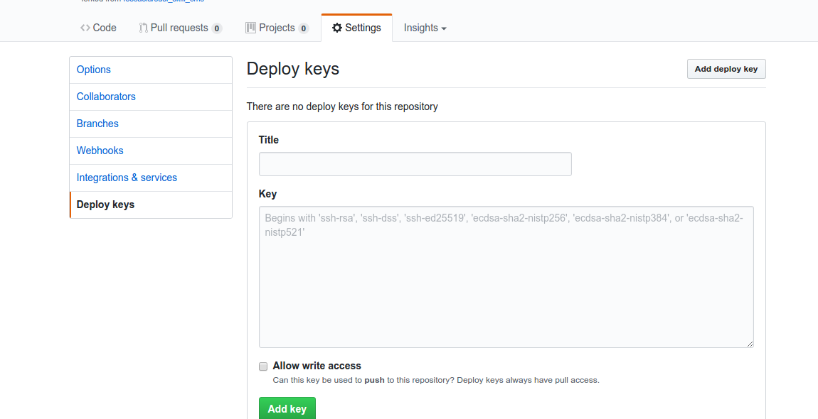
  2. Copy the public key and deploy the key to repository by visiting  

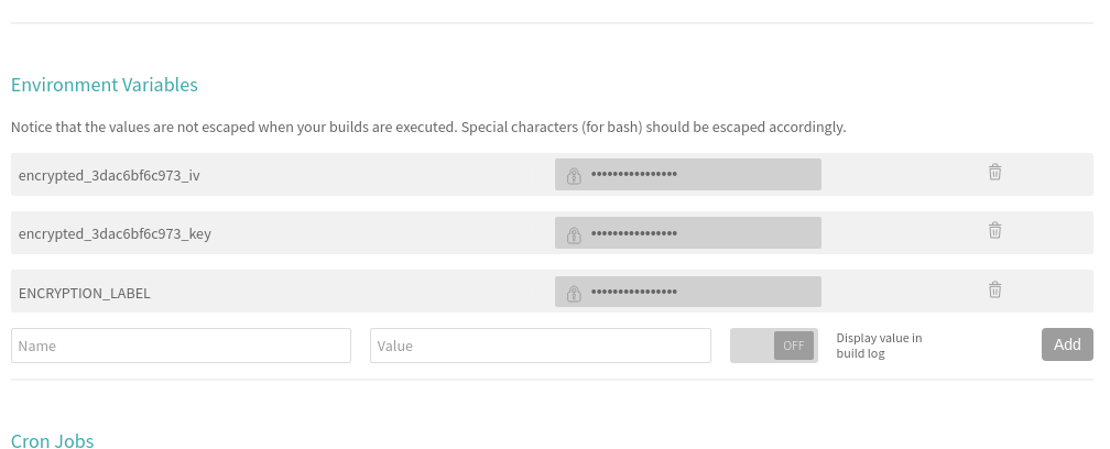
5. We also need to set the environment variable ENCRYPTED_KEY in Travis. Here’s a screenshot where to set it in the Travis repository dashboard.

6. Next, install Travis for encryption of keys.

sudo apt install ruby ruby-dev
sudo gem install travis

7. Make sure you are logged in to Travis, to login use the following command.

travis login

8. Make sure you have copied the ssh to deploy_key and then encrypt your private deploy_key and add it to root of your repository, use command –

travis encrypt-file deploy_key

9. After successful encryption, you will see a message

Please add the following to your build script (before_install stage in your .travis.yml, for instance):

openssl aes-256-cbc -K $encrypted_3dac6bf6c973_key -iv $encrypted_3dac6bf6c973_iv -in deploy_key.enc -out ../deploy_key -d
  1. Add the above-generated deploy_key in Travis and push the changes on your master branch. Do not push the deploy_key only the encryption file i.e., deploy_key.enc
  1. Finally, push the changes and create a Pull request and merge it to test the deployment. Visit Travis logs for more details and debugging.

Resources

Continue ReadingAuto Deployment of SUSI Web Chat on gh-pages with Travis-CI

Feeds Moderation in loklak Media Wall

Loklak Media Wall provides client side filters for entities received from loklak status.json API like blocking feeds from a particular user, removing duplicate feeds, hiding a particular feed post for moderating feeds. To implement it, we need pure functions which remove the requested type of feeds and returns a new array of feeds. Moreover, the original set of data must also be stored in an array so that if filters are removed, the requested data is provided to the user

In this blog, I would be explaining how I implemented client side filters to filter out a particular type of feeds and provide the user with a cleaner data as requested.

Types of filters

There are four client-side filters currently provided by Loklak media wall:

    • Profanity Filter: Checks for the feeds that might be offensive and removes it.
    • Remove Duplicate: Removes duplicate feeds and the retweets from the original feeds
    • Hide Feed: Removes a particular feed from the feeds
    • Block User: Blocks a User and removes all the feeds from the particular user

It is also important to ensure that on pagination, new feeds are filtered out based on the previous user requested moderation.

Flow Chart

The flow chart explains how different entities received from the server is filtered and how original set of entities is maintained so that if the user removes the filter, the original filtered entities are recovered.

Working

Profanity Filter

To avoid any obscene language used in the feed status to be shown up on media wall and providing a rather clean data, profanity filter can be used. For this filter, loklak search.json APIs provide a field classifier_profanity which states if there is some swear word is used in the status. We can check for the value of this field and filter out the feed accordingly.

export function profanityFilter(feeds: ApiResponseResult[]): ApiResponseResult[] {
const filteredFeeds: ApiResponseResult[] = [];
feeds.forEach((feed) => {
if ( feed.classifier_language !== null && feed.classifier_profanity !== undefined ) {
if (feed.classifier_profanity !== ‘sex’ &&  feed.classifier_profanity !== ‘swear’) {
filteredFeeds.push(feed);
}
}
else {
filteredFeeds.push(feed);
}
});
return filteredFeeds || feeds;
}

Here, we check if the classifier_profanity field is either not ‘swear’ or ‘sex’ which clearly classifies the feeds and we can push the status accordingly. Moreover, if no classifier_profanity field is provided for a particular field, we can push the feed in the filtered feeds.

Remove Duplicate

Remove duplicate filter removes the tweets that are either retweets or even copy of some feed and return just one original feed. We need to compare field id_str which is the status id of the feed and remove the duplicate feeds. For this filter, we need to create a map and compare feeds on map object and remove the duplicate feeds iteratively and return the array of feeds with unique elements.

export function removeDuplicateCheck(feeds: ApiResponseResult[]): ApiResponseResult[] {
const map = { };
const filteredFeeds: ApiResponseResult[] = [];
const newFeeds: ApiResponseResult[] = feeds;
let v: string;
for (let a = 0; a < feeds.length; a++) {
v = feeds[a].id_str;
if (!map[v]) {
filteredFeeds.push(feeds[a]);
map[v] = true;
}
}
return filteredFeeds;
}

Hide Feed

Hide Feed filter can be used to hide a particular feed from showing up on media wall. It can be a great option for the user to hide some particular feed that user might not want to see. Basically, when the user selects a particular feed, an action is dispatched with payload being the status id i.e. id_str. Now, we pass feeds and status id through a function which returns the particular feed. All the feeds with the same id_str are also removed from the feeds array.

export function hideFeed(feeds: ApiResponseResult[], statusId: string ): ApiResponseResult[] {
const filteredFeeds: ApiResponseResult[] = [];
feeds.forEach((feed) => {
if (feed.id_str !== statusId) {
filteredFeeds.push(feed);
}
});
return filteredFeeds || feeds;
}

User can undo the action and let the filtered feed again show up on media wall. Now, for implementing this, we need to pass original entities, filtered entities and the id_str of the particular entity through a function which checks for the particular entity with the same id_str and add it in the filtered entities and return the new array of filtered entities.

export function showFeed(originalFeeds: ApiResponseResult[], feeds: ApiResponseResult[], statusId: string ): ApiResponseResult[] {
const newFeeds = […feeds];
originalFeeds.forEach((feed) => {
if (feed.id_str === statusId) {
newFeeds.push(feed);
}
});
return newFeeds;
}

Block User

Block User filter can be used blocking feeds from a particular user/account from showing up on media wall. To implement this, we need to check for the User ID field user_id of the user and remove all the feeds from the same User ID. The function accountExclusion takes feeds and user_id (of the accounts) as a parameter and returns an array of filtered feeds removing all the feeds of the requested users/accounts.

export function accountExclusion(feeds: ApiResponseResult[], userId: string[] ): ApiResponseResult[] {
const filteredFeeds: ApiResponseResult[] = [];
let flag: boolean;
feeds.forEach((feed) => {
flag = false;
userId.forEach((user) => {
if (feed.user.user_id === user) {
flag = true;
}
});
if (!flag) {
filteredFeeds.push(feed);
}
});return filteredFeeds || feeds;
}

Key points

It is important to ensure that the new feeds (received on pagination or on a new query) must also be filtered according to the user requested filter. Therefore, before storing feeds in a state and supplying to templates after pagination, it must be ensured that new entities are also filtered out. For this, we need to keep boolean variables as a state property which checks if a particular filter is requested by a user and applies the filter to the new feeds accordingly and store filtered feeds in the filteredFeeds accordingly.

Also, the original feeds must be stored separately so that on removing filters the original feeds are regained. Here, entities stores the original entities received from the server.

case apiAction.ActionTypes.WALL_SEARCH_COMPLETE_SUCCESS: {
const apiResponse = action.payload;
let newFeeds = accountExclusion(apiResponse.statuses, state.blockedUser);
if (state.profanityCheck) {
newFeeds = profanityFilter(newFeeds);
}
if (state.removeDuplicate) {
newFeeds = removeDuplicateCheck(newFeeds);
}return Object.assign({}, state, {
entities: apiResponse.statuses,
filteredEntities: newFeeds,
lastResponseLength: apiResponse.statuses.length
});
}

case wallPaginationAction.ActionTypes.WALL_PAGINATION_COMPLETE_SUCCESS: {
const apiResponse = action.payload;
let newFeeds = accountExclusion(apiResponse.statuses, state.blockedUser);
if (state.profanityCheck) {
newFeeds = profanityFilter(apiResponse.statuses);
}
let filteredEntities = […newFeeds, state.filteredEntities];
if (state.removeDuplicate) {
filteredEntities = removeDuplicateCheck(filteredEntities);
}

return Object.assign({}, state, {
entities: [ apiResponse.statuses, state.entities ],
filteredEntities
});
}

Reference

Continue ReadingFeeds Moderation in loklak Media Wall