Reducing Initial Load Time Of Susper

Susper used to take long time to load the initial page. So, there was a discussion on how to decrease the initial loading time of Susper.

Later on going through issues raised in official Angular repository regarding the time takento load angular applications, we found some of the solutions. Those include:

  • Migrating from development to production during build:
    • This shrinks vendor.js and main.js by minimising them and also removing all packages that are not required on production.
    • Enables inline html and extracting CSS.
    • Disables source maps.
  • Enable Ahead of Time (AoT) compilation.
  • Enable service workers.

After these changes we found the following changes in Susper:

File Name Before (content-length) After
vendor.js 709752 216764
main.js 56412 138361

LOADING TIMES GRAPHS:

After:

Vendor file:

Main.js

Before:

Vendor file:

Main.js

Also we could see that all files are now initiated by service worker:

More about Service Workers could be read at Mozilla and Service Workers in Angular.

Implementation:

While deploying our application, we have added –prod and –aot as extra attributes to ng build .This enables angular to use production mode and ahead of time compilation.

For service workers we have to install @angular/service-worker module. One can install it by using:

npm install @angular/service-worker --save
ng set apps.0.serviceWorker=true

The whole implementation of this is available at this pull:

https://github.com/fossasia/susper.com/pull/597/files

Resources:


Continue ReadingReducing Initial Load Time Of Susper

Upload Images to OwnCloud and NextCloud in Phimpme Android

As increasing the stack of account manager in Phimpme Android. We have now two new items OwnCloud and NextCloud to add. Both are open source storage services. Provides complete source code of their official apps and libraries on Github. You can check below

OwnCloud: https://github.com/owncloud

NextCloud: https://github.com/nextcloud

This requires a hosting server, where you can deploy it and access it through their web app and Mobile apps. I added a feature in Phimpme to upload images directly to the server right from the app using their android-library.

Steps (How I did in Phimpme)

  • Add library in Application gradle file

Firstly, to work with, we need to add the android-library they provide.

compile "com.github.nextcloud:android-library:$rootProject.nextCloudVersion"

Check the new version from here and apply over it: https://github.com/nextcloud/android-library/releases

  • Login from Account Manager

As per our Phimpme app flow, User first connect itself from the account manager and then share image from app using these credentials. Added a new Login activity for OwnCloud and NextCloud both.


  • Saved credentials in Database

To use that further in android-library, I store the credentials in Realm database.

account.setServerUrl(data.getStringExtra(getString(R.string.server_url)));
account.setUsername(data.getStringExtra(getString(R.string.auth_username)));
account.setPassword(data.getStringExtra(getString(R.string.auth_password)));
  • Uploading image using library

As per the official guide of OwnCloud, used Created an object of OwnCloudClient. Set the username and password.

private OwnCloudClient mClient;
mClient = OwnCloudClientFactory.createOwnCloudClient(serverUri, this, true);
mClient.setCredentials(
       OwnCloudCredentialsFactory.newBasicCredentials(
               username,
               password
       )
);

Passed the image path which we are getting in the SharingActivity. Modified with adding the separator.

File fileToUpload = new File(saveFilePath);
String remotePath = FileUtils.PATH_SEPARATOR + fileToUpload.getName();

Used the UploadRemoteOperation Class and just need to pass the path, mimeType and timeStamp. The library have already defined functions to execute the upload operations.

UploadRemoteFileOperation uploadOperation =
       new UploadRemoteFileOperation(fileToUpload.getAbsolutePath(), remotePath, mimeType, timeStamp);
uploadOperation.execute(mClient, this, mHandler);

  • Setup Account using Docker and Digital Ocean

I have already a previous blog post on how to setup NextCloud or OwnCloud account on server using Digital Ocean and Docker.

Link: https://blog.fossasia.org/how-to-use-digital-ocean-and-docker-to-setup-test-cms-for-phimpme/

Resource:

  1. NextCloud Developer Mannual: https://docs.nextcloud.com/server/9/developer_manual/index.html
  2. OwnCloud Library installation: https://doc.owncloud.org/server/9.0/developer_manual/android_library/library_installation.html
  3. Examples: https://doc.owncloud.org/server/9.0/developer_manual/android_library/examples.html
Continue ReadingUpload Images to OwnCloud and NextCloud in Phimpme Android

Common Utility classes Progress Bar and Snack Bar in Phimpme Android

As the Phimpme Android is scaling very fast on its features, code gets redundant sometimes. Some of the widely used design widgets in Android are Progress Bar and Snack Bar. Progress Bar is shown to user when some process is happening in the background. Snackbar is a feedback operation to user of its recent process. In other words we can say Snackbar is the new toast in Android with a cool feature of setting action on them. So that User can interact with the feedback received on the process.

As In Phimpme lots of account Login and Logout progress happens. Uploading success and failure required Snackbar to show to the Users. So to remove the redundancy of the boilerplate of these codes, I added two Utilities class one is Phimpme ProgressbarHandler and other is SnackbarHandler in the app. Below is one by one code and explanation of both.

Progress Bar Handler

In the constructor I passed Context as parameter. Created a ViewGroup object and set view of android. Setting the progress bar style and length using Android core attributes such as progressBarStyleLarge and duration to setIndeterminate true.

private ProgressBar mProgressBar;

public PhimpmeProgressBarHandler(Context context) {
   ViewGroup layout = (ViewGroup) ((Activity) context).findViewById(android.R.id.content)
           .getRootView();

   mProgressBar = new ProgressBar(context, null, android.R.attr.progressBarStyleLarge);
   mProgressBar.setIndeterminate(true);


   RelativeLayout.LayoutParams params = new
           RelativeLayout.LayoutParams(RelativeLayout.LayoutParams.MATCH_PARENT,
           RelativeLayout.LayoutParams.MATCH_PARENT);

   RelativeLayout rl = new RelativeLayout(context);

   rl.setGravity(Gravity.CENTER);
   rl.addView(mProgressBar);

   layout.addView(rl, params);

   hide();

}

Next is used dynamically created Relative Layout object and setup the parameters for width and height as MATCH_PARENT. Setting gravity of the layout to center and added the progress bar view on it using the addView method. So basically we have a progress bar ready and we dynamically created a relative layout and added the view over it.

The function used in setting up the views and progress bar are from AOSP only.

After that a Progressbar is set, we now need functions to show and hide the progress bar in the code. Created two functions show() and hide().

public void show() {
   mProgressBar.setVisibility(View.VISIBLE);
}

public void hide() {
   mProgressBar.setVisibility(View.INVISIBLE);
}

These functions set the visibility of the the progress bar.

Usage:

Now in any class we can create object of our Progressbar handler class pass the context on it and use the show() and hide() methods wherever we want to show this and hide. Below is the code snippet to show the illustration.

phimpmeProgressBarHandler = new PhimpmeProgressBarHandler(this);

phimpmeProgressBarHandler.show();

phimpmeProgressBarHandler.hide();

Snackbar Handler

To do this, I created a separate class as Snackbar Handler. What we can do is to create a static function show() and inside the declaration, we can create an object of Snackbar and apply the styles to that.

As you can see in the code snippet below, I Created a static function with parameters such as View (to take the view instance), String (to show the message) and duration  of the Snackbar. Set Up the text, textsize and action on the snackbar. An “OK” action is predefined in the function only.

public static void show(View view, String text, int duration) {
   final Snackbar snackbar = Snackbar.make(view, text, duration);
   View sbView = snackbar.getView();
   TextView textView = (TextView)sbView.findViewById(android

.support.design.R.id.snackbar_text);
   textView.setTextColor(Color.WHITE);
   textView.setTextSize(12);
   snackbar.setAction("OK", new View.OnClickListener() {
       @Override
       public void onClick(View view) {
           snackbar.dismiss();
       }
   });
   snackbar.show();
}

Usage:

To use this directly call the show method pass the view and String of the message which you want to show on Snackbar. There are overloaded methods as well in which you can pass the durations. See the below code as example.

SnackBarHandler.show(parentLayout, getString(R.string.no_account_signed_in));

Resources

Continue ReadingCommon Utility classes Progress Bar and Snack Bar in Phimpme Android

Adding Transition Effect Using RxJS And CSS In Voice Search UI Of Susper


Susper has been given a voice search feature through which it provides a user with a better experience of search. We introduced to enhance the speech-recognition user interface by adding transition effects. The transition effect was required to display appropriate messages according to voice being detected or not. The following messages were:

  • When a user should start a voice search, it should display ‘Speak Now’ message for 1-2 seconds and then show up with message ‘Listening…’ to acknowledge user that now it is ready to recognize the voice which will be spoken.
  • If a user should do not speak anything, it should display ‘Please check audio levels or your microphone working’ message in 3-4 seconds and should exit the voice search interface.

The idea of speech UI was taken from the market leader and it was implemented in a similar way. On the homepage, it looks like this:

On the results page, it looks like this:

For creating transitions like, ‘Listening…’ and ‘Please check audio levels and microphone’ messages, we used CSS, RxJS Observables and timer() function.

Let’s start with RxJS Observables and timer() function.

RxJS Observables and timer()

timer() is used to emit numbers in sequence in every specified duration or after a given duration. It acts as an observable. For example:

let countdown = Observable.timer(2000);
The above code will emit value of countdown in 2000 milliseconds. Similarly, let’s see another example:
let countdown = Observable.timer(2000, 6000);
The above code will emit value of countdown in 2000 milliseconds and subsequent values in every 6000 milliseconds.
export class SpeechToTextComponent implements OnInit {
  message: any = ‘Speak Now’;
  timer: any;
  subscription: any;
  ticks: any;
  miccolor: any = #f44;
}
ngOnInit() {
  this.timer = Observable.timer(1500, 2000);
  this.subscription = this.timer.subscribe(t => {
  this.ticks = t;// it will throw listening message after 1.5   sec
  if (t === 1) {
    this.message = Listening;
  }// subsequent events will be performed in 2 secs interval
  // as it has been defined in timer()
  if (t === 4) {
    this.message = Please check your microphone audio levels.;
    this.miccolor = #C2C2C2;
}// if no voice is given, it will throw audio level message
// and unsubscribe to the event to exit back on homepage
  if (t === 6) {
    this.subscription.unsubscribe();
    this.store.dispatch(new speechactions.SearchAction(false));
  }
 });
}
The above code will throw following messages at a particular time. For creating the text-animation effect, most developers go for plain javascript. The text-animation effects can also be achieved by using pure CSS.

Text animation using CSS

@webkitkeyframes typing {from {width:0;}}
.spch {
  fontweight: normal;
  lineheight: 1.2;
  pointerevents: none;
  position: none;
  textalign: left;
  –webkitfontsmoothing: antialiased;
  transition: opacity .1s easein, marginleft .5s easein,                  top  0s linear 0.218s;
  –webkitanimation: typing 2s steps(21,end), blinkcaret .5s                       stepend infinite alternate;
  whitespace: nowrap;
  overflow: hidden;
  animationdelay: 3.5s;
}
@keyframes specifies animation code. Here width: 0; tells that animation begins from 0% width and ends to 100% width of the message. Also, animation-delay: 3.5s has been adjusted w.r.t timer to display messages with animation at the same time.
This is how it works now:

The source code for the implementation can be found in this pull request: https://github.com/fossasia/susper.com/pull/663

Resources:


Continue ReadingAdding Transition Effect Using RxJS And CSS In Voice Search UI Of Susper

Adding Color Options in loklak Media Wall

Color options in loklak media wall gives user the ability to set colors for different elements of the media wall. Taking advantage of Angular two-way data binding property and ngrx/store, we can link up the CSS properties of the elements with concerned state properties which stores the user-selected color. This makes color customization fast and reactive for media walls.

In this blog here, I am explaining the unidirectional workflow using ngrx for updating various colors and working of color customization.

Flow Chart

The flowchart below explains how the color as a string is taken as an input from the user and how actions, reducers and component observables link up to change the current CSS property of the font color.

Working

Designing Models: It is important at first to design model which must contain every CSS color property that can be customized. A single interface for a particular HTML element of media wall can be added so that color customization for a particular element can take at once with faster rendering. Here we have three interfaces:

  • WallHeader
  • WallBackground
  • WallCard

These three interfaces are the models for the three core components of the media wall that can be customized.

export interface WallHeader {
backgroundColor: string;
fontColor: string;
}
export interface WallBackground {
backgroundColor: string;
}
export interface WallCard {
fontColor: string;
backgroundColor: string;
accentColor: string;
}


Creating Actions: Next step is to design actions for customization. Here we need to pass the respective interface model as a payload with updated color properties. These actions when dispatched causes reducer to change the respective state property, and hence, the linked CSS color property.

export class WallHeaderPropertiesChangeAction implements Action {
type = ActionTypes.WALL_HEADER_PROPERTIES_CHANGE;constructor(public payload: WallHeader) { }
}
export class WallBackgroundPropertiesChangeAction implements Action {
type = ActionTypes.WALL_BACKGROUND_PROPERTIES_CHANGE;constructor(public payload: WallBackground) { }
}
export class WallCardPropertiesChangeAction implements Action {
type = ActionTypes.WALL_CARD_PROPERTIES_CHANGE;constructor(public payload: WallCard) { }
}


Creating reducers: Now, we can proceed to create reducer functions so as to change the current state property. Moreover, we need to define an initial state which is the default state for uncustomized media wall. Actions can now be linked to update state property using this reducer when dispatched. These state properties serve two purposes:

  • Updating Query params for Direct URL.
  • Updating Media wall Colors

case mediaWallCustomAction.ActionTypes.WALL_HEADER_PROPERTIES_CHANGE: {
const wallHeader = action.payload;return Object.assign({}, state, {
wallHeader
});
}case mediaWallCustomAction.ActionTypes.WALL_BACKGROUND_PROPERTIES_CHANGE: {
const wallBackground = action.payload;return Object.assign({}, state, {
wallBackground
});
}case mediaWallCustomAction.ActionTypes.WALL_CARD_PROPERTIES_CHANGE: {
const wallCard = action.payload;return Object.assign({}, state, {
wallCard
});
}


Extracting Data to the component from the store: In ngrx, the central container for states is the store. Store is itself an observable and returns observable related to state properties. We have already defined various states for media wall color options and now we can use selectors to return state observables from the store. These observables can now easily be linked to the CSS of the elements which changes according to customization.

private getDataFromStore(): void {
this.wallCustomHeader$ = this.store.select(fromRoot.getMediaWallCustomHeader);
this.wallCustomCard$ = this.store.select(fromRoot.getMediaWallCustomCard);
this.wallCustomBackground$ = this.store.select(fromRoot.getMediaWallCustomBackground);
}


Linking state observables to the CSS properties: At first, it is important to remove all the CSS color properties from the elements that need to be customized. Now, we will instead use style directive provided by Angular in the template which can be used to update CSS properties directly from the component variables. Since the customized color received from the central store are observables, we need to use the async pipe to extract string color data from it.

Here, we are updating background color of the wall.

<span class=“wrapper”
[style.background-color]=“(wallCustomBackground$ | async).backgroundColor”>
</span>


For other child components, we need to use @Input Decorator to send color data as an input to it and use the style directive as used above.

Here, we are interacting with the child component i.e. media wall card component using @Input Decorator.

Template:

<media-wall-card
[feedItem]=“item”
[wallCustomCard$]=“wallCustomCard$”></media-wall-card>


Component:

export class MediaWallCardComponent implements OnInit {
..
@Input() feedItem: ApiResponseResult;
@Input() wallCustomCard$: Observable<WallCard>;
..
}


This creates a perfect binding of CSS properties in the template with the state properties of color actions. Now, we can dispatch different actions to update the state and hence, the colors of media wall.

Reference

Continue ReadingAdding Color Options in loklak Media Wall

I2C Communication in PSLab

PSLab supports communication using the I2C protocol and both the Desktop App and the Android App have the framework set-up to use the I2C protocol. I2C protocol is mainly used by sensors which can be connected to PSLab. For supporting I2C communication, PSLab board has a separate block for I2C communication and has pins named 3.3V, GND, SCL and SDA. A brief overview of how I2C communication works and its advantages & limitations compared to SPI communication can be found here.

The PSLab Python and Java communication libraries have a class dedicated for I2C communication with numerous methods defined in them. The methods required for a particular I2C sensor may differ, however, in general most sensors utilise a certain common set of methods. The set of methods that are commonly used are listed below with their functions. For utilising the methods, the I2C bus is first notified using the HEADER byte (it is common to all the methods) and then a byte to uniquely determine the method in use.

The send method is used to send the data over the I2C bus. First the I2C bus is initialised and set to the correct slave address using I2C.start(address) followed by this method. The method takes the data to be sent as the argument.

def send(self, data):
    try:
        self.H.__sendByte__(CP.I2C_HEADER)
        self.H.__sendByte__(CP.I2C_SEND)
        self.H.__sendByte__(data)  # data byte
        return self.H.__get_ack__() >> 4
    except Exception as ex:
        self.raiseException(ex, "Communication Error , Function : " + inspect.currentframe().f_code.co_name)


The read method reads a fixed number of bytes from the I2C slave. One can also use I2C.simpleRead(address,  numbytes) instead to read from the I2C slave. This method takes the length of the data to be read as argument.  It fetches length-1 bytes with acknowledge bits for each.

def read(self, length):
     data = []
     try:
        for a in range(length - 1):
             self.H.__sendByte__(CP.I2C_HEADER)
             self.H.__sendByte__(CP.I2C_READ_MORE)
             data.append(self.H.__getByte__())
             self.H.__get_ack__()
       self.H.__sendByte__(CP.I2C_HEADER)
       self.H.__sendByte__(CP.I2C_READ_END)
       data.append(self.H.__getByte__())
       self.H.__get_ack__()
    except Exception as ex:
       self.raiseException(ex, "Communication Error , Function : " + inspect.currentframe().f_code.co_name)
   return data


The readBulk method reads the data from the I2C slave. This takes the I2C slave device address, the address of the device from which the data is to be read and the length of the data to be read as argument and the returns the bytes read in the form of a list.

def readBulk(self, device_address, register_address, bytes_to_read):
        try:
            self.H.__sendByte__(CP.I2C_HEADER)
            self.H.__sendByte__(CP.I2C_READ_BULK)
            self.H.__sendByte__(device_address)
            self.H.__sendByte__(register_address)
            self.H.__sendByte__(bytes_to_read)
            data = self.H.fd.read(bytes_to_read)
            self.H.__get_ack__()
            try:
                return [ord(a) for a in data]
            except:
                print('Transaction failed')
                return False
        except Exception as ex:
           self.raiseException(ex, "Communication Error , Function : " + inspect.currentframe().f_code.co_name)


The writeBulk method writes the data to the I2C slave. It takes address of the particular I2C slave for which the data is to be written and the data to be written as arguments.

def writeBulk(self, device_address, bytestream):
        try:
            self.H.__sendByte__(CP.I2C_HEADER)
            self.H.__sendByte__(CP.I2C_WRITE_BULK)
            self.H.__sendByte__(device_address)
            self.H.__sendByte__(len(bytestream))
            for a in bytestream:
                self.H.__sendByte__(a)
            self.H.__get_ack__()
        except Exception as ex:
  self.raiseException(ex, "Communication Error , Function : " + inspect.currentframe().f_code.co_name)


The scan method scans the I2C port for connected devices which utilise I2C as a communication mode. It takes frequency as an argument to set the frequency of the communication and is by default set to 100000. An array containing the addresses of the connected devices (which are integers) is returned.

def scan(self, frequency=100000, verbose=False):
        self.config(frequency, verbose)
        addrs = []
        n = 0
        if verbose:
            print('Scanning addresses 0-127...')
            print('Address', '\t', 'Possible Devices')
        for a in range(0, 128):
            x = self.start(a, 0)
            if x & 1 == 0:  # ACK received
                addrs.append(a)
                if verbose: print(hex(a), '\t\t', self.SENSORS.get(a, 'None'))
                n += 1
            self.stop()
       return addrs


Additional Sources

  1. Learn more about the principles behind i2c communication https://learn.sparkfun.com/tutorials/i2c
  2. A simple experiment to demonstrate use of i2c communication with Arduino http://howtomechatronics.com/tutorials/arduino/how-i2c-communication-works-and-how-to-use-it-with-arduino/
  3. Java counterpart of the PSLab I2C library https://github.com/fossasia/pslab-android/blob/master/app/src/main/java/org/fossasia/pslab/communication/peripherals/I2C.java
Continue ReadingI2C Communication in PSLab

High School Physics Practicals using PSLab Device

High school physics syllabus includes rather advanced concepts in the world of Physics; namely practicals related to sound, heat, light and electric. Almost all of these practicals are done in physics labs using conventional bulky equipments. Especially the practicals related to electrical and electronics. They use bulky oscilloscopes with complex controls and multimeter with so many controls. PSLab being a sophisticated device which integrates a whole science lab into a 2” by 2” small circuit, these practicals made easy and interesting.

There are several practicals required to be completed by a student before sitting for GCE (Advanced Level) examination. This blog post points out how to perform those experiments using PSLab device and several other tools required without having to use bulky instruments.

  • Calculating internal resistance and EMF of a dry cell

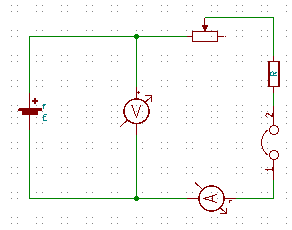
This experiment includes the above mentioned circuitry. Once the basic setup is completed using;
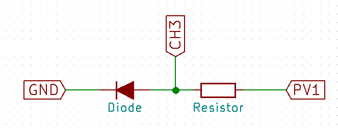
  • Dry cell
  • 10K variable resistor
  • 1K resistor
  • Switch/Jumper

Connect the CH1 pin and GND pin of PSLab across the dry cell and CH2 pin and GND across the Ammeter instead of the Ammeter. Once the pin connection is complete, plug the PSLab device to the computer and using the desktop application voltmeter, measure the voltage from CH1 and current from voltage value read from CH2 and the known resistance value of R. Record these data against step changes in the resistance of the variable resistor starting from a high value to a low value. Once there are sufficient data as much as 10 data set, using a graph paper draw the relation between current and voltage measured according to the equation given below.

E = V + Ir

V = -rI + E

This will produce a graph with a constant negative gradient. Gradient of the graph will produce the internal resistance of the dry cell.

  • I-V graphs for a semiconductor

This experiment will require;

  • Diode
  • 100 Ohms resistor

Conduct the experiment as follows once the circuit is set up. Increase the voltage provided by the PV1 pin of the PSLab by 100 mV per step and measure the voltage across diode using CH3 pin of PSLab device. Using that voltage and the supply voltage, calculate the current flowing through the resistor. Note down the readings as voltage to current pairs and plot them on a graph paper. The graph will produce the following results which is identical to common IV characteristics of a semiconductor.

Start A at zero and increase by 0.1V steps while measuring voltage and current across diode. (Image from Wikipedia)

Apart from this conventional experiment, PSLab provides an inbuilt experiment students and teachers can use. In the Electronics Experiments section, Diode IV characteristics experiment is configured in such a way that this experiment can be conducted very easily. The circuit configuration is the same and R value should be 1K. Once the step size is set to an appropriate resolution, START button will begin the experiment and provide with the final graph.

  • Transfer characteristics of a transistor

Set up the above mentioned circuitry on a breadboard and connect the appropriate pins of PSLab device as mentioned. In this experiment, student need to observe the increase in current/voltage across CH1 when PV2 is varying. We need to measure CH1 parameter value against PV2 voltage value and plot these two against to obtain the transfer characteristics of a BJT.

Apart from this conventional experiment, PSLab provides an inbuilt experiment to perform this lab exercise. Using “BJT Transfer Characteristics” experiment, students and teachers can easily obtain the characteristics curves by setting step sizes and voltage values to the required pins.

  • Ohm’s law

Configure the following circuit and connect PCS, CH1 and GND pins of PSLab into relevant positions. This experiment is to measure voltage across the resistor against the variation in current through the circuit. Increase current provided to the circuit using PCS pin and measure voltage using CH1 pin and plot against the current. The gradient will produce the resistor value.

In the electrical experiments section in PSLab application has a separate experiment to perform the Ohm’s Law experiment. Using this experiment, students can change the current values using the knob and record the voltage values related to that. Finally the plot can be generated which will be of a constant gradient.

  • Kirchhoff’s Laws
  • Voltage law

Kirchhoff’s Voltage law states that the directed sum of the voltage around any closed network is zero.

This law can be proved using the following circuit with the help of PSLab device. Connect the channel pins as per the diagram and measure voltages in the three channels. They will show a relationship as the directed sum of the combination will turn into a zero.

  • Current law

Kirchhoff’s current law states that at any node in a circuit, the sum of currents flowing into that node is equal to the sum of currents flowing out of that node; which is similar to the direct summation of currents in a node is zero.

Using the same circuit as above, measure the current flowing through each node using the voltage readings of the channels and known resistor values. Considering the sign of the current which is easily readable in PSLab desktop application, the summation will produce a zero.

Resources:

Continue ReadingHigh School Physics Practicals using PSLab Device

How to integrate SUSI AI in Google Assistant

Google Assistant is a personal assistant by Google. Google Assistant can interact with other applications. In fact, we can integrate our own applications with Google Assistant using Actions on Google. In order to integrate SUSI action with Google Assistant we will follow these steps:

  1. Install Node.js from the link below on your computer if you haven’t installed it already. https://nodejs.org/en/
  2. Create a folder with any name and open a shell and change your current directory to the new folder you created. 
  3. Type npm init in the shell and enter details like name, version and entry point. 
  4. Create a file with the same name that you wrote in entry point in above-given step. i.e index.js and it should be in the same folder you created. 
  5. Type following commands in command line  npm install –save actions-on-google. After actions-on-google is installed, type npm install –save express.  On success, type npm install –save request, and at last type npm install –save body-parser. When all the modules are installed check your package.json file; therein you’ll see the modules in the dependencies portion.

    Your package.json file should look like this

    {
     "name": "susi_google",
     "version": "1.0.0",
     "description": "susi on google",
     "main": "app.js",
     "scripts": {
       "start": "node app.js"
     },
     "author": "",
     "license": "ISC",
     "dependencies": {
       "actions-on-google": "^1.1.1",
       "body-parser": "^1.17.2",
       "express": "^4.15.3",
       "request": "^2.81.0"
     }
    }
    
  6. Copy following code into file you created i.e index.js
    // Enable debugging
    process.env.DEBUG = 'actions-on-google:*';
    
    var Assistant = require('actions-on-google').ApiAiApp;
    var express = require('express');
    var bodyParser = require('body-parser');
    
    //defining app and port
    var app = express();
    app.set('port', (process.env.PORT || 8080));
    app.use(bodyParser.json());
    
    const SUSI_INTENT = 'name-of-action-you defined-in-your-intent';
    
    app.post('/webhook', function (request, response) {
     //console.log('headers: ' + JSON.stringify(request.headers));
     //console.log('body: ' + JSON.stringify(request.body));
    
     const assistant = new Assistant({request: request, response: response});
    
     function responseHandler (app) {
       // intent contains the name of the intent you defined in the Actions area of API.AI
       let intent = assistant.getIntent();
       switch (intent) {
         case SUSI_INTENT:
           var query = assistant.getRawInput(SUSI_INTENT);
           console.log(query);
    
           var options = {
           method: 'GET',
           url: 'http://api.asksusi.com/susi/chat.json',
           qs: {
               timezoneOffset: '-330',
               q: query
             }
           };
    
           var request = require('request');
           request(options, function(error, response, body) {
           if (error) throw new Error(error);
    
           var ans = (JSON.parse(body)).answers[0].actions[0].expression;
           assistant.ask(ans);
    
           });
           break;
    
       }
     }
     assistant.handleRequest(responseHandler);
    });
    
    // For starting the server
    var server = app.listen(app.get('port'), function () {
     console.log('App listening on port %s', server.address().port);
    });
    
  7. Now we will make a project on developer’s console of Actions on Google and after that, you will set up action on your project using API.AI
  8. Above step will open API.AI console create an agent there for the project you created above. 
  9. Now we have an agent. In order to create SUSI action on Google, we will define an “intent” from options in the left menu on API.AI, but as we have to receive responses from SUSI API so we have to set up webhook first.

     
  10. See “fulfillment” option in the left menu. Open to enable it and to enter the URL. We have to deploy the above-written code onto Heroku, but first, make a Github repository and push the files in the folder we created above.

    In command line change current directory to folder we created above and  write
    git init
    git add .
    git commit -m”initial”
    git remote add origin <URL for remote repository>
    git remote -v
    git push -u origin master 

    You will get URL for the remote repository by making a repository on your Github and copying this link of your repository.


  11. Now we have to deploy this Github repository to Heroku to get URL. 
  12. If you don’t have an account on Heroku sign up here https://www.heroku.com/ else just sign in and create a new app. 
  13. Deploy your repository onto Heroku from deploy option and choosing GitHub as a deployment method.
  14. Select automatic deployment so that when you make any changes in the Github repository, they are automatically deployed to Heroku.
  15. Open your app from an option on the top right and copy the link of your Heroku app and append it with /webhook and enter this URL into fulfillment URL.

    https://{Your_App_Name}.herokuapp.com/webhook
     
  16. After setting up webhook we will make an intent on API.AI, which will get what user is asking from SUSI. To create an intent, select “intent” from the left menu and create an intent with the information given in screenshot below and save your intent.

     
  17. After creating the intent, your agent is ready. You just have to integrate your agent with Actions on Google. Turn on its integration from the “integration” option in the left menu. 
  18. Your SUSI action on Google Assistant is ready now. To test it click on actions on Google in integration menu and choose “test” option.

  19. You can only test it with the same email you have used for creating the project in step 7. To test it on Google Assistant follow this demo video https://youtu.be/wHwsZOCKaYY

If you want to learn more about action on Google with API.AI refer to this link https://developers.google.com/actions/apiai/

Resources
Actions on Google: https://developers.google.com/actions/apiai/

Continue ReadingHow to integrate SUSI AI in Google Assistant

Specifying Configurations for Yaydoc with .yaydoc.yml

Like many continuous integration services, Yaydoc also reads configurations from a YAML file. To get started with Yaydoc the first step is to create a file named .yaydoc.yml and specify the required options. Recently the yaydoc team finalized the layout of the file. You can still expect some changes as the projects continues to grow on but they shall not be major ones. Let me give you an outline of the entire layout before describing each in detail. Overall the file is divided into four sections.

  • metadata
  • build
  • publish
  • extras

For the first three sections, their intention is pretty clear from their names. The last section extras is meant to hold settings related to integration to external services.

Following is a description of config options under the metadata section and it’s example usage.

Key Description Default
author

The author of the repository. It is used to construct the copyright text.

user/organization
projectname

The name of the project. This would be displayed on the generated documentation.

Name of the repository
version

The version of the project. This would be displayed alongside the project name

Current UTC date
debug

If true, the logs generated would be a little more verbose. Can be one of true|false.

true
inline_math

Whether inline math should be enabled. This only affects markdown documents.

false
autoindex

This section contains various settings to control the behavior of the auto generated index. Use this to customize the starting page while having the benefit of not having to specify a manual index.

metadata:
  author: FOSSASIA
  projectname: Yaydoc
  version: development
  debug: true
  inline_math: false

Following is a description of config options under the build section and it’s example usage.

Key Description Default
theme

The theme which should be used to build the documentation. The attribute name can be one of the built-in themes or any custom sphinx theme from PyPI. Note that for PyPI themes, you need to specify the distribution name and not the package name. It also provides an attribute options to control specific theme options

sphinx_fossasia_theme
source

This is the path which would be scanned for markdown and reST files. Also any static content such as images referenced from embedded html in markdown should be placed under a _static directory inside source. Note that the README would always be included in the starting page irrespective of source from the auto-generated index

docs/
logo

The path to an image to be used as logo for the project. The path specified should be relative to the source directory.

markdown_flavour

The markdown flavour which should be used to parse the markdown documents. Possible values for this are markdown, markdown_strict, markdown_phpextra, markdown_github, markdown_mmd and commonmark. Note that currently this option is only used for parsing any included documents using the mdinclude directive and it’s unlikely to change soon.

markdown_github
mock

Any python modules or packages which should be mocked. This only makes sense if the project is in python and uses autodoc has C dependencies.

autoapi

If enabled, Yaydoc will crawl your repository and try to extract API documentation. It Provides attributes for specifying the language and source path. Currently supported languages are java and python.

subproject

This section can be used to include other repositories when building the docs for the current repositories. The source attribute should be set accordingly.

github_button

This section can be used to include various Github buttons such as fork, watch, star, etc.

hidden
github_ribbon

This section can be used to include a Github ribbon linking to your github repo.

hidden
build:
  theme:
    name: sphinx_fossasia_theme
  source: docs
  logo: images/logo.svg
  markdown_flavour: markdown_github
  mock:
    - numpy
    - scipy
  autoapi:
    - language: python
      source: modules
    - language: java
  subproject:
    - url: <URL of Subproject 1>
      source: doc
    - url: <URL of subproject 2>

Following is a description of config options under the publish section and it’s example usage.

Key Description Default
ghpages

It provides a attribute url whose value is written in a CNAME file while publishing to github pages.

heroku

It provides an app_name attribute which is used as the name of the heroku app. Your docs would be deployed at <app_name>.herokuapp.com

publish:
  ghpages:
    url: yaydoc.fossasia.org
  heroku:
    app_name: yaydoc 

Following is a description of config options under the extras section and it’s example usage.

Key Description Default
swagger

This can be used to include swagger API documentation in the build. The attribute url should point to a valid swagger json file. It also accepts an additional parameter ui which for now only supports swagger.

javadoc

It takes an attribute path and can include javadocs from the repository.

extras:
  swagger:
    url: http://api.susi.ai/docs/swagger.json
    ui: swagger
  javadoc:
    path: 'src/' 

Resources

Continue ReadingSpecifying Configurations for Yaydoc with .yaydoc.yml