Individual skill usage subsections in SUSI Skill CMS

In SUSI.AI Skills CMS several interactive skill related statistics are displayed on the skill page for each skill which includes user ratings, ratings over time, user feedback and skill usage data displayed interactively. The skill usage section is further subdivided to get more insight into how the skill has been used and from where. Therefore we have three subsections which display Time wise skill usage, device wise usage, and country wise usage. All this data can help evaluate which devices are mostly using the skill or data like in which country the skill is more popular than others. So in this post, we mainly discuss the UI of how these sections are implemented.

Implementation

Adding a Card component to the skill page component at the bottom of the skill page component.

<SkillUsageCard
 skill_usage={this.state.skill_usage}
 device_usage_data={this.state.device_usage_data}
 countryWiseSkillUsage={this.state.countryWiseSkillUsage}
/>


In the render function of the newly made component, we import the Paper component from material-ui and render it at the top to contain the subsections to give it a card-like UI.

<div>
   <Paper className="margin-b-md margin-t-md">
           ...
   </Paper>
</div>


Create div for the time wise skill usage. Calculate total skill usage for displaying the total skill usage count and also it helps to decide whether we need to render the section or not. So if the total skill usage by time count is greater than zero then render the line chart for visual analysis and display the total skill usage count too.

let totalSkillUsage = 0;
if (this.props.skill_usage) {
 // eslint-disable-next-line
 totalSkillUsage = this.props.skill_usage.reduce((totalCount, day) => {
        if (day) {
         return totalCount + day.count;
        }
        return totalCount;
 }, 0);
}

<div className="time-chart">
 <div>
        <ResponsiveContainer width={this.state.width} height={300}>
         <LineChart
           ...
         >
           <XAxis dataKey="date" padding={{ right: 20 }} />
           <YAxis allowDecimals={false} />
           <Tooltip wrapperStyle={{ height: '60px' }} />
           <Legend />
           <Line
             ...
           />
         </LineChart>
        </ResponsiveContainer>
 </div>
</div>
<div className="total-hits">
 <div className="large-text">{totalSkillUsage}</div>
 Hits this week
</div>


Create div for the Device wise usage. Conditionally render it in case the device wise data is available in the props.

<div className="device-usage">
 <div className="sub-title">Device wise Usage</div>
 {this.props.device_usage_data &&
 this.props.device_usage_data.length ? (
        <div className="pie-chart">
         <ResponsiveContainer width={600} height={350}>
           <PieChart>
             <Pie
               ...
             >
               {this.props.device_usage_data.map((entry, index) => (
                 <Cell key={index} fill={entry.color} />
               ))}
             </Pie>
             <Legend wrapperStyle={{ position: 'relative' }} />
           </PieChart>
         </ResponsiveContainer>
        </div>
</div>


Create a div for the country wise usage. We get the country wise usage data from the props and then we plug in the data in the geo chart component and also display the data as a table on the side. In case no data comes in or is unavailable we do not render the component at all.

<div>
 {countryWiseSkillUsage && countryWiseSkillUsage.length ? (
        <div className="country-usage-container">
         <div className="country-usage-graph">
           <GeoChart data={countryWiseSkillUsage} />
         </div>
         <div className="country-usage-list">
           <Table>
             ...
         </div>
        </div>
 ) : (
        <div className="unavailable-message">
         Country wise usage distribution is not available.
        </div>
 )}
</div>


This is how the three subsection in the skill usage component are implemented

Resources

Continue ReadingIndividual skill usage subsections in SUSI Skill CMS

Add Info on Skill Usage Distribution for all Skills by an Author in SUSI.AI

SUSI Skill CMS has a dashboard option available at the /dashboard route which displays several data for the logged in user as the skills created by the user and the ratings the user has provided to all the skills, since we have a skill usage section available on all skill pages which depicts the skill usage count for the past week in a line chart. Skill creators didn’t have a functionality to see the skill usage distribution on their skills which can provide some useful insight like how some of the skills they created are performing in comparison to the others so I developed a ‘My Analytics’ section in the dashboard page and displayed the skill usage distribution in the form of pie chart among the skills created by the logged in users.

About the API

An API is developed at the server so from the client we call this API to fetch data from the server and plug this data into the chart we wish to render.

Endpoint :

/cms/getSkillsByAuthor.json?author_email={email}


Parameters :

Email ID which is taken from the cookies since it is stored there once the user logs in.

Sample API call :

/cms/getSkillsByAuthor.json?author_email=anshu.av97@gmail.com

Fetching the data for the component

We first create a separate My Analytics component and require it in the dashboard and make an AJAX call to the appropriate endpoint inside a loadSkillsUsage function which is called inside the componentDidMount hook after which the server returns raw data in the form of JSON. We then pass the response into a saveUsageData function to parse the data for our use and save it to the application state.

loadSKillsUsage = () => {
 let url =
        urls.API_URL +
`/cms/getSkillsByAuthor.json?author_email=${cookies.get('emailId')}`;
 let self = this;
 $.ajax({
        url: url,
        dataType: 'jsonp',
        jsonp: 'callback',
        crossDomain: true,
        success: function(data) {
         self.saveUsageData(data.author_skills || []);
         ...
        },
        error: function(err) {
         ...
        },
 });
};


Set the application state with the received data which the pie chart component will use as it’s data source.

saveUsageData = data => {
 const skillUsage = data.map(skill => {
        let dataObject = {};
        dataObject.skill_name = skill.skill_name;
        dataObject.usage_count = skill.usage_count || 0;
        return dataObject;
 });
 this.setState({ skillUsage });
};

Implementing the UI

We create a separate ‘My Analytics’ component which is imported into the dashboard component to make the code cleaner and manageable. So inside the My analytics component, we fetch the data from the server as depicted above and after that, we render the pie chart component after importing from the recharts library.

Importing the pie chart components from the recharts library.

import { Legend, PieChart, Pie, Sector, Cell, ResponsiveContainer } from 'recharts';


Rendering the pie chart component while supplying appropriate props most important of which is the data prop which will be used in the chart and that data is available in the application state as saved earlier. We also have other styling props and a function which is triggered when hovering over cells of the pie chart to represent the data of the hovered cell. We also supply the appropriate nameKey and dataKey props as per the data format available in the state.

<ResponsiveContainer width={600} height={350}>
 <PieChart>
        <Pie
         activeIndex={this.state.activePieIndex}
         activeShape={renderActiveShape}
         data={this.state.skillUsage}
         cx={300}
         cy={175}
         innerRadius={80}
         nameKey="skill_name"
         dataKey="usage_count"
         outerRadius={120}
         fill="#8884d8"
         onMouseEnter={this.onPieEnter}
        >

       ...
         </Pie>
        <Legend wrapperStyle={{ position: 'relative' }} />
 </PieChart>
</ResponsiveContainer>


Configuring color for each Cell in the pie so it looks more interactive and we have distinguished colors for all devices.

{this.state.skillUsage.map((entry, index) => (
 <Cell
   key={index}
   fill={
     [
       '#0088FE',
       '#00C49F',
       '#FFBB28',
       '#FF8042',
       '#EA4335',
     ][index % 5]
   }
 />
))}


Rendering the Pie only when data is available in props so we don’t end up rendering a blank chart which obviously won’t look good.

{
 this.state.skillUsage !== [] ? (
   ...
 ): ''
}

Resources

Continue ReadingAdd Info on Skill Usage Distribution for all Skills by an Author in SUSI.AI

Implementing feature to filter skills by average customer review

SUSI Skill CMS showcases all the skills on the index page but lacks the functionality to refine skills according to average customer review which is a much-needed feature since some users may only want to try skills which have at least a minimum rating so they can know instantly which skills are performing well in comparison to others. Thus, we implement several star inputs on the sidebar to select skills which have ratings greater than or equal to the selected rating input.

Implementing the UI

Add a menu to the sidebar at the bottom of all categories and display ‘Refine by’ submenu text to denote the section.

<Menu desktop={true} disableAutoFocus={true}>
 <Subheader style={{ fontWeight: 'bold' }}>Refine by</Subheader>
 <h4 style={{ marginLeft: '12px', marginBottom: '4px' }}>
   Avg. Customer Review
 </h4>

...


Display rating options to the user by displaying a list of Ratings component imported from react-ratings-declarative, these are to be displayed for all ratings say four stars and above, three stars and above and so on, i.e.

<div
 style={styles.singleRating}
 onClick={() => this.handleRatingRefine(4)}
>
 <Ratings
        rating={4}
        widgetRatedColors="#ffbb28"
        widgetDimensions="20px"
        widgetSpacings="0px"
 >
        <Ratings.Widget />
        <Ratings.Widget />
        <Ratings.Widget />
        <Ratings.Widget />
        <Ratings.Widget />
 </Ratings>
 <div
        style={styles.ratingLabel}
        className={this.state.rating_refine === 4 ? 'bold' : ''}
 >
        & Up
 </div>
</div>


We add some styling and attach an onClick listener on each rating component which will handle the refining of skills according to the rating clicked, the idea behind this is to save the rating for the clicked option to the component state and re-render the skill cards

handleRatingRefine = rating => {
 this.setState(
        {
         rating_refine: rating,
        },
        this.loadCards(),
 );
};


When the component state is successfully set loadCards function as a callback is called which re-renders the cards by applying filter over the skills which match the average rating criteria which we just set.

if (self.state.rating_refine) {
 data.filteredData = data.filteredData.filter(
        skill =>
         skill.skill_rating.stars.avg_star >= self.state.rating_refine,
 );
}

Displaying a button to clear any refinements made

Once the skills are refined a button is needed to clear any refinements made. Initially when no refinements are made the rating_refine in the state is set to null which indicates that no refinements are made so whenever the value of that state is no null we render a button to clear the refinements or set the rating_refine state to null.

{this.state.rating_refine ? (
 <div
        className="clear-button"
        style={styles.clearButton}
        onClick={() => this.handleRatingRefine(null)}
 >
        Clear
 </div>
) : (
 ''
)}

Resources

Continue ReadingImplementing feature to filter skills by average customer review

Implementing My Rating Section on the SUSI.AI Skills Dashboard

SUSI Skill CMS provides the functionality to rate the skills, therefore users rate skills they use but there isn’t any place where they can see all the skills they rated, thus a ‘My Ratings’ section was implemented on the dashboard page to view these statistics. So to see what ratings they have given to skills they can just login to the cms and navigate to /dashboard and a my ratings components is visible there which lists all the ratings the user has provided in a nice tabular format.

About the API

An API endpoint is implemented on the server which fetches the skill data for skills the user has rated which includes the skill name, stars given and the timestamp.

/cms/getProfileDetails.json?access_token=


So we pass the access token of the authenticated user and a JSON response is received which contains all the details as depicted below, this data is then parsed on the frontend and filled in a tabular form on the MyRatings section.

{
 "rated_skills": [
   {"amazon_shopping": {
     "stars": "1",
     "timestamp": "2018-06-10 13:05:32.295"
   }},
   {"aboutsusi": {
     "stars": "2",
     "timestamp": "2018-06-10 13:26:26.222"
   }},
   {"anagrams": {
     "stars": "3",
     "timestamp": "2018-06-10 13:25:31.195"
   }}
 ],
 "session": {"identity": {
   "type": "email",
   "name": "anshu.av97@gmail.com",
   "anonymous": false
 }},
 "accepted": true,
 "message": "User ratings fetched."
}

Displaying the results on the web

Make a MyRatings component and render it on the dashboard component

Make an AJAX call to the API and save the returned data to the component state. First create a loadSkills function in componentDidMount which will be called just as the component is mounted to the DOM which will then fetch data from the server, extract the meaningful parts such as skill_name, skill_star and timestamp and push them to an array which in this case is ratingsData. While the data is being fetched we show a circular loader for better UX and once we receive the data we save it in the component state and turn loading to false which will replace the loading animation with the actual data.

loadSkills = () => {
 let url;
 url =
   urls.API_URL +
   '/cms/getProfileDetails.json?access_token=' +
   cookies.get('loggedIn');
 let self = this;
 let ratingsData = [];
 $.ajax({
   url: url,
   jsonpCallback: 'pxcd',
   dataType: 'jsonp',
   jsonp: 'callback',
   crossDomain: true,
   success: function(data) {
     if (data.rated_skills) {
       for (let i of data.rated_skills) {
         let skill_name = Object.keys(i)[0];
         ratingsData.push({
           skill_name: skill_name,
           skill_star: i[skill_name].stars,
           rating_timestamp: i[skill_name].timestamp,
         });
       }
       self.setState({
         ratingsData,
       });
     }
     self.setState({
       loading: false,
     });
   },
   error: function(err) {
     self.setState({
       loading: false,
       openSnackbar: true,
       msgSnackbar: "Error. Couldn't rating data.",
     });
   },
 });
};


Display a loading animation when the data is being fetched, we maintain a state in the component called loading which is initially true since we don’t have the data just as the component is rendered so after we receive the data we turn the loading state to false which will hide the circular loader and display the component with the data received.

{this.state.loading ? (
         <div className="center">
           <CircularProgress size={62} color="#4285f5" />
           <h4>Loading</h4>
         </div>
       ) : ( ... )
}


Add a table to structure the state data, since we’re using material-ui library throughout the project we use material table component from the library and populate the data received in it with 3 columns namely skill name, skill star, and timestamp.

<div className="table-wrap">
 <Table className="table-root" selectable={false}>
   <TableHeader displaySelectAll={false} adjustForCheckbox={false}>
     <TableRow>
       <TableHeaderColumn>Skill Name</TableHeaderColumn>
       <TableHeaderColumn>Rating</TableHeaderColumn>
       <TableHeaderColumn>Timestamp</TableHeaderColumn>
     </TableRow>
   </TableHeader>
   <TableBody displayRowCheckbox={false}>
     {ratingsData.map((skill, index) => {
       return (
         <TableRow key={index}>
           <TableRowColumn style={{ fontSize: '16px' }}>
             {(
               skill.skill_name.charAt(0).toUpperCase() +
               skill.skill_name.slice(1)
             ).replace(/[_-]/g, ' ')}
           </TableRowColumn>
           <TableRowColumn style={{ fontSize: '16px' }}>
             {skill.skill_star}
           </TableRowColumn>
           <TableRowColumn>
             {this.parseDate(skill.rating_timestamp)}
           </TableRowColumn>
         </TableRow>
       );
     })}
     <TableRow />
   </TableBody>
 </Table>
</div>


Display a message when there is no rating data available, let’s say the user has not rated any skills so it does not make sense to display an empty table and therefore we display a message instead for users to rate skills.

{ratingsData.length === 0 &&
!this.state.loading && (
 <div>
   <div className="center">
     <br />
     <h2>
       You have not rated any skill, go to{' '}
       <Link to="/">SUSI Skills Explorer</Link> and rate.
     </h2>
     <br />
   </div>
 </div>
)}


Import this component in the dashboard component and render it below My Skills

import MyRatings from './MyRatings';


Render the imported MyRatings component on a separate card from material-ui on the dashboard.

<Paper
 style={styles.paperStyle}
 className="botBuilder-page-card"
 zDepth={1}
>
 <h1 className="center">My Ratings</h1>
 <MyRatings />
</Paper>

Resources

Continue ReadingImplementing My Rating Section on the SUSI.AI Skills Dashboard

Implementing a device wise usage section on the skill page

SUSI Skill CMS showcases all the skills on the index page as skill cards and users can visit any skill page for any skill by clicking on any of these cards, skill pages for each skill hold some interesting metrics like rating, usage data, country wise usage data etc. But since SUSI runs on different devices so we need something to distribute and showcase how a skill is performing on each device so we implemented a pie chart for visualization of device wise usage data.

About the API

An API is developed at the server so from the client we call this API to fetch data from the server and plug this data into the chart we wish to render.

Endpoint :

/cms/getDeviceWiseSkillUsage.json


Parameters :

  • model
  • group
  • language
  • skill

Sample API call :

/cms/getDeviceWiseSkillUsage.json?model=general&group=Knowledge&language=en&skill=ceo


Response

{
 "skill_usage": [
   {
     "count": 3,
     "device_type": "Others"
   },
   {
     "count": 39,
     "device_type": "Android"
   },
   {
     "count": 1,
     "device_type": "Web Client"
   }
 ],
 "session": {"identity": {
   "type": "host",
   "name": "162.158.166.37_35449f1b",
   "anonymous": true
 }},
 "skill_name": "news",
 "accepted": true,
 "message": "Device wise skill usage fetched"
}

Fetching the data for the chart

Setting the URL to fetch data from, this URL will be used to make the AJAX call.

let deviceUsageUrl = `${urls.API_URL}/cms/getSkillsByAuthor.json?author_email=${cookies.get('emailId')}`;
deviceUsageUrl = deviceUsageUrl + '?model=' + modelValue + '&group=' + this.groupValue + '&language=' + this.languageValue + '&skill=' + this.name;


Make an ajax call to extract data from the response and call a function which saves the data to the application state, this data will later be used to render our chart we wish to render.

$.ajax({
 url: deviceUsageUrl,
 ...
 success: function(data) {
   if (data.skill_usage) {
     self.saveDeviceUsageData(data.skill_usage);
   }
 },
 error: function(e) {
   self.saveDeviceUsageData();
 },
});


Set the application state with the received data which the pie chart component will use as it’s data source.

saveDeviceUsageData = (device_usage_data = []) => {
 this.setState({
   device_usage_data,
 });
};

Implementing the UI

We already have a card component for device usage section so we append our device wise usage section to this already present card. We fetch the data in the skillListing component and pass that data as props to the skill usage component so using data from the received props we render our pie chart.

Importing the needed components from recharts library.

import { Tooltip, Legend, PieChart, Pie, Sector, Cell } from 'recharts';


Rendering the Piechart component with appropriate props, the data props is the most important which is taken from the application state which we saved earlier.

<PieChart width={600} height={350}>
 <Pie
   data={this.props.device_usage_data}
   nameKey="device_type"
   dataKey="count"
   onMouseEnter={this.onPieEnter}
   ...
 >
   ...
 </Pie>
 <Legend wrapperStyle={{ position: 'relative' }} />
</PieChart>


Configuring color for each Cell in the pie so it looks more interactive and we have distinguished colors for all devices.

{this.props.device_usage_data.map((entry, index) => (
 <Cell
   key={index}
   fill={
     [
       '#0088FE',
       '#00C49F',
       '#FFBB28',
       '#FF8042',
       '#EA4335',
     ][index % 5]
   }
 />
))}


Rendering the Pie only when data is available in props so we don’t end up rendering a blank chart which obviously won’t look good.

{
 this.props.device_usage_data !== [] ? (
   ...
 ): ''
}


Resources

  • Swizec Teller, Rendering a pie chart using react and d3, URL
  • Pie chart example from recharts, URL
Continue ReadingImplementing a device wise usage section on the skill page

Displaying skill rating for each skill on skill page of SUSI SKILL CMS

SUSI exhibits several skills which are managed by the SUSI Skill CMS, it essentially is a client which allows users to create/update skills conveniently since for each skill it is important to have the functionality of rating system so developers can get to know which skills are performing better than the rest and consequently improve them, thus a skill rating system which allows the users to give positive or negative feedback for each skill is implemented on the server.

Fetching skill_rating from the server

  1. Fetch skill data for which ratings are to be displayed through ajax calls
    API Endpoint –

    /cms/getSkillMetadata.json?
    

  2. Parse the received metadata object to get positive and negative ratings for that skill
  3. if(skillData.skill_rating) {
           	let positive_rating = skillData.skill_rating.positive;
            	let negative_rating = skillData.skill_rating.negative;
    }
    

    Sample API response

    {
      "skill_metadata": {
        "model": "general",
        "group": "Knowledge",
        "language": "en",
        "developer_privacy_policy": null,
        "descriptions": "Want to know about fossasia, just ask susi to tell that, Susi tells about the SUSI.AI creators",
        "image": "images/creator_info.png",
        "author": "madhav rathi",
        "author_url": "https://github.com/madhavrathi",
        "author_email": null,
        "skill_name": "Creator Info",
        "terms_of_use": null,
        "dynamic_content": false,
        "examples": [
          "Who created you?",
          "what is fossasia?"
        ],
        "skill_rating": {
          "negative": "0",
          "positive": "0",
          "stars": {
            "one_star": 0,
            "four_star": 0,
            "five_star": 0,
            "total_star": 0,
            "three_star": 0,
            "avg_star": 0,
            "two_star": 0
          },
          "feedback_count": 0
        },
        "creationTime": "2018-03-17T16:38:29Z",
        "lastAccessTime": "2018-06-15T15:51:50Z",
        "lastModifiedTime": "2018-03-17T16:38:29Z"
      },
      "accepted": true,
      "message": "Success: Fetched Skill's Metadata",
      "session": {"identity": {
        "type": "host",
        "name": "162.158.166.37_d80fb5c9",
        "anonymous": true
      }}
    }
    

  4. Set the react state of the component to store positive and negative rating.
  5. this.setState({
      positive_rating,
      negative_rating
    })
    

  6. Use react-icons to fetch like and dislike icon components from font-awesome.
  7. npm i -S react-icons
    

  8. Import the corresponding icons in the SkillPage component
  9. import { FaThumbsOUp, FaThumbsODown } from 'react-icons/lib/fa/'
    

  10. Display the rating count along with their icons
  11. <div className="rating">
        <div className="positive">
             <FaThumbsOUp />
             {this.state.positive_rating}
         </div>
           <div className="negative">
                 <FaThumbsODown />
                 {this.state.negative_rating}
             </div>
    </div>
    

Example

References

Continue ReadingDisplaying skill rating for each skill on skill page of SUSI SKILL CMS

Recognise new SUSI users and Welcome them

SUSI web chat application is up and running now. It gives better answers for most of the questions that users ask. But for new users application does not display a welcome message or introduction about the application. It is a distraction for new users. So a new requirement arrived that is to show a welcome message for new users or give them a introduction about the application.

To give a introduction or to show a welcome message we need to identify new users. For that I used cookies.
I added a new dialog to show welcome message and introductory video. Then placed below code in the DialogSection.js file which contains codes about every dialog-box of the application.

 <Dialog
          contentStyle={{ width: '610px' }}
          title="Welcome to SUSI Web Chat"
          open={this.props.tour}
        >
          
            width="560"
            height="315"
            src="https://www.youtube.com/embed/9T3iMoAUKYA"
            gesture="media"
            allow="encrypted-media"
            >
          
          <Close style={closingStyle} onTouchTap={this.props.onRequestCloseTour()} />
        </Dialog>

We already have installed ‘universal-cookie’ npm module in our application so we can use this module to identify cookies.
I used this way to check whether user is new or not.

           <DialogSection
             {...this.props}
             openLogin={this.state.showLogin}
              .
              .
              .
              onRequestCloseTour={()=>this.handleCloseTour}
              tour={!cookies.get('visited')}

           	/>

Now it shows dialog-box for each and every user we don’t need to display the welcome message to old users so we need to store a cookie in users computer.
I stored a cookie in users computer when user clicks on the close button of the welcome dialog-box.
Below function makes new cookie in users computer.

  handleCloseTour = ()=>{
   this.setState({
     showLogin: false,
     showSignUp: false,
     showThemeChanger: false,
     openForgotPassword: false,
     tour:false
    });
    cookies.set('visited', true, { path: '/' });
 }


Below line sets a cookie and { path : ’/’ } makes cookie accessible on all pages.

References:

Continue ReadingRecognise new SUSI users and Welcome them

How to Store Mobile Settings in the Server from SUSI Web Chat Settings Page

While we are adding new features and capabilities to SUSI Web Chat application, we wanted to provide settings changing capability to SUSI users. SUSI team decided to maintain a settings page to give that capability to users.

This is how it’s interface looks like now.

In this blog post I’m going to add another setting category to our setting page. This one is for  saving mobile phone number and dial code in the server.

UI Development:

First we need to  add new category to settings page and it should be invisible when user is not logged in. Anonymous users should not get mobile phone category in settings page.

     let menuItems = cookies.get('loggedIn') ?
            <div>
                <div className="settings-list">
                    <Menu
                        onItemTouchTap={this.loadSettings}
                        selectedMenuItemStyle={blueThemeColor}
                        style={{ width: '100%' }}
                        value={this.state.selectedSetting}
                    >
                       <MenuItem value='Mobile' className="setting-item" leftIcon={<MobileIcon />}>Mobile<ChevronRight className="right-chevron" /></MenuItem>
                        <hr className="break-line" />
                    </Menu>
                </div>
            </div>


Next we have to show settings UI when user clicks on the category name.

 if (this.state.selectedSetting === 'Mobile' && cookies.get('loggedIn')) {}
                currentSetting = (
  <Translate text="Country/region : " />
                            <DropDownMenu maxHeight={300}
               value={this.state.countryCode?this.state.countryCode:'US'}


Show US if the state does not deines the country code

                                onChange={this.handleCountryChange}>
                                {countries}
                            </DropDownMenu>
<Translate text="Phone number : " />
                            <TextField name="selectedCountry"
                            disabled={true}
                            value={countryData.countries[this.state.countryCode?this.state.countryCode:'US'].countryCallingCodes[0] }
                         	/>
                            <TextField name="serverUrl"
                                onChange={this.handleTelephoneNoChange}
                                value={this.state.phoneNo }
 />
)}


Then we need to get list of country names and country dial codes to show in the above drop down. We used country-data node module for that.

To install country-data module use this  command.

npm install --save country-data


We have used it in the settings page as below.

import countryData from 'country-data';
    	countryData.countries.all.sort(function(a, b) {
            if(a.name < b.name){ return -1};
            if(a.name > b.name){ return 1};
            return 0;
        });
        let countries = countryData.countries.all.map((country, i) => {
         	return (<MenuItem value={countryData.countries.all[i].alpha2} key={i} primaryText={ countryData.countries.all[i].name+' '+ countryData.countries.all[i].countryCallingCodes[0] } />);
        });


First we sort the country data list from it’s name. After that we made a list of “”s from this list of data.
Then we have to check whether the user changed or added the phone number and region (dial code).
It handles by this function mentioned above. ( onChange={this.handleCountryChange}> and
onChange={this.handleTelephoneNoChange} )

    handleCountryChange = (event, index, value) => {
        this.setState({'countryCode': value });
    }


Then we have to get the phone number using below function.

    handleTelephoneNoChange = (event, value) => {
        this.setState({'phoneNo': value});
    }


Next we have to update the function that triggers when user clicks the save button.

    handleSubmit = () => {
        let newCountryCode = !this.state.countryCode?
        this.intialSettings.countryCode:this.state.countryCode;
        let newCountryDialCode = !this.state.countryDialCode?
        this.intialSettings.countryDialCode:this.state.countryDialCode;
        let newPhoneNo = this.state.phoneNo;
        let vals = {
            countryCode: newCountryCode,
            countryDialCode: newCountryDialCode,
            phoneNo: newPhoneNo
}
let settings = Object.assign({}, vals);
cookies.set('settings', settings);
 this.implementSettings(vals);
 }


This code snippet stores Country Code, Country Dial code and phone no in the server.
Now we have to update the Store. Here we are going to change UserPreferencesStore “UserPreferencesStore” .
First we have to setup default values for things we are going to store.

let _defaults = {
	  CountryCode: 'US',
   	  CountryDialCode: '+1',
   	  PhoneNo: ''
}


Finally we have to update the dispatchToken to change and get these new data

UserPreferencesStore.dispatchToken = ChatAppDispatcher.register(action => {
   switch (action.type) {
       case ActionTypes.SETTINGS_CHANGED: {
           let settings = action.settings;
           if(settings.hasOwnProperty('theme')){
                   _defaults.Theme = settings.theme;
           }
           if(settings.hasOwnProperty('countryDialCode')){
               _defaults.countryDialCode = settings.countryDialCode;
           }
           if(settings.hasOwnProperty('phoneNo')){
               _defaults.phoneNo = settings.phoneNo;
           }
           if(settings.hasOwnProperty('countryCode')){
               _defaults.countryCode = settings.countryCode;
           }
           UserPreferencesStore.emitChange();
           break;
}
}


Finally application is ready to store and update Mobile phone number and region code in the server.

Resources:

Continue ReadingHow to Store Mobile Settings in the Server from SUSI Web Chat Settings Page

Implementing Version Control System for SUSI Skill CMS

SUSI Skill CMS now has a version control system where users can browse through all the previous revisions of a skill and roll back to a selected version. Users can modify existing skills and push the changes. So a skill could have been edited many times by the same or different users and so have many revisions. The version control functionalities help users to :

  • Browse through all the revisions of a selected skill
  • View the content of a selected revision
  • Compare any two selected revisions highlighting the changes
  • Option to edit and rollback to a selected revision.

Let us visit SUSI Skill CMS and try it out.

  1. Select a skill
  2. Click on versions button
  3. A table populated with previous revisions is displayed

  1. Clicking on a single revision opens the content of that version
  2. Selecting 2 versions and clicking on compare selected versions loads the content of the 2 selected revisions and shows the differences between the two.
  3. Clicking on Undo loads the selected revision and the latest version of that skill, highlighting the differences and also an editor loaded with the code of the selected revision to make changes and save to roll back.

How was this implemented?

Firstly, to get the previous revisions of a selected skill, we need the skills meta data including model, group, language and skill name which is used to make an ajax call to the server using the endpoint :

http://api.susi.ai/cms/getSkillHistory.json?model=MODEL&group=GROUP&language=LANGUAGE&skill=SKILL_NAME

We create a new component SkillVersion and pass the skill meta data in the pathname while accessing that component. The path where SkillVersion component is loaded is /:category/:skill/versions/:lang . We parse this data from the path and set our state with skill meta data. In componentDidMount we use this data to make the ajax call to the server to get all previous version data and update our state. A sample response from getSkillHistory endpoint looks like :

{
  "session": {
    "identity": {
      "type": "",
      "name": "",
      "anonymous":
    }
  },
  "commits": [
    {
      "commitRev": "",
      "author_mail": "AUTHOR_MAIL_ID",
      "author": "AUTOR_NAME",
      "commitID": "COMMIT_ID",
      "commit_message": "COMMIT_MESSAGE",
     "commitName": "COMMIT_NAME",
     "commitDate": "COMMIT_DATE"
    },
  ],
  "accepted": TRUE/FALSE
}

We now populate the table with the obtained revision history. We used Material UI Table for tabulating the data. The first 2 columns of the table have radio buttons to select any 2 revisions. The left side radio buttons are for selecting the older versions and the right side radio buttons to select the more recent versions. We keep track of the selected versions through onCheck function of the radio buttons and updating state accordingly.

if(side === 'right'){
  if(!(index >= currLeft)){
    rightChecks.fill(false);
    rightChecks[index] = true;
    currRight = index;
  }
}
else if(side === 'left'){
  if(!(index <= currRight)){
    leftChecks.fill(false);
    leftChecks[index] = true;
    currLeft = index;
  }
}
this.setState({
  currLeftChecked: currLeft,
  currRightChecked: currRight,
  leftChecks: leftChecks,
  rightChecks: rightChecks,
});

Once 2 versions are selected and we click on compare selected versions button, we get the currently selected versions stored from getCheckedCommits function and we are redirected to /:category/:skill/compare/:lang/:oldid/:recentid where we pass the selected 2 revisions commitIDs in the URL.

{(this.state.commitsChecked.length === 2) &&
<Link to={{
  pathname: '/'+this.state.skillMeta.groupValue+
            '/'+this.state.skillMeta.skillName+
            '/compare/'+this.state.skillMeta.languageValue+
            '/'+checkedCommits[0].commitID+
            '/'+checkedCommits[1].commitID,
}}>
  <RaisedButton
    label='Compare Selected Versions'
    backgroundColor='#4285f4'
    labelColor='#fff'
    style={compareBtnStyle}
  />
</Link>
}

SkillHistory Component is now loaded and the 2 selected revisions commitIDs are parsed from the URL pathname. Once we have the commitIDs we make ajax calls to the server to get the code for that particular commit. The skill meta data is also parsed from the URL path which is required to make the server call to getFileAtCommitID.

http://api.susi.ai/cms/getSkillHistory.json?model=MODEL&group=GROUP&language=LANGUAGE&skill=SKILL_NAME&commitID=COMMIT_ID

We make the ajax calls in componentDidMount and update the state with the received data. A sample response from getFileAtCommitID looks like :

{
  "accepted": TRUE/FALSE,
  "file": "CONTENT",
  "session": {
    "identity": {
       "type": "",
       "name": "",
       "anonymous":
    }
  }
}

We populate the code of each revision in an editor. We used react-ace as our editor component where we use the value prop to populate the content and display it in read-only mode.

<AceEditor
  mode='java'
  readOnly={true}
  theme={this.state.editorTheme}
  width='100%'
  fontSize={this.state.fontSizeCode}
  height= '400px'
  value={this.state.commitData[0].code}
  showPrintMargin={false}
  name='skill_code_editor'
  editorProps={{$blockScrolling: true}}
/>

We then show the differences between the 2 selected versions content. To compare and highlight the differences, we used react-diff package which takes in the content of both the commits as inputA and inputB props and we compare character by character using the type chars prop. Here input A is compared with input B. The component compares and returns the highlighted element which we display in a scrollable div preventing overflows.

{/* latest code should be inputB */}
<Diff
  inputA={this.state.commitData[0].code}
  inputB={this.state.commitData[1].code}
  type='chars'
/>

Clicking on Undo then redirects to /:category/:skill/edit/:lang/:latestid/:revertid where latest id is the commitID of the latest revision and revert id is the commitID of the oldest commit ID selected amongst the 2 commits selected initially. This redirects to SkillRollBack component where we again parse the skill meta data and the commit IDs from the URL pathname and call getFileAtCommitID to get the content for the latest and the reverting commit and again populate the content in editor using react-ace and also show the differences using react-diff and finally load the modify skill component where an editor is preloaded with the content of the reverting commit and a similar interface like modify skill is shown where user can edit the content of the reverting commit and push the changes.

let baseUrl = this.getSkillAtCommitIDUrl() ;
let self = this;
var url1 = baseUrl + self.state.latestCommit;
$.ajax({
  url: url1,
  jsonpCallback: 'pc',
  dataType: 'jsonp',
  jsonp: 'callback',
  crossDomain: true,
  success: function (data1) {
    var url2 = baseUrl + self.state.revertingCommit;
    $.ajax({
      url: url2,
      jsonpCallback: 'pd',
      dataType: 'jsonp',
      jsonp: 'callback',
      crossDomain: true,
      success: function (data2) {
        self.updateData([{
        code:data1.file,
        commitID:self.state.latestCommit,
      },{
        code:data2.file,
        commitID:self.state.revertingCommit,
      }])
      }
    });
  }
});

Here, we make nested ajax calls to maintain synchronization and update state after we receive data from both the calls else if we make ajax calls in a loop, then the second ajax call doesn’t wait for the first one to finish and is most likely to fail.

This is how the skill version system was implemented in SUSI Skill CMS. You can find the complete code at SUSI Skill CMS Repository. Feel free to contribute.

Resources:

Continue ReadingImplementing Version Control System for SUSI Skill CMS

Implementing Internationalization with Weblate Integration on SUSI Web Chat

SUSI Web Chat supports different browser languages on the Chat UI. The content used to render the date/time formats and the text is translated to the preferred language based on the language selected in the Language Settings.

To test it out on SUSI Web Chat, 

  1. Head over to http://chat.susi.ai
  2. Go to settings from the right dropdown.
  3. Set your preferred language inside Language Settings.
  4. Save and see the SUSI Chat render in the preferred language.

To achieve Internationalization, a number of important steps are to be followed –

  1. The best approach to follow would be to use po/pot files and get the translated string from the files. The format of the files can be used as follows. This is a JSON Structure for Javascript Projects. (File : de.json)
{
   "About":"About",
   "Chat":"Chat",
   "Skills":"Skills",
   "Settings":"Settings",
   "Login":"Login",
   "Logout":"Logout",
   "Themes": "Themes",
}


2. After creating the valid po/pot files in the right formats, we create a component which shall translate our text in the selected language and will import that particular string from that po file. To make it easier in Javascript we are using the JSON files that we created here.

3. Our Translate.react.js component is a special component which shall return us only a <span> text which shall get the User’s preferred language from the store and import that particular po/pot file and match the key as text which is being passed to it and give us the translated text. The following code snippet explains the above sentences more precisely.

changeLanguage = (text) => {
        this.setState({
            text:text
        })
  }
  // Here 'de' is the JSON file which we imported into this component
  componentDidMount() {
    let defaultPrefLanguage = this.state.defaultPrefLanguage;
    var arrDe = Object.keys(de);
    let text = this.state.text;
    if(defaultPrefLanguage!=='en-US'){
      for (let key=0;key<arrDe.length;key++) {
          if (arrDe[key]===text) {
              this.changeLanguage(de[arrDe[key]]);
          }
        }
    }
  } 
   render() {
        return <span>{this.state.text}</span>
     }

4. The next step is to bind all the text throughout our components into this <Translate text=” ”/> component which shall send us back the translated content. So any string in any component can be replaced with the following.

<Translate text="About" />

Here the text “About” is being sent over to the Translate.react.js component and it is getting us the German translation of the string About from the file de.json.

5. We then render the Translated content in our Chat UI. (File: Translate.react.js)


About Weblate

Weblate is a Web based translation tool with git integration supporting wide range of file formats and making it easy for translators to contribute. The translations should be kept within the same repository as source code and translation process should closely follow development. To know more about Weblate go to this link.

Integrating SUSI Web Chat with Weblate

  1. First, we deploy Weblate on our localhost using the installation guide given in these docs. I used the pip installation guide for Weblate as mentioned in this link. After doing that we copy weblate/settings_example.py to weblate/settings.py. Then we configure settings.py and use the following command to migrate the settings.
./manage.py migrate
  1. Next step is to create an admin using the following command.
./manage.py createadmin
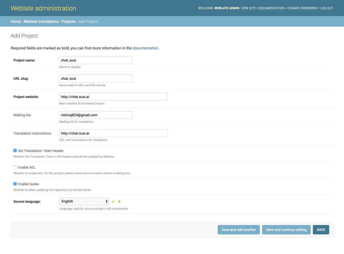
  1. We then add a project from our Admin dashboard by filling details in the following manner as shown in the image
  2. Once the project is added, we add the component to link our Translation files as shown in the image.
  3. Once the files are linked we will see our Overview Project Page and the Information. It can be seen in the image below. The screenshot shows a 100% translation that means all of our strings are translated correctly for German.
  4. To change any translation we make changes and push it to the repository where our SSH key generated from Weblate is added. A full guide to do that is mentioned in this link.
  5. We can push any changes to the repository by making changes in our local. This will generate a commit from the Weblate Admin in our repository as seen in the following screenshot.

Resources

  1. React Internationalization Library  – react-intl
  2. Official Docs about Weblate – Weblate docs.
  3. Format for po/pot files, JSON files etc. – https://docs.weblate.org/en/latest/formats.html#json-and-nested-structure-json-files
  4. Weblate – https://weblate.org
Continue ReadingImplementing Internationalization with Weblate Integration on SUSI Web Chat