Using Multiple Languages in Giggity app

Giggity app is used for conferences around the world. It becomes essential that it provides support for native languages as the users may not understand the terminologies written primarily in English from different countries. In this blog, I describe how to add a resource for another language in your app with the example of Giggity.  I recently worked on the addition of French translation in the app. We look at the addition of German in the app.

You can specify resources tailored to the culture of the people who use your app. You can provide any resource type that is appropriate for the language and culture of your users. For example, the following screenshot shows an app displaying string and drawable resources in the device’s default (en_US) locale and the German (de_DE) locale.

It is good practice to use the Android resource framework to separate the localized aspects of your application as much as possible from the core Java functionality:

  • You can put most or all of the contents of your application’s user interface into resource files, as described in this document and in Providing Resources.
  • The behaviour of the user interface, on the other hand, is driven by your Java code. For example, if users input data that needs to be formatted or sorted differently depending on locale, then you would use Java to handle the data programmatically. This document does not cover how to localize your Java code.

Whenever the application runs in a locale for which you have not provided locale-specific text, Android will load the default strings from res/values/strings.xml. If this default file is absent, or if it is missing a string that your application needs, then your application will not run and will show an error. Here is an example of default strings in the app.

<!-- Menu -->
<string name="settings">Settings</string>
<string name="change_day">Change day</string>
<string name="show_hidden">Show hidden items</string>
<string name="timetable">Timetable</string>
<string name="tracks">Tracks</string>
<string name="now_next">Now and next</string>
<string name="my_events">My events</string>
<string name="search">Search</string>

An application can specify many res/<qualifiers>/ directories, each with different qualifiers. To create an alternative resource for a different locale, you use a qualifier that specifies a language or a language-region combination. (The name of a resource directory must conform to the naming scheme described in Providing Alternative Resources, or else it will not compile.) You can specify resources tailored to the culture of the people who use your app. You can provide any resource type that is appropriate for the language and culture of your users. For example, the following screenshot shows an app displaying string and drawable resources in the device’s default (en_US) locale and the German (de_DE) locale.

<!-- Menu -->
<string name="settings">Einstellungen</string>
<string name="change_day">Tag ändern</string>
<string name="timetable">Zeitplan</string>
<string name="tracks">Tracks</string>
<string name="now_next">Jetzt und gleich</string>
<string name="my_events">Meine Veranstaltungen</string>
<string name="search">Suche</string>

Then you can use it in the app like this anywhere you need to use the string. This is an example of putting the options menu in the toolbar in Giggity app.

@Override
public boolean onCreateOptionsMenu(Menu menu) {
   super.onCreateOptionsMenu(menu);

   menu.add(Menu.NONE, 1, 5, R.string.settings)
           .setShortcut('0', 's')
           .setIcon(R.drawable.ic_settings_white_24dp)
           .setShowAsAction(MenuItem.SHOW_AS_ACTION_ALWAYS);
   menu.add(Menu.NONE, 2, 7, R.string.add_dialog)
           .setShortcut('0', 'a')
           .setIcon(R.drawable.ic_add_white_24dp)
           .setShowAsAction(MenuItem.SHOW_AS_ACTION_ALWAYS);

   return true;
}

References:

Continue ReadingUsing Multiple Languages in Giggity app

Timer Option in Phimpme Android’s Camera

The Phimpme Android application comes in with all the options like clicking a picture, editing them and sharing it with the world using many many connected social media accounts. Not only this, it features a fully functional camera with lots of different functionality which a user wants in their day to day life. One such feature is the Timer option in Phimpme. In Phimpme, the user can go to the camera settings to enable or disable the Timer options and click their photos after setting the timer for a particular duration. After setting the timer and pressing the capture photo button, it also displays a ticker at the UI of the camera to notify the user the amount of time after which the photo will be clicked.

In this tutorial, I will be explaining how we have achieved this feature in the Phimpme application.

Step 1

The first thing we need to do is to display the options to the user in camera settings to enable/disable the timer and to select the specific amount of time for the delay in the capture. To do this we have made use of the pop-up view in which we have programmatically added all the timer values to be displayed to the user using the code snippet below:

final String[] timer_values = getResources().getStringArray(R.array.preference_timer_values);
  String[] timer_entries = getResources().getStringArray(R.array.preference_timer_entries);
String timer_value = sharedPreferences.getString(PreferenceKeys.getTimerPreferenceKey(), "0");
addArrayOptionsToPopup(Arrays.asList(timer_entries), getResources().getString(R.string.preference_timer), true, timer_index, false)

What the function addArrayOptionsToPopup does is that it adds the following arrays to the linear layout of the pop-up view programmatically.

Step 2

After displaying the timer values to the user, we need to think about the functionality of the camera if the timer is enabled. When the user presses the click picture button we check the condition whether the timer is enabled or not. If it is enabled, we make the application to wait for a specific amount of time before clicking the photo. This can be done using the CountDownTimer class which is provided by Android.

new CountDownTimer(timerDelay, 1000) {
   public void onTick(long millisUntilFinished) {
          //Called after each second
       }
       public void onFinish() {
         //Called after timer delay
       }
   }.start();

What the above piece of code does is to wait for the specific amount of time as specified by the timer delay. Suppose the user selects the option to wait for 5 seconds then we set the timerDelay to be 5000, then the above code calls the onTick method after each second where we update the user that how much time is remaining and on the onFinish method we call the takePicture method to capture the image using the following line of code below.

mCamera.takePicture(null, null, mPicture);

This is how we have implemented the option of Timer in the Phimpme Android application. To get the full source code of the Camera, please check out the Phimpme Android GitHub repository listed in the resources section below.

Resources

  1. Android Developer Guide : CountDown Timer – https://developer.android.com/reference/android/os/CountDownTimer.html
  2. StackOverflow – Implementing Timer in Camera – https://stackoverflow.com/questions/35355320/camera-application-timer-implementaion-issue
  3. GitHub – Phimpme Android Repository – https://github.com/fossasia/phimpme-android/
  4. GitHub – Open Camera Source Code – https://github.com/almalence/OpenCamera


Continue ReadingTimer Option in Phimpme Android’s Camera

Marker Click Management in Android Google Map API Version 2

We could display a marker on Google map to point to a particular location. Although it is a simple task sometimes we need to customise it a bit more. Recently I customised marker displayed in Connfa app displaying the location of the sessions on the map loaded from Open Event format. In this blog manipulation related to map marker is explored.

Markers indicate single locations on the map. You can customize your markers by changing the default colour, or replace the marker icon with a custom image. Info windows can provide additional context to a marker. You can place a marker on the map by using following code.

MarkerOptions marker = new MarkerOptions().position(new LatLng(latitude, longitude)).title("Dalton Hall");
googleMap.addMarker(marker);

But as you can see this may not be enough, we need to do operations on clicking the marker too, so we define them in the Marker Click Listener. We declare marker null initially so we check if the marker colour is changed previously or not.

private Marker previousMarker = null;

We check if the marker is initialized to change its colour again to initial colour, we can do other related manipulation like changing the map title here,

Note: the first thing that happens when a marker is clicked or tapped is that any currently showing info window is closed, and the GoogleMap.OnInfoWindowCloseListener is triggered. Then the OnMarkerClickListener is triggered. Therefore, calling isInfoWindowShown() on any marker from the OnMarkerClickListener will return false.

mGoogleMap.setOnMarkerClickListener(new GoogleMap.OnMarkerClickListener() {
   @Override
   public boolean onMarkerClick(Marker marker) {
       String locAddress = marker.getTitle();
       fillTextViews(locAddress);
       if (previousMarker != null) {
           previousMarker.setIcon(BitmapDescriptorFactory.defaultMarker(BitmapDescriptorFactory.HUE_RED));
       }
       marker.setIcon(BitmapDescriptorFactory.defaultMarker(BitmapDescriptorFactory.HUE_BLUE));
       previousMarker = marker;

       return true;
   }
});

It’s possible to customize the colour of the default marker image by passing a BitmapDescriptor object to the icon() method. You can use a set of predefined colours in the BitmapDescriptorFactory object, or set a custom marker colour with the BitmapDescriptorFactory.defaultMarker(float hue) method. The hue is a value between 0 and 360, representing points on a colour wheel. We use red colour when the marker is not clicked and blue when it is clicked so a user knows which one is clicked.

To conclude you can use an OnMarkerClickListener to listen for click events on the marker. To set this listener on the map, call GoogleMap.setOnMarkerClickListener(OnMarkerClickListener). When a user clicks on a marker, onMarkerClick(Marker) will be called and the marker will be passed through as an argument. This method returns a boolean that indicates whether you have consumed the event (i.e., you want to suppress the default behaviour). If it returns false, then the default behaviour will occur in addition to your custom behaviour. The default behaviour for a marker click event is to show its info window (if available) and move the camera such that the marker is centered on the map.

The final result looks like this, so you the user can see which marker is clicked as its colour is changed,


References:

  • Google Map APIs Documentation – https://developers.google.com/maps/documentation/android-api/marker
Continue ReadingMarker Click Management in Android Google Map API Version 2

Setting up Travis Continuous Integration in Giggity

Travis is a continuous integration service that enables you to run tests against your latest Android builds. You can setup your projects to run both unit and integration tests, which can also include launching an emulator. I recently added Travis Continuous Integration Connfa, Giggity and Giraffe app. In this blog, I describe how to set up Travis Continuous Integration in an Android Project with reference to Giggity app.

  • Use your GitHub account, sign in to either to Travis CI .org for public repositories or Travis CI .com for private repositories
  • Accept the GitHub access permissions confirmation.
  • Once you’re signed in to Travis CI, and synchronized your GitHub repositories, go to your profile page and enable the repository you want to build:

  • Now you need to add a .travis.yml file into the root of your project. This file will tell how Travis handles the builds. You should check your .travis file on Travis Web Lint before committing any changes to it.
  • You can find the very basic instructions for building an Android project from the Travis documentation. But here we specify the .travis.yml build accordingly for Giggity’s continuous integration. Here, language shows that it is an Android project. We write “language: ruby” if it is a ruby project.  If you need a more customizable environment running in a virtual machine, use the Sudo Enabled infrastructure. Similarly, we define the API, play services and libraries defined as shown.
language: android
sudo: required
jdk: 
 - oraclejdk8
# Use the Travis Container-Based Infrastructure
android:
  components:
    - platform-tools
    - tools
    - build-tools-25.0.3
    - android-25
    
    # For Google APIs
    - addon-google_apis-google-$ANDROID_API_LEVEL
    # Google Play Services
    - extra-google-google_play_services
    # Support library
    - extra-android-support
    # Latest artifacts in local repository
    - extra-google-m2repository
    - extra-android-m2repository
    - android-sdk-license-.+
    - '.+'

before_script:
  - chmod +x gradlew    

script:
  - ./gradlew build

Now when you make a commit or pull request Travis check if all the defines checks pass and it is able to be merged. To be more advanced you can also define if you want to build APKs too with every build.

References:

  • Travis Continuous Integration Documentation – https://docs.travis-ci.com/user/getting-started/
Continue ReadingSetting up Travis Continuous Integration in Giggity

Extending Markdown Support in Yaydoc

Yaydoc, our automatic documentation generator, builds static websites from a set of markup documents in markdown or reStructuredText format. Yaydoc uses the sphinx documentation generator internally hence reStructuredText support comes out of the box with it. To support markdown we use multiple techniques depending on the context. Most of the markdown support is provided by recommonmark, a docutils bridge for sphinx which basically converts markdown documents into proper docutil’s abstract syntax tree which is then converted to HTML by sphinx. While It works pretty well for most of the use cases, It does fall short in some instances. They are discussed in the following paragraphs.

The first problem was inclusion of other markdown files in the starting page. This was due to the fact that markdown does not supports any include mechanism. And if we used the reStructuredText include directive, the included text was parsed as reStructuredText. This problem was solved earlier using pandoc – an excellent tool to convert between various markup formats. What we did was that we created another directive mdinclude which converts the markdown to reStructuredText before inclusion. Although this was solved a while ago, The reason I’m discussing this here is that this was the inspiration behind the solution to our recent problem.

The problem we encountered was that recommonmark follows the Commonmark spec which is an ongoing effort towards standardization of markdown which has been somewhat lacking till now. The process is currently going on so the recommonmark library doesn’t yet support the concept of extensions to support various features of different markdown flavours not in the core commonmark spec. We could have settled for only supporting the markdown features in the core spec but tables not being present in the core spec was problematic. We had to support tables as it is widely used in most of the docs present in github repositories as GFM(Github Flavoured Markdown) renders ascii tables nicely.

The solution was to use a combination of recommonmark and pandoc. recommonmark provides a eval_rst code block which can be used to embed non-section reStructuredText within markdown. I created a new MarkdownParser class which inherited the CommonMarkParser class from recommonmark. Within it, using regular expressions, I convert any text within `<!– markdown+ –>` and `<!– endmarkdown+ –>`  into reStructuredText and enclose it within eval_rst code block. The result was that tables when enclosed within those trigger html comments would be converted to reST tables and then enclosed within eval_rst block which resulted in recommonmark renderering them properly. Below is a snippet which shows how this was implemented.

import re
from recommonmark.parser import CommonMarkParser
from md2rst import md2rst


MARKDOWN_PLUS_REGEX = re.compile('<!--\s+markdown\+\s+-->(.*?)<!--\s+endmarkdown\+\s+-->', re.DOTALL)
EVAL_RST_TEMPLATE = "```eval_rst\n{content}\n```"


def preprocess_markdown(inputstring):
    def callback(match_object):
        text = match_object.group(1)
        return EVAL_RST_TEMPLATE.format(content=md2rst(text))

    return re.sub(MARKDOWN_PLUS_REGEX, callback, inputstring)


class MarkdownParser(CommonMarkParser):
    def parse(self, inputstring, document):
        content = preprocess_markdown(inputstring)
        CommonMarkParser.parse(self, content, document)

Resources

Continue ReadingExtending Markdown Support in Yaydoc

Creating an Infobox for Mobile View Using Angular in Susper

In Susper, the Information and Analytics boxes disappeared for widths smaller than 1100px, since they were too big to fit in the existing page layout.
In Laptop view:

In Mobile view:

Hence we decided to design a new Info-cum-Analytics box for mobile devices, where the Analytics are displayed only if the ‘Show Analytics’ button is clicked and they are hidden on clicking the ‘Hide Analytics’ button.

The following is the html code for the Infobox:

<div class=“combo-box”>
<appinfobox></app-infobox>
<button class=“btn” id=“toggle-button” (click)=“BoxToggle()” type=“button” datatoggle=“collapse” datatarget=“#statbox” ariaexpanded=“false” ariacontrols=“collapseExample”>
{{boxMessage}} Analytics
</button>
<appstatsbox class=“collapse” id=“statbox”></app-statsbox>
</div>

We can make the following observations:

  • The combo box has both the Info and the Stats box, in addition to a button, which toggles the display status of the Analytics box.
  • To display the appropriate message on the button, we have a special function called BoxToggle() which sets the value of boxMessage()
  • The data-toggle attribute of the button has been set to collapse and the data-target is statbox
  • The statsbox has the class collapse, so that it collapses on clicking on the Toggle button.

The typescript code is as follows:

BoxToggle() {
if (this.boxMessage === ‘Show’) {
this.boxMessage = ‘Hide’;
} else {
this.boxMessage = ‘Show’;
}
}

This code thus effectively toggles between the messages Show and Hide, if the button is clicked when the message says Show, it changes to Hide and vice-versa

The CSS code:

@media screen and (min-width:768px) {
div.combo-box {
display: none;
}
}

The css code ensures that this combo-box is displayed only for widths less than 768px (only mobile and tablet screens).

To view the entire code you can check results.component.html and results.component.css in the Susper repository.

References

  1. W3 Schools for Collapsible buttons and their implementation: https://www.w3schools.com/bootstrap/bootstrap_collapse.asp
  2. Official Bootstrap documentation for collapsible buttons: https://v4-alpha.getbootstrap.com/components/collapse/
Continue ReadingCreating an Infobox for Mobile View Using Angular in Susper

Auto Deployment of SUSI Web Chat on gh-pages with Travis-CI

SUSI Web Chat uses Travis CI with a custom build script to deploy itself on gh-pages after every pull request is merged into the project. The build system auto updates the latest changes hosted on chat.susi.ai. In this blog, we will see how to automatically deploy the repository on gh pages.

To proceed with auto deploy on gh-pages branch,

  1. We first need to setup Travis for the project.
  2. Register on https://travis-ci.org/ and turn on the Travis for this repository.

Next, we add .travis.yml in the root directory of the project.

# Set system config
sudo: required
dist: trusty
language: node_js

# Specifying node version
node_js:
  - 6

# Running the test script for the project
script:
  - npm test

# Running the deploy script by specifying the location of the script, here ‘deploy.sh’ 

deploy:
  provider: script
  script: "./deploy.sh"


# We proceed with the cache if there are no changes in the node_modules
cache:
  directories:
    - node_modules

branches:
  only:
    - master

To find the code go to https://github.com/fossasia/chat.susi.ai/blob/master/.travis.yml

The Travis configuration files will ensure that the project is building for every change made, using npm test command, in our case, it will only consider changes made on the master branch.

If one wants to watch other branches one can add the respective branch name in travis configurations. After checking for build passing we need to automatically push the changes made for which we will use a bash script.

#!/bin/bash

SOURCE_BRANCH="master"
TARGET_BRANCH="gh-pages"

# Pull requests and commits to other branches shouldn't try to deploy.
if [ "$TRAVIS_PULL_REQUEST" != "false" -o "$TRAVIS_BRANCH" != "$SOURCE_BRANCH" ]; then
    echo "Skipping deploy; The request or commit is not on master"
    exit 0
fi

# Save some useful information
REPO=`git config remote.origin.url`
SSH_REPO=${REPO/https:\/\/github.com\//git@github.com:}
SHA=`git rev-parse --verify HEAD`

ENCRYPTED_KEY_VAR="encrypted_${ENCRYPTION_LABEL}_key"
ENCRYPTED_IV_VAR="encrypted_${ENCRYPTION_LABEL}_iv"
ENCRYPTED_KEY=${!ENCRYPTED_KEY_VAR}
ENCRYPTED_IV=${!ENCRYPTED_IV_VAR}
openssl aes-256-cbc -K $ENCRYPTED_KEY -iv $ENCRYPTED_IV -in deploy_key.enc -out ../deploy_key -d

chmod 600 ../deploy_key
eval `ssh-agent -s`
ssh-add ../deploy_key

# Cloning the repository to repo/ directory,
# Creating gh-pages branch if it doesn't exists else moving to that branch
git clone $REPO repo
cd repo
git checkout $TARGET_BRANCH || git checkout --orphan $TARGET_BRANCH
cd ..

# Setting up the username and email.
git config user.name "Travis CI"
git config user.email "$COMMIT_AUTHOR_EMAIL"

# Cleaning up the old repo's gh-pages branch except CNAME file and 404.html
find repo/* ! -name "CNAME" ! -name "404.html" -maxdepth 1  -exec rm -rf {} \; 2> /dev/null
cd repo

git add --all
git commit -m "Travis CI Clean Deploy : ${SHA}"

git checkout $SOURCE_BRANCH

# Actual building and setup of current push or PR.
npm install
npm run build
mv build ../build/

git checkout $TARGET_BRANCH
rm -rf node_modules/
mv ../build/* .
cp index.html 404.html

# Staging the new build for commit; and then committing the latest build
git add -A
git commit --amend --no-edit --allow-empty

# Deploying only if the build has changed
if [ -z `git diff --name-only HEAD HEAD~1` ]; then

  echo "No Changes in the Build; exiting"
  exit 0

else
  # There are changes in the Build; push the changes to gh-pages
  echo "There are changes in the Build; pushing the changes to gh-pages"

  # Actual push to gh-pages branch via Travis
  git push --force $SSH_REPO $TARGET_BRANCH
fi

This bash script will enable Travis CI user to push changes to gh pages, for this we need to store the credentials of the repository in encrypted form.

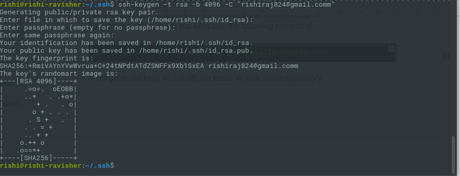
1. To get the public/private rsa keys we use the following command

ssh-keygen -t rsa -b 4096 -C "your_email@example.com"

2.  It will generate keys in .ssh/id_rsa folder in your home repository.

  1. Make sure you do not enter any passphrase while generating credentials otherwise Travis will get stuck at the time of decryption of the keys.
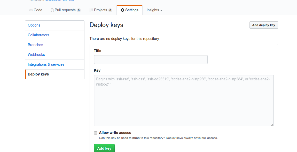
  2. Copy the public key and deploy the key to repository by visiting  

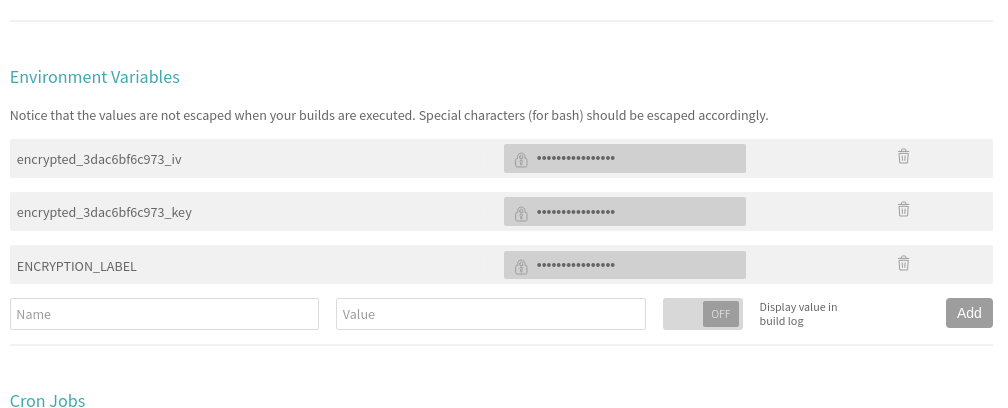
5. We also need to set the environment variable ENCRYPTED_KEY in Travis. Here’s a screenshot where to set it in the Travis repository dashboard.

6. Next, install Travis for encryption of keys.

sudo apt install ruby ruby-dev
sudo gem install travis

7. Make sure you are logged in to Travis, to login use the following command.

travis login

8. Make sure you have copied the ssh to deploy_key and then encrypt your private deploy_key and add it to root of your repository, use command –

travis encrypt-file deploy_key

9. After successful encryption, you will see a message

Please add the following to your build script (before_install stage in your .travis.yml, for instance):

openssl aes-256-cbc -K $encrypted_3dac6bf6c973_key -iv $encrypted_3dac6bf6c973_iv -in deploy_key.enc -out ../deploy_key -d
  1. Add the above-generated deploy_key in Travis and push the changes on your master branch. Do not push the deploy_key only the encryption file i.e., deploy_key.enc
  1. Finally, push the changes and create a Pull request and merge it to test the deployment. Visit Travis logs for more details and debugging.

Resources

Continue ReadingAuto Deployment of SUSI Web Chat on gh-pages with Travis-CI

Showing Pull Request Build logs in Yaydoc

In Yaydoc, I added the feature to show build status of the Pull Request. But there was no way for the user to see the reason for build failure, hence I decided to show the build log in the Pull Request similar to that of TRAVIS CI. For this, I had to save the build log into the database, then use GitHub status API to show the build log url in the Pull Request which redirects to Yaydoc website where we render the build log.

StatusLog.storeLog(name, repositoryName, metadata,  `temp/admin@fossasia.org/generate_${uniqueId}.txt`, function(error, data) {
                            if (error) {
                              status = "failure";
                            } else {
                              targetBranch = `https://${process.env.HOSTNAME}/prstatus/${data._id}`
                            }
                            github.createStatus(commitId, req.body.repository.full_name, status, description, targetBranch, repositoryData.accessToken, function(error, data) {
                              if (error) {
                                console.log(error);
                              } else {
                                console.log(data);
                              }
                            });
                          });

In the above snippet, I’m storing the build log which is generated from the build script to the mongodb and I’m appending the mongodb unqiueID to the `prstatus` url so that we can use that id to retrieve build log from the database.

exports.createStatus = function(commitId, name, state, description, targetURL, accessToken, callback) {
  request.post({
    url: `https://api.github.com/repos/${name}/statuses/${commitId}`,
    headers: {
      'User-Agent': 'Yaydoc',
      'Authorization': 'token ' + crypter.decrypt(accessToken)
    },
    "content-type": "application/json",
    body: JSON.stringify({
      state: state,
      target_url: targetURL,
      description: description,
      context: "Yaydoc CI"
    })
  }, function(error, response, body) {
    if (error!== null) {
      return callback({description: 'Unable to create status'}, null);
    }
    callback(null, JSON.parse(body));
  });
};

After saving the build log, I’m sending the request to GitHub for showing the status of the build along with build log url where user can click the detail link and can see the build log.

Resources:

Continue ReadingShowing Pull Request Build logs in Yaydoc

Implementing Skill Detail Section in SUSI Android App

SUSI Skills are rules that are defined in SUSI Skill Data repo which are basically the responses SUSI gives to the user queries. When a user queries something from the SUSI Android app, a query to SUSI Server is made which further fetches response from SUSI Skill Data and gives the response to the app. Similarly, when we need to list all skills, an API call is made to server to list all skills. The server then checks the SUSI Skill Data repo for the skills and then return all the required information to the app. Then the app displays all the information about the skill to user. User then can view details of each skill and then interact on the chat interface to use that skill. This process is similar to what SUSI Skill CMS does. The CMS is a skill wiki like interface to view all skills and then edit them. Though the app can not be currently used to edit the skills but it can be used to view them and try them on the chat interface.

API Information

For listing SUSI Skill groups, we have to call on /cms/getGroups.json

This will give you all groups in SUSI model in which skills are present. Current response:

{
  "session": {"identity": {
    "type": "host",
    "name": "14.139.194.24",
    "anonymous": true
  }},
  "accepted": true,
  "groups": [
    "Small Talk",
    "Entertainment",
    "Problem Solving",
    "Knowledge",
    "Assistants",
    "Shopping"
  ],
  "message": "Success: Fetched group list"
}

So, the groups object gives all the groups in which SUSI Skills are located.

Next comes, fetching of skills. For that the endpoint is /cms/getGroups.json?group=GROUP_NAME

Since we want all skills to be fetched, we call this api for every group. So, for example we will be calling http://api.susi.ai/cms/getSkillList.json?group=Entertainment for getting all skills in group “Entertainment”. Similarly for other groups as well.

Sample response of skill:

{
  "accepted": true,
  "model": "general",
  "group": "Shopping",
  "language": "en",
  "skills": {"amazon_shopping": {
    "image": "images/amazon_shopping.png",
    "author_url": "https://github.com/meriki",
    "examples": ["Buy a dress"],
    "developer_privacy_policy": null,
    "author": "Y S Ramya",
    "skill_name": "Shop At Amazon",
    "dynamic_content": true,
    "terms_of_use": null,
    "descriptions": "Searches items on Amazon.com for shopping",
    "skill_rating": null
  }},
  "message": "Success: Fetched skill list",
  "session": {"identity": {
    "type": "host",
    "name": "14.139.194.24",
    "anonymous": true
  }}
}

It gives all details about skills:

  1. image
  2. author_url
  3. examples
  4. developer_privacy_policy
  5. author
  6. skill_name
  7. dynamic_content
  8. terms_of_use
  9. descriptions
  10. skill_rating

Implementation in SUSI Android App

Skill Detail Section UI of Google Assistant

Skill Detail Section UI of SUSI SKill CMS

Skill Detail Section UI of SUSI Android App

The UI of skill detail section in SUSI Android App is the mixture of UI of Skill detail section in Google Assistant ap and SUSI Skill CMS. It displays details of skills in a beautiful manner with horizontal recyclerview used to display the examples.

So, we have to display following details about the skill in Skill Detail Section:

  1. Skill Name
  2. Author Name
  3. Skill Image
  4. Try it Button
  5. Description
  6. Examples
  7. Rating
  8. Content type (Dynamic/Static)
  9. Terms of Use
  10. Developer’s Privacy policy

Let’s see the implementation.

1. Whenever a skill Card View is clicked, showSkillDetailFragment() is called and it opens a new instance of a fragment named SkillDetailsFragment which shows details of the skill. We have to provide necessary information while starting the fragment. This information is passed as a Serializable.

fun showSkillDetailFragment(skillData: SkillData, skillGroup: String) {
   val skillDetailsFragment = SkillDetailsFragment.newInstance(skillData,skillGroup)
   (context as SkillsActivity).fragmentManager.beginTransaction()
           .replace(R.id.fragment_container, skillDetailsFragment)
           .commit()
}

2.  The data which was passed as a Serializeable object is now casted back to the required form and a method to set up the UI is called.

companion object {
   val SKILL_KEY = "skill_key"
   val SKILL_GROUP = "skill_group"
   fun newInstance(skillData: SkillData, skillGroup: String): SkillDetailsFragment {
       val fragment = SkillDetailsFragment()
       val bundle = Bundle()
       bundle.putSerializable(SKILL_KEY, skillData as Serializable)
       bundle.putString(SKILL_GROUP, skillGroup)
       fragment.arguments = bundle

       return fragment
   }
}

override fun onCreateView(inflater: LayoutInflater, container: ViewGroup?, savedInstanceState: Bundle?): View {
   skillData = arguments.getSerializable(
           SKILL_KEY) as SkillData
   skillGroup = arguments.getString(SKILL_GROUP)
   return inflater.inflate(R.layout.fragment_skill_details, container, false)
}

override fun onViewCreated(view: View?, savedInstanceState: Bundle?) {
   setupUI()
   super.onViewCreated(view, savedInstanceState)
}

3. The setupUI() method then calls separate method for setting every part of the UI like image, name etc.

fun setupUI() {
   setImage()
   setName()
   setAuthor()
   setTryButton()
   setDescription()
   setExamples()
   setRating()
   setDynamicContent()
   setPolicy()
   setTerms()
}

4. One example of setting a part of the UI is setting Author name. It checks if AuthorName is null or not. After that it anchors author’s github account link with his/her name.

fun setAuthor() {
   skill_detail_author.text = "Author : ${activity.getString(R.string.no_skill_author)}"
   if(skillData.author != null && !skillData.author.isEmpty()){
       if(skillData.authorUrl == null || skillData.authorUrl.isEmpty())
           skill_detail_author.text = "Author : ${skillData.skillName}"
       else {
           skill_detail_author.linksClickable = true
           skill_detail_author.movementMethod = LinkMovementMethod.getInstance()
           if (android.os.Build.VERSION.SDK_INT >= Build.VERSION_CODES.N) {
               skill_detail_author.text = Html.fromHtml("Author : <a href=\"${skillData.authorUrl}\">${skillData.author}</a>", Html.FROM_HTML_MODE_COMPACT)
           } else {
               skill_detail_author.text = Html.fromHtml("Author : <a href=\"${skillData.authorUrl}\">${skillData.author}</a>")
           }
       }
   }
}

Summary

So, this blog talked about how the Skill detail section in SUSI Android App is implemented. This included how a network call is made, logic for making different network calls, making a horizontal recyclerview for displaying examples. So, If you are looking forward to contribute to SUSI Android App, this can help you a little. But if not so, this may also help you in understanding and how you can implement horizontal recyclerview similar to Google Play Store.

References

  1. To know about servlets https://en.wikipedia.org/wiki/Java_servlet
  2. To see how to implement one https://www.javatpoint.com/servlet-tutorial
  3. To see how to make network calls in android using Retrofit https://guides.codepath.com/android/Consuming-APIs-with-Retrofit
  4. To see how to implement custom RecyclerView Adapter https://www.survivingwithandroid.com/2016/09/android-recyclerview-tutorial.html
Continue ReadingImplementing Skill Detail Section in SUSI Android App

Implementing Event Copy API in Open Event Frontend

In Open Event Frontend, we give the organizer a facility to create a copy of the event by copying it and making the modifications he wants to a particular event. Thus, it is easy for the organizer to create multiple events with same sponsors, sessions, etc. For this, we implemented the event copy API in frontend.
We achieved the copy of events as follows:
Since the event copy API is application/json type, we used the simple GET and POST requests to copy the event rather than using the ember data. For this, we use the loader service which is injected throughout the app. To copy the event we have given a “Copy” button which looks as follows:

 <button class="ui button {{if isCopying 'loading'}}" {{action 'copyEvent'}} disabled={{isCopying}}>
    <i class="copy icon"></i>
        {{t 'Copy'}}
 </button>

Thus, we trigger an action ‘copyEvent’ on clicking the Copy button. The action is defined in controller as follows:

 copyEvent() {
      this.set('isCopying', true);
      this.get('loader')
        .post(`events/${this.get('model.id')}/copy`, {})
        .then(copiedEvent => {
          this.transitionToRoute('events.view.edit', copiedEvent.identifier);
          this.get('notify').success(this.l10n.t('Event copied successfully'));
        })
        .catch(() => {
          this.get('notify').error(this.l10n.t('Copying of event failed'));
        })
        .finally(() => {
          this.set('isCopying', false);
        });
    }

The endpoint to copy the event as defined in our API is:

POST : /v1/events/{identifier}/copy
Content-Type: application/vnd.api+json
Authorization: JWT <Auth Key>
Request body: {}

Thus, we make a post request to the given URL by passing the event id of the event to be copied and the request body to be an empty object. Thus, on successful response from the server, we get the new event id for which the event info is same. We then redirect the user to the edit details route where he can change the info he wants.
Thus, we copy the event in Open Event Frontend.

Resources: Docs on loader service in Ember JS

Continue ReadingImplementing Event Copy API in Open Event Frontend