Hiding Intelligence of Susper When a Query is Empty or Erased with Angular

Recently, we have implemented intelligence feature in Susper using SUSI chat API to provide users answer a question without going deeper in search results. When a user types “height of Trump”, it shows answer like this:

Problem which we faced after implementing the feature:

When a user was erasing a query or query field was empty, Susper was still showing the answer of the intelligence component like this:

The answer should not be displayed when a query is empty because the user is not asking any question. The answer was still displayed because it had received a response from SUSI API.

How did we solve the problem?

The problem was solved in two ways.

  1. By using if/else condition: We checked if the statement shown inside the component is similar to the if-and-else condition. If the condition is true, it should hide the component.
  2. Using [hidden] attribute method: The Angular 4 supports [hidden] attribute which acts as { display:none; } . [hidden] attribute generally works as ngShow and ngHide which was earlier supported by Angular 2.

We preferred both the methods to solve the problem. The intelligence component is being loaded inside results component using <app-intelligence> element. Further, we added [hidden] attribute to this element like this :

<appintelligence [hidden]=“hideIntelligence”></app-intelligence>
We created hideIntelligence as variable and assign it as boolean. To check if a query is empty, searchdata variable was used.
searchdata: any = {
  query: ‘ ‘,
  rows: 10,
  start: 0
};
And then checked if a query is empty using if-else condition :
// checks if query is empty or erased
if (this.searchdata.query === ‘ ‘) {// display: none; is true
  this.hideIntelligence = true;

} else {
// display: none; is false
  this.hideIntelligence = false;
}


Applying this solution, we succeeded in hiding the intelligence component. We would also had used *ngIf statement but we preferred using [hidden]. [hidden] modifies the display property.  *ngIf is a structural directive which creates or destroys content inside DOM.

The source code for the implementation can be found here: https://github.com/fossasia/susper.com/pull/613

Resources:


Continue ReadingHiding Intelligence of Susper When a Query is Empty or Erased with Angular

Implementing Intelligence Feature in Susper

Susper gives answers to your questions using SUSI AI. We want to give users best experience while they are searching for solutions to their questions. To achieve this, we have incorporated with features like infobox and intelligence using SUSI.

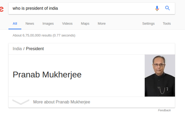
Google has this feature where users can ask questions like ‘Who is president of USA?’ and get answers directly without encouraging the users to deep-dive into the search results to know the answer.

Similarly Susper gives answer to the user:

It also gives answer to question which is related to real time data like temperature.


How we have implemented this feature?

We used the API Endpoint of SUSI at http://api.asksusi.com/

Using SUSI API is as simple as sending query as a URL parameter in GET request http://api.susi.ai/susi/chat.json?q=YOUR_QUERY

You can also get various action types in the response. Eg: An anwser type response for http://api.susi.ai/susi/chat.json?q=hey%20susi is:

actions: [
  {
    type: "answer",
    expression: "Hi, I'm Susi"
  }
],


Documentation regarding SUSI is available at here.

Implementation in Susper:

We have created an Intelligence component to display answer related to a question. You can check it here: https://github.com/fossasia/susper.com/tree/master/src/app/intelligence

It takes care about rendering the information and styling of the rendered data received from SUSI API.

The intelligence.component.ts makes a call to Intelligence Service with the required query and the intelligence service makes a GETrequest to the SUSI API and retrieves the results.

Intelligence.component.ts

this.intelligence.getintelligentresponse(data.query).subscribe(res => {
  if (res && res.answers && res.answers[0].actions) {
     this.actions = res.answers[0].actions;
       for (let action of this.actions) {
         if (action.type === 'answer' && action.mood !== 'sabta') {
           this.answer = action.expression;
         } else {
             this.answer = '';
         }
      }
   } else {
       this.answer = '';
   }
});


Intelligence.service.ts

export class IntelligenceService {
 server = 'http://api.susi.ai';
 searchURL = 'http://' + this.server + '/susi/chat.json';
 constructor(private http: Http, private jsonp: Jsonp, private store: Store<fromRoot.State>) {
 }
 getintelligentresponse(searchquery) {
   let params = new URLSearchParams();
   params.set('q', searchquery);
   params.set('callback', 'JSONP_CALLBACK');
   return this.jsonp
     .get('http://api.asksusi.com/susi/chat.json', {search: params}).map(res =>
       res.json()

     );
 }

Whenever the getintelligenceresponse of intelligenceService is called, it creates a URLSearchParams() object and set required parameters in it and send them in jsonp.get request. We also set callback to ‘JSONP_CALLBACK’ to inform the API to send us data in JSONP.

Thereby, the intelligence component retrieves the answer and displays it with search resultson Susper.

Source code for this implementation could be found in this pull:

https://github.com/fossasia/susper.com/pull/569

Resources:

Continue ReadingImplementing Intelligence Feature in Susper

Changing Dimensions of Search Box Dynamically in Susper

Earlier the Susper search box had a fixed dimension. When a user types in a query, the dimensions of the search box remained fixed. This approach resulted in several issues like:

  • Matching the dimensions of the search bar following the market leader.
  • When dimensions are dynamically changing, it should not disturb alignment w.r.t tabs in the results page.

What actually happens is, when a user enters a query, the search box quickly changes its dimensions when results appear. I will be discussing below how we achieved this goal.

On the home page, we created the dimensions of a search bar with 584 x 44 pixels.

On the results page, we created the dimensions of search bar 632 x 44 similar to market leader:

How we proceeded?

Susper is built on Angular v4.1.3. It automatically comes with a function ngOnInit() whenever a new component has been created. ngOnInit() is a part of life cycle hook in Angular 4 (in Angular 2 as well). The function is called up or initialized when the component is rendered completely. This was the key for changing dimensions of search bar dynamically as soon as a component is created.

What happens is when a user types a query on the homepage and hits enter then, results component is created. As soon as, it is created – ngOnInit() function is called.

The default dimensions of search bar have been provided as follows:

search-bar.component.css

#navgroup {
  height: 44px;
  width: 584px;
}
When the homepage loads up, dimensions by default are 584 x 44.

search-bar.component.ts

private navbarWidth: any;
ngOnInit() {
  this.navbarWidth = 632px;
}

search-bar.component.html

We used [style.width] attribute to change the dimensions dynamically. Add this attribute inside input element.

<input #input type=“text” name=“query” class=“form-control” id=“nav-input” (ngModelChange)=“onquery($event)” [(ngModel)]=“searchdata.query” autocomplete=“off” (keypress)=“onEnter($event)” [style.width]=“navbarWidth”>
As soon as results component is loaded, the dimensions of search bar change to 632 x 44. In this way, we change the dimensions of search bar dynamically as soon as results are loaded.

Resources

Continue ReadingChanging Dimensions of Search Box Dynamically in Susper

Aligning Images to Same Height Maintaining Ratio in Susper

In this blog, I’ll be sharing the idea how we have perfectly aligned images to the same height in Susper without disturbing their ratio. When it comes to aligning images perfectly, they should have:

  • Same height.
  • A proper ratio to maintain the image quality. Many developers apply same width and height without keeping in mind about image ratio which results in:
    • Blurred image,
    • Image with a lot of pixels,
    • Cropping of an image.

Earlier Susper was having image layout like this:

In the screenshot, images are not properly aligned.  They are also not having the same height. We wanted to improve the layout of images just like market leaders Google and DuckDuckGo.

  • How we implemented a better layout for images?

<div class=“container”>
  <div class=“grid” *ngIf=“Display(‘images’)”>
    <div class=“cell” *ngFor=“let item of item$ | async”>
      <a class=“image-pointer” href=“{{item.link}}”>
        <img class=“responsive-image” src=“{{item.link}}”></a>
    </div>
  </div>
</div>
I have created a container, in which images will be loaded from yacy server. Then I have created a grid with an equal number of rows and column. I have adjusted the height and width of rows and columns to obtain a grid which contains each division as a cell. The image will load inside the cell. Each cell consists of one image.
.grid {
  paddingleft: 80px;
}
.container {
  width: 100%;
  margin: 0;
  top: 0;
  bottom: 0;
  padding: 0;
}

After implementing it, we were facing issues like cropping of the image inside a cell. So, to avoid cropping and maintain the image ratio we introduced .responsive-image class which will avoid cropping of images inside cell.

.responsiveimage {
  maxwidth: 100%;
  height: 200px;
  paddingtop: 20px;
  padding: 0.6%;
  display: inlineblock;
  float: left;
}

This is how Susper’s image section looks now:

It took some time to align images, but somehow we succeeded in creating a perfect layout for the images.

We are facing some issues regarding images. Some of them don’t appear due to broken link. This issue will be resolved soon on the server.

Resources

Continue ReadingAligning Images to Same Height Maintaining Ratio in Susper

Adding Unit Tests for Services in loklak search

In Loklak search, it can be tricky to write tests for services as these services are customizable and not fixed. Therefore, we need to test every query parameter of the URL. Moreover, we need to test if service is parsing data in a correct manner and returns only data of type ApiResponse.

In this blog here, we are going to see how to build different components for unit testing services. We will be going to test Search service in loklak search which makes Jsonp request to get the response from the loklak search.json API which are displayed as feeds on loklak search. We need to test if the service handles the response in a correct way and if the request parameters are exactly according to customization.

Service to test

Search service in loklak search is one of the most important component in the loklak search. SearchService is a class with a method fetchQuery() which takes parameter and sets up URL parameters for the search.json API of loklak. Now, it makes a JSONP request and maps the API response. The Method fetchQuery() can be called from other components with parameters query and lastRecord to get the response from the server based on a certain search query and the last record to implement pagination feature in loklak search. Now as the data is retrieved, a callback function is called to access the response returned by the API. Now, the response received from the server is parsed to JSON format data to extract data from the response easily.

@Injectable()
export class SearchService {
private static readonly apiUrl: URL = new URL(‘http://api.loklak.org/api/search.json’);
private static maximum_records_fetch = 20;
private static minified_results = true;
private static source = ‘all’;
private static fields = ‘created_at,screen_name,mentions,hashtags’;
private static limit = 10;
private static timezoneOffset: string = new Date().getTimezoneOffset().toString();constructor(
private jsonp: Jsonp
) { }// TODO: make the searchParams as configureable model rather than this approach.
public fetchQuery(query: string, lastRecord = 0): Observable<ApiResponse> {
const searchParams = new URLSearchParams();
searchParams.set(‘q’, query);
searchParams.set(‘callback’, ‘JSONP_CALLBACK’);
searchParams.set(‘minified’, SearchService.minified_results.toString());
searchParams.set(‘source’, SearchService.source);
searchParams.set(‘maximumRecords’, SearchService.maximum_records_fetch.toString());
searchParams.set(‘timezoneOffset’, SearchService.timezoneOffset);
searchParams.set(‘startRecord’, (lastRecord + 1).toString());
searchParams.set(‘fields’, SearchService.fields);
searchParams.set(‘limit’, SearchService.limit.toString());
return this.jsonp.get(SearchService.apiUrl.toString(), { search: searchParams })
.map(this.extractData)}private extractData(res: Response): ApiResponse {
try {
return <ApiResponse>res.json();
} catch (error) {
console.error(error);
}
}

Testing the service

  • Create a mock backend to assure that we are not making any Jsonp request. We need to use Mock Jsonp provider for this. This provider sets up MockBackend and wires up all the dependencies to override the Request Options used by the JSONP request.

const mockJsonpProvider = {
provide: Jsonp,
deps: [MockBackend, BaseRequestOptions],
useFactory: (backend: MockBackend, defaultOptions: BaseRequestOptions) => {
return new Jsonp(backend, defaultOptions);
}
};


  • Now, we need to configure the testing module to isolate service from other dependencies. With this, we can instantiate services manually. We have to use TestBed for unit testing and provide all necessary imports/providers for creating and testing services in the unit test.

describe(‘Service: Search’, () => {
let service: SearchService = null;
let backend: MockBackend = null;
beforeEach(() => {
TestBed.configureTestingModule({
providers: [
MockBackend,
BaseRequestOptions,
mockJsonpProvider,
SearchService
]
});
});


  • Now, we will inject Service (to be tested) and MockBackend into the Testing module. As all the dependencies are injected, we can now initiate the connections and start testing the service.

beforeEach(inject([SearchService, MockBackend], (searchService: SearchService, mockBackend: MockBackend) => {
service = searchService;
backend = mockBackend;
}));


  • We will be using it() block to mention about what property/feature we are going to test in the block. All the tests will be included in this block. One of the most important part is to induce callback function done which will close the connection as soon the testing is over.

it(‘should call the search api and return the search results’, (done)=>{
// test goes here
});


  • Now, we will create a connection to the MockBackend and subscribe to this connection. We need to configure ResponseOptions so that mock response is JSONified and returned when the request is made.  Now, the MockBackend is set up and we can proceed to make assertions and test the service.

const result = MockResponse;
backend.connections.subscribe((connection: MockConnection) => {
const options = new ResponseOptions({
body: JSON.stringify(result)
});
connection.mockRespond(new Response(options));


  • We can now add test by using expect() block to check if the assertion is true or false. We will now test:
    • Request method: We will be testing if the request method used by the connection created is GET.

expect(connection.request.method).toEqual(RequestMethod.Get);
    • Request Url: We will be testing if all the URL Search Parameters are correct and according to what we provide as a parameter to the method fetchQuery().

expect(connection.request.url).toEqual(
`http://api.loklak.org/api/search.json` +
`?q=${query}` +
`&callback=JSONP_CALLBACK` +
`&minified=true&source=all` +
`&maximumRecords=20&timezoneOffset=${timezoneOffset}` +
`&startRecord=${lastRecord + 1}` +
`&fields=created_at,screen_name,mentions,hashtags&limit=10`);
});
);


  • Response:  Now, we need to call the service to make a request to the backend and subscribe to the response returned. Next, we will make an assertion to check if the response returned and parsed by the service is equal the Mock Response that should be returned. At the end, we need to call the callback function done() to close the connection.

service
.fetchQuery(query, lastRecord)
.subscribe((res) => {
expect(res).toEqual(result);
done();
});
});

Reference

Continue ReadingAdding Unit Tests for Services in loklak search

Auto-Refreshing Mode in loklak Media Wall

Auto-refreshing wall means that the request to the loklak server for the feeds must be sent after every few seconds and adding up new feeds in the media wall as soon as the response is received for a single session. For a nice implementation, it is also necessary to check if the new feeds are being received from the server and consequently, close the connection as soon as no feeds are received as to maintain session singularity.

In this blog post, I am explaining how I implemented the auto-refreshing mode for media wall using tools like ngrx/store and ngrx/effects.

Flow Chart

The flowchart below explains the workflow of how the actions, effects and service are linked to create a cycle of events for auto-refreshing mode. It also shows up how the response is handled as a dependency for the next request. Since effects play a major role for this behaviour, we can say it as the “Game of Effects”.

Working

  • Effect wallSearchAction$: Assuming the Query for media wall has changed and ACTION: WALL_SEARCH has been dispatched, we will start from this point of time. Looking into the flowchart, we can see as soon the action WALL_SEARCH is dispatched, a effect needs to be created to detect the action dispatched.This effect customizes the query and sets up various configurations for search service and calls the service. Depending on whether the response is received or not, it either dispatches WallSearchCompleteSuccessAction or WallSearchCompleteFailAction respectively. Moreover, this effect is responsible for changing the route/location of the application.

@Effect()
wallSearchAction$: Observable<Action>
= this.actions$
.ofType(wallAction.ActionTypes.WALL_SEARCH)
.debounceTime(400)
.map((action: wallAction.WallSearchAction) => action.payload)
.switchMap(query => {
const nextSearch$ = this.actions$.ofType(wallAction.ActionTypes.WALL_SEARCH).skip(1);
const searchServiceConfig: SearchServiceConfig = new SearchServiceConfig();if (query.filter.image) {
searchServiceConfig.addFilters([‘image’]);
} else {
searchServiceConfig.removeFilters([‘image’]);
}
if (query.filter.video) {
searchServiceConfig.addFilters([‘video’]);
} else {
searchServiceConfig.removeFilters([‘video’]);
}return this.apiSearchService.fetchQuery(query.queryString, searchServiceConfig)
.takeUntil(nextSearch$)
.map(response => {
const URIquery = encodeURIComponent(query.queryString);
this.location.go(`/wall?query=${URIquery}`);
return new apiAction.WallSearchCompleteSuccessAction(response);
})
.catch(() => of(new apiAction.WallSearchCompleteFailAction()));
  • Property lastResponseLength: Looking into the flow chart, we can see that after WallSearchCompleteSuccessAction is dispatched, we need to check for the number of feeds in the response. If the number of feeds in the response is more than 0, we can continue to make a new request to the server. On the other hand, if no feeds are received, we need to close the connection and stop requesting for more feeds. This check is implemented using lastResponseLength state property of the reducer which maintains the length of the entities for the last response received.

case apiAction.ActionTypes.WALL_SEARCH_COMPLETE_SUCCESS: {
const apiResponse = action.payload;return Object.assign({}, state, {
entities: apiResponse.statuses,
lastResponseLength: apiResponse.statuses.length
});
}


  • Effect nextWallSearchAction$: Now, we have all the information regarding if we should dispatch WALL_NEXT_PAGE_ACTION depending on the last response received. We need to implement an effect that detects WALL_SEARCH_COMPLETE_SUCCESS  keeping in mind that the next request should be made 10 seconds after the previous response is received. For this behaviour, we need to use debounceTime() which emits a value only after certain specified time period has passed. Here, debounce is set to 10000ms which is equal to 10 seconds. The effect also needs to dispatch the next action depending on the lastResponseLength state property of the reducer. It should dispatch WallNextPageAction if the entities length of the response is more than 0, otherwise, it should dispatch StopWallPaginationAction.

@Effect()
nextWallSearchAction$
= this.actions$
.ofType(apiAction.ActionTypes.WALL_SEARCH_COMPLETE_SUCCESS)
.debounceTime(10000)
.withLatestFrom(this.store$)
.map(([action, state]) => {
if (state.mediaWallResponse.lastResponseLength > 0) {
return new wallPaginationAction.WallNextPageAction();
}
else {
return new wallPaginationAction.StopWallPaginationAction();
}
});


  • Effect wallPagination$: Now, we need to have an effect that should detect WALL_NEXT_PAGE_ACTION and call the SearchService similar to wallSearchAction$ Effect. However, we need to keep a check on the last record of the entities from the previous response received. This can be done using lastRecord state property which maintains the last record of the entities.

@Effect()
wallPagination$: Observable<Action>
= this.actions$
.ofType(wallPaginationAction.ActionTypes.WALL_NEXT_PAGE)
.map((action: wallPaginationAction.WallNextPageAction) => action.payload)
.withLatestFrom(this.store$)
.map(([action, state]) => {
return {
query: state.mediaWallQuery.query,
lastRecord: state.mediaWallResponse.entities.length
};
})
.switchMap(queryObject => {
const nextSearch$ = this.actions$.ofType(wallAction.ActionTypes.WALL_SEARCH);this.searchServiceConfig.startRecord = queryObject.lastRecord + 1;
if (queryObject.query.filter.image) {
this.searchServiceConfig.addFilters([‘image’]);
} else {
this.searchServiceConfig.removeFilters([‘image’]);
}
if (queryObject.query.filter.video) {
this.searchServiceConfig.addFilters([‘video’]);
} else {
this.searchServiceConfig.removeFilters([‘video’]);
}return this.apiSearchService.fetchQuery(queryObject.query.queryString, this.searchServiceConfig)
.takeUntil(nextSearch$)
.map(response => {
return new wallPaginationAction.WallPaginationCompleteSuccessAction(response);
})
.catch(() => of(new wallPaginationAction.WallPaginationCompleteFailAction()));
});


  • Effect nextWallPageAction$: Similar to the nextWallSearchAction$ effect, we need to implement an effect that detects WALL_PAGINATION_SUCCESS_ACTION and depending on the lastResponseLength should either dispatch WallNextPageAction or StopWallPaginationAction after a certain specified debounceTime.

@Effect()
nextWallPageAction$
= this.actions$
.ofType(wallPaginationAction.ActionTypes.WALL_PAGINATION_COMPLETE_SUCCESS)
.debounceTime(10000)
.withLatestFrom(this.store$)
.map(([action, state]) => {
if (state.mediaWallResponse.lastResponseLength > 0) {
return new wallPaginationAction.WallNextPageAction();
}
else {
return new wallPaginationAction.StopWallPaginationAction();
}
});


Now the cycle is created and requests will be automatically made after every 10 seconds depending on the previous response. This cycle also closes the connection and stops making a pagination request for the particular query as soon as no feeds are received from the server.

Reference

Continue ReadingAuto-Refreshing Mode in loklak Media Wall

Adding tip to drop downs in Susper using CSS in Angular

To create simple drop downs using twitter bootstrap, it is fairly easy for developers. The issue faced in Susper, however, was to add a tip on the top over such dropdowns similar to Google:

This is how it looks finally, in Susper, with a tip over the standard rectangular drop-down:

This is how it was done:

  1. First, make sure you have designed your drop-down according to your requirements, added the desired height, width and padding. These were the specifications used in Susper’s drop-down.

.dropdown-menu{
height: 500px;
width: 327px;
padding: 28px;
}
  1. Next add the following code to your drop-down class css:

.dropdown-menu:before {
position: absolute;
top: -7px;
right: 19px;
display: inlineblock;
border-right: 7px solid transparent;
border-bottom: 7px solid #ccc;
border-left: 7px solid transparent;
border-bottom-color: rgba(0, 0, 0, 0.2);
content: ;
}
.dropdown-menu:after {
position: absolute;
top: -5px;
right: 20px;
display: inlineblock;
border-right: 6px solid transparent;
border-bottom: 6px solid #ffffff;
border-left: 6px solid transparent;
content: ;
}

In css, :before inserts the style before any other html, whereas :after inserts the style after the html is loaded. Some of the parameters are explained here:

  • Top: can be used to change the position of the menu tip vertically, according to the position of your button and menu.
  • Right: can be used to change the position of the menu tip horizontally, so that it can be positioned used below the menu icon.
  • Position : absolute is used to make sure all our values are absolute and not relative to the higher div hierarchically
  • Border: All border attributes are used to specify border thickness, color and transparency before and after, which collectively gives the effect of a tip for the drop down.
  • Content : This value is set to a blank string ‘’, because otherwise none of our changes will be visible, since the divs will have no space allocated to them.

Resources

Continue ReadingAdding tip to drop downs in Susper using CSS in Angular

Adding unit tests for effects in Loklak Search

Loklak search uses @ngrx/effects to listen to actions dispatched by the user and sending API request to the loklak server. Loklak search, currently, has seven effects such as Search Effects,  Suggest Effects which runs to make the application reactive. It is important to test these effects to ensure that effects make API calls at the right time and then map the response to send it back to the reducer.

I will  explain here how I added unit tests for the effects. Surprisingly, the test coverage increased from 43% to 55% after adding these tests.

Effects to test

We are going to test effects for user search. This effect listens to the event of type USER_SEARCH and makes a call to the user-search service with the query as a parameter. After a response is received, it maps the response and passes it on the UserSearchCompleteSuccessAction action which performs the later operation. If the service fails to get a response, it makes a call to the UserSearchCompleteFailAction.

Code

ApiUserSearchEffects is the effect which detects if the USER_SEARCH action is dispatched from some component of the application and consequently, it makes a call to the UserSearchService and handles the JSON response received from the server. The effects then, dispatch the action new UserSearchCompleteSuccessAction if response is received from server or either dispatch the action new UserSearchCompleteFailAction if no response is received. The debounce time is set to 400 so that response can be flushed if a new USER_SEARCH is dispatched within the next 400ms.

For this effect, we need to test if the effects actually runs when USER_SEARCH action is made. Further, we need to test if the correct parameters are supplied to the service and response is handled carefully. We also, need to check if the response if really flushed out within the certain debounce time limit.

@Injectable()
export class ApiUserSearchEffects {@Effect()
search$: Observable<Action>
= this.actions$
.ofType(userApiAction.ActionTypes.USER_SEARCH)
.debounceTime(400)
.map((action: userApiAction.UserSearchAction) => action.payload)
.switchMap(query => {
const nextSearch$ = this.actions$.ofType(userApiAction.ActionTypes.USER_SEARCH).skip(1);const follow_count = 10;return this.apiUserService.fetchQuery(query.screen_name, follow_count)
.takeUntil(nextSearch$)
.map(response => new userApiAction.UserSearchCompleteSuccessAction(response))
.catch(() => of(new userApiAction.UserSearchCompleteFailAction()));
});constructor(
private actions$: Actions,
private apiUserService: UserService
) { }

}

Unit test for effects

  • Configure the TestBed class before starting the unit test and add all the necessary imports (most important being the EffectsTestingModule) and providers. This step will help to isolate the effects completely from all other components and testing it independently. We also need to create spy object which spies on the method userService.fetchQuery with provider being UserService.

beforeEach(() => TestBed.configureTestingModule({
imports: [
EffectsTestingModule,
RouterTestingModule
],
providers: [
ApiUserSearchEffects,
{
provide: UserService,
useValue: jasmine.createSpyObj(‘userService’, [‘fetchQuery’])
}
]
}));
  • Now, we will be needing a function setup which takes params which are the data to be returned by the Mock User Service. We can now configure the response to returned by the service. Moreover, this function will be initializing EffectsRunner and returning ApiUserSearchEffects so that it can be used for unit testing.

function setup(params?: {userApiReturnValue: any}) {
const userService = TestBed.get(UserService);
if (params) { userService.fetchQuery.and.returnValue(params.userApiReturnValue);
}return {
runner: TestBed.get(EffectsRunner),
apiUserSearchEffects: TestBed.get(ApiUserSearchEffects)
};
}


  • Now we will be adding unit tests for the effects. In these tests, we are going to test if the effects recognise the action and return some new action based on the response we want and if it maps the response only after a certain debounce time.We have used fakeAsync() which gives us access to the tick() function. Next, We are calling the function setup and pass on the Mock Response so that whenever User Service is called it returns the Mock Response and never runs the service actually. We will now queue the action UserSearchAction in the runner and subscribe to the value returned by the effects class. We can now test the value returned using expect() block and that the value is returned only after a certain debounce time using tick() block.

it(‘should return a new userApiAction.UserSearchCompleteSuccessAction, ‘ +
‘with the response, on success, after the de-bounce’, fakeAsync(() => {
const response = MockUserResponse;const {runner, apiUserSearchEffects} = setup({userApiReturnValue: Observable.of(response)});

const expectedResult = new userApiAction.UserSearchCompleteSuccessAction(response);

runner.queue(new userApiAction.UserSearchAction(MockUserQuery));

let result = null;
apiUserSearchEffects.search$.subscribe(_result => result = _result);
tick(399); // test debounce
expect(result).toBe(null);
tick(401);
expect(result).toEqual(expectedResult);
}));

it(‘should return a new userApiAction.UserSearchCompleteFailAction,’ +
‘if the SearchService throws’, fakeAsync(() => {
const { runner, apiUserSearchEffects } = setup({ userApiReturnValue: Observable.throw(new Error()) });

const expectedResult = new userApiAction.UserSearchCompleteFailAction();

runner.queue(new userApiAction.UserSearchAction(MockUserQuery));

let result = null;
apiUserSearchEffects.search$.subscribe(_result => result = _result );

tick(399); // Test debounce
expect(result).toBe(null);
tick(401);
expect(result).toEqual(expectedResult);
}));
});

Reference

Continue ReadingAdding unit tests for effects in Loklak Search

Introducing Customization in Loklak Media Wall

My GSoC Project includes implementing media wall in loklak search . One part of the issue is to include customization options in media wall. I looked around for most important features that can be implemented in a media wall to give the user a more appealing and personalized view. One of the feature that can be implemented is enabling Full Screen Mode.  This feature can help the user to display media wall on the projector or any big display screen without compromising with space available. In one part, I would be explaining how I implemented Full screen Mode in loklak media wall using fullscreen.js library.

Secondly, it is important to include a very reactive and user-friendly setting box. The setting box should be a central container in which all the customization options will be included.In loklak media wall,  setting box is implemented as a dialog box with various classifications in form of tabs. I would also be explaining  how I designed customization menu using Angular Material.

Implementation

Full Screen Mode

Since loklak search is an Angular 2 application and all the code is written in typescript, we can’t simply use the fullscreen.js library. We have to import the library into our application and create a directive that can be applied to the element to use it in the application.

  • Install fullscreen.js library in the application using Node Package Manager.

npm install save screenfull

import {Directive, HostListener, Output, EventEmitter} from ‘@angular/core’;
import * as screenfull from ‘screenfull’;@Directive({
selector: ‘[toggleFullscreen]’
})
export class ToggleFullscreenDirective {constructor() {}@HostListener(‘click’) onClick() {
if (screenfull.enabled) {
screenfull.toggle();
}
}
}
  • Import Directive into the module and add it to declaration. This allows directive to be used anywhere in the template.

import { ToggleFullscreenDirective } from ‘../shared//full-screen.directive’;
.
.
.
@NgModule({
.
.
.
declarations: [
.
.
.
ToggleFullscreenDirective,
.
.
.
]
})
export class MediaWallModule { }
  • Now, the directive is ready to use on the template. We just have to add this attribute directive to an element.

<i toggleFullscreen mdTooltip=“Full Screen” mdTooltipPosition=“below” class=“material-icons md-36”>fullscreen</i>

Customization Menu

Customization Menu is created using the idea of central container for customization. It is created using two components of Angular Material – Dialog Box and Tabs . We will now be looking how customization menu is implemented using these two components.

  • Create a component with the pre-configured position, height and width of the dialog box. This can be done simply using updatePosition and updateSize property of the MdDialogRef class.

export class MediaWallCustomizationComponent implements OnInit {
public query: string;constructor(
private dialogRef: MdDialogRef<MediaWallCustomizationComponent>,
private store: Store<fromRoot.State>,
private location: Location) { }ngOnInit() {
this.dialogRef.updatePosition(’10px’);
this.dialogRef.updateSize(‘80%’, ‘80%’);
}public searchAction() {
if (this.query) {
this.store.dispatch(new mediaWallAction.WallInputValueChangeAction(this.query));
this.location.go(‘/wall’, `query=${this.query}`);
}
}
}
  • Create a template for the Customization menu. We will be using md-tab and md-dialog to create a dialog box with options displayed using tabs. dynamicHeight should be set to true so that dialog box adjust according to the tabs. We can simply add an attribute md-dialog-close to the button which will close the dialog box. All the content should be added in the div with attribute md-dialog-content linked to it. Moreover, to make options look more user-friendly and adjustable on smaller screens, icons must be added with the Tab title.

<h1 mddialogtitle>Customization Menu</h1>
<button class=“form-close” mddialogclose>x</button>
<span mddialogcontent>
<mdtabgroup color=“accent” dynamicHeight=“true”>
<mdtab>
<ngtemplate mdtablabel>
<mdicon>search</mdicon>
Search For
</ngtemplate>
<h3> Search Customization </h3>
<mdinputcontainer class=“example-full-width” color=“accent”>
<input placeholder=“Search Term” mdInput type =“text” class=“input” name=“search-term” [(ngModel)]=“query”>
</mdinputcontainer>
<span class=“apply-button”>
<button mdraisedbutton color=“accent” mddialogclose (click)=“searchAction()”>Display</button>
</span>
</mdtab>
</mdtabgroup>
</span>

The code currently shows up code for search customization. It basically, records to the input using [(ngModel)] for two-way binding and makes the call the search action whenever user clicks on Display button.

  • Add a button which would open dialog box using open property of MdDialog class. This property would provide an instance for MediaWallCustomizationComponent and the component will show up dynamically.

<i class=“material-icons md-36” (click)=“dialog.open(MediaWallCustomizationComponent)”>settings</i>
  • It is important to add MediaWallCustomizationComponent as an entry component in the module so that AOT compiler can create a ComponentFactory for it during initialization.

import { MediaWallCustomizationComponent } from ‘./media-wall-customization/media-wall-customization.component’;

@NgModule({
entryComponents: [
MediaWallCustomizationComponent
]
})
export class MediaWallModule { }


This creates an appealing and user-friendly customization menu which acts a central container for customization options.

References

Continue ReadingIntroducing Customization in Loklak Media Wall

Using Hidden Attribute for Angular in Susper

In Angular, we can use the hidden attribute, to hide and show different components of the page. This blog explains what the hidden attribute is, how it works and how to use it for some common tasks.
In Susper, we used the [hidden] attribute for two kinds of tasks.

  1. To hide components of the page until all the search results load.
  2. To hide components of the page, if they were meant to appear only in particular cases (say only the first page of the search results etc).

Let us now see how we apply this in a html file.
Use the [hidden] attribute for the component, to specify a flag variable responsible for hiding it.
When this variable is set to true or 1, the component is hidden otherwise it is shown.
Here is an example of how the [hidden] attribute is used:

<app-infobox [hidden]=”hidefooter class=“infobox col-md-4” *ngIf=“Display(‘all’)”></app-infobox>

Note that [hidden] in a way simply sets the css of the component as { display: none }, whereas in *ngIf, the component is not loaded in the DOM.
So, in this case unless Display(‘all’) returns true the component is not even loaded to the DOM but if [hidden] is set to true, then the component is still present, only not displayed.
In the typescript files, here is how the two tasks are performed:
To hide components of the page, until all the search results load.

this.querychange$ = store.select(fromRoot.getquery);
this.querychange$.subscribe(res => {
this.hidefooter = 1;

this.responseTime$ = store.select(fromRoot.getResponseTime);
this.responseTime$.subscribe(responsetime => {
this.hidefooter = 0;

The component is hidden when the query request is just sent. It is then kept hidden until the results for the previously sent query are available.

2. To hide components of the page, if they were meant to appear only in particular cases.
For example, if you wish to show a component like Autocorrect only when you are on the first page of the search results, here is how you can do it:

if (this.presentPage === 1) {
this.hideAutoCorrect = 0;
} else {
this.hideAutoCorrect = 1;
}

This should hopefully give you a good idea on how to use the hidden attribute. These resources can be referred to for more information.

Continue ReadingUsing Hidden Attribute for Angular in Susper