Implementing a Chat Bubble in SUSI.AI

SUSI.AI now has a chat bubble on the bottom right of every page to assist you. Chat Bubble allows you to connect with susi.ai on just a click. You can now directly play test examples of skill on chatbot. It can also be viewed on full screen mode.
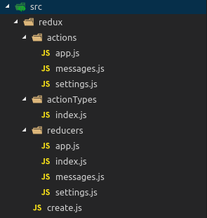
Redux Code

Redux Action associated with chat bubble is handleChatBubble. Redux state chatBubble can have 3 states:

  • minimised – chat bubble is not visible. This set state is set when the chat is viewed in full screen mode.
  • bubble – only the chat bubble is visible. This state is set when close icon is clicked and on toggle.
  • full – the chat bubble along with message section is visible. This state is set when minimize icon is clicked on full screen mode and on toggle.
const defaultState = {
chatBubble: 'bubble',
};
export default handleActions(
 {
  [actionTypes.HANDLE_CHAT_BUBBLE](state, { payload }) {
     return {
       ...state,
       chatBubble: payload.chatBubble,
     };
   },
 },
 defaultState,
);

Speech box for skill example

The user can click on the speech box for skill example and immediately view the answer for the skill on the chatbot. When a speech bubble is clicked a query parameter testExample is added to the URL. The value of this query parameter is resolved and answered by Message Composer. To be able to generate an answer bubble again and again for the same query, we have a reducer state testSkillExampleKey which is updated when the user clicks on the speech box. This is passed as key parameter to messageSection.

Chat Bubble Code

The functions involved in the working of chatBubble code are:

  • openFullScreen – This function is called when the full screen icon is clicked in the tab and laptop view and also when chat bubble is clicked in mobile view. This opens up a full screen dialog with message section. It dispatches handleChatBubble action which sets the chatBubble reducer state as minimised.
  • closeFullScreen – This function is called when the exit full screen icon is clicked. It dispatches a handleChatBubble action which sets the chatBubble reducer state as full.
  • toggleChat –  This function is called when the user clicks on the chat bubble. It dispatches handleChatBubble action which toggles the chatBubble reducer state between full and bubble.
  • handleClose – This function is called when the user clicks on the close icon. It dispatches handleChatBubble action which sets the chatBubble reducer state to bubble.
openFullScreen = () => {
   const { actions } = this.props;
   actions.handleChatBubble({
     chatBubble: 'minimised',
   });
   actions.openModal({
     modalType: 'chatBubble',
     fullScreenChat: true,
   });
 };

 closeFullScreen = () => {
   const { actions } = this.props;
   actions.handleChatBubble({
     chatBubble: 'full',
   });
   actions.closeModal();
 };

 toggleChat = () => {
   const { actions, chatBubble } = this.props;
   actions.handleChatBubble({
     chatBubble: chatBubble === 'bubble' ? 'full' : 'bubble',
   });
 };

 handleClose = () => {
   const { actions } = this.props;
   actions.handleChatBubble({ chatBubble: 'bubble' });
   actions.closeModal();
 };

Message Section Code (Reduced)

The message section comprises of three parts the actionBar, messageSection and the message Composer.

Action Bar

The actionBar consists of the action buttons – search, full screen, exit full screen and close button. Clicking on the search button expands and opens up a search bar. On clicking the full screen icon openFullScreen function is called which open up the chat dialog. On clicking the exit icon the handleClose function is called, which set chatBubble reducer state to bubble. On full screen view, clicking on the exit full screen icon calls the closeFullScreen functions which sets the reducer state chatBubble to full.

   const actionBar = (
     <ActionBar fullScreenChat={fullScreenChat}>
       {fullScreenChat !== undefined ? (
         <FullScreenExit onClick={this.closeFullScreen} width={width} />
       ) : (
         <FullScreen onClick={this.openFullScreen} width={width} />
       )}
       <Close onClick={fullScreenChat ? this.handleClose : this.toggleChat}/>
     </ActionBar>
   );

Message Section

The message section has two parts MessageList and Message Composer. Message List is where the messages are viewed and the Message composer allows you to interact with the bot through text and speech. ScrollBar is imported from the npm library react-custom-scrollbars. When the scroll bar is moved it sets the state of showScrollTop and showScrollBottom in the chat. messageListItems consists of all the messages between the user and the bot.


   const messageSection = (
     <MessageSectionContainer showChatBubble={showChatBubble} height={height}>
       {loadingHistory ? (
         <CircularLoader height={38} />
       ) : (
         <Fragment>
           {fullScreenChat ? null : actionBar}
           <MessageList
             ref={c => {
               this.messageList = c;
             }}
             pane={pane}
             messageBackgroundImage={messageBackgroundImage}
             showChatBubble={showChatBubble}
             height={height}>
             <Scrollbars
               renderThumbHorizontal={this.renderThumb}
               renderThumbVertical={this.renderThumb}
               ref={ref => {
                 this.scrollarea = ref;
               }}
               onScroll={this.onScroll}
               autoHide={false}>
               {messageListItems}
               {!search && loadingReply && this.getLoadingGIF()}
             </Scrollbars>
           </MessageList>
           {showScrollTop && (
             <ScrollTopFab
               size="small"
               backgroundcolor={body}
               color={theme === 'light' ? 'inherit' : 'secondary'}
               onClick={this.scrollToTop}
             >
               <NavigateUp />
             </ScrollTopFab>
           )}
           {showScrollBottom && (
             <ScrollBottomContainer>
               <ScrollBottomFab
                 size="small"
                 backgroundcolor={body}
                 color={theme === 'light' ? 'inherit' : 'secondary'}
                 onClick={this.scrollToBottom}>
                 <NavigateDown />
               </ScrollBottomFab>
             </ScrollBottomContainer>
           )}
         </Fragment>
       )}
       <MessageComposeContainer
         backgroundColor={composer}
         theme={theme}
         showChatBubble={showChatBubble}>
         <MessageComposer
           focus={!search}
           dream={dream}
           speechOutput={speechOutput}
           speechOutputAlways={speechOutputAlways}
           micColor={button}
           textarea={textarea}
           exitSearch={this.exitSearch}
           showChatBubble={showChatBubble}
         />
       </MessageComposeContainer>
     </MessageSectionContainer>
   );

 const Chat = (
     <ChatBubbleContainer className="chatbubble" height={height} width={width}>
       {chatBubble === 'full' ? messageSection : null}
       {chatBubble !== 'minimised' ? (
         <SUSILauncherContainer>
           <SUSILauncherWrapper
             onClick={width < 500 ? this.openFullscreen : this.toggleChat}>
             <SUSILauncherButton data-tip="Toggle Launcher" />
           </SUSILauncherWrapper>
         </SUSILauncherContainer>
       ) : null}
     </ChatBubbleContainer>
   );

Resources

Continue ReadingImplementing a Chat Bubble in SUSI.AI

List SUSI.AI Devices in Admin Panel

In this blog I’ll be explaining about the Devices Tab in SUSI.AI Admin Panel. Admins can now view the connected devices of the users with view, edit and delete actions. Also the admins can directly view the location of the device on the map by clicking on the device location of that user.

Implementation

List Devices

Admin device Tab

Devices tab displays device name, macId, room, email Id, date added, last active, last login IP and location of the device. loadDevices function is called on componentDidMount which calls the fetchDevices API which fetches the list of devices from /aaa/getDeviceList.json endpoint. List of all devices is stored in devices array. Each device in the array is an object with the above properties. Clicking on the device location opens a popup displaying the device location on the map.

loadDevices = () => {
   fetchDevices()
     .then(payload => {
       const { devices } = payload;
       let devicesArray = [];
       devices.forEach(device => {
         const email = device.name;
         const devices = device.devices;
         const macIdArray = Object.keys(devices);
         const lastLoginIP =
           device.lastLoginIP !== undefined ? device.lastLoginIP : '-';
         const lastActive =
           device.lastActive !== undefined
             ? new Date(device.lastActive).toDateString()
             : '-';
         macIdArray.forEach(macId => {
           const device = devices[macId];
           let deviceName = device.name !== undefined ? device.name : '-';
           deviceName =
             deviceName.length > 20
               ? deviceName.substr(0, 20) + '...'
               : deviceName;
           let location = 'Location not given';
           if (device.geolocation) {
             location = (
               
                 {device.geolocation.latitude},{device.geolocation.longitude}
               
             );
           }
           const dateAdded =
             device.deviceAddTime !== undefined
               ? new Date(device.deviceAddTime).toDateString()
               : '-';
 
           const deviceObj = {
             deviceName,
             macId,
             email,
             room: device.room,
             location,
             latitude:
               device.geolocation !== undefined
                 ? device.geolocation.latitude
                 : '-',
             longitude:
               device.geolocation !== undefined
                 ? device.geolocation.longitude
                 : '-',
             dateAdded,
             lastActive,
             lastLoginIP,
           };
           devicesArray.push(deviceObj);
         });
       });
       this.setState({
         loadingDevices: false,
         devices: devicesArray,
       });
     })
     .catch(error => {
       console.log(error);
     });
 };

View Device

User Device Page

View action redirects to users /mydevices?email<email>&macid=<macid>. This allows admin to have full control of the My devices section of the user. Admin can change device details and delete device. Also admin can see all the devices of the user from the ALL tab. To edit a device click on edit icon in the table, update the details and click on check icon. To delete a device click on the delete device which then asks for confirmation of device name and on confirmation deletes the device.

Edit Device

Edit Device Dialog

Edit actions opens up a dialog modal which allows the admin to update the device name and room. Clicking on the edit button calls the modifyUserDevices API which takes in email Id, macId, device name and room name as parameters. This calls the API endpoint /aaa/modifyUserDevices.json.

 handleChange = event => {
   this.setState({ [event.target.name]: event.target.value });
 };

 render() {
   const { macId, email, handleConfirm, handleClose } = this.props;
   const { room, deviceName } = this.state;
   return (
     <React.Fragment>
       <DialogTitle>Edit Device Details for {macId}</DialogTitle>
       <DialogContent>
         <OutlinedTextField
           value={deviceName}
           label="Device Name"
           name="deviceName"
           variant="outlined"
           onChange={this.handleChange}
           style={{ marginRight: '20px' }}
         />
         <OutlinedTextField
           value={room}
           label="Room"
           name="room"
           variant="outlined"
           onChange={this.handleChange}
         />
       </DialogContent>
       <DialogActions>
         <Button
           key={1}
           color="primary"
           onClick={() => handleConfirm(email, macId, room, deviceName)}>
           Change
         </Button>
         <Button key={2} color="primary" onClick={handleClose}>
           Cancel
         </Button>
       </DialogActions>
     </React.Fragment>
   );
 }

Delete Device

Delete Device Dialog

Delete action opens up a confirm delete dialog modal. To delete a device enter the device name and click on delete. This calls the confirmDelete function which calls the removeUserDevice API which takes in email Id and macId as parameters. This API hits the endpoint /aaa/removeUserDevices.json.

confirmDelete = () => {
   const { actions } = this.props;
   const { macId, email } = this.state;
   removeUserDevice({ macId, email })
     .then(payload => {
       actions.openSnackBar({
         snackBarMessage: payload.message,
         snackBarDuration: 2000,
       });
       actions.closeModal();
       this.setState({
         loadingDevices: true,
       });
       this.loadDevices();
     })
     .catch(error => {
       actions.openSnackBar({
         snackBarMessage: `Unable to delete device with macID ${macId}. Please try again.`,
         snackBarDuration: 2000,
       });
     });
 };

To conclude, admin can now view all the connected SUSI.AI devices along with the user details and location. They can also access users My Devices tab in Dashboard and update and delete devices.

Resources

Continue ReadingList SUSI.AI Devices in Admin Panel

CRUD operations on Config Keys in Admin Panel of SUSI.AI

SUSI.AI Admin Panel now allows the Admin to create, read, update and delete config keys present in system settings. Config keys are API keys which are used to link the application to third party services like Google Maps, Google ReCaptcha, Google Analytics, Matomo, etc. The API key is a unique identifier that is used to authenticate requests associated with the project for usage and billing purposes.

CRUD Operations

Create Config Key

To create a config key click on “Add Config Key” Button, a dialog opens up which has two field Key Name and Key Value. this.props.actions.openModal opens up the shared Dialog Modal. On clicking on “Create”, the createApiKey is called which takes in the two parameters.

handleCreate = () => {
   this.props.actions.openModal({
     modalType: 'createSystemSettings',
     type: 'Create',
     handleConfirm: this.confirmUpdate,
     keyName: this.state.keyName,
     keyValue: this.state.keyValue,
     handleClose: this.props.actions.closeModal,
   });
 };
 handleSave = () => {
   const { keyName, keyValue } = this.state;
   const { handleConfirm } = this.props;
   createApiKey({ keyName, keyValue })
     .then(() => handleConfirm())
     .catch(error => {
       console.log(error);
     });
 }; 

Read Config Key

API endpoint fetchApiKeys is called on componentDidMount and when Config Key is created, updated or deleted.

 fetchApiKeys = () => {
   fetchApiKeys()
     .then(payload => {
       let apiKeys = [];
       let i = 1;
       let keys = Object.keys(payload.keys);
       keys.forEach(j => {
         const apiKey = {
           serialNum: i,
           keyName: j,
           value: payload.keys[j],
         };
         ++i;
         apiKeys.push(apiKey);
       });
       this.setState({
         apiKeys: apiKeys,
         loading: false,
       });
     })
     .catch(error => {
       console.log(error);
     });
 };

Update Config Key

To Update a config key click on edit from the actions column, Update Config Key dialog opens up which allows you to edit the key value. On clicking on update, the createApiKey API is called.

 handleUpdate = row => {
   this.props.actions.openModal({
     modalType: 'updateSystemSettings',
     type: 'Update',
     keyName: row.keyName,
     keyValue: row.value,
     handleConfirm: this.confirmUpdate,
     handleClose: this.props.actions.closeModal,
   });
 };

Delete Config Key

To delete a config key click on delete from actions column, delete config key confirmation dialog opens up. On clicking on Delete, the deleteApiKey is called which takes in key name as parameter.

 handleDelete = row => {
   this.setState({ keyName: row.keyName });
   this.props.actions.openModal({
     modalType: 'deleteSystemSettings',
     keyName: row.keyName,
     handleConfirm: this.confirmDelete,
     handleClose: this.props.actions.closeModal,
   });
 };
 confirmDelete = () => {
   const { keyName } = this.state;
   deleteApiKey({ keyName })
     .then(this.fetchApiKeys)
     .catch(error => {
       console.log(error);
     });
   this.props.actions.closeModal();
 };

In conclusion, CRUD operations of Config Keys help admins to manage third party services. With these operations the admin can manage the API keys of various services without having to look for them in the backend.

Resources

Continue ReadingCRUD operations on Config Keys in Admin Panel of SUSI.AI

Dialog Component in SUSI.AI

Dialog Component in SUSI.AI is rendered in App.js to remove code redundancy. Redux is integrated in the Dialog component which allows us to open/close the dialog from any component by altering the modal states. This implementation allows us to get rid of the need of having dialog component in different components.

Redux Code

There are two actions and reducers which control the dialog component. Default state of isModalOpen is false and modalType is an empty string. To open a dialog modal the action openModal is dispatched, which sets isModalOpen to true and the modalType. To close a dialog modal the action closeModal is dispatched, which sets isModalOpen to default state i.e. false.

import { handleActions } from 'redux-actions';
import actionTypes from '../actionTypes';

const defaultState = {
 modalProps: {
   isModalOpen: false,
   modalType: '',
 },
};

export default handleActions(
 {
   [actionTypes.UI_OPEN_MODAL](state, { payload }) {
     return {
       ...state,
       modalProps: {
         isModalOpen: true,
         ...payload,
       },
     };
   },
   [actionTypes.UI_CLOSE_MODAL](state) {
     return {
       ...state,
       modalProps: defaultState.modalProps,
     };
   },
 }
 defaultState,
);

Shared Dialog Component

Dialog Modal can be opened from any component by dispatching an action. 

To open a Dialog Modal: this.props.actions.openModal({modalType: [modal name]});

To close a Dialog Modal: this.props.actions.closeModal();

Shared Dialog Component has a DialogData object which contains objects with two main properties : Dialog component and Dialog size. Other props can also be passed along with these two properties such as fullScreen. Dialog Content of different Dialogs are present in their respective folders. Each Dialog Content has a Title, Content and Actions.Different Dialog types present are:

  1. Confirm Delete with Input: This dialog modal is used when a user deletes account, device and skill. 
  2. Confirm Dialog: This dialog modal is used where confirmation is required from the user/admin such as on changing skill status, on password reset,etc.
  3. Share Dialog: This dialog modal opens up when the share icon is clicked in the chat.
  4. Standard Action Dialog: This dialog modal opens up on restore skill, delete feedback, system settings and bot.
  5. Tour Dialog: This dialog modal opens up SUSI.AI tour.

To add a new Dialog to DialogSection, the steps are:

  1. Import the Dialog Content Component
  2. Add the Dialog Component to DialogData object in the following manner:
const DialogData = {
[dialog componet name]: { Component : [imported dialog component name], size : [size of the Dialog Component]},
}

Code (Reduced)

const DialogData = {
  login: { Component: Login, size: 'sm' },
}
const DialogSection = props => {
 const {
   actions,
   modalProps: { isModalOpen, modalType, ...otherProps },
   visited,
 } = props;

 const getDialog = () => {
   if (isModalOpen) {
     return DialogData[modalType];
   }
   return DialogData.noComponent;
 };

 const { size, Component, fullScreen = false } = getDialog();

return (
   <Dialog
      maxWidth={size}
      fullWidth={true}
      open={isModalOpen || !visited}
      onClose={isModalOpen ? actions.closeModal : actions.setVisited}
      fullScreen={fullScreen}
    >
     <DialogContainer>
       {Component ? <Component {...otherProps} /> : null}
     </DialogContainer>
  </Dialog>
)
};

In conclusion, having a shared dialog component reduces redundant code and allows to have a similar Dialog UI across the repo. Also having one component managing all the dialogs removes the possibility of  two dialogs being fired up at once.

Resources

Continue ReadingDialog Component in SUSI.AI

My Devices in SUSI.AI

In this blog I’ll be explaining how to view, edit and delete connected devices from SUSI.AI webclient. To connect a device open up the SUSI.AI android app, and fill the details accordingly. Device can also be connected by logging in to your raspberry pi. Once the devices is connected you can edit, delete and access specific features for the device from the web client.

My Devices

All the connected devices can be viewed in My Devices tab in the Dashboard. In this tab all the devices connected to your account are listed in a table along with their locations on the map. Each device table row has three action buttons – view, edit and delete. Clicking on the view button takes to device specific page. Clicking on the edit button makes the fields name and room editable in table row. Clicking on the delete button opens a confirm with input dialog. Device can be deleted by entering the device name and clicking on delete.

To fetch all the device getUserDevices action is dispatched on component mounting which sets the reducer state devices in settings reducer. initialiseDevices function is called after all the devices are fetched from the server. This function creates an array of objects of devices with name, room, macId, latitude, longitude and location.

 componentDidMount() {
   const { accessToken, actions } = this.props;
   if (accessToken) {
     actions
       .getUserDevices()
       .then(({ payload }) => {
         this.initialiseDevices();
         this.setState({
           loading: false,
           emptyText: 'You do not have any devices connected yet!',
         });
       })
       .catch(error => {
         this.setState({
           loading: false,
           emptyText: 'Some error occurred while fetching the devices!',
         });
         console.log(error);
       });
   }
   document.title =
     'My Devices - SUSI.AI - Open Source Artificial Intelligence for Personal  Assistants, Robots, Help Desks and Chatbots';
 }
 initialiseDevices = () => {
   const { devices } = this.props;
 
   if (devices) {
     let devicesData = [];
     let deviceIds = Object.keys(devices);
     let invalidLocationDevices = 0;
 
     deviceIds.forEach(eachDevice => {
       const {
         name,
         room,
         geolocation: { latitude, longitude },
       } = devices[eachDevice];
 
       let deviceObj = {
         macId: eachDevice,
         deviceName: name,
         room,
         latitude,
         longitude,
         location: `${latitude}, ${longitude}`,
       };
 
       if (
         deviceObj.latitude === 'Latitude not available.' ||
         deviceObj.longitude === 'Longitude not available.'
       ) {
         deviceObj.location = 'Not found';
         invalidLocationDevices++;
       } else {
         deviceObj.latitude = parseFloat(latitude);
         deviceObj.longitude = parseFloat(longitude);
       }
       devicesData.push(deviceObj);
     });
 
     this.setState({
       devicesData,
       invalidLocationDevices,
     });
   }
 };

Device Page

Clicking on the view icon button in my devices redirects to mydevices/:macId. This page consists of device information in tabular format, local configuration settings and location of the device on the map. User can edit and delete the device from actions present in table. Local configuration settings can be accessed only if the user is logged in the local server.

Edit Device

To edit a device click on the edit icon button in the actions column of the table. The name and room field become editable.On changing the values handleChange function is called which updates the devicesData state. Clicking on the tick icon saves the new details by calling the onDeviceSave function. This function class the addUserDevice api which takes in the new device details.

startEditing = rowIndex => {
   this.setState({ editIdx: rowIndex });
 };
 
 handleChange = (e, fieldName, rowIndex) => {
   const value = e.target.value;
   let data = this.state.devicesData;
   this.setState({
     devicesData: data.map((row, index) =>
       index === rowIndex ? { ...row, [fieldName]: value } : row,
     ),
   });
 };

 handleDeviceSave = rowIndex => {
   this.setState({
     editIdx: -1,
   });
   const deviceData = this.state.devicesData[rowIndex];
 
   addUserDevice({ ...deviceData })
     .then(payload => {})
     .catch(error => {
       console.log(error);
     });
 };

Delete Device

To delete a device click on the delete icon button under the actions column in the table. Clicking on the delete device button opens up the confirm with input dialog modal. Type in the name of the device and click on delete. Clicking on delete calls the handeRemoveDevice function which calls the removeUserDevice api which takes in the macId. On deleting the device user is redirected to the My Devices in Dashboard.

 handleRemoveConfirmation = () => {
   this.props.actions.openModal({
     modalType: 'deleteDevice',
     name: this.state.devicesData[0].deviceName,
     handleConfirm: this.handleRemoveDevice,
     handleClose: this.props.actions.closeModal,
   });
 };
 handleRemoveDevice = () => {
   const macId = this.macId;
   removeUserDevice({ macId })
     .then(payload => {
       this.props.actions.closeModal();
       window.location.replace('/mydevices);
     })
     .catch(error => {
       console.log(error);
     });
 };

In conclusion, My Devices tab in dashboard helps you manage the devices connected with your account along with specific device configuration. Now the users can edit, view and delete their connected devices.

Resources

Continue ReadingMy Devices in SUSI.AI

Integrating Redux with SUSI.AI Web Clients

In this blog post, we are going to go through the implementation of the Redux integration on the SUSI.AI web clients. The existing SUSI.AI WebChat codebase has Flux integrated into it, but integrating Redux would make it a lot easier to manage the app state in a single store. And would result in a more maintainable and performant application. Let us go through the implementation in the blog –

The key steps involved the following –

  • Restructuring the directory structure of the repository to enable better maintenance.
  • Creating a Redux store and configuring the middlewares.
  • Standardizing the format for writing actions and make API calls on dispatching an action.
  • Standardizing the format for writing reducers.
  • Hook the components to the Redux store.

Restructuring the directory structure

DIrectory structure for https://chat.susi.ai
  • All the redux related files and utils are put into the redux directory, to avoid any sort of confusion, better maintenance and enhanced discoverability. The prime reason for it also because the integration was done side-by-side the existing Flux implementation.
  • The actions and reducers directory each has a index.js, which exports all the actions and reducers respectively, so as to maintain a single import path for the components and this also helped to easily split out different types of actions/reducers.

Creating Redux store and configure middlewares

import { createStore as _createStore, applyMiddleware } from 'redux';
import { routerMiddleware } from 'react-router-redux';
import reduxPromise from 'redux-promise';
import reducers from './reducers';

export default function createStore(history) {
 // Sync dispatched route actions to the history
 const reduxRouterMiddleware = routerMiddleware(history);
 const middleware = [reduxRouterMiddleware, reduxPromise];

 let finalCreateStore;
 finalCreateStore = applyMiddleware(...middleware)(_createStore);

 const store = finalCreateStore(
   reducers,
   {},
   window.__REDUX_DEVTOOLS_EXTENSION__ &&
     window.__REDUX_DEVTOOLS_EXTENSION__(),
 );

 return store;
}
  • The function createStore takes in the browserHistory (provided by React Router) and returns a single store object that is passed on to the entry point component of the App.
  • The store is passed to the application via the <Provider> component, provided by the react-redux. It is wrapped to the <App> component as follows –

ReactDOM.render(
 <Provider store={store} key="provider">
   <App />
 </Provider>,
 document.getElementById('root'),
);
  • The 2 middlewares used are routerMiddleware provided by the react-router-redux and the reduxPromise provided by redux-promise.
  • The routerMiddleware enhances a history instance to allow it to synchronize any changes it receives into application state.
  • The reduxPromise returns a promise to the caller so that it can wait for the operation to finish before continuing. This is useful to assist the application to tackle async behaviour.

Standardizing the actions and making API calls on action dispatch

  • The actions file contains the following –

import { createAction } from 'redux-actions';
import actionTypes from '../actionTypes';
import * as apis from '../../apis';

const returnArgumentsFn = function(payload) {
 return Promise.resolve(payload);
};

export default {
// API call on action dispatch
 getApiKeys: createAction(actionTypes.APP_GET_API_KEYS, apis.fetchApiKeys),
// Returns a promise for actions not requiring API calls
 logout: createAction(actionTypes.APP_LOGOUT, returnArgumentsFn),
};

  • As new actions are added, it can be added to the actionTypes file and can be added in the export statement of the above snippet. This enables very standard and easy to manage actions.
  • This approach allows to handle both types of action dispatch – with and without API call. In case of API call on dispatch, the action resolves with the payload of the API.
  • The APIs are called via the AJAX helper (Check out this blog – https://blog.fossasia.org/make-a-helper-for-ajax-requests-using-axios/ ).

Standardizing the reducers and combining them

  • The reducers file contains the following –

import { handleActions } from 'redux-actions';
import actionTypes from '../actionTypes';

const defaultState = {
 ...
 apiKeys: {},
 ...
};

export default handleActions({
  [actionTypes.APP_GET_API_KEYS](state, { payload }) {
     const { keys } = payload;
     return {
       ...state,
       apiKeys: { ...keys },
     };
  },
  ...
},defaultState);
  • The default application state is defined and the reducer corresponding to each action type returns an immutable object which is the new application state,
  • In the above example, the payload from the getApiKeys API call is received in the reducer, which then updated the store.
  • The reducers/index.js  combines all the reducers using combineReducers provided by redux and exports a single object of reducers.

import { combineReducers } from 'redux';
import { routerReducer } from 'react-router-redux';
import app from './app';
import settings from './settings';
import messages from './messages';

export default combineReducers({
 routing: routerReducer,
 app,
 settings,
 messages,
});

Hook the components to the Redux store

  • After Redux integration and standardization of the reducers, actions, any of the component can be hooked to the store as follows –

import React, { Component } from 'react';
import { connect } from 'react-redux';
import { bindActionCreators } from 'redux';

class MyComponent extends Component {
 componentDidMount() {
    // Dispatch an action
    this.props.actions.getApiKeys();
 }
 render() {
   const { apiKeys } = this.props;
   return (
     <div>
        /* JSX */
     </div>     
   );
 }
}

function mapStateToProps(store) {
 const { apiKeys } = store.app;
 return {
   apiKeys
 };
}

function mapDispatchToProps(dispatch) {
 return {
   actions: bindActionCreators(actions, dispatch),
 };
}

export default connect(mapStateToProps, mapDispatchToProps)(MyComponent);
  • The mapStateToProps is a function that is used to provide the store data to the component via props, whereas mapDispatchToProps is used to provide the action creators as props to the component.

The above was the implementation of Redux in the SUSI.AI Web Clients. I hope the blog provided a detailed insight of how Redux was integrated and the standards that were followed.

References

Continue ReadingIntegrating Redux with SUSI.AI Web Clients

Adding News Tab in Susper

Most of the current search engines have a News tab where results are displayed which are fetched from different News Organisations. The latest results are displayed on top followed by the older ones. Current market leader, Google even uses AI and Machine Learning to analyze the contents before delivering it as results to the user. In this blog, I will describe how I have implemented a basic News Tab in Susper which show news results from dailymail.co.uk . This News tab can be improved in future to match the market leader.

Implementation of News tab in Susper:

Implementation of News tab in UI:

To implement News tab the current design pattern has been followed in Susper. Here is the code to show News tab on the results page.

<ul type="none" id="search-options">
       <li [class.active_view]="Display('news')" (click)="newsClick()">News</li>

Angular attribute binding is used to bind the active_view property with the “Display(‘news’)” function and the click event is associated with “newsClick()” function.

Here is the code for newsClick() function which filters the result using ‘site:’ parameter of yacy and then dispatches the ‘urldata’ object to ‘QueryServerAction(urldata)’ function in Query Action.

newsClick() {
   let urldata = Object.assign({}, this.searchdata);
   this.getPresentPage(1);
   this.resultDisplay = 'news';
   delete urldata.fq;
   urldata.rows = 10;
   if (urldata.query.substr(urldata.query.length - 25, 25) !== " site:www.dailymail.co.uk") {
     urldata.query += " site:www.dailymail.co.uk";
   } else {
     urldata.query += "";
   }
   urldata.resultDisplay = this.resultDisplay;
   this.store.dispatch(new queryactions.QueryServerAction(urldata));
   }

Here is the code for Query Action in query.ts file. It has two actions QueryAction and QueryServerAction

export const ActionTypes = {
 QUERYCHANGE: type('[Query] Change'),
 QUERYSERVER: type('[Query] Server'),
};
export class QueryAction implements Action {
 type = ActionTypes.QUERYCHANGE;

 constructor(public payload: any) {}
}
export class QueryServerAction implements Action {
 type = ActionTypes.QUERYSERVER;
 constructor(public payload: any) {}
}
export type Actions
 = QueryAction|QueryServerAction ;

Now the reducer takes either of the two query actions and the current state and returns the new state to the store.

Here is the code for the reducer query.ts

export const CHANGE = 'CHANGE';
export interface State {
 query: string;
 wholequery: any;
}
const initialState: State = {
 query: '',
 wholequery: {
   query: '',
   rows: 10,
   start: 0,
   mode: 'text'
 },
};
export function reducer(state: State = initialState, action: query.Actions): State {
 switch (action.type) {
   case query.ActionTypes.QUERYCHANGE: {
     const changeQuery = action.payload;
     return Object.assign({}, state, {
       query: changeQuery,
       wholequery: state.wholequery
     });
   }
   case query.ActionTypes.QUERYSERVER: {
     let serverQuery = Object.assign({}, action.payload);
     let resultCount = 10;
     if (localStorage.getItem('resultscount')) {
       resultCount = JSON.parse(localStorage.getItem('resultscount')).value || 10;
     }
     let instantsearch = JSON.parse(localStorage.getItem('instantsearch'));

     if (instantsearch && instantsearch.value) {
       resultCount = 10;
     }

     serverQuery.rows = resultCount;
     return Object.assign({}, state, {
       wholequery: serverQuery,
       query: state.query
     });
   }
   default: {
     return state;
   }
 }
}
export const getpresentquery = (state: State) => state.query;
export const getpresentwholequery = (state: State) => state.wholequery;


From the store the modified query is available to all other components of the appand is used by search service to get the filtered results.

The search results are then stored in observable items$ in results.components.ts and is then used in results.components.html to display results under News tab.

Here is the code to display the results.

 <div class="feed container">
     <div *ngFor="let item of items$|async" class="result">
       <div class="title">
         <a class="title-pointer" href="{{item.link}}">{{item.title}}</a>
       </div>
       <div class="link">
         <p>{{item.link}}</p>
       </div>
     </div>
   </div>


Resources

1.YaCy Search Parameters: http://www.yacywebsearch.net/wiki/index.php/En:SearchParameters

2.Redux in Angular: http://blog.ng-book.com/introduction-to-redux-with-typescript-and-angular-2/

3.Corresponding PR: https://github.com/fossasia/susper.com/pull/1023

Continue ReadingAdding News Tab in Susper

Fixing Infinite Scroll Feature for Susper using Angular

In Susper, we faced a unique problem. Every time the image tab was opened, and the user scrolled through the images, all the other tabs in the search engine, such as All, Videos etc, would stop working. They would continue to display image results as shown:

Since this problem occurred only when the infinite scroll action was called in the image tab, I diagnosed that the problem probably was in the url parameters being set.

The url parameters were set in the onScroll() function as shown:

onScroll () {
let urldata = Object.assign({}, this.searchdata);
this.getPresentPage(1);
this.resultDisplay = ‘images’;
urldata.start = (this.startindex) + urldata.rows;
urldata.fq = ‘url_file_ext_s:(png+OR+jpeg+OR+jpg+OR+gif)’;
urldata.resultDisplay = this.resultDisplay;
urldata.append = true;
urldata.nopagechange = true;
this.store.dispatch(new queryactions.QueryServerAction(urldata));
};

The parameters append and nopagechange were to ensure that the images are displayed in the same page, one after the other.
To solve this bug I first displayed the query call each time a tab is clicked on the web console.
Here I noticed that for the tab videos, nopagechange and append attributes still persisted, and had not been reset. The start offset had not been set to 0 either.
So adding these few lines before making a query call from any tab, would solve the problem.

urldata.start = 0;
urldata.nopagechange = false;
urldata.append = false;

Now the object is displayed as follows:

Now videos are displayed in the videos tab, text in the text tab and so on.
Please refer to results.component.ts for the entire code.

References:

  1. On how to dispatch queries to the store: https://gist.github.com/btroncone/a6e4347326749f938510
  2. Tutorial on the ngrx suite:http://bodiddlie.github.io/ng-2-toh-with-ngrx-suite/
Continue ReadingFixing Infinite Scroll Feature for Susper using Angular

Reactive Side Effects of Actions in Loklak Search

In a Redux based application, every component of the application is state driven. Redux based applications manage state in a predictable way, using a centralized Store, and Reducers to manipulate various aspects of the state. Each reducer controls a specific part of the state and this allows us to write the code which is testable, and state is shared between the components in a stable way, ie. there are no undesired mutations to the state from any components. This undesired mutation of the shared state is prevented by using a set of predefined functions called reducers which are central to the system and updates the state in a predictable way.

These reducers to update the state require some sort triggers to run. This blog post concentrates on these triggers, and how in turn these triggers get chained to form a Reactive Chaining of events which occur in a predictable way, and how this technique is used in latest application structure of Loklak Search. In any state based asynchronous application, like, Loklak Search the main issue with state management is to handle the asynchronous action streams in a predictable manner and to chain asynchronous events one after the other.  The technique of reactive action chaining solves the problem of dealing with asynchronous data streams in a predictable and manageable manner.

Overview

Actions are the triggers for the reducers, each redux action consists of a type and an optional payload. Type of the action is like its ID which should be purposely unique in the application. Each reducer function takes the current state which it controls and action which is dispatched. The reducer decides whether it needs to react to that action or not. If the user reacts to the action, it modifies the state according to the action payload and returns the modified state, else, it returns the original state. So at the core, the actions are like the triggers in the application, which make one or more reducers to work. This is the basic architecture of any redux application. The actions are the triggers and reducers are the state maintainers and modifiers. The only way to modify the state is via a reducer, and a reducer only runs when a corresponding action is dispatched.

Now, who dispatches these actions? This question is very important. The Actions can be technically dispatched from anywhere in the application, from components, from services, from directives, from pipes etc. But we almost in every situation will always want the action to be dispatched by the component. Component who wishes to modify the state dispatch the corresponding actions.

Reactive Effects

If the components are the one who dispatch the action, which triggers a reducer function which modifies the state, then what are these effects, cause the cycle of events seem pretty much complete. The Effects are the Side Effects, of a particular action. The term “side effect” means these are the piece of code which runs whenever an action is dispatched. Don’t confuse them with the reducer functions, effects are not same as the reducer functions as they are not associated with any state i.e. they don’t modify any state. They are the independent sources of other actions. What this means is whenever an Action is dispatched, and we want to dispatch some other action, maybe immediately or asynchronously, we use these side effects. So in a nutshell, effects are the piece of code which reacts to a particular action, and eventually dispatches some other actions.

The most common use case of effects is to call a corresponding service and fetch the data from the server, and then when the data is loaded, dispatch a SearchCompleteAction. These are the simplest of use cases of effects and are most commonly use in Loklak Search. This piece of code below shows how it is done.

@Effect()
search$: Observable<Action>
= this.actions$
.ofType(apiAction.ActionTypes.SEARCH)
.map((action: apiAction.SearchAction) => action.payload)
.switchMap(query => {
return this.apiSearchService.fetchQuery(query)
.map(response => new apiAction.SearchCompleteSuccessAction(response))

This is a very simple type of an effect, it filters out all the actions and react to only the type of action which we are interested in, here SEARCH, and then after calling the respective Service, it either dispatches SearchComplete or a SearchFail action depending on the status of the response from the API. The effect runs on SEARCH action and eventually dispatches, the success or the fail actions.

This scheme illustrates the effect as another point apart from components, to dispatch some action. The difference being, components dispatch action on the basis of the User inputs and events, whereas Effects dispatch actions on the basis of other actions.

Reactive Chaining of Actions

We can thus take the advantage of this approach in a form of reactive chaining of actions. This reactive chaining of actions means that some component dispatches some action, which as a side effects, dispatches some other action, and it dispatches another set of actions and so on. This means a single action dispatched from a component, brings about the series of actions which follow one another. This approach makes it possible to write reducers at the granular level rather than complete state level. As a series of actions can be set up which, start from a fine grain, and reaches out to a coarse grain. The loklak search application uses this technique to update the state of query. The reducers in the loklak search rather than updating the whole query structure update only the required part of the state. This helps in code maintainability as the one type of query attribute has no effect on the other type

@Effect()
inputChange$: Observable<Action>
= this.actions$
.ofType(queryAction.ActionTypes.VALUE_CHANGE)
.map(_ => new queryAction.QueryChangeAction(''));

@Effect()
filterChange$: Observable<Action>
= this.actions$
.ofType(queryAction.ActionTypes.FILTER_CHANGE)
.map(_ => new queryAction.QueryChangeAction(''));

Here the QUERY_CHANGE action further can do other processing of the query and then dispatch the SearchAction, which eventually calls the service and then return the response, then the success or fail actions can be dispatched eventually.

Conclusion

The reactive side effects is one of the most beautiful thing we can do with Redux and Reactive Programming. They provide an easy clean way to chain events in an application, which helps in a cleaner non-overlapping state management along with clean and simple reducers. This idea of the reactive chaining can be extended to any level of sophistication, and that too in a simple and easy to understand manner.

Resources and links

Continue ReadingReactive Side Effects of Actions in Loklak Search

Implementing Advanced Search Feature In Susper

Susper has been provided ‘Advanced Search’ feature which provides the user a great experience to search for desired results. Advanced search has been implemented in such a way it shows top authors, top providers, and distribution regarding protocols. Users can choose any of these options to get best results.

We receive data of each facet name from Yacy using yacy search endpoint. More about yacy search endpoint can be found here:  http://yacy.searchlab.eu/solr/select?query=india&fl=last_modified&start=0&rows=15&facet=true&facet.mincount=1&facet.field=host_s&facet.field=url_protocol_s&facet.field=author_sxt&facet.field=collection_sxt&wt=yjson

For implementing this feature, we created Actions and Reducers using concepts of Redux. The implemented actions can be found here: https://github.com/fossasia/susper.com/blob/master/src/app/actions/search.ts

Actions have been implemented because these actually represent some kind of event. For e.g. like the beginning of an API call here.

We also have created an interface for search action which can be found here under reducers as filename index.ts: https://github.com/fossasia/susper.com/blob/master/src/app/reducers/index.ts

Reducers are a pure type of function that takes the previous state and an action and returns the next state. We have used Redux to implement actions and reducers for the advanced search.

For advanced search, the reducer file can be found here: https://github.com/fossasia/susper.com/blob/master/src/app/reducers/search.ts

The main logic has been implemented under advancedsearch.component.ts:

export class AdvancedsearchComponent implements OnInit {
  querylook = {}; // array of urls
  navigation$: Observable<any>;
  selectedelements: Array<any> = []; // selected urls by user
changeurl
(modifier, element) {
// based on query urls are fetched
// if an url is selected by user, it is decoded
  this.querylook[‘query’] = this.querylook[‘query’] + ‘+’ + decodeURIComponent(modifier);
  this.selectedelements.push(element);
// according to selected urls
// results are loaded from yacy
  this.route.navigate([‘/search’], {queryParams: this.querylook});
}

// same method is implemented for removing an url
removeurl(modifier) {
  this.querylook[‘query’] = this.querylook[‘query’].replace(‘+’ + decodeURIComponent(modifier), );

  this.route.navigate([‘/search’], {queryParams: this.querylook});
}


The changeurl() function replaces the query with a query and selected URL and searches for the results only from the URL provider. The removeurl() function removes URL from the query and works as a normal search, searching for the results from all providers.

The source code for the implementation of advanced search feature can be found here: https://github.com/fossasia/susper.com/tree/master/src/app/advancedsearch

Resources

Continue ReadingImplementing Advanced Search Feature In Susper