Integrate prettier with lint-staged and ESLint for consistent code style throughout the project

SUSI Skill CMS presently use ESLint to check for code linting errors, the ESLint rules are written in a separate .eslintrc file which lives at the project root. The project didn’t follow any best practices for react apps and the rules were weak therefore a lot of bad/unindented code was present in the project which takes a lot of time to fix manually, not to mention there was no mechanism to auto-format the code while committing. Also, code reviews take a lot of time to discuss code styles and fixing them.

Prettier comes to the rescue as it’s a code formatter which provides a ton of options to achieve the desired well-formatted code. Prettier enforces a consistent code style across your entire codebase because it disregards the original styling by parsing it away and re-printing the parsed code with its own rules

Add prettier as a development dependency

npm install prettier --save-dev --save-exact


Similar to how we write ESLint rules in a separate .eslintrc file, we have a .prettierrc file which contains rules for prettier but since we already have ESLint so we run prettier on top of ESLint to leverage functionalities of both packages, this is achieved by using eslint-plugin-prettier and eslint-config-prettier which exist for ESLint. These packages are saved as devDependencies in the project and “prettier” as a plugin is added to .eslintrc file and recommended prettier rules are extended by adding “prettier” in .eslintrc file.

Install the config and plugin packages

npm i eslint-plugin-prettier eslint-config-prettier --save-dev


To run prettier using ESLint, add the prettier to ESLint plugins and add prettier errors to ESLint rules.

// .eslintrc
{
 "plugins": ["prettier"],
 "rules": {
   "prettier/prettier": "error"
 }
}


Extending Prettier rules in ESLint

// .eslintrc
{
 ...
 "extends": ["prettier"]
 ...
}


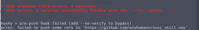
5856 linting errors found which were undetected initially (SUSI Skill CMS).

image

Add a .prettierrc file with some basic formatting rules for now like enabling single quotes wherever applicable and to have trailing comma at the end of JSON objects.

// .prettierrc
{
   "singleQuote": true,
   "trailingComma": "all",
   "parser": "flow"
}


Add a format script in package.json so that user can format the code whenever required manually too.

// package.json
"scripts": {
        ...
        "format": "prettier --write \"src/**/*.js\"",
        ...
},


Since we want to prevent contributors from committing unindented code we used lint-staged, a package which runs tasks on a set of specified files. We achieve this by adding a set of tasks in the lint-staged object and then run lint-staged as a pre-commit hook using husky.

Install lint-staged as a development dependency which will be visible in package.json file.

npm i lint-staged --save-dev 


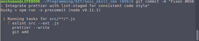
Add tasks for lint-staged as an object in package.json, we add a lint-staged object in the pacage.json file and grab all .js files in the project and run eslint, prettier over them and then we finally run git add to stage the changes done by prettier.

// package.json

"lint-staged": {
   "src/**/*.js": [
     "eslint src --ext .js",
     "prettier --write",
     "git add"
   ]
 }


Call lint-staged in pre-commit git-hook to run the specified tasks in the package.json.

// package.json

"scripts": {
   ...
   "precommit": "lint-staged",
   ...
},


Running lint-staged tasks before committing

image

As a result, we save a lot of time in reviewing the code since we don’t have to be worried about the code styles anymore as pre-commit hook already takes care of that also this ensures consistent code style throughout the project which improves the overall quality.

Resources

Prettier library website
Use ESLint to run Prettier
Link to my Pull Request
eslint-plugin-prettier
eslint-config-prettier

Continue ReadingIntegrate prettier with lint-staged and ESLint for consistent code style throughout the project

Display Skill Usage of the Past Week in a Line Chart

Skill usage statistics in SUSI.AI is an important aspect which greatly helps the skill developers know what is more engaging for the users and the users know which skills are more popular than the others and are being used widely. So data like this should be interactively available on the clients. An API is developed at the server to retrieve the skill usage details, we can use these details to render attractive components for a better visual understanding of how the skill is performing and get statistics like on which days the skill has been active in particular.


About the API

Endpoint : /cms/getSkillUsage.json

Parameters

  • model
  • group
  • language
  • skill

After consuming these params the API will return the number of times a skill is called along with the date on which it is called. We use that data as an input for the line chart component that we want to render.

Creating a Skill Usage card component

Import the required packages from corresponding libraries. We are using recharts as the library for the charts support and thus we import several components required for the line chart at the top of the Skill Usage component.

// Packages
import React, { Component } from 'react';
import PropTypes from 'prop-types';
import { LineChart, Line, XAxis, YAxis, Tooltip, Legend } from 'recharts';
import { Paper } from 'material-ui';


Create a SkillUsageCard component which is enclosed in a Paper component from material ui library to give it a card like look and then we render a Line chart inside it using appropriate data props which are received from the skill page component, we set a height and a width for the chart, Add an X-Axis, Y-Axis, Tooltip which shows up on hovering over points on the graph, legends to describe the line on the chart and then finally a line with several styling and other props.

class SkillUsageCard extends Component {
 render() {
   return(
     <Paper className="margin-b-md margin-t-md">
       <h1 className='title'>
           Skill Usage
       </h1>
       <div className="skill-usage-graph">
         <LineChart width={600} height={300} data={this.props.skill_usage}
               margin={{top: 5, right: 30, left: 20, bottom: 5}}>
           <XAxis dataKey="date" padding={{right: 20}} />
           <YAxis/>
           <Tooltip wrapperStyle={{height: '60px'}}/>
           <Legend />
           <Line name='Skill usage count' type="monotone" dataKey="count" stroke="#82ca9d" activeDot={{r: 8}}/>
         </LineChart>
       </div>
     </Paper>
   )
 }
}


Add prop validation at the end of the file to validate the coming props from the skill page component to validate that correct props are being received.

SkillUsageCard.propTypes = {
   skill_usage: PropTypes.array
}


Export the component so it can be used in other components.

export default SkillUsageCard;


Fetch the data for the component from the API in the skill page component where the skill usage component will be rendered. First set the API url and then make an AJAX call to that URL and once the data is received from the server pass that received data to a saveSkillUsage function which does the simple task of saving the data to the state and passing the saved data as a prop to the skill usage component. In case the call fails we log the error to the console.

let skillRatingUrl = `${urls.API_URL}/cms/getSkillRating.json`;
skillUsageUrl = skillUsageUrl + '?model=' + modelValue + '&group=' + this.groupValue + '&language=' + this.languageValue + '&skill=' + this.name;
// Fetch skill usage of the visited skill
$.ajax({
  url: skillUsageUrl,
  dataType: 'json',
  crossDomain: true,
  success: function (data) {
      self.saveSkillUsage(data.skill_usage)
  },
  error: function(e) {
       console.log(e)
  }
});


Save the skill usage details in the component state to render the skill usage component.

saveSkillUsage = (skill_usage = []) => {
  this.setState({
     skill_usage
 })
}


Send the received data as props to the Skill Usage component and render it.

<SkillUsageCard skill_usage={this.state.skill_usage} /> 


So I hope after reading this blog you have a more clearer insight into how the skill usage details are implemented in the CMS.

Resources –

  • Jerry J. Muzsik, Creating and deploying a react app using recharts URL.
  • Recharts, Documentation, URL.
Continue ReadingDisplay Skill Usage of the Past Week in a Line Chart

Rendering a Uniform StaticAppBar Component across all SUSI Web Clients on all Routes.

The Problem –
We have three SUSI Web Clients namely

Webchat
Skills CMS
Accounts

And it’s important to keep the design guidelines in sync across all the clients, StaticAppBar is a component which forms the header of all the pages and thus it is important to keep it uniform in all clients which was clearly missing before. There is also a lot of code duplication of the AppBar component (in accounts app) since it is used on all the pages so our approach will be to prepare a single component and render it on all routes.

Tackling the problem – Since the StaticAppBar component is present on all the clients we simply make the menu items uniform across all the clients and apply a check on those menu items on which are a premium feature or should appear only once the user is logged in.

Building blocks of the StaticAppBar component

  • AppBar
  • SUSI logo on the left end
  • Drop down hamburger menu on the right

Here’s how the JSX for the StaticAppBar component in CMS looks like, it uses an AppBar component from the material-ui library and has several props and styling as per the requirement.

<AppBar
   className='topAppBar'
   id='appBar'
   title={<div id='rightIconButton' ><Link to='/' style={{ float: 'left', marginTop: '-10px',height:'25px',width:'122px' }}>
       <img src={susiWhite} alt='susi-logo' className='siteTitle' /></Link></div>}
   style={{
       backgroundColor: colors.header,
       height: '46px',
       boxShadow: 'none',
       margin: '0 auto',
   }}
   iconStyleRight={{ marginTop: '-2px' }}
   iconElementRight={<TopRightMenu />}
/>


TopRightMenu is a function that returns JSX for the hamburger dropdown and is rendered in the AppBar as depicted below. It is a conditional menubar meaning some menu items are only rendered when the user is logged in and thus this helps cover those features which should only be available to logged in users. After that we use a popover component which shows up when the 3 dots or the expander on the top right is clicked. Almost all of the components in material ui has a style prop so styling is easy for the components moreover the workflow for the popover click goes like once the expander is clicked a boolean state variable named showOptions is toggled which in turn toggles the opening or closing state of the Popover as per the open prop.

let TopRightMenu = (props) => (
           <div onScroll={this.handleScroll}>
               <div>
                   {cookies.get('loggedIn') ?
                       (<label
                           style={{color: 'white', fontSize: '16px', verticalAlign:'super'}}>
                           {cookies.get('emailId')}
                           </label>) :
                       (<label>
                           </label>)
                   }
                   <IconMenu
                       {...props}
                       iconButtonElement={
                           <IconButton
                               iconStyle={{ fill: 'white' }}><MoreVertIcon /></IconButton>
                       }
                       targetOrigin={{ horizontal: 'right', vertical: 'top' }}
                       anchorOrigin={{ horizontal: 'right', vertical: 'top' }}
                       onTouchTap={this.showOptions}
                   >
                   </IconMenu>
                   <Popover
                       {...props}
                       animated={false}
                       style={{ float: 'right', position: 'relative', marginTop: '46px', marginLeft: leftGap }}
                       open={this.state.showOptions}
                       anchorEl={this.state.anchorEl}
                       anchorOrigin={{ horizontal: 'right', vertical: 'bottom' }}
                       targetOrigin={{ horizontal: 'right', vertical: 'top' }}
                       onRequestClose={this.closeOptions}
                   >
                       <TopRightMenuItems />
                       {cookies.get('loggedIn') ?
                           (<MenuItem primaryText='Botbuilder'
                               containerElement={<Link to='/botbuilder' />}
                               rightIcon={<Extension />} />) :
                           null
                       }
                       <MenuItem primaryText='Settings'
                           containerElement={<Link to='/settings' />}
                           rightIcon={<Settings />} />
                       {cookies.get('loggedIn') ?
                           (<MenuItem primaryText='Logout'
                               containerElement={<Link to='/logout' />}
                               rightIcon={<Exit />} />) :
                           (<MenuItem primaryText='Login'
                               onTouchTap={this.handleLogin}
                               rightIcon={<LoginIcon />} />)
                       }
                   </Popover>
               </div>
           </div>
       );
Handling the conditional display of menu items based on the user session

Some features are to be offered to only those who are logged in and thus we need to display them depending on the user session i.e they should be visible when the user is logged in and hidden when the user is logged out. User state is stored in the browser’s cookies and using that we can achieve the desired result.

{
     cookies.get('loggedIn') ?
       (<MenuItem primaryText="Botbuilder"
         href="https://skills.susi.ai/botbuilder"
         rightIcon={<Extension/>}/>):
         null
}


So I hope after going through this blog you have a much more clearer insight to how the StaticAppBar is implemented.


References

  1. Check out AppBar component from material-ui library here.
  2. Check blog post introducing the usage of material-ui in react here
Continue ReadingRendering a Uniform StaticAppBar Component across all SUSI Web Clients on all Routes.

Displaying skill rating for each skill on skill page of SUSI SKILL CMS

SUSI exhibits several skills which are managed by the SUSI Skill CMS, it essentially is a client which allows users to create/update skills conveniently since for each skill it is important to have the functionality of rating system so developers can get to know which skills are performing better than the rest and consequently improve them, thus a skill rating system which allows the users to give positive or negative feedback for each skill is implemented on the server.

Fetching skill_rating from the server

  1. Fetch skill data for which ratings are to be displayed through ajax calls
    API Endpoint –

    /cms/getSkillMetadata.json?
    

  2. Parse the received metadata object to get positive and negative ratings for that skill
  3. if(skillData.skill_rating) {
           	let positive_rating = skillData.skill_rating.positive;
            	let negative_rating = skillData.skill_rating.negative;
    }
    

    Sample API response

    {
      "skill_metadata": {
        "model": "general",
        "group": "Knowledge",
        "language": "en",
        "developer_privacy_policy": null,
        "descriptions": "Want to know about fossasia, just ask susi to tell that, Susi tells about the SUSI.AI creators",
        "image": "images/creator_info.png",
        "author": "madhav rathi",
        "author_url": "https://github.com/madhavrathi",
        "author_email": null,
        "skill_name": "Creator Info",
        "terms_of_use": null,
        "dynamic_content": false,
        "examples": [
          "Who created you?",
          "what is fossasia?"
        ],
        "skill_rating": {
          "negative": "0",
          "positive": "0",
          "stars": {
            "one_star": 0,
            "four_star": 0,
            "five_star": 0,
            "total_star": 0,
            "three_star": 0,
            "avg_star": 0,
            "two_star": 0
          },
          "feedback_count": 0
        },
        "creationTime": "2018-03-17T16:38:29Z",
        "lastAccessTime": "2018-06-15T15:51:50Z",
        "lastModifiedTime": "2018-03-17T16:38:29Z"
      },
      "accepted": true,
      "message": "Success: Fetched Skill's Metadata",
      "session": {"identity": {
        "type": "host",
        "name": "162.158.166.37_d80fb5c9",
        "anonymous": true
      }}
    }
    

  4. Set the react state of the component to store positive and negative rating.
  5. this.setState({
      positive_rating,
      negative_rating
    })
    

  6. Use react-icons to fetch like and dislike icon components from font-awesome.
  7. npm i -S react-icons
    

  8. Import the corresponding icons in the SkillPage component
  9. import { FaThumbsOUp, FaThumbsODown } from 'react-icons/lib/fa/'
    

  10. Display the rating count along with their icons
  11. <div className="rating">
        <div className="positive">
             <FaThumbsOUp />
             {this.state.positive_rating}
         </div>
           <div className="negative">
                 <FaThumbsODown />
                 {this.state.negative_rating}
             </div>
    </div>
    

Example

References

Continue ReadingDisplaying skill rating for each skill on skill page of SUSI SKILL CMS

Using a Git repo as a Storage & Managing skills through susi_skill_cms

In this post, I’ll be talking about SUSI’s skill management and the workflow of creating new skills

The SUSI skills are maintained in a separate github repository susi_skill_data which provides the features of version controlling and the ability to rollback to a previous version implemented in SUSI Server.

The workflow is as explained in the featured image of this blog, SUSI CMS provides the user with a GUI through which user can talk to the SUSI Server and using it’s api calls, it can manipulate the susi skills present/stored on the susi_skill_data repository.

When the user opts to create a new skill, a new createSkill component is loaded with an editor to define rules of the skill. Once the form is submitted, an AJAX POST request is made to the server which actually commits the skill data to the repository and thus it is visible in the CMS from that point on.

Grab the skill details within the editor and put them in a form which is to be sent via the POST request.

let form = new FormData();
form.append('model', 'general');
form.append('group', this.state.groupValue);
form.append('language', this.state.languageValue);
form.append('skill', this.state.expertValue.trim().replace(/\s/g,'_'));
form.append('image', this.state.file);
form.append('content', this.state.code);
form.append('image_name', this.state.imageUrl.replace('images/',''));
form.append('access_token', cookies.get('loggedIn'));


Configure POST request settings object

let settings = {
   'async': true,
   'crossDomain': true,
   'url': urls.API_URL + '/cms/createSkill.json',
   'method': 'POST',
   'processData': false,
   'contentType': false,
   'mimeType': 'multipart/form-data',
   'data': form
};


Make an AJAX request using the settings above to upload the skill to the server and send a notification when the request is successful.

$.ajax(settings)
   .done(function (response) {
   self.setState({
          loading:false
   });
notification.open({
    message: 'Accepted',
    description: 'Your Skill has been uploaded to the server',
    icon: <Icon type='check-circle' style={{ color: '#00C853' }}       />,
});


Parse the received response as JSON and if the accept key in the response is true, we push the new skill data to the history API and set relevant states.

let data = JSON.parse(response);
if(data.accepted===true){
  self.props.history.push({
	pathname: '/' + self.state.groupValue  +
  	'/' + self.state.expertValue.trim().replace(/\s/g,'_') +
  	'/' + self.state.languageValue,
	state: {
  	from_upload: true,
  	expertValue:  self.state.expertValue,
  	groupValue: self.state.groupValue ,
  	languageValue: self.state.languageValue,
}});


If the accepted key of the server response is not true, display a notification.

else{
	self.setState({
  		loading:false
	});
	notification.open({
	  	message: 'Error Processing your Request',
	  	description: String(data.message),
	  	icon: <Icon type='close-circle' style={{ color: '#f44336' }} />,
	});
}})


Handle cases when AJAX request fails and send a corresponding notification

.fail(function (jqXHR, textStatus) {
 ...
  notification.open({
    message: 'Error Processing your Request',
    description: String(textStatus),
    icon: <Icon type='close-circle' style={{ color: '#f44336' }} />,
  });
});


I hope after reading this post, the objectives of susi_skill_data are more clear and you understood how CMS handles the creation of skills.

Resources

1.AJAX Jquery – AJAX request using Jquery
2. React State – Read about React states and lifecycle hooks.

Continue ReadingUsing a Git repo as a Storage & Managing skills through susi_skill_cms

Open Event Server: No (no-wrap) Ellipsis using jquery!

Yes, the title says it all i.e., Enabling multiple line ellipsis. This was used to solve an issue to keep Session abstract view within 200 characters (#3059) on FOSSASIA‘s Open Event Server project.

There is this one way to ellipsis a paragraph in html-css and that is by using the text-overflow property:

.div_class{
white-space: nowrap;
overflow: hidden;
text-overflow: ellipsis;
}’’

But the downside of this is the one line ellipis. Eg: My name is Medozonuo. I am…..

And here you might pretty much want to ellipsis after a few characters in multiple lines, given that your div space is small and you do want to wrap your paragraph. Or maybe not.

So jquery to the rescue.

There are two ways you can easily do this multiple line ellipsis:

1) Height-Ellipsis (Using the do-while loop):

//script:
if ($('.div_class').height() > 100) {
    var words = $('.div_class').html().split(/\s+/);
    words.push('...');

    do {
        words.splice(-2, 1);
        $('.div_class').html( words.join(' ') );
    } while($('.div_class').height() > 100);
}

Here, you check for the div content’s height and split the paragraph after that certain height and add a “…”, do- while making sure that the paragraphs are in multiple lines and not in one single line. But checkout for that infinite loop.

2) Length-Ellipsis (Using substring function):  

//script:
$.each($('.div_class'), function() {
        if ($(this).html().length > 100) {
               var cropped_words = $(this).html();
               cropped_words = cropped_words.substring(0, 200) + "...";
               $(this).html(cropped_words);
        }
 });

Here, you check for the length/characters rather than the height, take in the substring of the content starting from 0-th character to the 200-th character and then add in extra “…”.

This is exactly how I used it in the code.

$.each($('.short_abstract',function() {
   if ($(this).html().length > 200) {
       var  words = $(this).html();
       words = words.substring(0,200 + "...";
       $(this).html(words);
    }
});


So ellipsing paragraphs over heights and lengths can be done using jQuery likewise.

Continue ReadingOpen Event Server: No (no-wrap) Ellipsis using jquery!

Creating Dynamic Footer with Popover

  • Post author:
  • Post category:FOSSASIA

In Open-Event Webapp generator, the track page height varies according to the popover that appears on hovering the tracks. The problem with this design was the footer of the page that always remains static and produce a bad UI to user.

12

So, I have decided to make footer dynamic so that it varies it’s position according to the popover appeared on hover. The approach was a bit tricky but the diagram below will make it easy to understand.

Dynamic footer

The following code will work on hovering the track.

//popover.js 

var outerContheight= $('.main').offset().top + $('.main').outerHeight();
var tracknext= $(track).next();
var tracktocheck= track.offset().top + track.outerHeight() + 
 tracknext.outerHeight() + 15;
 var shift= tracktocheck - outerContheight;
 if(shift > 0){
 
 $('.footer').css({
 'position':'absolute',
 'top': outerContheight + shift,
 'width':'100%',
 'z-index': '999'
 })
 }

If shift > 0 which is calculated as shown in the above code it means that the footer needs to be shifted and hence we shift the footer by setting absolute position in CSS. Else we set position: static for footer.

 $('.footer').css({
 'position':'static'
 })

After following the above approach the footer position changes according to the popover. Here is the screencast for the approach.


Continue ReadingCreating Dynamic Footer with Popover

The three C’s of Javascript

week5gsoc1

You might be wondering what the three C’s are :

  • Currying
  • Closures
  • Callbacks

Ok what are those ?

Before i start, let me tell you that in Javascript Functions are Objects. So every object in Javascript, be it Number, String, Array; Every Object in javascript has a prototype object. For instance if the object is declared using an object literal then it has access to Object.prototype, Similarly all the arrays so declared have access to the Array.prototype. So since functions are objects, they can be used like any other value. They can be stored in variables, objects, and arrays. They can also be passed as arguments to functions, and donot forget that functions can be returned from functions.
Currying :

In Javascript if one wants to partially evaluate functions then one can take advantage of a concept called function currying. Currying allows us to produce a new function by combining a function and an argument. For example let us consider writing an add function, :

function add(foo, bar) {
if(arguments.length === 1) {
return function (boo) {
return foo + boo;
}
}
return foo + bar;
}
So for the above code,
add(12, 13); // gives 25
add(12)(13); // gives 25

The curry method works by creating a closure that holds that original function and the arguments to curry. It returns a function that, when invoked, returns the result of calling that original function, passing it all of the arguments from the invocation of curry and the current invocation
Closures :

Simply put, a closure is an inner function that has access to the outer (enclosing) function’s variables scope chain. Except the parameters and variables that which are defined using this and arguments all, the inner functions have access to all the parameters and variables of the function in which those are defined.

var a = 0;
function counter() {
var i = 2;
return i*i;
}
function counter1() {
return a+= 1;
}

// this wont work as part of Js closures
function counter_foo() {
var a = 0;
a += 1;
}

// this also wont work as part of Js closures
function counter_bar() {
var c = 0;
function go() { c+= 1;}
go();
return counter;
}
// this will work as part of Js closures
var counter_closure = (function () {
var incr;
return function() {return incr+= 1;}
})();

show(counter1());
show(counter1());
show(counter1()); // since we are added the counter three times the value of a is set to 3.
show(counter_foo());
show(counter_foo()); // this is similar to the above but doesnot set the value of a to 3, but returns undefined.
show(counter_bar());
show(counter_bar()); // Neither this works which will always set the value to 1
show(counter_closure());
show(counter_closure()); // Now this is called closures implementation in Js

Function Closures in Javascript is all about how are the variables being treated and referred to in the local or global scope. In Js variables can be given : 'local scope' 'global scope' There is no inbuilt concept for something called private variables, so when there is a requirement for such a scenario Closures are written in Js in order to make scope for variables that are private in scope. Observing the functions ‘counter1()’, ‘counter_foo()’ and ‘counter_bar()’ there is a similarity that can be observed, Basically we can understand that closures are nothing but self invoking functions in Js. Observe the example ‘counter_closure()’ where in we are calling the function thrice and hoping to increment the functional value each time when we call the function. So this self invoking function runs only once but it increments the value each time it is called. The scope of the variable is protected by the anonymous return function making us assume that this can be called implementation of private variables in Js.
Callbacks :

A callback function is a function that is passed to another function as a parameter and giving the provision for the function to “call us back” later. Since the callback function is just a normal function when it is executed, we can pass parameters to it. We can pass any of the containing function’s properties (or global properties) as parameters to the callback function. Let us look at an example :

function manipulate(foo, bar) {
console.log("Do you know that " + foo + " is better than " + bar);
}
function useIt(boo, callback) {
var t1 = boo.slice(1,5);
var t2 = boo.slice(31,36);
callback(t2, t1);
}
The above code can be used like this :
var str = "Akhil is going to wrestle with hector";
useIt(str, manipulate); // Gives : Do you know that Akhil is better than hector.

So that is how we can implement Currying, Closures and Callbacks in Javascript.

Thats it folks,
Happy Hacking !!

Continue ReadingThe three C’s of Javascript

LearnJS

week4gsoc1

LearnJs is an attempt to portray the best parts of Javasript that are pretty tough and hard to find. It is to be noted that this is not a book/guide in any form, but a congregation of best practices, language constructs, and other simple yet effective snippets that gives us an essence of how we can harness the best out of the language.

So what are all covered in the cheatsheet ?

  • Intro
  • Arrays
  • Strings
  • Objects
  • Functions
  • Conventions
  • Closures
  • Currying
  • Tail Calls

Intro : Declarations

week4gsoc2

We have to understand the fact that in Javascript everything is an object, so for suppose if we declare a string using the String object and compare it with var a = “” then the outcome of the comparision would be false. This is simply because if we declare a string using the bad way and compare it with a string declared using the good way then fundamentally we are comparing a string with an Object(String).
Intro : Semicolons

week4gsoc3

Code Snippet one and two are the same. but the fundamental difference between both the code samples is that one uses semicolons in the lang- -uage semantics but whereas the other doesnot. Basically we are taught to use semicolons in languages such as C, C++, Java etc since lines of code are terminated using ‘;’ but in Javascript the entire scenario is different. There is absolutely no difference in execution of code with or without semicolons.

Objects

week4gsoc4

So basically except the primitive values all are objects in Javascript

Tail Calls

week4gsoc5

Tail calls are nothing but essentially replacing the concept of recursive functions with loop. In a way this can not only save time but also saves space i.e better time complexity and space complexity.Observing both the algorithms above written for factorial we can understand that f() is the traditional recursive method used for finding the factorial, but f1() is the tail call optimized algorithm which is better and fast.

The work is going in progress, since there is still a lot to cover.
Github : Click here
Source : Click here

Thats it folks,
Happy Hacking !!

Continue ReadingLearnJS

The beauty of Directives, Transclusion in Angular.JS

week3gsoc1

To be honest in Angular directives are nothing but DOM elements simply put on steroids. Now if you add transclusion to it literally the possibilty of exploring the playground is boundless .With that said before diving into what directives are and how cool are they, let us basically understand what makes directives in angular so powerful.

Some of the well known directives which are used regularly are :

  • ng-src
  • ng-show
  • ng-hide
  • ng-model
  • ng-repeat

Custom Directives and the benifit of creating reusable components

We often tend to waste a lot of time and energy in writing code which is already/previously written and components which are already built. But what if you could write them only once and reuse them as many times as possible ?
ANS : “Directives”
You can create truly reusable components with directives, and the approach to build custom components is definitely neater and more intuitive.
Where do Custom Directives get implemented ?

  • elements
  • attributes
  • classes

Scope of Directives

After we initialize a directive we can observe that it gets a parent scope by default. In the best interests of the application you write you won’t really want that to happen. So in order to freely modify the properties of the directive we expose the parent’s controller scope to the directives.In some cases your directive may want to add several properties and functions to the scope that are for internal use only.

Example : If you have a directive that deals with comments(just like my sTeam web interface), you may want to set some internal variable to show or hide some of its specific sections. If we set these models to the parent’s scope we would pollute it.

Without polluting, is there any option ?

Absolutely there are two options,

  • Use a child scope
  • Use an isolated scope

If we use a child scope then the child scope prototypically inherits the parent’s scope. If we use an isolated scope then its all on its own, by not inheriting its parent’s scope

Transclusion

Transclusion is a feature that enables us to wrap a directive around arbitrary content. We can extract and compile it against the correct scope later, and eventually place it at the specified position in the directive template. If you set transclude:true in the directive definition, a new transcluded scope will be created which prototypically inherits from the parent scope. If you want your directive with isolated scope to contain an arbitrary piece of content and execute it against the parent scope, transclusion can be used.

Example :

week3gsoc2

See the above snippet, here ng-transclude says where to put the transcluded content. In this case the DOM content Hello {{name}} is extracted and put inside div ng-tran- sclude /div> . The important point to remember is that the expression {{name}} interpolates against the property defined in the parent scope rather than the isolated scope.

Thats it folks,
Happy Hacking !!

Continue ReadingThe beauty of Directives, Transclusion in Angular.JS