Auto deployment of SUSI Skill CMS on gh pages

Susi Skill CMS is a web application framework to edit susi skills. It is currently in development stage, hosted on http://skills.susi.ai. It is built using ReactJS . In this blogpost we will see how to automatically deploy the repository on gh pages.
Setting up the project
Fork susi_skill_cms repository and clone it to your desktop, make sure you have node and npm versions greater than 6 and 3 respectively. Next go to cloned folder and install all the dependencies by running :

:$ npm install

Next run on http://localhost:3000 by running the command

:$ npm run start

To auto deploy changes on gh-pages branch, we need to setup Travis for the project. Register yourself on https://travis-ci.org/ and turn on the Travis for this repository. Next add .travis.yml in the root directory of the source folder.  

sudo: required
dist: trusty
language: node_js
node_js:
  - 6

before_install:
  - export CHROME_BIN=chromium-browser
  - export DISPLAY=:99.0
  - sh -e /etc/init.d/xvfb start

before_script:
  - npm run build

script:
  - npm run test

after_success:
  - bash ./deploy.sh

cache:
  directories: node_modules

# safelist
branches:
  only:
  - master 

Source: https://github.com/fossasia/susi_skill_cms/blob/master/.travis.yml

The travis configuration files will ensure that the project is building for every changes made, using npm run test command, in our case it will only consider changes made on master branch , if you want to watch other branches to add the respective branch name in travis configurations. After checking for build passing we need to automatically push the changes made for which we will use a bash script.

#!/bin/bash

SOURCE_BRANCH="master"
TARGET_BRANCH="gh-pages"

# Pull requests and commits to other branches shouldn't try to deploy.
if [ "$TRAVIS_PULL_REQUEST" != "false" -o "$TRAVIS_BRANCH" != "$SOURCE_BRANCH" ]; then
    echo "Skipping deploy; The request or commit is not on master"
    exit 0
fi

# Save some useful information
REPO=`git config remote.origin.url`
SSH_REPO=${REPO/https:\/\/github.com\//git@github.com:}
SHA=`git rev-parse --verify HEAD`

ENCRYPTED_KEY_VAR="encrypted_${ENCRYPTION_LABEL}_key"
ENCRYPTED_IV_VAR="encrypted_${ENCRYPTION_LABEL}_iv"
ENCRYPTED_KEY=${!ENCRYPTED_KEY_VAR}
ENCRYPTED_IV=${!ENCRYPTED_IV_VAR}
openssl aes-256-cbc -K $encrypted_2662bc12c918_key -iv $encrypted_2662bc12c918_iv -in deploy_key.enc -out ../deploy_key -d
chmod 600 ../deploy_key
eval `ssh-agent -s`
ssh-add ../deploy_key

# Cloning the repository to repo/ directory,
# Creating gh-pages branch if it doesn't exists else moving to that branch
git clone $REPO repo
cd repo
git checkout $TARGET_BRANCH || git checkout --orphan $TARGET_BRANCH
cd ..

# Setting up the username and email.
git config user.name "Travis CI"
git config user.email "$COMMIT_AUTHOR_EMAIL"

# Cleaning up the old repo's gh-pages branch except CNAME file and 404.html
find repo/* ! -name "CNAME" ! -name "404.html" -maxdepth 1  -exec rm -rf {} \; 2> /dev/null
cd repo

git add --all
git commit -m "Travis CI Clean Deploy : ${SHA}"

git checkout $SOURCE_BRANCH

# Actual building and setup of current push or PR.
npm install
npm run build
mv build ../build/

git checkout $TARGET_BRANCH
rm -rf node_modules/
mv ../build/* .
cp index.html 404.html

# Staging the new build for commit; and then committing the latest build
git add -A
git commit --amend --no-edit --allow-empty

# Deploying only if the build has changed
if [ -z `git diff --name-only HEAD HEAD~1` ]; then

  echo "No Changes in the Build; exiting"
  exit 0

else
  # There are changes in the Build; push the changes to gh-pages
  echo "There are changes in the Build; pushing the changes to gh-pages"

  # Actual push to gh-pages branch via Travis
  git push --force $SSH_REPO $TARGET_BRANCH
fi

Source : Bash script for automatic deployment

This bash script will enable travis ci user to push changes to gh pages, for this we need to store the credentials of the repository in encrypted form. To get the public/ private rsa keys use the following command

ssh-keygen -t rsa -b 4096 -C "your_email@example.com"

It will generate keys in .ssh/id_rsa folder in your home repository.

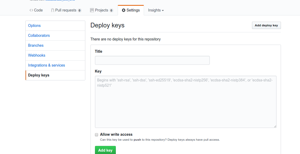
Make sure you do not enter any passphrase while generating credentials otherwise travis will get stuck at time of decrypting the keys. Copy the public key and deploy the key to repository by visiting  https://github.com/<your name>/<your repo>/settings/keys


Next install travis for encryption of keys.

sudo apt install ruby ruby-dev
sudo gem install travis

Encrypt your private deploy_key and add it to root of your repository using command

travis encrypt-file deploy_key

After successful encryption, you will see a message

Please add the following to your build script (before_install stage in your .travis.yml, for instance):

openssl aes-256-cbc -K $encrypted_2662bc12c918_key -iv $encrypted_2662bc12c918_iv -in deploy_key.enc -out ../deploy_key -d

Add the above generated script in travis and push the changes on your master branch. Do not push the deploy_key only the encryption file deploy_key.enc
Finally, add the deploy link of gh pages in package.json of your using key “homepage”.

 "homepage": "http://skills.susi.ai/"

And in scripts of package.json add

"deploy": "gh-pages -d build",

Commit and push your changes and from now onward all your changes will be automatically pushed to gh pages branch. For contribution visit Susi_Skill_CMS.

Resources

Continue ReadingAuto deployment of SUSI Skill CMS on gh pages

How SUSI Analyzes A Given Response

Ever wondered where SUSI’s answers come from? Now Susi has ability to do an answer analysis. To get that analysis, just ask susi “analysis”. This will set susi into an analysis mode, will tell where the latest answer came from and will give you the link for improving the skill.

Let’s check out how Susi analysis work. The skill for analysis is defined  en_0001_foundation.txt  as following

analysis|analyse|analyze|* analysis|* analyse|* analyze|analysis *|analyse *|analyze *
My previous answer is defined in the skill $skill$. You can help to improve this skill and <a href="$skill_link$" target="_blank"> edit it in the code repository here.</a>

$skill$ and $skill_link$ are the variable compiled using

public static final Pattern variable_pattern = Pattern.compile("\\$.*?\\$");

These variables are memorized in Susi cognition. A cognition is the combination of a query of a user with the response of susi.

SusiThought dispute = new SusiThought();
List<String> skills = clonedThought.getSkills();
 if (skills.size() > 0) {
    dispute.addObservation("skill", skills.get(0));
    dispute.addObservation("skill_link",getSkillLink(skills.get(0)));
   }

Susi Thought is a piece of data that can be remembered. The structure of the thought is modeled as a table in which information contained in it is organized in rows and columns.

 public SusiThought addObservation(String featureName, String observation) ;

One can memorize using addObservation() method.  It takes two parameter featureName the object key and observation the object value. It is a table of information pieces as a set of rows which all have the same column names. It inserts the new data always in front of existing similar data rather than overwriting them.

 public String getSkillLink(String skillPath) {
       String link=skillPath;
        if(skillPath.startsWith("/susi_server")) {
            link ="https://github.com/fossasia/susi_server/blob/development" + skillPath.substring("/susi_server".length());
        } else if (skillPath.startsWith("/susi_skill_data")) {
            link = "https://github.com/fossasia/susi_skill_data/blob/master" + skillPath.substring("/susi_skill_data".length());
        }
        return link;
    }

The getSkillLink is a utitlity method to return the link of the skill source github repository based on skillPath.

private String skill;
SusiThought recall;
final SusiArgument flow = new SusiArgument().think(recall);
this.skill = origin.getAbsolutePath();
 if (this.skill != null && this.skill.length() > 0) flow.addSkill(this.skill);

The source of the skill gets added in SusiIntent.java using getAbsolutePath() method which resolves the skill path in the filesystem. Intent  considers the key from the user query, matches the intent tokens to get the optimum result and produces json like

 "data": [
      {
        "object": "If you spend too much time thinking about a thing, you'll never get it done.",
        "0": "tell me a quote",
        "token_original": "quote",
        "token_canonical": "quote",
        "token_categorized": "quote",
        "timezoneOffset": "-330",
        "answer": "When you discover your mission, you will feel its demand. It will fill you with enthusiasm and a burning desire to get to work on it. ",
        "skill_link": "https://github.com/fossasia/susi_skill_data/blob/master/models/general/entertainment/en/quotes.txt",
        "query": "tell me a quote",
        "skill": "/susi_skill_data/models/general/entertainment/en/quotes.txt"
      },

The getskills() method returns list of skill from json which are later added for memorization.

    public List<String> getSkills() {
        List<String> skills = new ArrayList<>();
        getSkillsJSON().forEach(skill -> skills.add((String) skill));
        return skills;
    }

This is how Susi is able to fetch  where the answer came from. Next time when you have a chat with susi do check skill analysis and add your ideas to improve the skill. Take a look at Susi_skill_data for more skills and  read this tutorial  for creating skills for susi.

Resources

Continue ReadingHow SUSI Analyzes A Given Response

Adding unit tests for effects in Loklak Search

Loklak search uses @ngrx/effects to listen to actions dispatched by the user and sending API request to the loklak server. Loklak search, currently, has seven effects such as Search Effects,  Suggest Effects which runs to make the application reactive. It is important to test these effects to ensure that effects make API calls at the right time and then map the response to send it back to the reducer.

I will  explain here how I added unit tests for the effects. Surprisingly, the test coverage increased from 43% to 55% after adding these tests.

Effects to test

We are going to test effects for user search. This effect listens to the event of type USER_SEARCH and makes a call to the user-search service with the query as a parameter. After a response is received, it maps the response and passes it on the UserSearchCompleteSuccessAction action which performs the later operation. If the service fails to get a response, it makes a call to the UserSearchCompleteFailAction.

Code

ApiUserSearchEffects is the effect which detects if the USER_SEARCH action is dispatched from some component of the application and consequently, it makes a call to the UserSearchService and handles the JSON response received from the server. The effects then, dispatch the action new UserSearchCompleteSuccessAction if response is received from server or either dispatch the action new UserSearchCompleteFailAction if no response is received. The debounce time is set to 400 so that response can be flushed if a new USER_SEARCH is dispatched within the next 400ms.

For this effect, we need to test if the effects actually runs when USER_SEARCH action is made. Further, we need to test if the correct parameters are supplied to the service and response is handled carefully. We also, need to check if the response if really flushed out within the certain debounce time limit.

@Injectable()
export class ApiUserSearchEffects {@Effect()
search$: Observable<Action>
= this.actions$
.ofType(userApiAction.ActionTypes.USER_SEARCH)
.debounceTime(400)
.map((action: userApiAction.UserSearchAction) => action.payload)
.switchMap(query => {
const nextSearch$ = this.actions$.ofType(userApiAction.ActionTypes.USER_SEARCH).skip(1);const follow_count = 10;return this.apiUserService.fetchQuery(query.screen_name, follow_count)
.takeUntil(nextSearch$)
.map(response => new userApiAction.UserSearchCompleteSuccessAction(response))
.catch(() => of(new userApiAction.UserSearchCompleteFailAction()));
});constructor(
private actions$: Actions,
private apiUserService: UserService
) { }

}

Unit test for effects

  • Configure the TestBed class before starting the unit test and add all the necessary imports (most important being the EffectsTestingModule) and providers. This step will help to isolate the effects completely from all other components and testing it independently. We also need to create spy object which spies on the method userService.fetchQuery with provider being UserService.

beforeEach(() => TestBed.configureTestingModule({
imports: [
EffectsTestingModule,
RouterTestingModule
],
providers: [
ApiUserSearchEffects,
{
provide: UserService,
useValue: jasmine.createSpyObj(‘userService’, [‘fetchQuery’])
}
]
}));
  • Now, we will be needing a function setup which takes params which are the data to be returned by the Mock User Service. We can now configure the response to returned by the service. Moreover, this function will be initializing EffectsRunner and returning ApiUserSearchEffects so that it can be used for unit testing.

function setup(params?: {userApiReturnValue: any}) {
const userService = TestBed.get(UserService);
if (params) { userService.fetchQuery.and.returnValue(params.userApiReturnValue);
}return {
runner: TestBed.get(EffectsRunner),
apiUserSearchEffects: TestBed.get(ApiUserSearchEffects)
};
}


  • Now we will be adding unit tests for the effects. In these tests, we are going to test if the effects recognise the action and return some new action based on the response we want and if it maps the response only after a certain debounce time.We have used fakeAsync() which gives us access to the tick() function. Next, We are calling the function setup and pass on the Mock Response so that whenever User Service is called it returns the Mock Response and never runs the service actually. We will now queue the action UserSearchAction in the runner and subscribe to the value returned by the effects class. We can now test the value returned using expect() block and that the value is returned only after a certain debounce time using tick() block.

it(‘should return a new userApiAction.UserSearchCompleteSuccessAction, ‘ +
‘with the response, on success, after the de-bounce’, fakeAsync(() => {
const response = MockUserResponse;const {runner, apiUserSearchEffects} = setup({userApiReturnValue: Observable.of(response)});

const expectedResult = new userApiAction.UserSearchCompleteSuccessAction(response);

runner.queue(new userApiAction.UserSearchAction(MockUserQuery));

let result = null;
apiUserSearchEffects.search$.subscribe(_result => result = _result);
tick(399); // test debounce
expect(result).toBe(null);
tick(401);
expect(result).toEqual(expectedResult);
}));

it(‘should return a new userApiAction.UserSearchCompleteFailAction,’ +
‘if the SearchService throws’, fakeAsync(() => {
const { runner, apiUserSearchEffects } = setup({ userApiReturnValue: Observable.throw(new Error()) });

const expectedResult = new userApiAction.UserSearchCompleteFailAction();

runner.queue(new userApiAction.UserSearchAction(MockUserQuery));

let result = null;
apiUserSearchEffects.search$.subscribe(_result => result = _result );

tick(399); // Test debounce
expect(result).toBe(null);
tick(401);
expect(result).toEqual(expectedResult);
}));
});

Reference

Continue ReadingAdding unit tests for effects in Loklak Search

Introducing Customization in Loklak Media Wall

My GSoC Project includes implementing media wall in loklak search . One part of the issue is to include customization options in media wall. I looked around for most important features that can be implemented in a media wall to give the user a more appealing and personalized view. One of the feature that can be implemented is enabling Full Screen Mode.  This feature can help the user to display media wall on the projector or any big display screen without compromising with space available. In one part, I would be explaining how I implemented Full screen Mode in loklak media wall using fullscreen.js library.

Secondly, it is important to include a very reactive and user-friendly setting box. The setting box should be a central container in which all the customization options will be included.In loklak media wall,  setting box is implemented as a dialog box with various classifications in form of tabs. I would also be explaining  how I designed customization menu using Angular Material.

Implementation

Full Screen Mode

Since loklak search is an Angular 2 application and all the code is written in typescript, we can’t simply use the fullscreen.js library. We have to import the library into our application and create a directive that can be applied to the element to use it in the application.

  • Install fullscreen.js library in the application using Node Package Manager.

npm install save screenfull

import {Directive, HostListener, Output, EventEmitter} from ‘@angular/core’;
import * as screenfull from ‘screenfull’;@Directive({
selector: ‘[toggleFullscreen]’
})
export class ToggleFullscreenDirective {constructor() {}@HostListener(‘click’) onClick() {
if (screenfull.enabled) {
screenfull.toggle();
}
}
}
  • Import Directive into the module and add it to declaration. This allows directive to be used anywhere in the template.

import { ToggleFullscreenDirective } from ‘../shared//full-screen.directive’;
.
.
.
@NgModule({
.
.
.
declarations: [
.
.
.
ToggleFullscreenDirective,
.
.
.
]
})
export class MediaWallModule { }
  • Now, the directive is ready to use on the template. We just have to add this attribute directive to an element.

<i toggleFullscreen mdTooltip=“Full Screen” mdTooltipPosition=“below” class=“material-icons md-36”>fullscreen</i>

Customization Menu

Customization Menu is created using the idea of central container for customization. It is created using two components of Angular Material – Dialog Box and Tabs . We will now be looking how customization menu is implemented using these two components.

  • Create a component with the pre-configured position, height and width of the dialog box. This can be done simply using updatePosition and updateSize property of the MdDialogRef class.

export class MediaWallCustomizationComponent implements OnInit {
public query: string;constructor(
private dialogRef: MdDialogRef<MediaWallCustomizationComponent>,
private store: Store<fromRoot.State>,
private location: Location) { }ngOnInit() {
this.dialogRef.updatePosition(’10px’);
this.dialogRef.updateSize(‘80%’, ‘80%’);
}public searchAction() {
if (this.query) {
this.store.dispatch(new mediaWallAction.WallInputValueChangeAction(this.query));
this.location.go(‘/wall’, `query=${this.query}`);
}
}
}
  • Create a template for the Customization menu. We will be using md-tab and md-dialog to create a dialog box with options displayed using tabs. dynamicHeight should be set to true so that dialog box adjust according to the tabs. We can simply add an attribute md-dialog-close to the button which will close the dialog box. All the content should be added in the div with attribute md-dialog-content linked to it. Moreover, to make options look more user-friendly and adjustable on smaller screens, icons must be added with the Tab title.

<h1 mddialogtitle>Customization Menu</h1>
<button class=“form-close” mddialogclose>x</button>
<span mddialogcontent>
<mdtabgroup color=“accent” dynamicHeight=“true”>
<mdtab>
<ngtemplate mdtablabel>
<mdicon>search</mdicon>
Search For
</ngtemplate>
<h3> Search Customization </h3>
<mdinputcontainer class=“example-full-width” color=“accent”>
<input placeholder=“Search Term” mdInput type =“text” class=“input” name=“search-term” [(ngModel)]=“query”>
</mdinputcontainer>
<span class=“apply-button”>
<button mdraisedbutton color=“accent” mddialogclose (click)=“searchAction()”>Display</button>
</span>
</mdtab>
</mdtabgroup>
</span>

The code currently shows up code for search customization. It basically, records to the input using [(ngModel)] for two-way binding and makes the call the search action whenever user clicks on Display button.

  • Add a button which would open dialog box using open property of MdDialog class. This property would provide an instance for MediaWallCustomizationComponent and the component will show up dynamically.

<i class=“material-icons md-36” (click)=“dialog.open(MediaWallCustomizationComponent)”>settings</i>
  • It is important to add MediaWallCustomizationComponent as an entry component in the module so that AOT compiler can create a ComponentFactory for it during initialization.

import { MediaWallCustomizationComponent } from ‘./media-wall-customization/media-wall-customization.component’;

@NgModule({
entryComponents: [
MediaWallCustomizationComponent
]
})
export class MediaWallModule { }


This creates an appealing and user-friendly customization menu which acts a central container for customization options.

References

Continue ReadingIntroducing Customization in Loklak Media Wall

Adding Masonry Grid Layout to loklak Media Wall

Working on loklak media walls, I wanted to add a responsive self-adjusting grid layout for media walls. Going through the most trending media wall, I concluded that the most commonly used view for media walls is Masonry view. This view is a much similar view to the Pinterest grid layout. In fact, Masonry Desandro states that Masonry view can be one of the most responsive and most pretty ways to present cards. It is also beneficial to use masonry view as it avoids unnecessary gaps and makes full use of the display screen.

In this blog, we are going to see how I added a masonry view to the media walls without any other dependency than CSS using column-count and column-gap. We would also be looking upon how to adjust font-size using rem units to make text readable for all screen-sizes depending on number of columns.

HTML File

<span class=“masonry”>
<span class=“masonry-panel” *ngFor=“let item of (apiResponseResults$ | async)”>
<span class=“masonry-content”>
<mediawallcard [feedItem]=“item”></mediawallcard>
</span>
</span>
</span>
  • The first span with class masonry is like a container in which all the cards will be embedded. This div will provide a container to adjust the number of columns in which cards will be adjusted.
  • The second span with class masonry-panel will be the column division. These panels are like the elements of a matrix. These panels are responsive and will adjust according to the screen size.
  • The third span with class masonry-content are like the content box in which all the content will be embedded. This div will create a space in the panel for the card to be adjusted.
  • The fourth element media-wall-card are the cards in which all the feed items are placed.

CSS File

  • Adjusting columns – The column-count and column-gap property was introduced in CSS3 to divide the element in a specified number of column and to keep the specified number (whole number) of column gap between the elements respectively. For different screen sizes, these are the column count that are kept. We need adjust the number of columns according to various screen sizes so that cards neither look too stretched or too bleak. Media wall is now responsive enough to adjust on smaller screens like mobiles with one column and on larger screens too with five columns.

@media only screen and (max-width: 600px) {
.masonry {
columncount: 1;
columngap: 0;
}
} @media only screen and (min-width: 600px) and (max-width: 900px) {
.masonry {
columncount: 2;
columngap: 0;
}
} @media only screen and (min-width: 1280px) and (max-width: 1500px) {
.masonry {
columncount: 3;
columngap: 0;
}
} @media only screen and (min-width: 1500px) and (max-width: 1920px) {
.masonry {
columncount: 4;
columngap: 0;
}
} @media only screen and (min-width: 1920px) {
.masonry {
columncount: 5;
columngap: 0;
}
}
  • Adjusting Font-Size – For a fixed aspect ratio of various divisions of the media wall card, we need a central unit that can be adjusted to keep this ratio fixed. Using px will rather make the sizes fixed and adjusting these sizes for various screen sizes will make it hectic and would spoil the ratio. We will be instead using rem as a font-unit to adjust the font size for different screen sizes. Firstly, we need to assign a certain font size to all the elements in the media wall card. Now, we can configure the central font-size of the root unit for all the screen sizes using @media tag.

One thing that should be kept in mind is that The root font size should be kept more than 14px always.

@media only screen and (max-width: 600px) {
:root {
font-size: 14px;
}
}@media only screen and (min-width: 600px) and (max-width: 800px) {
:root {
font-size: 16px;
}
}@media only screen and (min-width: 800px) and (max-width: 1200px) {
:root {
font-size: 17px;
}
}@media only screen and (min-width: 1200px) and (max-width: 1500px) {
:root {
font-size: 18px;
}
}@media only screen and (min-width: 1500px) {
:root {
font-size: 20px;
}
}


This will create a masonry layout and now, all the cards can be adjusted in this self-adjusting grid and will look readable on all types of screen.

Reference

Continue ReadingAdding Masonry Grid Layout to loklak Media Wall

Adding Unit Test for Reducer in loklak search

Ngrx/store components are an integral part of the loklak search. All the components are dependent on how the data is received from the reducers. Reducer is like a client-side database which stores up all the data received from the API response. It is responsible for changing the state of the application. Reducers also supplies data to the Angular components from the central Store. If correct data is not received by the components, the application would crash. Therefore, we need to test if the reducer is storing the data in a correct way and changes the state of the application as expected.

Reducer also stores the current state properties which are fetched from the APIs. We need to check if reducers store the data in a correct way and if the data is received from the reducer when called from the angular components.

In this blog, I would explain how to build up different components for unit testing reducers.

Reducer to test

This reducer is used for store the data from suggest.json API from the loklak server.The data received from the server is further classified into three properties which can be used by the components to show up auto- suggestions related to current search query.

  • metadata: – This property stores the metadata from API suggestion response.
  • entities: – This property stores the array of suggestions corresponding to the particular query received from the server.
  • valid: – This is a boolean which keeps a check if the suggestions are valid or not.

We also have two actions corresponding to this reducer. These actions, when called, changes the state properties which , further, supplies data to the components in a more classified manner. Moreover, state properties also causes change in the UI of the component according to the action dispatched.

  • SUGGEST_COMPLETE_SUCCESS: – This action is called when the data is received successfully from the server.
  • SUGGEST_COMPLETE_FAIL: – This action is called when the retrieving data from the server fails.

export interface State {
metadata: SuggestMetadata;
entities: SuggestResults[];
valid: boolean;
}export const initialState: State = {
metadata: null,
entities: [],
valid: true
};export function reducer(state: State = initialState, action: suggestAction.Actions): State {
switch (action.type) {
case suggestAction.ActionTypes.SUGGEST_COMPLETE_SUCCESS: {
const suggestResponse = action.payload;return {
metadata: suggestResponse.suggest_metadata,
entities: suggestResponse.queries,
valid: true
};
}case suggestAction.ActionTypes.SUGGEST_COMPLETE_FAIL: {
return Object.assign({}, state, {
valid: false
});
}default: {
return state;
}
}
}

Unit tests for reducers

  • Import all the actions, reducers and mocks

import * as fromSuggestionResponse from ‘./suggest-response’;
import * as suggestAction from ‘../actions/suggest’;
import { SuggestResponse } from ‘../models/api-suggest’;
import { MockSuggestResponse } from ‘../shared/mocks/suggestResponse.mock’;


  • Next, we are going to test if the undefined action doesn’t a cause change in the state and returns the initial state properties. We will be creating an action by const action = {} as any;  and call the reducer by const result = fromSuggestionResponse.reducer(undefined, action);. Now we will be making assertions with expect() block to check if the result is equal to initialState and all the initial state properties are returned

describe(‘SuggestReducer’, () => {
describe(‘undefined action’, () => {
it(‘should return the default state’, () => {
const action = {} as any;const result = fromSuggestionResponse.reducer(undefined, action);
expect(result).toEqual(fromSuggestionResponse.initialState);
});
});


  • Now, we are going to test SUGGEST_COMPLETE_SUCCESS and SUGGEST_COMPLETE_FAIL action and check if reducers change only the assigned state properties corresponding to the action in a correct way.  Here, we will be creating action as assigned to the const action variable in the code below. Our next step would be to create a new state object with expected new state properties as assigned to variable const expectedResult below. Now, we would be calling reducer and make an assertion if the individual state properties of the result returned from the reducer (by calling reducer) is equal to the state properties of the expectedResult (Mock state result created to test).

describe(‘SUGGEST_COMPLETE_SUCCESS’, () => {
it(‘should add suggest response to the state’, () => {
const ResponseAction = new suggestAction.SuggestCompleteSuccessAction(MockSuggestResponse);
const expectedResult: fromSuggestionResponse.State = {
metadata: MockSuggestResponse.suggest_metadata,
entities: MockSuggestResponse.queries,
valid: true
};const result = fromSuggestionResponse.reducer(fromSuggestionResponse.initialState, ResponseAction);
expect(result).toEqual(expectedResult);
});
});describe(‘SUGGEST_COMPLETE_FAIL’, () => {
it(‘should set valid to true’, () => {
const action = new suggestAction.SuggestCompleteFailAction();
const result = fromSuggestionResponse.reducer(fromSuggestionResponse.initialState, action);expect(result.valid).toBe(false);
});
});

Reference

Continue ReadingAdding Unit Test for Reducer in loklak search

Create Discount Code Component in Open-Event-Frontend

We in Open-Event-Frontend have given the event organiser the feature to create discount coupons for his or her event. Here the organiser can either enter the discount amount or discount percentage and can set even set the total number of coupons he wants to make available for his customers. We have also automatically generated an unique link for each discount coupon.

We’ll be creating a separate component create-discount-code for creating discount codes.To create the component we’ll run the following command

ember g component forms/events/view/create-discount-code

This will create

1.Create-discount-code.hbs

Here we have designed our form.We have nested all the fields used, inside semantic’s ui form class.Some of the helpers used in the form are

We have used the ember input helper in following way for all the input fields.The

attribute name,value corresponds to the id and value attached with the helper

{{input type=‘text’ name=‘discount_code’ value=data.code}}

Ember radio buttons are used by the organizer to select between discount

{{ui-radio label=(t ‘Amount (US$)’)
          name=‘discount_type’  
          value=‘amount’
          current=‘amount’
          onChange=(action (mut selectedMode))}}


We have given the organizer an additional option to set the validity of the discount code. For this we have used date-picker and time-picker component already present in Open-Event-Frontend in the following manner.

<div class=“fields”>
       <div class=“wide field {{if device.isMobile ‘sixteen’ ‘five’}}”>
         <label>{{t ‘Valid from’}}</label>
         {{widgets/forms/date-picker id=’start_date’ value=data.validFromDate rangePosition=’start’}}
         <div class=“ui hidden divider”></div>
         {{widgets/forms/time-picker id=’start_time’ value=data.validFromTime rangePosition=’start’}}
       </div>
       <div class=“wide field {{if device.isMobile ‘sixteen’ ‘five’}}”>
         <label>{{t ‘Expires on’}}</label>
         {{widgets/forms/date-picker id=‘end_date’ value=data.validTillDate rangePosition=‘end’}}
         <div class=“ui hidden divider”></div>
         {{widgets/forms/time-picker id=‘end_time’ value=data.validTillTime rangePosition=‘end’}}
       </div>
     </div>

The above snippet will the following output

2.Create-discount-code.js

Here we validate the form and provide it with an unique discount code url. We have generated the url using the event id and the discount code.

discountLink: computed(‘data.code’, function() {
 const params = this.get(‘routing.router.router.state.params’);
 return location.origin + this.get(‘routing.router’)
                         .generate(‘public’, params[‘events.view’]                          .event_id,
        { queryParams: { discount_code: this.get(‘data.code’) } });
}),
actions: {
 submit() {
   this.onValid(() => {
   });
 }
}

3.Create-discount-code-test.js

This is where we check whether our component is compatible with other components of the system or not. Here, for now, we are just making sure if our component renders or not, by checking the presence of ‘Save’.

import { test } from ’ember-qunit’;
import moduleForComponent from ‘open-event-frontend/tests/helpers/component-helper’;
import hbs from ‘htmlbars-inline-precompile’;

moduleForComponent(‘forms/events/view/create-discount-code’, ‘Integration | Component | forms/events/view/create discount code’);

test(‘it renders’, function(assert) {
 this.render(hbs`{{forms/events/view/create-discount-code routing=routing}}`);
 assert.ok(this.$().html().trim().includes(‘Save’));
});

Now, our component is ready, and the only part remaining is to place it in our application. We place it in app/templates/events/view/tickets/discount-codes/create.hbs in the given form.

{{forms/events/view/create-discount-code data=model}}

Here we have passed model from create-discount-code.js to data used in Create-discount-code.hbs

Now our create discount code page is up and running

Additional Resources

Continue ReadingCreate Discount Code Component in Open-Event-Frontend

Adding Messaging Route in Ember.js for Admin UI of Open Event Frontend

In this blog post I am explaining how we implement a messages page for admins to keep track of all types of system messages sent to users in the Open Event Frontend. The page shows the types of messages sent out to various users at one place and as well as additional details. It offers configuration options to control which messages get sent out  as emails or notifications or both. And, the page shows when and what message should be sent via notification or mail.
To create the messages page we’ll run the following command

ember generate route admin/messages

This will create

This command will also add  this.route(‘messages’);  to router.js. As admin is the parent route for messages, messages will be nested inside admin in router.js

this.route(‘admin’, function(){
  this.route(‘messages’);
});

Let’s now understand the content of each of above files.

  1. Messages.js

In admin/messages.js we have used titletoken helper to set the title of the tab. Here we have created the message model and added attribute like recipient, trigger, emailMessage, notificationMessage, options and sentAt. We have returned this model from the js file to template.

import Ember from ’ember’;
const { Route } = Ember;
export default Route.extend({
 titleToken() {
   return this.l10n.t(‘Messages’);
 },
 model() {
   return [{
     recipient: [
       {
         name: ‘Organizer’
       },
       {
         name: ‘Speaker’
       }
     ],
     trigger      : ‘Title1’,
     emailMessage : {
       subject : ‘Email subject1’,
       message : ‘Hi, the schedule for session1 has been changed’
     },
     notificationMessage: {
       subject : ‘Notification subject1’,
       message : ‘Hi, the schedule for session1 has been changed’
     },
     option: {
       mail         : true,
       notification : false,
       userControl  : true
     },
     sentAt: new Date()
   }];
 }
});


  1. Messages.hbs

In template we have created a table and added classes like stackable and compact. Stackable class makes the table responsive and stacks all the rows for devices with smaller screen size. Compact class helps to show more number of rows at a time.

Then in the template we iterate through the model using a loop. Here we have used other semantic-ui elements like ui ordered list , ui header, ui-checkbox inside the table. For options column we have three attributes denoting how the admin wants to send the message to the user. Here we have grouped three fields using the class grouped fields .In each field we have used semantic’s  ui-checkbox .In check-box we are mutating values on click by using mut helper.

<div class=“grouped fields”>
 <div class=“field”>
   {{ui-checkbox checked=message.option.mail
                 label=(t ‘Mail’)      
                 onChange=(action (mut message.option.mail))}}
 </div>
 <div class=“field”>
   {{ui-checkbox checked=message.option.notification
                 label=(t ‘Notification’)  
               onChange=(action (mut message.option.notification))}}
 </div>

 <div class=“field”>
   {{ui-checkbox checked=message.option.userControl
                label=(t ‘User Control’)  
               onChange=(action (mut message.option.userControl))}}
 </div>
</div>

We are getting date object from js and to convert it into human readable format we have used moment like {{moment-format message.sentAt ‘dddd, DD MMMM YYYY’}}

  1. Messages-test.js
import { test } from ’ember-qunit’;
import moduleFor from ‘open-event-frontend/tests/helpers/unit-helper’;

moduleFor(‘route:admin/messages’, ‘Unit | Route | admin/messages’, []);

test(‘it exists’, function(assert) {
 let route = this.subject();
 assert.ok(route);
});

Using this we can test the existence of our route. These tests are run using the command ember t.

Our message page is ready now. The admin can have a check at all the messages sent to users.

Additional Resources

Continue ReadingAdding Messaging Route in Ember.js for Admin UI of Open Event Frontend

Addition of Bookmarks to the Homescreen in the Open Event Android App

In the Open Event Android app we had already built the new homescreen but the users only had access to bookmarks in a separate page which could be accessed from the navbar.If the bookmarks section were to be incorporated in the homescreen itself, it would definitely improve its access to the user. In this blog post, I’ll be talking about how this was done in the app.

These 2 images show the homescreen and the bookmarks section respectively.

No Bookmark View
Bookmark View


This was the proposed homescreen page for the app. This would provide easy access to important stuff to the user such as event venue,date,description etc. Also the same homescreen would also have the bookmarks showing at the top if there are any.

The list of bookmarks in the first iteration of design was modeled to be a horizontal list of cards.

Bookmarks Merging Process

These are some variables for reference.

private SessionsListAdapter sessionsListAdapter;
 private RealmResults<Session> bookmarksResult;
 private List<Session> mSessions = new ArrayList<>();

The code snippet below highlights the initial setup of the bookmarks recycler view for the horizontal List of cards. All of this is being done in the onCreateView callback of the AboutFragment.java file which is the fragment file for the homescreen.

bookmarksRecyclerView.setVisibility(View.VISIBLE);
 sessionsListAdapter = new SessionsListAdapter(getContext(), mSessions, bookmarkedSessionList);
 sessionsListAdapter.setBookmarkView(true);
 bookmarksRecyclerView.setAdapter(sessionsListAdapter);
 bookmarksRecyclerView.setLayoutManager(new LinearLayoutManager(getContext(),LinearLayoutManager.HORIZONTAL,false));

The SessionListAdapter is an adapter that was built to handle multiple types of displays of the same viewholder i.e SessionViewHolder . This SessionListAdapter is given a static variable as an argument which is just notifies the adapter to switch to the bookmarks mode for the adapter.

private void loadData() {
    bookmarksResult = realmRepo.getBookMarkedSessions();
    bookmarksResult.removeAllChangeListeners();
    bookmarksResult.addChangeListener((bookmarked, orderedCollectionChangeSet) -> {
        mSessions.clear();
        mSessions.addAll(bookmarked);
 
        sessionsListAdapter.notifyDataSetChanged();
 
        handleVisibility();
    });
 }

This function loadData() is responsible for extracting the sessions that are bookmarked from the local Realm database. We the update the BookmarkAdapter on the homescreen with the list of the bookmarks obtained. Here we see that a ChangeListener is being attached to our RealmResults. This is being done so that we do our adapter notify only after the data of the bookmarked sessions has been processed from a background thread.

if(bookmarksResult != null)
    bookmarksResult.removeAllChangeListeners();

And it is good practice to remove any ChangeListeners that we attach during the fragment life cycle in the onStop() method to avoid memory leaks.

So now we have successfully added bookmarks to the homescreen.

Resources

Continue ReadingAddition of Bookmarks to the Homescreen in the Open Event Android App

CSS Styling Tips Used for loklak Apps

Cascading Style Sheets (CSS) is one of the main factors which is valuable to create beautiful and dynamic websites. So we use CSS for styling our apps in apps.loklak.org.

In this blog post am going to tell you about few rules and tips for using CSS when you style your App:

1.Always try something new – The loklak apps website is very flexible according to the user whomsoever creates an app. The user is always allowed to use any new CSS frameworks to create an app.

2.Strive for Simplicity – As the app grows, we’ll start developing a lot more than we imagine like many CSS rules and elements etc. Some of the rules may also override each other without we noticing it. It’s good practice to always check before adding a new style rule—maybe an existing one could apply.

3.Proper Structured file –

  • Maintain uniform spacing.
  • Always use semantic or “familiar” class/id names.
  • Follow DRY (Don’t Repeat Yourself) Principle.

CSS file of Compare Twitter Profiles App:

#searchBar {
    width:500px;
}

table {
  border-collapse: collapse;
  width: 70%;
}

th, td {
  padding: 8px;
  text-align: center;
  border-bottom: 1px solid#ddd;
}


The output screen of the app:


Do’s and Don’ts while using CSS:

  • Pages must continue to work when style sheets are disabled. In this case this means that the apps which are written in apps.loklak.org should run in any and every case. Let’s say for instance, when a user uses a old browsers or bugs or either because of style conflicts.
  • Do not use the !important attribute to override the user’s settings. Using the !important declaration is often considered bad practice because it has side effects that mess with one of CSS’s core mechanisms: specificity. In many cases, using it could indicate poor CSS architecture.
  • If you have multiple style sheets, then make sure to use the same CLASS names for the same concept in all of the style sheets.
    Do not use more than two fonts. Using a lot of fonts simply because you can will result in a messy look.
  • A firm rule for home page design is more is less : the more buttons and options you put on the home page, the less users are capable of quickly finding the information they need.

Resources:

Continue ReadingCSS Styling Tips Used for loklak Apps