
Basic Badge Preview in Badgeyay
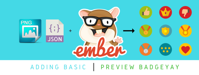
A Badge generator like Badgeyay must be able to generate, store and export the user data as and when needed. This blog post covers the addition of a preview section in the badge generator. It is discussed as to how the attributes on preview section are added.
Adding the functionality to badgeyay
Let us see how we implemented this functionality into the frontend of the project.
Step 1 : Adding the helper function
We need to add a helper function for determining the font of the preview items. We define a function “rel”, as in relative, which defines the relative font size according to the chosen one.
|
export function rel(params) { |
Step 2 : Adding the styling in the scss file
Now we add the required styling in the SCSS file to ensure that the preview appears at the exactly as we desire it to be.
|
.bgImg { .preview.content { |
Step 3 : Now we need to add attributes to controller
Now we need to define the attributes that will control the text inside the preview and the preview controller.
|
firstName : ”, |
Now we define when will the preview be changed. In our case it will be changed when a user types in something or a new image is selected.
|
mutateText(txtData) { |
The state of variables inside the preview section changes whenever the user types in a new name or designation etc. The image gets populated once the image is added either using the custom image input or by selecting the default image.
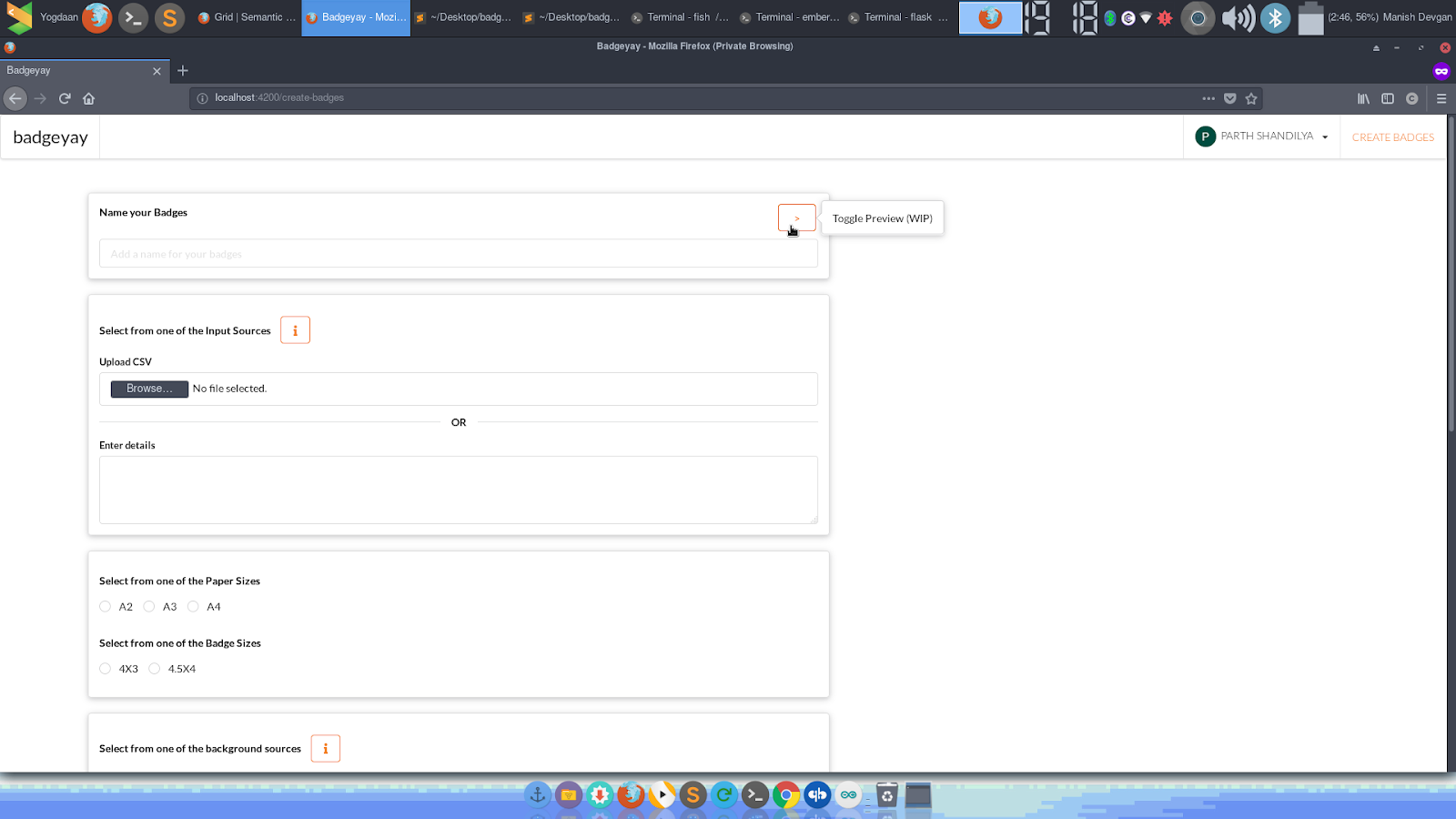
Screenshot of changes

Resources
- The Pull Request for the same : https://github.com/fossasia/badgeyay/pull/1482
- The Issue for the same : https://github.com/fossasia/badgeyay/issues/1478
- Read about Ember data : https://www.emberjs.com/api/data/classes/DS.Model.html
- Read about Handlebars : https://guides.emberjs.com/release/templates/handlebars-basics/


You must be logged in to post a comment.