Creating A Better Responsive Design In Susper

A lot of work has been done on making Susper, a wonderful search-engine and still more work have to be done on it. To become a good competitor in the market, one should make their website UI design such that:

  • It should be eye-catching for the users on the first-time visit to the website.
  • It should be easy to use with simple UI features rather than having more complex UI features.

We have been more oriented towards the material design. We have used Bootstrap technology for designing UI. Earlier, we proposed an idea of creating a UI using Angular Material v2 but it was dropped due to time limitations and other issue priorities.

To make Susper a better competitor in the market, we made sure it should be responsive as well on the following devices:

  • Mobile screen devices:
    • 320px – Smaller screen size.
    • 375px – Medium screen size.
    • 425px – Larger screen size.
  • Tablets:
    • 768px – default screen size for tablets.
  • Laptops:
    • 1024px – Smaller screen size.
    • 1440px – Larger screen size.
  • 4K:
    • 2560px – Default screen size.

We targeted these devices using @media queries in CSS3. For e.g. if I want to make a site responsive for the mobile devices, I will be using:

@media screen and (minwidth: 320px) and (maxwidth: 425px) {
  // do something
}


Here, min-width: 320px means that the screen size should be greater than and equal to 320px and max-width: 425px means that the screen size should be less than and equal to 425px.

It is not necessary to use only these dimensions. Suppose if there is break in UI design between 320px and 425px then, one can add that screen size using @media query. In this case, nested @media queries play a quite good role.

@media screen and (minwidth: 320px) and (maxwidth: 425px) {
  // do something
  // let’s say, break in UI design is observed at 375px
  // add nested @media query
  @media screen and (minwidth: 375px) {
    // do something
  }
}


We’re still improving our CSS code at present following this grid pattern. One can check UI code at Susper repository hosted on GitHub: https://github.com/fossasia/susper.com

We have also used a lot of breakpoints which are not nested. But it’s good practice to break points in nested form. This will be solved while improving our CSS code.

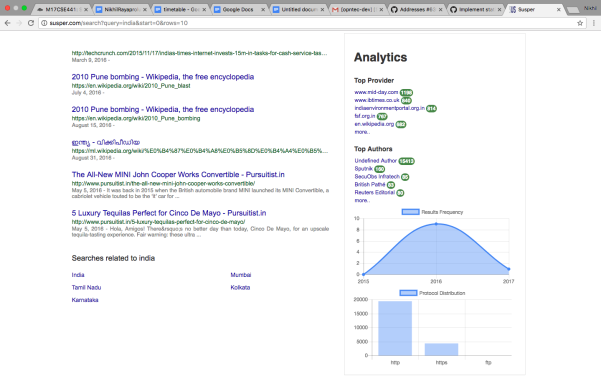
Here are some screenshots of the current responsiveness of Susper:

  • Mobile screen devices:
  • Tablet devices:

  • Laptops:
  • 4K display:

Resources:

Continue ReadingCreating A Better Responsive Design In Susper

Creating A Dockerfile For Yacy Grid MCP

The YaCy Grid is the second-generation implementation of YaCy, a peer-to-peer search engine. A YaCy Grid installation consists of a set of micro-services which communicate with each other using a common infrastructure for data persistence. The task was to deploy the second-generation of YaCy Grid. To do so, we first had created a Dockerfile. This dockerfile should start the micro services such as rabbitmq, Apache ftp and elasticsearch in one docker instance along with MCP. The microservices perform following tasks:

  • Apache ftp server for asset storage.
  • RabbitMQ message queues for the message system.
  • Elasticsearch for database operations.

To launch these microservices using Dockerfile, we referred to following documentations regarding running these services locally: https://github.com/yacy/yacy_grid_mcp/blob/master/README.md

For creating a Dockerfile we proceeded as follows:

FROM ubuntu:latest
MAINTAINER Harshit Prasad# Update
RUN apt-get update
RUN apt-get upgrade -y# add packages
# install jdk package for java
RUN apt-get install -y git openjdk-8-jdk

#install gradle required for build
RUN apt-get update && apt-get install -y software-properties-common
RUN add-apt-repository ppa:cwchien/gradle
RUN apt-get update
RUN apt-get install -y wget
RUN wget https://services.gradle.org/distributions/gradle-3.4.1-bin.zip
RUN mkdir /opt/gradle
RUN apt-get install -y unzip
RUN unzip -d /opt/gradle gradle-3.4.1-bin.zip
RUN PATH=$PATH:/opt/gradle/gradle-3.4.1/bin
ENV GRADLE_HOME=/opt/gradle/gradle-3.4.1
ENV PATH=$PATH:$GRADLE_HOME/bin
RUN gradle -v

# install apache ftp server 1.1.0
RUN wget http://www-eu.apache.org/dist/mina/ftpserver/1.1.0/dist/apache-ftpserver-1.1.0.tar.gz
RUN tar xfz apache-ftpserver-1.1.0.tar.gz

# install RabbitMQ server
RUN wget https://www.rabbitmq.com/releases/rabbitmq-server/v3.6.6/rabbitmq-server-generic-unix-3.6.6.tar.xz
RUN tar xf rabbitmq-server-generic-unix-3.6.6.tar.xz

# install erlang language for RabbitMQ
RUN apt-get install -y erlang

# install elasticsearch
RUN wget https://artifacts.elastic.co/downloads/elasticsearch/elasticsearch-5.5.0.tar.gz
RUN sha1sum elasticsearch-5.5.0.tar.gz
RUN tar -xzf elasticsearch-5.5.0.tar.gz

# clone yacy_grid_mcp repository
RUN git clone https://github.com/nikhilrayaprolu/yacy_grid_mcp.git
WORKDIR /yacy_grid_mcp

RUN cat docker/configftp.properties > ../apacheftpserver1.1.0/res/conf/users.properties

# compile
RUN gradle build
RUN mkdir data/mcp-8100/conf/ -p
RUN cp docker/config-mcp.properties data/mcp-8100/conf/config.properties
RUN chmod +x ./docker/start.sh

# Expose web interface ports
# 2121: ftp, a FTP server to be used for mass data / file storage
# 5672: rabbitmq, a rabbitmq message queue server to be used for global messages, queues and stacks
# 9300: elastic, an elasticsearch server or main cluster address for global database storage
EXPOSE 2121 5672 9300 9200 15672 8100

# Define default command.
ENTRYPOINT [“/bin/bash”, “./docker/start.sh”]


We have created a start.sh file to start RabbitMQ and Apache FTP services. At the end, for compilation gradle run will be executed.

adduser –disabled-password –gecos ” r
adduser r sudo
echo ‘%sudo ALL=(ALL) NOPASSWD:ALL’ >> /etc/sudoers
chmod a+rwx /elasticsearch-5.5.0 -R
su -m r -c ‘/elasticsearch-5.5.0/bin/elasticsearch -Ecluster.name=yacygrid &’
cd /apacheftpserver1.1.0
./bin/ftpd.sh res/conf/ftpdtypical.xml &
/rabbitmq_server-3.6.6/sbin/rabbitmq-server -detached
sleep 5s;
/rabbitmq_server-3.6.6/sbin/rabbitmq-plugins enable rabbitmq_management
/rabbitmq_server3.6.6/sbin/rabbitmqctl add_user yacygrid password4account
echo [{rabbit, [{loopback_users, []}]}]. >> /rabbitmq_server-3.6.6/etc/rabbitmq/rabbitmq.config
/rabbitmq_server-3.6.6/sbin/rabbitmqctl set_permissions -p / yacygrid “.*” “.*” “.*”
cd /yacy_grid_mcp
sleep 5s;
gradle run


start.sh will first add username and then password. Then it will start RabbitMQ along with Apache FTP.  For username and password, we have created a separate files to configure their properties during Docker run which can be found here:

The logic behind running all the microservices in one docker instance was: creating each container for microservice and then link those containers with the help of docker-compose.yml file.

The Dockerfile which we have created was corresponding to one image. Another image was elasticsearch which was linked to this Dockerfile. The latest version of elasticsearch image was already available on their site: https://www.elastic.co/guide/en/elasticsearch/reference/current/docker.html

We configured the docker-compose.yml file according to the reference link provided above. The docker-compose file can be found here: https://github.com/yacy/yacy_grid_mcp/blob/master/docker/docker-compose.yml

The source code for the implementation of whole structure can be found here: https://github.com/yacy/yacy_grid_mcp/tree/master/docker

Resources


Continue ReadingCreating A Dockerfile For Yacy Grid MCP

Implementing Advanced Search Feature In Susper

Susper has been provided ‘Advanced Search’ feature which provides the user a great experience to search for desired results. Advanced search has been implemented in such a way it shows top authors, top providers, and distribution regarding protocols. Users can choose any of these options to get best results.

We receive data of each facet name from Yacy using yacy search endpoint. More about yacy search endpoint can be found here:  http://yacy.searchlab.eu/solr/select?query=india&fl=last_modified&start=0&rows=15&facet=true&facet.mincount=1&facet.field=host_s&facet.field=url_protocol_s&facet.field=author_sxt&facet.field=collection_sxt&wt=yjson

For implementing this feature, we created Actions and Reducers using concepts of Redux. The implemented actions can be found here: https://github.com/fossasia/susper.com/blob/master/src/app/actions/search.ts

Actions have been implemented because these actually represent some kind of event. For e.g. like the beginning of an API call here.

We also have created an interface for search action which can be found here under reducers as filename index.ts: https://github.com/fossasia/susper.com/blob/master/src/app/reducers/index.ts

Reducers are a pure type of function that takes the previous state and an action and returns the next state. We have used Redux to implement actions and reducers for the advanced search.

For advanced search, the reducer file can be found here: https://github.com/fossasia/susper.com/blob/master/src/app/reducers/search.ts

The main logic has been implemented under advancedsearch.component.ts:

export class AdvancedsearchComponent implements OnInit {
  querylook = {}; // array of urls
  navigation$: Observable<any>;
  selectedelements: Array<any> = []; // selected urls by user
changeurl
(modifier, element) {
// based on query urls are fetched
// if an url is selected by user, it is decoded
  this.querylook[‘query’] = this.querylook[‘query’] + ‘+’ + decodeURIComponent(modifier);
  this.selectedelements.push(element);
// according to selected urls
// results are loaded from yacy
  this.route.navigate([‘/search’], {queryParams: this.querylook});
}

// same method is implemented for removing an url
removeurl(modifier) {
  this.querylook[‘query’] = this.querylook[‘query’].replace(‘+’ + decodeURIComponent(modifier), );

  this.route.navigate([‘/search’], {queryParams: this.querylook});
}


The changeurl() function replaces the query with a query and selected URL and searches for the results only from the URL provider. The removeurl() function removes URL from the query and works as a normal search, searching for the results from all providers.

The source code for the implementation of advanced search feature can be found here: https://github.com/fossasia/susper.com/tree/master/src/app/advancedsearch

Resources

Continue ReadingImplementing Advanced Search Feature In Susper

Implementation of Statistic Infobox for Susper

In Susper, we have implemented a statistic infobox to show analytics regarding Top authors, Top Providers and distribution regarding protocols and Results frequency by year.

Yacy also offers additional information for infoboxes such as files types, provider and authors. Using that information which we receive along with results we have implemented the infobox.

Implementation of Infobox:

1. For the distribution graphs, we have used angular library for chart.js https://www.npmjs.com/package/ng2-charts

2. We receive required statistics of each facet name from Yacy using the yacy search endpoint

http://yacy.searchlab.eu/solr/select?query=india&fl=last_modified&start=0&rows=15&facet=true&facet.mincount=1&facet.field=host_s&facet.field=url_protocol_s&facet.field=author_sxt&facet.field=collection_sxt&wt=yjson

Screenshot from 2017-08-15 14-10-30.png

Screenshot from 2017-08-15 14-10-16.png

We have created a statbox component to display the data related to statistic infobox at https://github.com/fossasia/susper.com/tree/master/src/app/statsbox

It takes care about rendering the statistic infobox and styling it.

Statsbox.component.ts

this.navigation$.subscribe(navigation => {
   for (let nav of navigation) {
     if (nav.displayname === 'Protocol') {
       let data = [];
       let datalabels = [];
       for (let element of nav.elements){
           datalabels.push(element.name);
           data.push(parseInt(element.count, 10));
         }
       this.barChartData[0].data = data;
       this.barChartLabels = datalabels;

     }
   }
 });
});

navigation observable gives us the latest statistics information received from the yacy and we subscribe to it and update the component variables accordingly for displaying the data.

Later these values are used by statsbox.component.html to display the statsbox.

The whole implementation of this feature can be found at pull: https://github.com/fossasia/susper.com/pull/704/

References:

1.Using Postman for analysing an API Endpoint: https://www.getpostman.com/docs

2.Using ngrx store: https://github.com/ngrx/store

Continue ReadingImplementation of Statistic Infobox for Susper

Continuous Integration and Deployment of Yacy Grid

We have deployed Yacy Grid on Google cloud recently, and we have achieved this using kubernetes and Travis for auto deployment.

How we have deployed it:

Firstly, it is advised to have different containers for each service your application requires, and follow a multi container architecture. Using multi container architecture you can allocate fixed size of power to each application and also replicate individual services, whichever is required. Presently, Yacy has two main applications which are required to be deployed in separate containers – Yacy_grid_mcp and ElasticSearch.

We took the official kubernetes YAML files of ElasticSearch and followed the instructions at https://github.com/kubernetes/examples/blob/master/staging/elasticsearch/README.md for deployment of elastic search on the google cloud.

With this we are able to run pods, volumes required for elastic search and services for connecting Yacy with elastic search.

The pull request regarding deployment of separate elasticsearch component is at https://github.com/yacy/yacy_grid_mcp/pull/27/files

Below figure shows different services and external endpoints present pods use for elastic search.

Now elastic search can be accessed at 35.202.154.219:9300 and http://35.193.124.253:9200/

Continuous deployment of Yacy_grid_mcp:

Please make sure that you have created a cluster on google container engine for deploying our containers on it. Regarding starting a project and cluster please read https://cloud.google.com/container-engine/docs/

1.Initially, Travis.yml initiates and sets up the required environment for Yacy deployment by installing Google cloud cli and kubectl components.

Source code regarding the Travis setup could be found at https://github.com/yacy/yacy_grid_mcp/blob/master/.travis.yml

2.Later Travis runs the depoy_staging.sh file, which builds the docker image of yacy o the present build and pushes it to hub.docker.com

if [ "$TRAVIS_PULL_REQUEST" != "false" -o "$TRAVIS_BRANCH" != "$SOURCE_BRANCH" ]; then
    echo "Skipping deploy; The request or commit is not on master"
    exit 0
fi

set -e

docker build -t nikhilrayaprolu/yacygridmcp:$TRAVIS_COMMIT ./docker
docker login -u="$DOCKER_USERNAME" -p="$DOCKER_PASSWORD"
docker tag nikhilrayaprolu/yacygridmcp:$TRAVIS_COMMIT nikhilrayaprolu/yacygridmcp:latest
docker push nikhilrayaprolu/yacygridmcp

Later with service key, we authenticate with google cloud and set the required environments and variables

echo $GCLOUD_SERVICE   base64 --decode -i > ${HOME}/gcloud-service-key.json
gcloud auth activate-service-account --key-file ${HOME}/gcloud-service-key.json

gcloud --quiet config set project $PROJECT_NAME_STG
gcloud --quiet config set container/cluster $CLUSTER_NAME_STG
gcloud --quiet config set compute/zone ${CLOUDSDK_COMPUTE_ZONE}
gcloud --quiet container clusters get-credentials $CLUSTER_NAME_STG

And Later we push the docker image built to google cloud and deploy it

kubectl config view
kubectl config current-context

kubectl set image deployment/${KUBE_DEPLOYMENT_NAME} ${KUBE_DEPLOYMENT_CONTAINER_NAME}=nikhilrayaprolu/yacygridmcp:$TRAVIS_COMMIT

Presently Yacy runs on 5vCPUs

With the following pods and services:

Also one can use kubectl cli for getting information regarding the cluster and pods as shown below

Pull request regarding deployment of yacy on google cloud is available at: https://github.com/yacy/yacy_grid_mcp/pull/16/files

References:

1.A Medium Blog on CD to Google Container: https://medium.com/google-cloud/continuous-delivery-in-a-microservice-infrastructure-with-google-container-engine-docker-and-fb9772e81da7

2.Another Blog on CD to Google Container: https://engineering.hexacta.com/automatic-deployment-of-multiple-docker-containers-to-google-container-engine-using-travis-e5d9e191d5ad

3.Deploying ElasticSearch to Cloud using Kubernetes: https://github.com/kubernetes/examples/blob/master/staging/elasticsearch/README.md

Continue Reading

Writing Browser Specific CSS for Susper in Angular

In Susper, we were facing a unique problem for Information box and Analytics box alignment.
At a width of around 1290 px, the boxes fit perfectly in Firefox as shown:

However, they were slipping to the next line in Google Chrome browsers for the same dimension(1290 px)

The solution to this issue was to write browser-specific CSS.
The two most commonly used browser specific tags are

  1. @-moz-document url-prefix() { }: This tag is used to target the Mozilla Firefox browser in particular. Anything written within the curly braces will not apply to any other browser.
  2. @media screen and (-webkit-min-device-pixel-ratio:0) { }: This tag is used to target all browsers that support webkit such as Chrome, Safari etc.

For our problem, we need to use @media screen and (-webkit-min-device-pixel-ratio:0) { }
This was how the code was written for both the components (Information box and Analytics box). Please refer to infobox.component.css and statsbox.component.css for the entire code.

@media screen and (-webkit-min-device-pixel-ratio:0) {
@media screen and (max-width: 1300px) {
.card {
width: 366px;
}
}
}
@media screen and (max-width: 1280px) {
.card {
width: 366px;
}

As a result of this snippet of code, we see the following effects:

  • In Chrome, the boxes change to a smaller width at 1300px itself, thus preventing it from slipping to the next line
  • In Firefox, the boxes change to a smaller width only at 1280px, and not at 1300px, thus achieving the exact design we envisioned.

This is how the display finally looks in Chrome:

References:

  1. Stack overflow on specific CSS tags for Chrome: https://stackoverflow.com/questions/9328832/how-to-apply-specific-css-rules-to-chrome-only
  2. Stack overflow on specific CSS tags for Firefox: https://stackoverflow.com/questions/952861/targeting-only-firefox-with-css
Continue ReadingWriting Browser Specific CSS for Susper in Angular

Making a Sticky Top Navigation bar for Susper using Angular

A lot of websites, require a top navigation bar that sticks to the top, irrespective of the screen dimension size. This blog deals with how the top navigation bar was made sticky in Susper.

  1. Using the correct Bootstrap classes. Notice the code enveloping the navigation bar.

<nav class=“top-nav navbar navbar-static-top navbar-default”>

class=“container-fluid”>

class=“navbar-header” id=“navcontainer”>

</div>
</div>
</nav>

Points to note:

  • Using navbar and navbar-default creates a standard gray navigation bar.
  • Using navbar-static-top makes the navbar stick only to the top of the page and disappear on scrolling down.
  • Using container-fluid creates a container for the contents of the navbar with wide margins
  1.  Now we also need to write some personalized CSS code. Notice the classes navcontainer and  top-nav. This is the CSS code for these classes:

.top-nav{
margin-bottom: 0;
}
#navcontainer {
height: 65px;
width: 100vw;
}#navcontainer ul {
margin: 0;
padding: 0;
list-style-type: none;
}

Points to note:

  • Margin and padding can be set according to how the navbar should look. Click here to know the difference between margins and padding.
  • The height has been customized to 65px in Susper, with a width of 100vw(entire viewpost width).
  1. Lastly, if your navigation bar is inside the body tag, remember that by default, body has a top margin of 57 px. As a result you may see an extra white space on top of your navigation bar. To remove this:
  • Move the navigation bar code out of the body tag. If you can’t then,
  • Place your navigation bar in a container ( resultContainer on the Susper result page) and write this in your CSS file.

.resultContainer{
margin-top: -57px;
}

References:

Continue ReadingMaking a Sticky Top Navigation bar for Susper using Angular

Making Customized and Mobile Responsive Drop-down Menus in Susper using Angular

In  Susper, the drop-down menu is customized with colorful search icons and we wanted to maintain the same menu for mobile screens too, however the drop-down menu disappeared for all screens with width less than 767px. This blog can be used to learn how to create css classes for such drop-down menus without using any bootstrap.
This is how the issue was solved.

  1. Replacing standard bootstrap classes : The drop-down menu blocks had a source code as follows:

class=“dropdown-menu”>

class=“row”>

class=“col-sm-4”>

class=“block”>

</div>
</div>

Using col-sm-4 will do the following

  • For widths greater than 767px: Divide each row into four equally sized columns.
  • For widths smaller than 767px: Stack all the columns on top of each other.

Since the drop-down menu’s design was to remain intact, I made the following changes:

  • Replace row with menu-row
  • Replace col-sm-4 with menu-item

Now I wrote personalized css for these classes.

.menu-row{
width: 267px;
gridtemplatecolumns: 1fr 1fr 1fr;
background-color: white;
}
.menu-item{
display: inlineblock;
width: 86px;
}
  • Width: It is used to set the width of the div class, each row now has a width of 267px, with each column in it having a width of 86px.
  • Grid-template-columns: It is used to layout the structure of the template, here 1fr 1fr 1fr represents that there will be three columns in a row.
  • Display: The display is set to inline block to overwrite the default property of the div element to start in a new line.
  1. Custom css for small screens : In standard bootstrap, for screen sizes less than 767px, dropdown class has properties like transparent background, no border etc. that need to be over written. So we add a new id for the div tag as shown:

<div id=“small-drop” class=“dropdown-menu”>

/** Now we add css for it, as shown: **/
@media screen and (max-width: 767px) {
#small-drop{
position: absolute;
background-color: white;
border: 1px solid #cccccc;
right: -38px;
left: auto;
}

  • Position : absolute is used to make sure all our values are absolute and not relative to the higher div hierarchically
  • Border: The values for the border represent the following respectively: Thickness, Style and Color.
  • Auto: Here the value auto for left signifies that there is no fixed value for the left margin, it can take the default value

References:

  1. For working of grids in Bootstrap: https://www.w3schools.com/bootstrap/bootstrap_grid_examples.asp
  2. A useful article for difference between id and class: https://css-tricks.com/the-difference-between-id-and-class


Continue ReadingMaking Customized and Mobile Responsive Drop-down Menus in Susper using Angular

Making Autocomplete Box Compatible with the Search Bar using Angular in Susper

A major problem in Susper was that we were using the same components on different pages, with different styling properties. A major issue was that the Autocomplete box was not properly aligned in the index page and looked like this:

This was happening because the autocomplete box width was set for 634 px, a width perfect for the search bar in the results page. The index page had a search bar of width 534 px, and the autocomplete box was too large for that.
Here is how the issue was solved:

  1. Changing the suggestion box html code:

id=“sug-box” class=“suggestion-box” *ngIf=”results.length0”>

</div>

The code uses *ngIf which is why setting the autocomplete box width using the typescript files becomes impossible. *ngIf does not load the component into the DOM until there are results, hence we didnot have the autocomplete box in the DOM until after the query was typed in the search bar. That was why we could not set its width, hence it was decided to remove this attribute. Using the ‘hidecomponent emitter’ is a better option here (used in the typescript file).

@Output() hidecomponent: EventEmitter<any> = new EventEmitter<any>();
if (this.results.length === 0) {
this.hidecomponent.emit(1);
} else {
this.hidecomponent.emit(0);
}

See autocomplete.component.ts for the complete code.

  1. It is now required to dynamically change the id of the suggestion-box depending on the page it is on, and apply the correct CSS.

Here is the html code:

<div [id]=”getID()” class=“suggestion-box” *ngIf=“results”>

The id of the suggestion box will now depend on the value returned from the function getID(), defined as follows:

getID() {
if ( this.route.url.toString() === ‘/’) {
  return ‘index-sug-box’;
} else {
  return ‘sug-box’
}
}
  • We first check if the route url is simply ‘/’ (which implies it is in the index page).
  • If yes the id is set to index-sug-box otherwise to sug-box.

Now we can write extra CSS properties for the index-sug-box id as follows:

#index-sug-box{
width: 586px;
}

References:

  1. For basic javascript functions: https://www.w3schools.com/js/js_functions.asp
  2. To understand components in Angular: https://angular.io/api/core/Component


Continue ReadingMaking Autocomplete Box Compatible with the Search Bar using Angular in Susper

Implementing Sort By Date Feature In Susper


Susper has been given ‘Sort By Date’ feature which provides the user with latest results with the latest date. This feature enhances the search experience and helps users to find desired results more accurately. The sorting of results date wise is done by yacy backend which uses Apache Solr technology.

The idea was to create a ‘Sort By Date’ feature similar to the market leader. For example, if a user searches for keyword ‘Jaipur’ then results appear to be like this:

If a user wishes to get latest results, they can use ‘Sort By Date’ feature provided under ‘Tools’.

The above screenshot shows the sorted results.

You may however notice that results are not arranged year wise. Currently, the backend work for this is being going on Yacy and soon will be implemented on the frontend as well once backend provide us this feature.

Under ‘Tools’ we created an option for ‘Sort By Date’ simply using <li> tag.

<ul class=dropdownmenu>
  <li (click)=filterByDate()>Sort By Date</li>
</ul>

When clicked, it calls filterByDate() function to perform the following task:

filterByDate() {
  let urldata = Object.assign({}, this.searchdata);
  urldata.query = urldata.query.replace(/date, “”);
  this.store.dispatch(new queryactions.QueryServerAction(urldata));
}
Earlier we were using ‘last_modified desc’ attribute provided by Solr for sorting out dates in descending order. In June 2017, this feature was deprecated with a new update of Solr. We are using /date attribute in query for sorting out results which is being provided by Solr.


Continue ReadingImplementing Sort By Date Feature In Susper