Enhancing pagination in Badgeyay

A Badge generator like Badgeyay must be able to generate, store and export the user data as and when needed. This blog post covers the enhancement of pagination in the frontend of badgeyay project. There are small “next” and “previous” links to toggle between pages..

Enhancing the current way of links

The problem with the pagination links was that in case of no more badges/users etc, the links would always appear on the bottom right of the table. The previous link must not appear when no previous page is there and vice versa for the next link.

Step 1 : Adding the package to package.json

Image link is the link to the user’s uploaded image on remote firebase server.

{{#if allow}}
<tfoot>
<
tr>
<
th colspan=“5”>
<
div class=“ui right floated pagination menu”>
{{#if allow_prev}}
<
a class=“icon item” {{action ‘prevPage‘}}>
<
i class=“left chevron icon”></i>
</
a>
{{/if}}
{{#if allow_next}}
<
a class=“icon item” {{action ‘nextPage‘}}>
<
i class=“right chevron icon”></i>
</
a>
{{/if}}
</
div>
</
th>
</
tr>
<
/tfoot>
{{/i
f}}

Step 2 : Initializing the variables in setupController

Once we have added the if construct to the badgeyay frontend then we need to add the variable initialization in the setupController method in EmberJS.

setupController(controller, model) {
this._super(…arguments);
set(controller,
‘reports’, model);
if (model.length < 9) {
set(controller,
‘allow_prev’, false);
set(controller,
‘allow_next’, false);
set(controller,
‘allow’, false);
}
}

Step 3 : Implementing state changed in the controllers

Now we need to handle the situation when a user clicks the links and there are more or less links to display. This is done by checking the length of the model in the controller.

if (this.page === 1) {
this.set(‘allow_prev’, false);
}
else {
this.set(‘allow_prev’, true);
}
this..set(‘allow_next’, true);

Same needs to be done for all the controllers that have pagination available.

And finally we need to pass these variables in the component template. One such example is given below.

<div class=“ui grid user-grid”>
<
div class=“row”>
<
div class=“sixteen wide column”>
{{badge-table badges=badges user=user session=session sendbadgeId=(action ‘deleteBadge’ badge) prevPage=(action ‘prevPage’) nextPage=(action ‘nextPage’) allow_prev=allow_prev allow_next=allow_next allow=allow}}
</
div>
</
div>
<
/div>

Finally, we have the pagination links working as desired..

Screenshot of changes

Resources


Continue ReadingEnhancing pagination in Badgeyay

Badge Generation : Adding Progress Bar

A Badge generator like Badgeyay must be able to generate, store and export the user data as and when needed. This blog post covers the addition of ember-progress-bar in the badgeyay project. This progress bar shows real-time progress of the badge generation process.

Adding the functionality to badgeyay

Let us see how we implemented this functionality into the backend of the project.

Step 1 : Adding the package to package.json

Image link is the link to the user’s uploaded image on remote firebase server.

ember install ember-progress-bar

or

npm install ember-progress-bar –save

Step 2 : Adding the progressbar to the frontend

Once we have installed the progress bar, we need to display it onto the frontend of the project.

To do that we use the handlebars templating engine to render the progress bar.

{{#if showProgress}}
<
div class=“ui segment”>
<
div class=“ui centered aligned grid”>{{progressState}}</div>
<
div class=“ui divider”></div>
{{ember-progress-bar progress=progress options=(hash color=’orange’)}}
</
div>
{{/if}}

Step 3 : Now we need to define states

We need to define the states that the progress bar will take up in realtime. And to do so, we make changes to the create-badges controller

showProgress   : false,
progress       : 0,
progressState  : ,

Now we manage the states according to the functionality that has been done.

this.set(‘showProgress’, true);
this.set(‘progress’, 0.1);
this.set(‘progressState’, ‘Setting Paper Size’);

this.set(
‘progress’, 0.4);
this.set(‘progressState’, ‘Gathering background’);

this.set(
‘progress’, 0.7);
this.set(‘progressState’, ‘Preparing your badges’);

this.set(
‘showProgress’, false);
this.set(‘progress’, 0);
this.set(‘progressState’, );

Finally, we have our basic progress bar ready for the users to view.

Screenshot of changes

Resources

Continue ReadingBadge Generation : Adding Progress Bar

Modifying the My-Badges Component

A Badge generator like Badgeyay must be able to generate, store and export the user data as and when needed. This blog post is about modify the my-badges component to show the badges in a more creative manner.. For making the badges look better than they already are, we decided to use another type of semantic-ui card. This card requires an image. So we decided to use the user’s uploaded image as the image for the badge card. For this, we made changes to the backend along with the frontend.

Adding the functionality to badgeyay

Let us see how we implemented this functionality into the backend of the project.

Step 1 : Adding the image_link to backend

Image link is the link to the user’s uploaded image on remote firebase server.

image_link = db.Column(db.String) # adding column to table

image_link = fields.Str(required=True)  # adding to schema

link = fileUploader(imageDirectory, ‘images/’ + image_name) badge_created.image_link = link  # uploading the file and storing the link

Step 2 : Adding a details to frontend model

Now we need add the attributes to the frontend model to accept our image_link data..

import DS from ’ember-data’;

const { Model, attr } = DS;

export default Model.extend({
badge_size    : attr(‘string’),
csv           : attr(‘string’),
download_link : attr(‘string’),
image         : attr(‘string’),
text_color    : attr(‘string’),
image_link    : attr(‘string’)
});

Step 3 : Adding required Handlebar code and SCSS

Now we need to add the handlebar code to render the image from the link provided from the ember data model.

<div class=”image”>
<img src=”{{badge.image_link}}”>
</div>

And apply some CSS to the image and card

.ui.segment {
.cards {
.card {
padding-right: 10px;

img {
height: 300px;
width: 100%;
}
}
}
}

Finally, we need to apply the migrations to the backend server as well. This is carried out by flask-migrate easily.

Screenshot of changes

Resources


Continue ReadingModifying the My-Badges Component

Adding Online Payment Support in Open Event Frontend via PayPal

Open Event Frontend involves ticketing system which supports both paid and free tickets. To buy a paid ticket Open Event provides several options such as debit card, credit card, cheque, bank transfer and onsite payments. So to add support for debit and credit card payments Open Event uses Paypal checkout as one of the options. Using paypal checkout screen users can enter their card details and pay for their ticket or they can use their paypal wallet money to pay for their tickets.

Given below are some steps which are to be followed for successfully charging a user for ticket using his/her card.

  • We create an application on paypal developer dashboard to receive client id and secret key.
  • We set these keys in admin dashboard of open event and then while checkout we use these keys to render checkout screen.
  • After clicking checkout button a request is sent to create-paypal-payment endpoint of open event server to create a paypal token which is used in checkout procedure.
  • After user’s verification paypal generates a payment id is which is used by open event frontend to charge the user for stipulated amount.
  • We send this token to open event server which processes the token and charge the user.
  • We get error or success message from open event server as per the process outcome.

To render the paypal checkout elements we use paypal checkout library provided by npm. Paypal button is rendered using Button.render method of paypal checkout library. Code snippet is given below.

// app/components/paypal-button.js

paypal.Button.render({
   env: 'sandbox',

   commit: true,

   style: {
     label : 'pay',
     size  : 'medium', // tiny, small, medium
     color : 'gold', // orange, blue, silver
     shape : 'pill'    // pill, rect
   },

   payment() {
   // this is used to obtain paypal token to initialize payment process 
   },

   onAuthorize(data) {
     // this callback will be for authorizing the payments
    }

 }, this.elementId);


After button is rendered next step is to obtain a payment token from create-paypal-payment endpoint of open event server. For this we use the payment() callback of paypal-checkout. Code snippet for payment callback method is given below:

// app/components/paypal-button.js

let createPayload = {
      'data': {
        'attributes': {
          'return-url' : `${window.location.origin}/orders/${order.identifier}/placed`,
          'cancel-url' : `${window.location.origin}/orders/${order.identifier}/placed`
        },
        'type': 'paypal-payment'
      }
    };
paypal.Button.render({
     //Button attributes

      payment() {
        return loader.post(`orders/${order.identifier}/create-paypal-payment`, createPayload)
          .then(res => {
            return res.payment_id;
          });
      },

      onAuthorize(data) {
        // this callback will be for authorizing the payments
      }

    }, this.elementId);


After getting the token payment screen is initialized and user is asked to enter his/her credentials. This process is handled by paypal servers. After user verifies his/her payment paypal generates a paymentId and a payerId and sends it back to open event. After the payment authorization onAuthorize() method of paypal is called and payment is further processed in this callback method. Payment ID and payer Id received from paypal is sent to charge endpoint of open event server to charge the user. After receiving success or failure message from paypal proper message is displayed to users and their order is confirmed or cancelled respectively. Code snippet for onAuthorize is given below:

// app/components/paypal-button.js

onAuthorize(data) {
        // this callback will be for authorizing the payments
        let chargePayload = {
          'data': {
            'attributes': {
              'stripe'            : null,
              'paypal_payer_id'   : data.payerID,
              'paypal_payment_id' : data.paymentID
            },
            'type': 'charge'
          }
        };
        let config = {
          skipDataTransform: true
        };
        chargePayload = JSON.stringify(chargePayload);
        return loader.post(`orders/${order.identifier}/charge`, chargePayload, config)
          .then(charge => {
            if (charge.data.attributes.status) {
              notify.success(charge.data.attributes.message);
              router.transitionTo('orders.view', order.identifier);
            } else {
              notify.error(charge.data.attributes.message);
            }
          });
      }


Full code can be seen here.

In this way we achieve the functionality of adding paypal payment support in open event frontend. Please follow the links below for further clarification and detailed overview.

Resources:

Continue ReadingAdding Online Payment Support in Open Event Frontend via PayPal

Adding Multiple Select Checkboxes to Select Multiple Tickets for Discount Code in Open Event Frontend

This blog illustrates how we can add multiple select checkboxes to open event frontend using EmberJS.

Here we take an example of discount code creation in open event frontend. Since a discount code can be related to multiple tickets. Hence we should allow the organizer to choose multiple tickets from the event’s ticket list for which he/she wants the discount code to be applicable.

We start by generating a create route where we create a record for the discount code and pass the model to the template.

// routes/events/view/tickets/discount-codes/create.js

import Route from '@ember/routing/route';

export default Route.extend({
 titleToken() {
   return this.get('l10n').t('Create');
 },

 model() {
   return this.get('store').createRecord('discount-code', {
     event    : this.modelFor('events.view'),
     tickets  : [],
     usedFor  : 'ticket',
     marketer : this.get('authManager.currentUser')
   });
 }
});

We can see that we have a tickets relationship for new record of discount code which can accept multiple ticket as an array. We access this model in our template and create checkboxes for all tickets related to the event. So that the organizer can select multiple tickets for which he/she wants the discount code to be applicable.

// templates/components/forms/events/view/create-discount-code.hbs

{{t 'Select Ticket(s) applied to the discount code'}}
   {{ui-checkbox label='Select all Ticket types' name='all_ticket_types' value='tickets' checked=allTicketTypesChecked onChange=(action 'toggleAllSelection')}}

   {{#each data.event.tickets as |ticket|}}
     {{ui-checkbox label=ticket.name checked=ticket.isChecked onChange=(action 'updateTicketsSelection' ticket)}}
     <br>
   {{/each}}

This is part of the code that contain checkboxes for tickets. Full code can be seen here. We can see that first div contains the checkbox that allows us to select all the tickets at once. Once checked, this calls the action toggleAllSelection. This action is defined like this.

// components/forms/events/view/create-discount-code.js

toggleAllSelection(allTicketTypesChecked) {
     this.toggleProperty('allTicketTypesChecked');
     let tickets = this.get('data.event.tickets');
     if (allTicketTypesChecked) {
       this.set('data.tickets', tickets.slice());
     } else {
       this.get('data.tickets').clear();
     }
     tickets.forEach(ticket => {
       ticket.set('isChecked', allTicketTypesChecked);
     });
   },


In the toggleAllSelection action we loop over all the tickets of an event and set their isCheck property to either true or false depending on whether Select All checkbox was checked or unchecked. This is done to make all individual tickets checkboxes as checked or unchecked depending on whether we have selected all or unselected all. Also we set or unset the data.tickets array which contains all the tickets of discount-code record that were selected using checkboxes.

Going back to template in second div we render all the tickets individually with their checkbox. Each time a ticket is checked or unchecked we call updateTicketSelection action. Let us have a look at updateTicketSelection action.

// components/forms/events/view/create-discount-code.js

updateTicketsSelection(ticket) {
     if (!ticket.get('isChecked')) {
       this.get('data.tickets').pushObject(ticket);
       ticket.set('isChecked', true);
       if (this.get('data.tickets').length === this.get('data.event.tickets').length) {
         this.set('allTicketTypesChecked', true);
       }
     } else {
       this.get('data.tickets').removeObject(ticket);
       ticket.set('isChecked', false);
       this.set('allTicketTypesChecked', false);
     }
   },


In this action, we check if the ticket is checked or not. If it is checked we add it to the data.tickets array and further check if we have selected all the tickets or not. In case we have selected all the tickets then we also mark select all checkbox as checked through allTicketTypesChecked property. If it is unchecked we remove that ticket from the array. You can see full code here.

In this way, we implement multiple select checkboxes to select more than one data of a particular type through Ember.

Resources:

Continue ReadingAdding Multiple Select Checkboxes to Select Multiple Tickets for Discount Code in Open Event Frontend

Ember Data Integration In Badgeyay Frontend

Badgeyay is an open source utility to develop badges for events and tech conferences. Badgeyay project is divided into two components. Frontend part is designed with ember and backend part is designed with Flask and database as PostgreSQL and Firebase as PaaS.

After refactoring the backend API for generation of badges, now it is time to consume the API in frontend by ember, and the way to consume the api in ember front–end is with the use of in built ember-data library. Ember data behaves in a way similar to server side ORM’s (Object Relational Mappers). It is a very versatile library and can be equipped with variety of backend services. It can be used with REST as well as sockets and other transfer protocols for communication.

For better understanding the working of ember data, let’s see how to use the same to consume the File Upload endpoint in the backend.

Procedure

  1. Enabling CORS on server, to allow cross-domain requests to the API.
from flask_cors import CORS
CORS(app, resources={r"*": {"origins": "*"}})
  1. Creating Adapter for the model in frontend. In our case it is csv-file. In the adapter we need to specify the host and the path, because our backend api is not running on the same port.
import DS from 'ember-data';

const { RESTAdapter } = DS;

export default RESTAdapter.extend({
host : 'http://localhost:5000',
pathForType : () => {
return 'api/upload/file';
}
});
  1. After creating the adapter we need to create the record in the controller of the respective component. The record is like an object of a class, which when pushed to store will make a network request to backend (POST) and fetch the response from the backend. Backend response will provide the id to save in store
import Controller from '@ember/controller';
import { inject as service } from '@ember/service';

export default Controller.extend({
routing : service('-routing'),
actions : {
mutateCSV(csvData) {
let csv_ = this.get('store').createRecord('csv-file', {
csvFile : csvData,
extension : 'csv'
});
csv_.save();
},

mutateText(txtData) {
console.log(txtData);
}
}
});

Model for the csv-file

import DS from 'ember-data';

const { Model, attr } = DS;

export default Model.extend({
csvFile : attr('string'),
extension : attr('string')
});
  1. Next is to create serializers for the model. Serializers gets triggered at two moments, first when the data is sent to the server and second when data is received from the server. Each time an independent function gets executed. As the naming conventions of the functions pretty much explains their role, but for the sake of clarification serialize function gets executed when we send request to the server and normalizeResponse gets executed when we are getting response from the server.
import DS from 'ember-data';

const { JSONAPISerializer } = DS;

export default JSONAPISerializer.extend({

serialize(snapshot, options) {
let json = this._super(...arguments);
json.csvFile = {
'csvFile' : json.data.attributes['csv-file'],
'extension' : json.data.attributes.extension
};

delete json.data;
return json;
},

normalizeResponse(store, primaryModelClass, payload, id, requestType) {
return payload;
}
});
  1. After receiving the response a promise is returned by the push method to save the record in the store and we can see the id is saved in the ember-data object.

Pull Request for the same is at this Link

Topics Involved

Working on the issue involve following topics:

  • Enabling CORS to accept cross-domain requests at server
  • Creating models in ember data
  • Passing action from controller to component
  • Modifying the Params and Response on the network sent by ember-data via serializers


Resources

  • Ember data repository – Link
  • Documentation for creating record in ember data – Link
  • API Doc for JSONAPIAdapter – Link
  • API Doc for JSONAPISerializer – Link
  • Property methods for serializer – serialize, normalizeResponse
Continue ReadingEmber Data Integration In Badgeyay Frontend

Implementation of Badge Size Feature in Badgeyay Front-end

Badgeyay project is divided into two parts i.e front-end with Ember JS and back-end with REST-API programmed in Python.

Badgeyay has many features related to enhancement in the generation of badges. It gives the choice of uploading data entries i.e by CSV or manually. There are options available for choosing Badge Background and font specifications. But there is an important feature missing which will make the service more user-friendly in terms of creation of badges for different types of events i.e, Badge Size.

Badge Size feature is implemented in Backend. I need to send the data in the backend in the desired format for creation of Badges with different sizes.

In this Blog, I will be discussing how I implemented Badge Size feature in Badgeyay Frontend in my Pull Request.

Let’s get started and understand it step by step.

Step 1:

Create Badge Size component with Ember CLI.


$ ember g  component  badge-component/badge-size


Step 2:

Write the HTML required in the badge-size component:


// templates/components/badge-component/badge-size.hbs

class="inline fields">
class="field">
class="ui radio checkbox" {{ action 'mutateBadgeSize' 'A3' }}> name="size" value="A3" type="radio"> A3
</div>
class="field">
class="ui radio checkbox" {{ action 'mutateBadgeSize' 'A4' }}> name="size" value="A4" type="radio"> A4
</div>
class="field">
class="ui radio checkbox" {{ action 'mutateBadgeSize' 'A5' }}> name="size" value="A5" type="radio"> A5
</div>
class="field">
class="ui radio checkbox" {{ action 'mutateBadgeSize' 'A6' }}> name="size" value="A6" type="radio"> A6
</div> </div>


Step 3:

Integrate the Badge Size component with creating badges component.


// templates/create-badges.hbs
…………………………….
class="ui raised segment">
class="ui form width-container">

Select from one of the Badge Sizes

{{#ui-accordion class="styled fluid"}}
class="title"> class="plus icon"> Badge Size
class="content">
class="center aligned"> {{ badge-component/badge-size sendBadgeSize=(action 'mutateBadgeSize') }} // Injecting Action
</div> {{/ui-accordion}} </div> </div> ………………………….


Step 4: Define the actions that are injected into the component.


// badge-component/badge-size.js

import Component from '@ember/component';

export default Component.extend({
  init() {
    this._super(...arguments);    // Initialize
  },

  actions: {
    mutateBadgeSize(value) {
      this.get('sendBadgeSize')(value);  // Get values
    }
  }
});


// controllers/create-badges.js
...............
     let badgeData = {
        uid        : _this.uid,
        badge_size : 'A3'  // Default Badge Size 
      };

      if (_this.defBadgeSize !== '' && _this.defBadgeSize !== undefined) {
        badgeData.badge_size = _this.defBadgeSize;
      }
...................
   mutateBadgeSize(value) {
      this.set('defBadgeSize', value);
    },
................


I have implemented the Feature to choose Badge Size in the frontend. Now, the user can choose Badge size also for Badge customization.

Step 5::

Now run the server to see the implemented changes by the following command.


$ ember serve


  • Badge Size Component

  • Payload when A5 Size Chosen for Badge Generation

Now, we are done with the implementation of Badge Size feature in Badgeyay Frontend.

Resources:

  • Ember Docs –  Link
  • Badgeyay Repository – Link
  • Issue Link – Link
Continue ReadingImplementation of Badge Size Feature in Badgeyay Front-end

Open Event Frontend – Updating Ember Models Table from V1 to V2

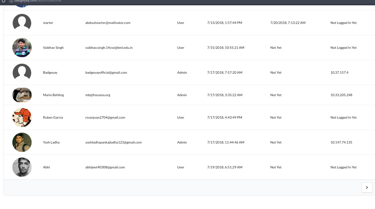
FOSSASIA‘s Open Event Frontend uses the Ember Models Table for rendering all its tables. This provides features like easy sorting, pagination etc. Another major feature is that it can be modified to meet our styling needs. As we use Semantic UI for styling, we added the required CSS classes to our table.

In version 1 this was done by overriding the classes, as shown below :

const defaultMessages = {
  searchLabel            : 'Search:',
  searchPlaceholder      : 'Search',


  ..... more to follow 
};

const defaultIcons = {
  sortAsc         : 'caret down icon',
  sortDesc        : 'caret up icon',
  columnVisible   : 'checkmark box icon',
  
  ..... more to follow  
};

const defaultCssClasses = {
  outerTableWrapper              : 'ui ui-table',
  innerTableWrapper              : 'ui segment column sixteen wide inner-table-wrapper',
  table                          : 'ui tablet stackable very basic table',
  globalFilterWrapper            : 'ui row',

 ... more to follow
};

const assign = Object.assign || assign;

export default TableComponent.extend({
  layout,

  _setupMessages: observer('customMessages', function() {
    const customIcons = getWithDefault(this, 'customMessages', {});
    let newMessages = {};
    assign(newMessages, defaultMessages, customIcons);
    set(this, 'messages', O.create(newMessages));
  }),

  _setupIcons() {
    const customIcons = getWithDefault(this, 'customIcons', {});
    let newIcons = {};
    assign(newIcons, defaultIcons, customIcons);
    set(this, 'icons', O.create(newIcons));
  },

  _setupClasses() {
    const customClasses = getWithDefault(this, 'customClasses', {});
    let newClasses = {};
    assign(newClasses, defaultCssClasses, customClasses);
    set(this, 'classes', O.create(newClasses));
  },

  simplePaginationTemplate: 'components/ui-table/simple-pagination',

  ........
});

And was used in the template as follows:

<div class="{{classes.outerTableWrapper}}">
  <div class="{{classes.globalFilterDropdownWrapper}}">

But in version 2, some major changes were introduced as follows:

  1. All partials inside a models-table were replaced with components
  2. models-table can now be used with block content
  3. New themes mechanism introduced for styling

Here, I will talk about how the theming mechanism has been changed. As I mentioned above, in version 1 we used custom classes and icons. In version 2 the idea itself has changed. A new type called Theme was added. It provides four themes out of the box – SemanticUI, Bootstrap4, Bootstrap3, Default.

We can create our custom theme based on any of the predefined themes. To suit our requirements we decided to modify the SemanticUI theme. We created a separate file to keep our custom theme so that code remains clean and short.

import Default from 'ember-models-table/themes/semanticui';

export default Default.extend({
 components: {
   'pagination-simple'    : 'components/ui-table/simple-pagination',
   'numericPagination'    : 'components/ui-table/numeric-pagination',
   .....  
 },

 classes: {
   outerTableWrapper              : 'ui ui-table',
   innerTableWrapper              : 'ui segment column sixteen wide inner-table-wrapper',
   .....
 },

 icons: {
   sortAsc         : 'caret down icon',
   sortDesc        : 'caret up icon',
   ......
 },

 messages: {
   searchLabel            : 'Search:',
   .....
 }
});

So a theme mostly consists of four main parts:

  • Components
  • Classes
  • Icons
  • Messages

The last three are same as customClasses and customIcons and customMessages in version 1. Components is the map for components used internally in the models-table. In case you need to use a custom component, that can be done as follows:

Make a new JavaScript file and provide its path in your theme file.

import DefaultDropdown from '../../columns-dropdown';
import layout from 'your layout file path';
export default DefaultDropdown.extend({
  layout
});

Now just create the theme file object and pass it to themeInstance in the ui-table file (can also be passed in the template and the controller, but this has to be done for each table individually).

import TableComponent from 'ember-models-table/components/models-table';
import layout from 'open-event-frontend/templates/components/ui-table';
import Semantic from 'open-event-frontend/themes/semantic';

export default TableComponent.extend({
 layout,

 themeInstance: Semantic.create()
});

Hence, version 2 introduces many new styling options and requires some refactoring for those who were using version 1. It is totally worth it though considering how easy and well managed it is now.

References

Continue ReadingOpen Event Frontend – Updating Ember Models Table from V1 to V2

Implementing Sponsors API for Events and Using Image Upload Widget in Open Event Frontend


This blog article will talk about how sponsors API has been implemented in events edit dashboard of Open Event Frontend. This discussion involves the /events/{event_identifier}/edit/sponsors route. Primary API endpoint of Open Event Server for fetching sponsors of an event are

GET         /v1/events/{event_identifier}/sponsors{?sort,filter}

GET        /v1/sponsors/{sponsor_id}

Next, we define the corresponding models according to the type of response returned by the server. This model extends the Base model.

import attr from 'ember-data/attr';
import ModelBase from 'open-event-frontend/models/base';
import { belongsTo } from 'ember-data/relationships';
import { computedSegmentedLink } from 'open-event-frontend/utils/computed-helpers';

export default ModelBase.extend({
 name        : attr('string'),
 level       : attr('number'),
 type        : attr('string'),
 url         : attr('string'),
 description : attr('string'),
 logoUrl     : attr('string'),

 event: belongsTo('event'),

 segmentedLink: computedSegmentedLink.bind(this)('url')
});


Here all the field attributes clearly signify what they mean. Event field has a relationship to events model, hence it is bound to event model through

belongsTo( ).

Next we fetch the data from the API and feed it into sponsor edit form available at event/{event_identifier}/edit/sponsor .

import Route from '@ember/routing/route';
import EventWizardMixin from 'open-event-frontend/mixins/event-wizard';

export default Route.extend(EventWizardMixin, {
 titleToken() {
   return this.get('l10n').t('Sponsors');
 },
 async model() {
   let data = this.modelFor('events.view.edit');
   data.sponsors = await data.event.get('sponsors');
   return data;
 }
});


We have defined model() asynchronously and return the fetched data to template. This data passes into sponsor form of event wizard located here.

We see that this form contains many widgets for handling form validation and its structure. Here we will explore the image upload widget of open event frontend that helps us adding image upload option to many forms across open event frontend.

Image upload component is like any other component of ember with many functions. This widget mainly includes processFiles() and uploadFiles(). Let us look at their working one by one. Full code of image-upload.js can be seen here.

processFiles(files) {
   if (files && files[0]) {
     isFileValid(files[0], this.maxSizeInKb, ['image/jpeg', 'image/png']).then(() => {
       const reader = new FileReader();
       reader.onload = e => {
         const untouchedImageData = e.target.result;
         if (this.get('needsCropper')) {
           this.set('imgData', untouchedImageData);
           this.set('cropperModalIsShown', true);
         } else {
           this.uploadImage(untouchedImageData);
         }
       };
       reader.readAsDataURL(files[0]);

     }).catch(error => {
       this.notify.error(error);
     });
   } else {
     this.notify.error(this.get('l10n').t('No FileReader support. Please use a more latest browser'));
   }

 },


This function accepts file input and processes them. It first passes it to a isFileValid() function with all arguments, which returns true if the files are in correct format. It then checks the dimensions and figures out if the image needs a cropper for cropping image. If yes, it opens a cropper modal and lets user crop the image to perfect size.

It then calls uploadImage() function to upload the cropped image. UploadImage() function looks something like this:

uploadImage(imageData) {
   this.set('selectedImage', imageData);
   this.set('needsConfirmation', false);
   this.set('uploadingImage', true);
   this.get('loader')
     .post('/upload/image', {
       data: imageData
     })
     .then(image => {
       this.set('uploadingImage', false);
       this.set('imageUrl', image.url);
     })
     .catch(() => {
       this.set('uploadingImage', false);
       this.set('errorMessage', this.i18n.t('An unexpected error occurred.'));
     });
 },


This function on receiving image data send a post request to the server for uploading the image to requested directory. If the server does not behave properly then it exits with an error.

Widgets such as image-upload help us to maintain our code in a better way by allowing re-usability of code. Ember provides good support for such controller, adapters, widgets to be used in the app.

Resources:

Continue ReadingImplementing Sponsors API for Events and Using Image Upload Widget in Open Event Frontend

Integrating Ember Notify with Badgeyay

Badgeyay project is divided into two parts i.e front-end with Ember JS and back-end with REST-API programmed in Python.

Badgeyay frontend has many features like Login and Sign up features and Login with OAuth and the most important, the badge generation feature is also up and running but the important thing from the User’s perspective is to get notified of all the actions performed in the application so that user can proceed easily further after performing a specific action in the Application..

In this Blog, I will be discussing how I integrated ember-notify in Badgeyay frontend to notify user about the actions performed in my Pull Request.

Ember-notify displays a little notification message down the bottom of our application.

Let’s get started and understand it step by step.

Step 1:

This module is an ember-cli addon, so installation is easy:

npm install ember-notify --save-dev


Step 2:

Inject the notify service in the controller of the template. Here, I will showing how I added it in showing Log In and Logout messages and you can check the whole code in my Pull request for other controllers also.

// controllers/login.js 

import Ember from 'ember';

import Controller from '@ember/controller';

const { inject } = Ember;

export default Controller.extend({
  session : inject.service(),
  notify  : inject.service('notify'),

..........

           this_.transitionToRoute('/');
          this_.get('notify').success('Log In Successful');
        }).catch(function(err) {
          console.log(err.message);
          this_.get('notify').error('Log In Failed ! Please try again');
        });

............

              this_.transitionToRoute('/');
              this_.get('notify').success('Log In Successful');
            })
            .catch(err => {
              console.log(err);
            });
        }).catch(function(err) {
          console.log(err.message);
          this_.get('notify').error('Log In Failed ! Please try again');
        });
 ..........
// controllers/logout.js

import Ember from 'ember';

import Controller from '@ember/controller';

const { inject } = Ember;

export default Controller.extend({
  session : inject.service(),
  notify  : inject.service('notify'),
  beforeModel() {
    return this.get('session').fetch().catch(function() {});
  },
  actions: {
    logOut() {
      this.get('session').close();
      this.transitionToRoute('/');
      this.get('notify').warning('Log Out Successful');
    }
  }
});


I have implemented ember-notify for Logging In and Out feature & in the similar way I have implemented it for other controllers and complete code can be seen in my Pull Request.

Step 3::

Now run the server to see the implemented changes by following command.

$ ember serve


Navigate to localhost and perform login and logout actions to see the changes.

  •  Successful Log In

  • Successful Log out

  • Successful CSV Upload

Now, we are done with the integration of ember-notify in Badgeyay frontend to notify user about the actions performed in the Application.

Resources:

  • Ember Docs –  Link
  • Ember Notify Docs – Link
Continue ReadingIntegrating Ember Notify with Badgeyay