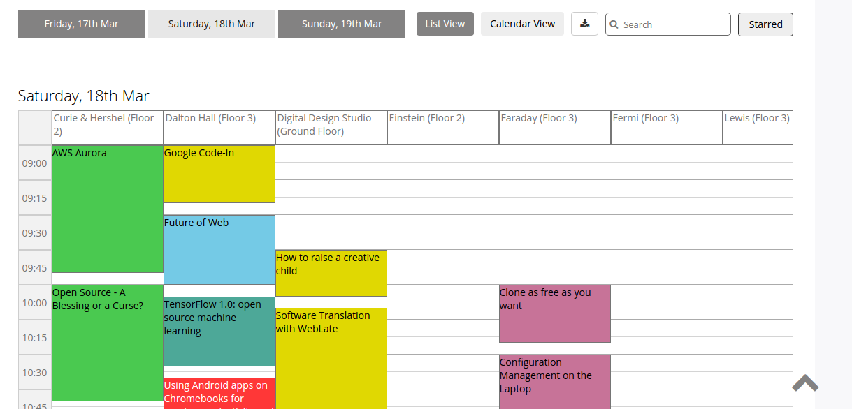
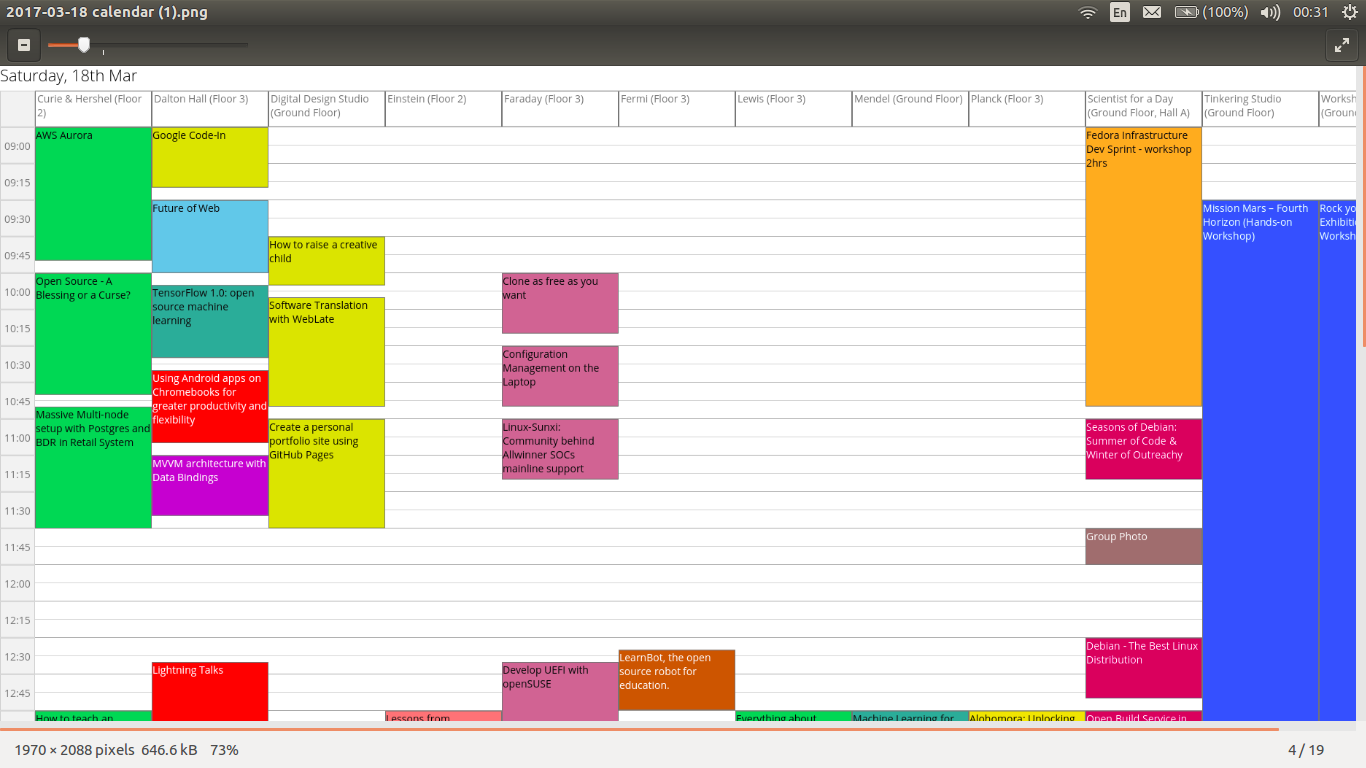
Implementing Session Bookmark Feature in Open Event Webapp
The event websites generated by Open Event Webapp can be large in size with a massive number of sessions in it. As such, it becomes a little difficult for the user to keep track of the sessions he is interested in without any bookmark facility. With the help of it, he/she can easily mark a session as his favorite and then see them all at once at the click of the button. This feature is available and synchronized across all the pages (track, rooms, and schedule) of the event. That is, if you bookmark a session on the tracks page, it would automatically appear on the other pages too. Likewise, if you unmark a session on any of the page, it would be reflected on rest of the pages.
The event websites generated by the webapp are static in nature. It means that there is no backend server and database where the data about the bookmarked sessions and the user can be stored. So how are we storing information about the marked sessions and persisting it across different browser sessions? There must be a place where we are storing the data! Yes. It’s the LocalStorage Object. HTML5 introduced a localStorage object for storing information which persists even when the site or the browser is closed and opened again. Also, the max size of the localStorage object is quite sufficient (around 5 – 10 MB) for storing textual data and should not be a bottleneck in the majority of the cases.
One very important thing to remember about the localStorage object is that it only supports strings in key and value pairs. Hence, we can’t store any other data type like Boolean, Number or Date directly in it. We would have to convert the concerned object into a string using the JSON.stringify() method and then store it.
Okay, let’s see how we implement the bookmark facility of sessions. We initialize the localStorage object. We create a key in it which is the name of the event and corresponding to its value, we store an object which will contain the information about the bookmarked sessions of that particular event. It’s key will be the id of the session and the value (0 or 1) will define whether it is bookmarked or not. Initially, when no sessions have been bookmarked, it will be empty.
function initPage() {
 //Check whether the localStorage object is already instantiated

 if(localStorage.hasOwnProperty(eventName) === false) {
   localStorage[eventName] = '{}'; // This object will store the bookmarked sessions info
 }
}
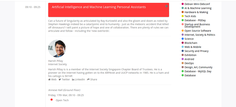
Now, we need to actually provide a button to the user for marking the sessions and then link it to the localStorage object. This is the session element with the star-shaped bookmark button

Here is the related code
<a class="bookmark" id="b{{session_id}}">
 <i class="fa fa-star" aria-hidden="true">
 </i>
</a>
Then we need to handle the click event which occurs when the user clicks this button. We will extract the id of the session and then store this info in the event object inside the localStorage object.
$('.bookmark').click(function (event) {
   // Get the event object from the localStorage
   var temp = JSON.parse(localStorage[eventName]);

   // Get the current color of the bookmark icon. If it's black, it means that the session is already bookmarked.
   var curColor = $(this).css("color");

   // Extract the id of the session
   var id = $(this).attr('id').substring(1);

   if (curColor == "rgb(0, 0, 0)") {
     // Unmark the session and revert the font-icon color to default
     temp[id] = 0;
     $(this).css("color", "");
   } else {
     // Bookmark the session and color the font icon black
     temp[id] = 1;
     $(this).css("color", "black");
   }

   localStorage[eventName] = JSON.stringify(temp);
   event.stopPropagation();
 });
So suppose, our event name is FOSSASIA Summit and we bookmarked sessions with the id of 2898 and 3100 respectively, then the structure of the localStorage object will be something like this:-
{'FOSSASIA Summit': { '2898': '1', '3100': '1'}};
To finally show all the bookmarked sessions at once, we defined two modes of the page: Starred and All. In the Starred mode, only the bookmarked sessions are shown. We simply select the event object inside the localStorage and iterate over all the session id’s and only show those which have their value set to 1. In the latter mode, all the sessions are displayed.
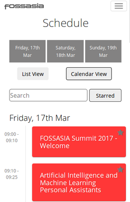
Starred Mode (Showing only the bookmarked sessions)

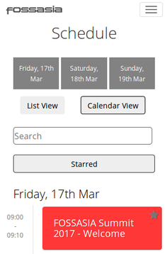
All Mode (Every session is displayed, both marked and unmarked)

References: