Adding Transition Effect Using RxJS And CSS In Voice Search UI Of Susper


Susper has been given a voice search feature through which it provides a user with a better experience of search. We introduced to enhance the speech-recognition user interface by adding transition effects. The transition effect was required to display appropriate messages according to voice being detected or not. The following messages were:

  • When a user should start a voice search, it should display ‘Speak Now’ message for 1-2 seconds and then show up with message ‘Listening…’ to acknowledge user that now it is ready to recognize the voice which will be spoken.
  • If a user should do not speak anything, it should display ‘Please check audio levels or your microphone working’ message in 3-4 seconds and should exit the voice search interface.

The idea of speech UI was taken from the market leader and it was implemented in a similar way. On the homepage, it looks like this:

On the results page, it looks like this:

For creating transitions like, ‘Listening…’ and ‘Please check audio levels and microphone’ messages, we used CSS, RxJS Observables and timer() function.

Let’s start with RxJS Observables and timer() function.

RxJS Observables and timer()

timer() is used to emit numbers in sequence in every specified duration or after a given duration. It acts as an observable. For example:

let countdown = Observable.timer(2000);
The above code will emit value of countdown in 2000 milliseconds. Similarly, let’s see another example:
let countdown = Observable.timer(2000, 6000);
The above code will emit value of countdown in 2000 milliseconds and subsequent values in every 6000 milliseconds.
export class SpeechToTextComponent implements OnInit {
  message: any = ‘Speak Now’;
  timer: any;
  subscription: any;
  ticks: any;
  miccolor: any = #f44;
}
ngOnInit() {
  this.timer = Observable.timer(1500, 2000);
  this.subscription = this.timer.subscribe(t => {
  this.ticks = t;// it will throw listening message after 1.5   sec
  if (t === 1) {
    this.message = Listening;
  }// subsequent events will be performed in 2 secs interval
  // as it has been defined in timer()
  if (t === 4) {
    this.message = Please check your microphone audio levels.;
    this.miccolor = #C2C2C2;
}// if no voice is given, it will throw audio level message
// and unsubscribe to the event to exit back on homepage
  if (t === 6) {
    this.subscription.unsubscribe();
    this.store.dispatch(new speechactions.SearchAction(false));
  }
 });
}
The above code will throw following messages at a particular time. For creating the text-animation effect, most developers go for plain javascript. The text-animation effects can also be achieved by using pure CSS.

Text animation using CSS

@webkitkeyframes typing {from {width:0;}}
.spch {
  fontweight: normal;
  lineheight: 1.2;
  pointerevents: none;
  position: none;
  textalign: left;
  –webkitfontsmoothing: antialiased;
  transition: opacity .1s easein, marginleft .5s easein,                  top  0s linear 0.218s;
  –webkitanimation: typing 2s steps(21,end), blinkcaret .5s                       stepend infinite alternate;
  whitespace: nowrap;
  overflow: hidden;
  animationdelay: 3.5s;
}
@keyframes specifies animation code. Here width: 0; tells that animation begins from 0% width and ends to 100% width of the message. Also, animation-delay: 3.5s has been adjusted w.r.t timer to display messages with animation at the same time.
This is how it works now:

The source code for the implementation can be found in this pull request: https://github.com/fossasia/susper.com/pull/663

Resources:


Continue ReadingAdding Transition Effect Using RxJS And CSS In Voice Search UI Of Susper

Implementing Intelligence Feature in Susper

Susper gives answers to your questions using SUSI AI. We want to give users best experience while they are searching for solutions to their questions. To achieve this, we have incorporated with features like infobox and intelligence using SUSI.

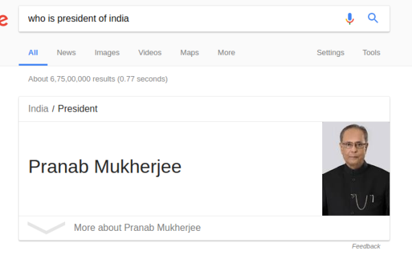
Google has this feature where users can ask questions like ‘Who is president of USA?’ and get answers directly without encouraging the users to deep-dive into the search results to know the answer.

Similarly Susper gives answer to the user:

It also gives answer to question which is related to real time data like temperature.


How we have implemented this feature?

We used the API Endpoint of SUSI at http://api.asksusi.com/

Using SUSI API is as simple as sending query as a URL parameter in GET request http://api.susi.ai/susi/chat.json?q=YOUR_QUERY

You can also get various action types in the response. Eg: An anwser type response for http://api.susi.ai/susi/chat.json?q=hey%20susi is:

actions: [
  {
    type: "answer",
    expression: "Hi, I'm Susi"
  }
],


Documentation regarding SUSI is available at here.

Implementation in Susper:

We have created an Intelligence component to display answer related to a question. You can check it here: https://github.com/fossasia/susper.com/tree/master/src/app/intelligence

It takes care about rendering the information and styling of the rendered data received from SUSI API.

The intelligence.component.ts makes a call to Intelligence Service with the required query and the intelligence service makes a GETrequest to the SUSI API and retrieves the results.

Intelligence.component.ts

this.intelligence.getintelligentresponse(data.query).subscribe(res => {
  if (res && res.answers && res.answers[0].actions) {
     this.actions = res.answers[0].actions;
       for (let action of this.actions) {
         if (action.type === 'answer' && action.mood !== 'sabta') {
           this.answer = action.expression;
         } else {
             this.answer = '';
         }
      }
   } else {
       this.answer = '';
   }
});


Intelligence.service.ts

export class IntelligenceService {
 server = 'http://api.susi.ai';
 searchURL = 'http://' + this.server + '/susi/chat.json';
 constructor(private http: Http, private jsonp: Jsonp, private store: Store<fromRoot.State>) {
 }
 getintelligentresponse(searchquery) {
   let params = new URLSearchParams();
   params.set('q', searchquery);
   params.set('callback', 'JSONP_CALLBACK');
   return this.jsonp
     .get('http://api.asksusi.com/susi/chat.json', {search: params}).map(res =>
       res.json()

     );
 }

Whenever the getintelligenceresponse of intelligenceService is called, it creates a URLSearchParams() object and set required parameters in it and send them in jsonp.get request. We also set callback to ‘JSONP_CALLBACK’ to inform the API to send us data in JSONP.

Thereby, the intelligence component retrieves the answer and displays it with search resultson Susper.

Source code for this implementation could be found in this pull:

https://github.com/fossasia/susper.com/pull/569

Resources:

Continue ReadingImplementing Intelligence Feature in Susper

Changing Dimensions of Search Box Dynamically in Susper

Earlier the Susper search box had a fixed dimension. When a user types in a query, the dimensions of the search box remained fixed. This approach resulted in several issues like:

  • Matching the dimensions of the search bar following the market leader.
  • When dimensions are dynamically changing, it should not disturb alignment w.r.t tabs in the results page.

What actually happens is, when a user enters a query, the search box quickly changes its dimensions when results appear. I will be discussing below how we achieved this goal.

On the home page, we created the dimensions of a search bar with 584 x 44 pixels.

On the results page, we created the dimensions of search bar 632 x 44 similar to market leader:

How we proceeded?

Susper is built on Angular v4.1.3. It automatically comes with a function ngOnInit() whenever a new component has been created. ngOnInit() is a part of life cycle hook in Angular 4 (in Angular 2 as well). The function is called up or initialized when the component is rendered completely. This was the key for changing dimensions of search bar dynamically as soon as a component is created.

What happens is when a user types a query on the homepage and hits enter then, results component is created. As soon as, it is created – ngOnInit() function is called.

The default dimensions of search bar have been provided as follows:

search-bar.component.css

#navgroup {
  height: 44px;
  width: 584px;
}
When the homepage loads up, dimensions by default are 584 x 44.

search-bar.component.ts

private navbarWidth: any;
ngOnInit() {
  this.navbarWidth = 632px;
}

search-bar.component.html

We used [style.width] attribute to change the dimensions dynamically. Add this attribute inside input element.

<input #input type=“text” name=“query” class=“form-control” id=“nav-input” (ngModelChange)=“onquery($event)” [(ngModel)]=“searchdata.query” autocomplete=“off” (keypress)=“onEnter($event)” [style.width]=“navbarWidth”>
As soon as results component is loaded, the dimensions of search bar change to 632 x 44. In this way, we change the dimensions of search bar dynamically as soon as results are loaded.

Resources

Continue ReadingChanging Dimensions of Search Box Dynamically in Susper

Aligning Images to Same Height Maintaining Ratio in Susper

In this blog, I’ll be sharing the idea how we have perfectly aligned images to the same height in Susper without disturbing their ratio. When it comes to aligning images perfectly, they should have:

  • Same height.
  • A proper ratio to maintain the image quality. Many developers apply same width and height without keeping in mind about image ratio which results in:
    • Blurred image,
    • Image with a lot of pixels,
    • Cropping of an image.

Earlier Susper was having image layout like this:

In the screenshot, images are not properly aligned.  They are also not having the same height. We wanted to improve the layout of images just like market leaders Google and DuckDuckGo.

  • How we implemented a better layout for images?

<div class=“container”>
  <div class=“grid” *ngIf=“Display(‘images’)”>
    <div class=“cell” *ngFor=“let item of item$ | async”>
      <a class=“image-pointer” href=“{{item.link}}”>
        <img class=“responsive-image” src=“{{item.link}}”></a>
    </div>
  </div>
</div>
I have created a container, in which images will be loaded from yacy server. Then I have created a grid with an equal number of rows and column. I have adjusted the height and width of rows and columns to obtain a grid which contains each division as a cell. The image will load inside the cell. Each cell consists of one image.
.grid {
  paddingleft: 80px;
}
.container {
  width: 100%;
  margin: 0;
  top: 0;
  bottom: 0;
  padding: 0;
}

After implementing it, we were facing issues like cropping of the image inside a cell. So, to avoid cropping and maintain the image ratio we introduced .responsive-image class which will avoid cropping of images inside cell.

.responsiveimage {
  maxwidth: 100%;
  height: 200px;
  paddingtop: 20px;
  padding: 0.6%;
  display: inlineblock;
  float: left;
}

This is how Susper’s image section looks now:

It took some time to align images, but somehow we succeeded in creating a perfect layout for the images.

We are facing some issues regarding images. Some of them don’t appear due to broken link. This issue will be resolved soon on the server.

Resources

Continue ReadingAligning Images to Same Height Maintaining Ratio in Susper

Implementation of Responsive SUSI Web Chat Search Bar

When we were building the first phase of the SUSI Web Chat Application we didn’t consider about  the responsiveness as a main goal. The main thing we needed was a working application. This changed at a later stage. In this post I’m going to emphasize how we implemented the responsive design and problems we met while we were developing the design.

When we were moving to Material-UI from static HTML CSS we were able to make most of the parts responsive. As an example App-bar of the application. We added App-bar like as follows: We made a separate component for App-bar and it includes the “searchfield” element. Material-UI app bar handles the responsiveness for some extent. We have to handle responsiveness of other sub-parts of the app bar manually.

In “TopBar.react.js” I returned marterial-ui <Toolbar> element like this.

<Toolbar>
                <ToolbarGroup >
                </ToolbarGroup>
                <ToolbarGroup lastChild={true}> //inside of this we have to include other components of the top bar inside this element

                </ToolbarGroup>
             </Toolbar>

We have to add the search button inside the element.
In this we added search component.

This field has the ability to expand and collapse like this.

It looks good. But it appears on mobile screen in a different way. This is how it appears on mobile devices.

So we wanted to hide the SUSI logo on small sized screens. For that we wrote medial queries like this.

@media only screen and (max-width: 860px){
 .app-bar-search{
   background-image: none;
 }
 .search{
   width: 100px !important;
 }
}

Even in smaller screens it appears like this.

To avoid that we minimized the width of the search bar in different screen sizes using media queries .

@media only screen and (max-width: 480px){
 .search{
   width: 100px !important;
 }
}
@media only screen and (max-width: 360px){
 .search{
   width: 65px !important;
 }
}

But in even smaller screens it still appears in the same way. We can’t show the search bar on small screens because the screen size is not enough to show the search bar.
So we wrote another media query to hide all the elements of search component in small screens except close button. Because when we collapse the screen on search mode it hides all the search components and messagecomposer. To take it back to the chat mode we have to enable the close button on smaller screens.

@media only screen and (max-width: 300px){
 .displayNone{
   display: none !important;
 }
 .displayCloseNone{
     position: relative;
     top:6px  !important;
 }
}

We have to define these two classes in “SearchField.react.js” file.

<IconButton className='displayNone'
                   <SearchIcon />
               </IconButton>
               <TextField  name='search'
                   className='search displayNone'
                   placeholder="Search..."/>
               <IconButton className='displayNone'>
                   <UpIcon />
               </IconButton>
               <IconButton className='displayNone'>
                   <DownIcon />
               </IconButton>
               <IconButton className='displayCloseNone'>
                   <ExitIcon />
               </IconButton>

Since we have “Codacy” integrated into our Github Repository we have to change Codacy rules because we used “!important” in media queries to override inline style which comes from Material-UI.
To change codacy rules we can simply login to the codacy and select the “code pattern ” button from the column left side.

It shows the list of rules that Codacy checks. And you can see the “!important” rule under CSSlint category like this.

Just uncheck it. Then codacy will not check your source code for “!important” attributes.

Resources
Configuring Codacy: Use Your Own Conventions: https://blog.codacy.com/configuring-codacy-use-your-own-conventions-9272bee5dcdb
Media queries: https://www.w3schools.com/css/css_rwd_mediaqueries.asp

Continue ReadingImplementation of Responsive SUSI Web Chat Search Bar

Adding tip to drop downs in Susper using CSS in Angular

To create simple drop downs using twitter bootstrap, it is fairly easy for developers. The issue faced in Susper, however, was to add a tip on the top over such dropdowns similar to Google:

This is how it looks finally, in Susper, with a tip over the standard rectangular drop-down:

This is how it was done:

  1. First, make sure you have designed your drop-down according to your requirements, added the desired height, width and padding. These were the specifications used in Susper’s drop-down.

.dropdown-menu{
height: 500px;
width: 327px;
padding: 28px;
}
  1. Next add the following code to your drop-down class css:

.dropdown-menu:before {
position: absolute;
top: -7px;
right: 19px;
display: inlineblock;
border-right: 7px solid transparent;
border-bottom: 7px solid #ccc;
border-left: 7px solid transparent;
border-bottom-color: rgba(0, 0, 0, 0.2);
content: ;
}
.dropdown-menu:after {
position: absolute;
top: -5px;
right: 20px;
display: inlineblock;
border-right: 6px solid transparent;
border-bottom: 6px solid #ffffff;
border-left: 6px solid transparent;
content: ;
}

In css, :before inserts the style before any other html, whereas :after inserts the style after the html is loaded. Some of the parameters are explained here:

  • Top: can be used to change the position of the menu tip vertically, according to the position of your button and menu.
  • Right: can be used to change the position of the menu tip horizontally, so that it can be positioned used below the menu icon.
  • Position : absolute is used to make sure all our values are absolute and not relative to the higher div hierarchically
  • Border: All border attributes are used to specify border thickness, color and transparency before and after, which collectively gives the effect of a tip for the drop down.
  • Content : This value is set to a blank string ‘’, because otherwise none of our changes will be visible, since the divs will have no space allocated to them.

Resources

Continue ReadingAdding tip to drop downs in Susper using CSS in Angular

Adding Masonry Grid Layout to loklak Media Wall

Working on loklak media walls, I wanted to add a responsive self-adjusting grid layout for media walls. Going through the most trending media wall, I concluded that the most commonly used view for media walls is Masonry view. This view is a much similar view to the Pinterest grid layout. In fact, Masonry Desandro states that Masonry view can be one of the most responsive and most pretty ways to present cards. It is also beneficial to use masonry view as it avoids unnecessary gaps and makes full use of the display screen.

In this blog, we are going to see how I added a masonry view to the media walls without any other dependency than CSS using column-count and column-gap. We would also be looking upon how to adjust font-size using rem units to make text readable for all screen-sizes depending on number of columns.

HTML File

<span class=“masonry”>
<span class=“masonry-panel” *ngFor=“let item of (apiResponseResults$ | async)”>
<span class=“masonry-content”>
<mediawallcard [feedItem]=“item”></mediawallcard>
</span>
</span>
</span>
  • The first span with class masonry is like a container in which all the cards will be embedded. This div will provide a container to adjust the number of columns in which cards will be adjusted.
  • The second span with class masonry-panel will be the column division. These panels are like the elements of a matrix. These panels are responsive and will adjust according to the screen size.
  • The third span with class masonry-content are like the content box in which all the content will be embedded. This div will create a space in the panel for the card to be adjusted.
  • The fourth element media-wall-card are the cards in which all the feed items are placed.

CSS File

  • Adjusting columns – The column-count and column-gap property was introduced in CSS3 to divide the element in a specified number of column and to keep the specified number (whole number) of column gap between the elements respectively. For different screen sizes, these are the column count that are kept. We need adjust the number of columns according to various screen sizes so that cards neither look too stretched or too bleak. Media wall is now responsive enough to adjust on smaller screens like mobiles with one column and on larger screens too with five columns.

@media only screen and (max-width: 600px) {
.masonry {
columncount: 1;
columngap: 0;
}
} @media only screen and (min-width: 600px) and (max-width: 900px) {
.masonry {
columncount: 2;
columngap: 0;
}
} @media only screen and (min-width: 1280px) and (max-width: 1500px) {
.masonry {
columncount: 3;
columngap: 0;
}
} @media only screen and (min-width: 1500px) and (max-width: 1920px) {
.masonry {
columncount: 4;
columngap: 0;
}
} @media only screen and (min-width: 1920px) {
.masonry {
columncount: 5;
columngap: 0;
}
}
  • Adjusting Font-Size – For a fixed aspect ratio of various divisions of the media wall card, we need a central unit that can be adjusted to keep this ratio fixed. Using px will rather make the sizes fixed and adjusting these sizes for various screen sizes will make it hectic and would spoil the ratio. We will be instead using rem as a font-unit to adjust the font size for different screen sizes. Firstly, we need to assign a certain font size to all the elements in the media wall card. Now, we can configure the central font-size of the root unit for all the screen sizes using @media tag.

One thing that should be kept in mind is that The root font size should be kept more than 14px always.

@media only screen and (max-width: 600px) {
:root {
font-size: 14px;
}
}@media only screen and (min-width: 600px) and (max-width: 800px) {
:root {
font-size: 16px;
}
}@media only screen and (min-width: 800px) and (max-width: 1200px) {
:root {
font-size: 17px;
}
}@media only screen and (min-width: 1200px) and (max-width: 1500px) {
:root {
font-size: 18px;
}
}@media only screen and (min-width: 1500px) {
:root {
font-size: 20px;
}
}


This will create a masonry layout and now, all the cards can be adjusted in this self-adjusting grid and will look readable on all types of screen.

Reference

Continue ReadingAdding Masonry Grid Layout to loklak Media Wall

CSS Styling Tips Used for loklak Apps

Cascading Style Sheets (CSS) is one of the main factors which is valuable to create beautiful and dynamic websites. So we use CSS for styling our apps in apps.loklak.org.

In this blog post am going to tell you about few rules and tips for using CSS when you style your App:

1.Always try something new – The loklak apps website is very flexible according to the user whomsoever creates an app. The user is always allowed to use any new CSS frameworks to create an app.

2.Strive for Simplicity – As the app grows, we’ll start developing a lot more than we imagine like many CSS rules and elements etc. Some of the rules may also override each other without we noticing it. It’s good practice to always check before adding a new style rule—maybe an existing one could apply.

3.Proper Structured file –

  • Maintain uniform spacing.
  • Always use semantic or “familiar” class/id names.
  • Follow DRY (Don’t Repeat Yourself) Principle.

CSS file of Compare Twitter Profiles App:

#searchBar {
    width:500px;
}

table {
  border-collapse: collapse;
  width: 70%;
}

th, td {
  padding: 8px;
  text-align: center;
  border-bottom: 1px solid#ddd;
}


The output screen of the app:


Do’s and Don’ts while using CSS:

  • Pages must continue to work when style sheets are disabled. In this case this means that the apps which are written in apps.loklak.org should run in any and every case. Let’s say for instance, when a user uses a old browsers or bugs or either because of style conflicts.
  • Do not use the !important attribute to override the user’s settings. Using the !important declaration is often considered bad practice because it has side effects that mess with one of CSS’s core mechanisms: specificity. In many cases, using it could indicate poor CSS architecture.
  • If you have multiple style sheets, then make sure to use the same CLASS names for the same concept in all of the style sheets.
    Do not use more than two fonts. Using a lot of fonts simply because you can will result in a messy look.
  • A firm rule for home page design is more is less : the more buttons and options you put on the home page, the less users are capable of quickly finding the information they need.

Resources:

Continue ReadingCSS Styling Tips Used for loklak Apps

Using Hidden Attribute for Angular in Susper

In Angular, we can use the hidden attribute, to hide and show different components of the page. This blog explains what the hidden attribute is, how it works and how to use it for some common tasks.
In Susper, we used the [hidden] attribute for two kinds of tasks.

  1. To hide components of the page until all the search results load.
  2. To hide components of the page, if they were meant to appear only in particular cases (say only the first page of the search results etc).

Let us now see how we apply this in a html file.
Use the [hidden] attribute for the component, to specify a flag variable responsible for hiding it.
When this variable is set to true or 1, the component is hidden otherwise it is shown.
Here is an example of how the [hidden] attribute is used:

<app-infobox [hidden]=”hidefooter class=“infobox col-md-4” *ngIf=“Display(‘all’)”></app-infobox>

Note that [hidden] in a way simply sets the css of the component as { display: none }, whereas in *ngIf, the component is not loaded in the DOM.
So, in this case unless Display(‘all’) returns true the component is not even loaded to the DOM but if [hidden] is set to true, then the component is still present, only not displayed.
In the typescript files, here is how the two tasks are performed:
To hide components of the page, until all the search results load.

this.querychange$ = store.select(fromRoot.getquery);
this.querychange$.subscribe(res => {
this.hidefooter = 1;

this.responseTime$ = store.select(fromRoot.getResponseTime);
this.responseTime$.subscribe(responsetime => {
this.hidefooter = 0;

The component is hidden when the query request is just sent. It is then kept hidden until the results for the previously sent query are available.

2. To hide components of the page, if they were meant to appear only in particular cases.
For example, if you wish to show a component like Autocorrect only when you are on the first page of the search results, here is how you can do it:

if (this.presentPage === 1) {
this.hideAutoCorrect = 0;
} else {
this.hideAutoCorrect = 1;
}

This should hopefully give you a good idea on how to use the hidden attribute. These resources can be referred to for more information.

Continue ReadingUsing Hidden Attribute for Angular in Susper

Implementing a suggestion box in Susper Angular JS Front-end

In Susper, we have implemented a suggestion box for our input box. This was done using Yacy suggest API. This is how the box looks:

In this blog, let us see how to implement such a box using html, css, twitter-bootstrap and typescript. You can also check the code at the Susper repository.

The html code is simple and straightforward:


class=“suggestion-box” *ngIf=“results”>

</div>

A few points to notice :

  • *ngIf=”results” ensures that the box is displayed only when it has suggestions to display and not otherwise
  • The [routerLink] and [queryParams] attributes together link every result to the search page, with the correct query.

This is the css code :

a {
text-decoration: none;
}.suggestions {
font-family: Arial, sans-serif;
font-size: 17px;
margin-left: 2.4%;
}.query-suggestions:hover {
background: #E3E3E3;
}.suggestion-box{
width: 635.2px;
max-width: 100%;
border: 1px solid rgba(150,150,150,0.3);
background-color: white;
margin-left: -25.7px;
position: absolute;
boxshadow: 0px 0.2px 0px;
}

A few points to notice again:

    • Box-shadow: This gives the drop up a shadow effect, which looks really nice, the first 3 parameters are for dimensions (X-offset, Y-offset, Blur). The rgba specifies color, with parameters as (red-component, green-component, blue-component, opacity).
    • Text-decoration: This attribute is used to add/remove decoration like underline for links.
    • Font-family: The font-family mentioned here is Arial, if Arial is unavailable sans-serif is used.

In the typescript file, there are two major tasks:

  1. Splice the results if greater than five. A neat suggestion-box should have a maximum of five results, hence we splice the results:

this.results.concat(res[0]);
if ( this.results.length > 5) {
this.results = this.results.splice (0, 5);
  1. Hide the suggestion-box if there are no suggestions from the API:
@Output() hidecomponent: EventEmitter<any> = new EventEmitter<any>();

this.query$.subscribe( query => {
if (query) {
this.autocompleteservice.getsearchresults(query).subscribe(res => {
if (res) {
this.results = res[1];
if (this.results.length === 0) {
this.hidecomponent.emit(1);
} else {
this.hidecomponent.emit(0);
}

If you want a more elaborate picture, you can view the entire html, css and typescript files of the auto-complete component.

This tutorial, http://4dev.tech/2016/03/tutorial-creating-an-angular2-autocomplete/ is very useful in case you want to implement auto complete suggestion feature from scratch.

In addition, this stack overflow thread has some interesting insights too: https://stackoverflow.com/questions/35881815/implementing-autocomplete-for-angular2

Continue ReadingImplementing a suggestion box in Susper Angular JS Front-end